In the dynamic landscape of digital communication, where billions rely on email daily, ensuring universal access has emerged as a critical concern for marketers worldwide. Far from being a niche consideration, email accessibility is a foundational pillar of user experience and design, dictating whether messages can be read, understood, and interacted with by everyone, including individuals with visual, physical, cognitive, and neurological disabilities, as well as those using assistive technologies. Overlooking this vital aspect can alienate a significant portion of the audience, undermine brand trust, and expose businesses to legal risks.
Defining Email Accessibility: A Core Principle of Inclusive Digital Design
Email accessibility extends the principles of inclusive design to the inbox, ensuring that every subscriber, regardless of their abilities or the assistive devices they employ, can fully engage with marketing messages. This involves designing and coding emails in a way that accommodates various needs, such as screen readers for the visually impaired, keyboard navigation for those with motor disabilities, and clear, concise language for individuals with cognitive challenges.

The concept is an extension of dealing with the varying support levels across different email clients. Just as marketers employ workarounds and fallbacks to ensure consistent rendering across diverse platforms, accessibility measures aim to deliver a positive experience universally. By embracing accessibility, businesses not only widen their audience but also cultivate deeper trust and loyalty among their subscribers, fostering a more inclusive and equitable digital environment.
The Global Standard: Web Content Accessibility Guidelines (WCAG)
The primary benchmark for email accessibility is the Web Content Accessibility Guidelines (WCAG). Developed by the World Wide Web Consortium (W3C) under its Web Accessibility Initiative (WAI), these internationally recognized standards provide a comprehensive framework for making all digital content, including websites, applications, and emails, accessible to people with disabilities. WCAG is regularly updated to incorporate new technological advancements and evolving accessibility considerations.
While WCAG itself is not a law, adherence to its guidelines is widely recognized as fulfilling the requirements of numerous accessibility laws across the globe. Conformance to WCAG standards means a business is actively meeting legal obligations in regions such as the United States (Americans with Disabilities Act – ADA), the European Union (European Accessibility Act – EEA), and Canada (Accessible Canada Act – ACA). Failing to meet these standards can lead to significant legal challenges, fines, and reputational damage.
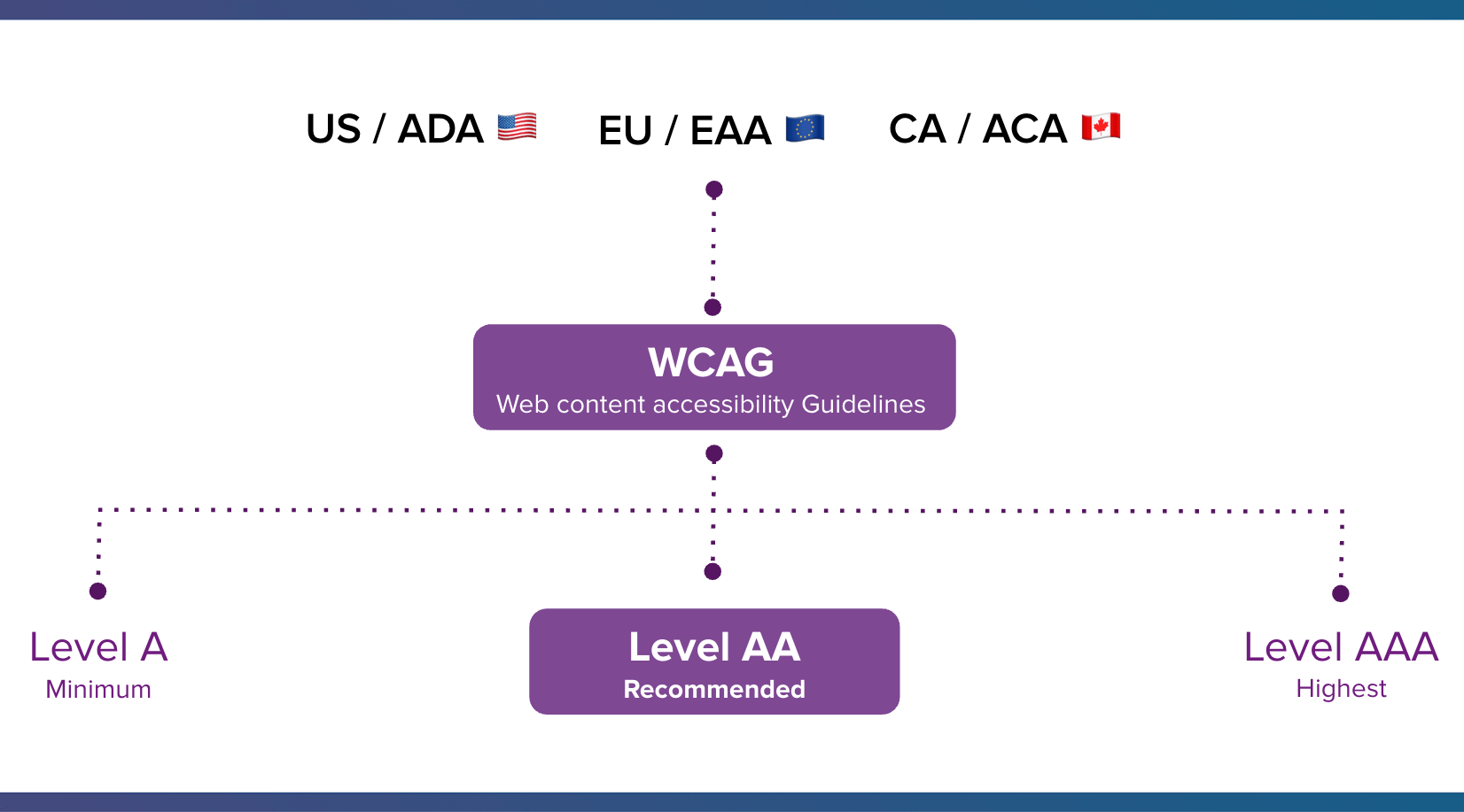
WCAG outlines three levels of conformance: Level A (minimum accessibility), Level AA (recommended and most commonly targeted for legal compliance), and Level AAA (highest level of accessibility). These standards are built upon four fundamental principles, often remembered by the acronym POUR:
- Perceivable: Information and user interface components must be presentable to users in ways they can perceive. This means not relying solely on one sense (e.g., providing text alternatives for images).
- Operable: User interface components and navigation must be operable. Users must be able to interact with the content, not just passively receive it (e.g., ensuring keyboard accessibility for all controls).
- Understandable: Information and the operation of the user interface must be understandable. Content should be clear and predictable, with aids for navigation and comprehension.
- Robust: Content must be robust enough that it can be interpreted reliably by a wide variety of user agents, including assistive technologies. This ensures compatibility with current and future tools.
The Compelling Case for Email Accessibility: Beyond Compliance
Despite email’s pervasive reach—with Statista projecting 4.89 billion email users by 2027 and subscribers spending an average of 8.97 seconds with an email—accessibility is frequently overlooked. However, the reasons for prioritizing it extend far beyond mere compliance.
1. A Vast and Underserved Audience:
Disabilities affect a substantial portion of the global population. In the United States, one in four adults lives with a disability, a figure mirrored in the European Union. Globally, this number rises to one in six. As Lauren Castady, Design Leader, Accessibility Advocate & Creative Consultant at LC Creative, aptly notes, "Too often accessibility is framed as designing for someone, if that’s an edge case or a small segment. But the truth is it’s one of the largest audiences we design for."

Understanding how various disabilities impact email engagement highlights the necessity of accessible design:
- Visual Impairments (Blindness, Low Vision, Color Blindness): Users rely on screen readers to interpret content, magnifiers to enlarge text, or specialized color contrast settings. Emails lacking proper alt text for images, sufficient color contrast, or logical structure become impenetrable.
- Physical Disabilities (Limited Mobility, Tremors): These users may navigate using keyboards, voice commands, or specialized input devices. Small, difficult-to-target links or buttons can render an email unusable.
- Cognitive and Neurological Disabilities (Dyslexia, ADHD, Epilepsy): Clear, concise language, predictable layouts, avoidance of flashing or overly complex animations, and consistent navigation are crucial for comprehension and to prevent adverse reactions.
Beyond permanent disabilities, accessible design also benefits individuals experiencing situational or temporary impairments. A person holding a baby might have limited use of one hand, someone in bright sunlight might struggle with low contrast, or an individual recovering from an injury might temporarily rely on assistive tech. As Castady emphasizes, "a hundred percent of people experience situational or temporary impairments." Therefore, neglecting accessible design means missing out on a huge audience and potential customers, while also failing to support users facing temporary challenges.
2. The Legal Imperative:
Governments worldwide have increasingly established and enforced digital accessibility laws. Key examples include:
- United States: The Americans with Disabilities Act (ADA) has been interpreted by courts to apply to digital content, including websites and emails.
- European Union: The European Accessibility Act (EAA), coming into full effect in 2025, mandates accessibility requirements for various products and services, including electronic communication.
- Canada: The Accessible Canada Act (ACA) aims to create a barrier-free Canada, impacting federal organizations and regulated private sectors.
Non-compliance with these laws can lead to significant legal actions, costly settlements, and mandatory remediation efforts, underscoring accessibility as a critical risk management factor for businesses.
3. Driving Business Results and Brand Value:
While legal compliance is a strong driver, accessibility is also a powerful engine for business growth. Making emails accessible expands market reach, including a demographic with substantial purchasing power. The Return on Disability (ROD) Group estimates that people with disabilities in the U.S. control over $1 trillion in annual disposable income. Ignoring this segment means leaving significant revenue on the table.
Beyond direct revenue, accessible design enhances brand reputation and fosters deeper customer loyalty. Brands that demonstrate a commitment to inclusivity are perceived more positively, building stronger, lasting relationships with their audience. Furthermore, boosting engagement through accessible emails can improve deliverability rates, ensuring more messages reach the inbox. In an era where customer experience is paramount, accessibility is not merely an ethical choice but a strategic business imperative that improves the experience for all subscribers.
Actionable Strategies: Email Accessibility Best Practices for Marketers
Implementing email accessibility requires a holistic approach, considering both design and technical execution. Marketers can significantly enhance their email campaigns by focusing on the following best practices:
Considering the Visual Aspects of Email Accessibility
Use Color Intelligently and Ensure High Contrast:
Color should never be the sole method of conveying important information, especially for subscribers with color blindness (e.g., protanopia, deuteranopia, tritanopia). Instead, use redundant cues like text labels, icons, or patterns alongside color.
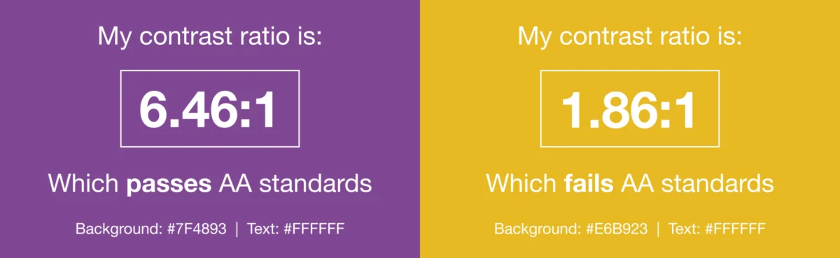
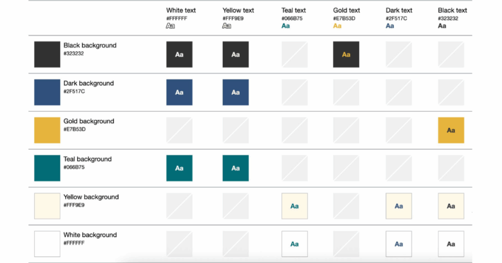
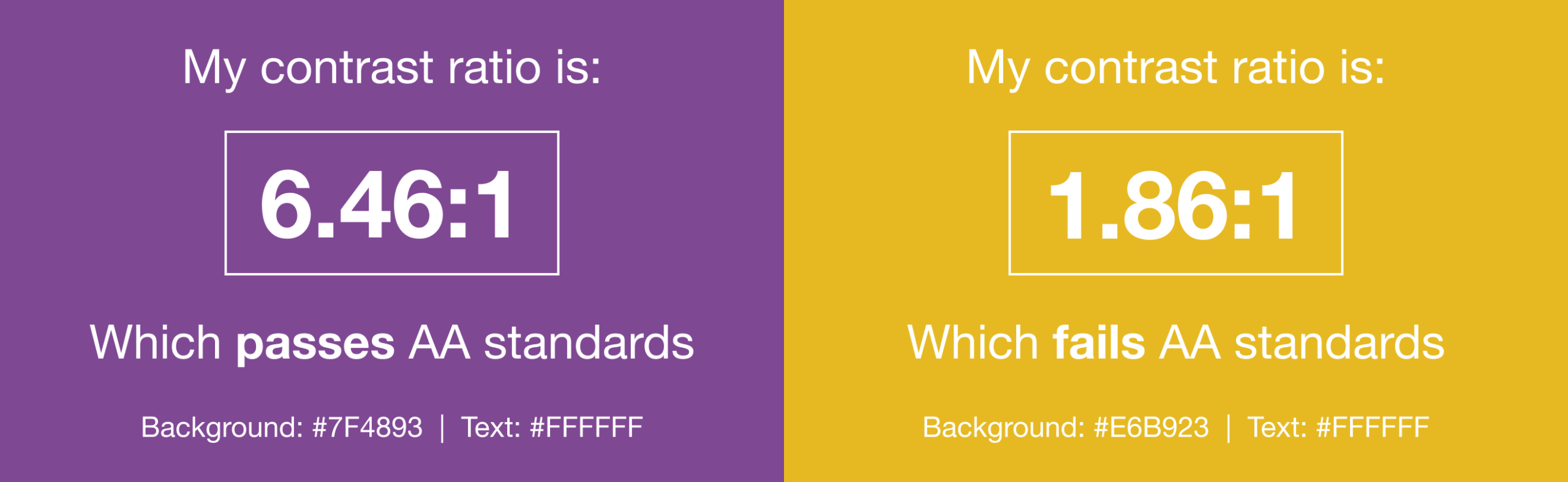
High color contrast between text and background elements is crucial for readability, particularly for individuals with low vision or those reading in challenging environments. Tools like WebAim’s Color Contrast Checker can help evaluate contrast ratios against WCAG AA standards. Lauren Castady advises, "Color contrast issues are one of the fastest ways brands can be more accessible. The fix isn’t fewer colors, it’s clearer rules. So one of the most practical things that you can do is create a color matrix. It shows which brand colors work together and which ones don’t. This removes subjective decision making and speeds teams up."
Avoid Harmful Content:
Content that flashes at certain rates (typically above 3 Hz) or in specific patterns can trigger photo-sensitive seizures. Animated GIFs, while popular, must be used cautiously. If including animated GIFs, ensure they stop after three cycles or within five seconds to prevent adverse reactions. Avoid linking to videos that may contain similar harmful flashing content.
Balance Text and Images with Live HTML Text:
While sighted users can quickly scan or skip visual content, screen reader users must listen to the entire email sequentially. Prioritize live HTML text over images for critical information. Live text adapts better to screen readers, scales with user zoom settings, responds to dark mode, and ensures a minimum readable body size (14-16 pixels) is maintained. As Lauren Castady points out, "The single biggest thing we can do to improve accessibility over and over for as long as I’ve worked in email is to use live HTML text wherever possible."
Optimizing Typography for Readability
Use Larger Font Sizes:
A minimum font size of 14 pixels on desktop and laptop screens is generally recommended; anything smaller requires effort to read. For mobile devices, increase this to 16 pixels using media queries to prevent users from having to zoom, which can break the email layout. Consider using rem units instead of px for font sizes. Rems scale based on the user’s browser settings, offering greater adaptability for those who customize their default font sizes for accessibility.
Give Copy Sufficient Space:
Adequate line height (leading) is essential for readability. A line height 1.5 times the font size is a good general recommendation. When increasing font size for mobile, remember to adjust line height accordingly.
Paragraphs also require ample white space above and below them to aid visual scanning and prevent cognitive overload. Adding padding to table cells or paragraph tags can move text away from the edges of the email, improving readability.
Avoid Justified Copy:
"Justified" text, where word and letter spacing are adjusted to align with both left and right margins, creates inconsistent gaps that can form "rivers of white space." This makes text significantly harder to read, especially for individuals with cognitive disabilities. Left-aligned text has consistently been proven to be easier to read for all users.
Choose the Right Typeface:
When selecting fonts, prioritize legibility. Choose typefaces that are evenly spaced, not overly condensed, and have clear character distinctions. Sans-serif fonts are often recommended for digital content due to their simplicity, but legibility is the ultimate criterion. Always include appropriate fallback fonts for email clients that do not support web fonts.
Structuring Content for Navigation and Comprehension
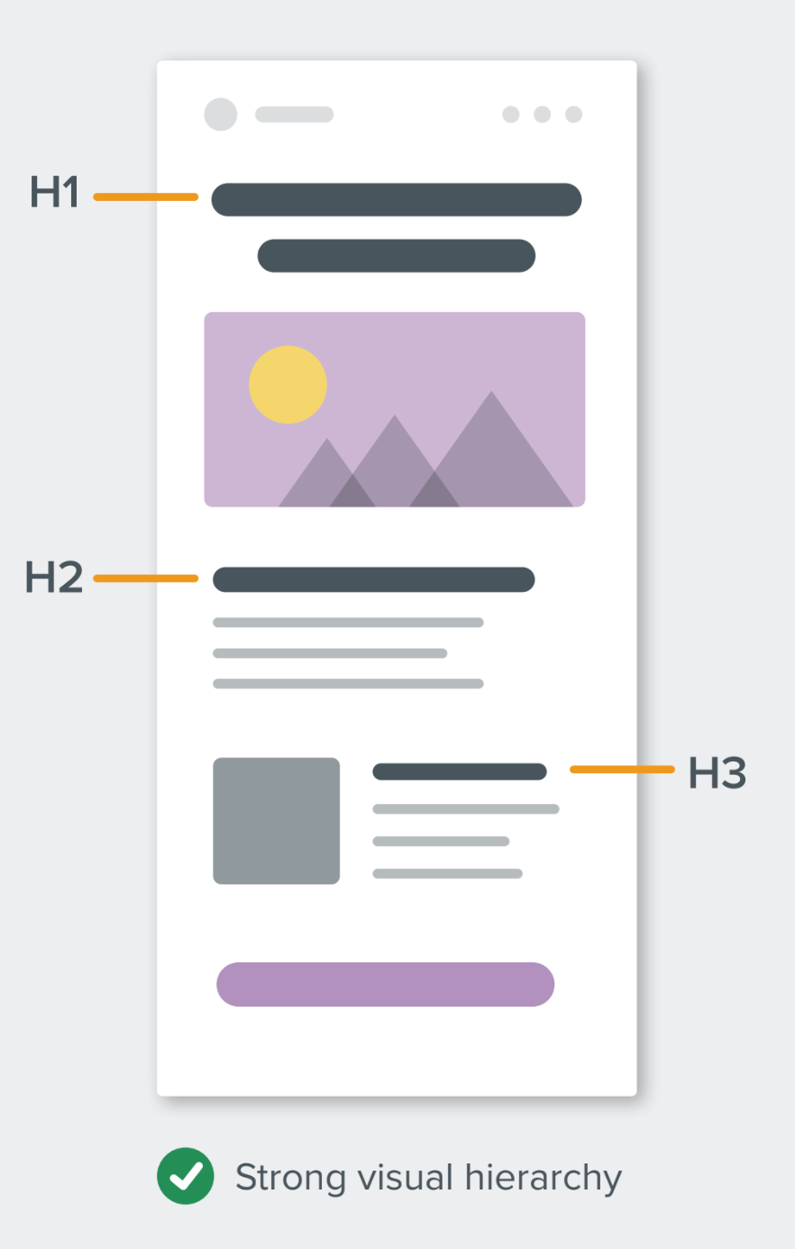
Use Semantic Elements and a Clear Hierarchy:
Employing HTML heading tags (<h1>, <h2>, etc.) creates a clear visual and structural hierarchy, which is invaluable for screen reader users who often navigate by headings. This makes it easier for them to understand the content’s organization and jump to relevant sections.
For semantic elements, use margin instead of padding where possible, as padding support can be inconsistent on these elements across email clients. Applying mso-line-height-rule:exactly; to heading tags helps maintain consistent line height in Microsoft Outlook clients.
Improve the Readability of Your Email Copy:
Accessible writing means making your email copy more "human" and easily digestible. The Flesch-Kincaid Reading Ease test, available in Microsoft Word, calculates content readability on a scale of 0-100. A score between 60 and 70 is often the sweet spot for a general audience, indicating easily understandable text.
To enhance readability:
- Use active voice and avoid jargon.
- Write shorter sentences and paragraphs.
- Break up large blocks of text with subheadings and bullet points.
- Prioritize clear, concise language over complex vocabulary, even for educated audiences.
- Ensure logical flow and clear calls to action.
Designing Interactive Elements
Make Links Clickable/Tappable:
Buttons and links should be large enough to be easily activated by fingers or thumbs on mobile devices. A minimum target size of 44×44 pixels is a widely accepted recommendation. Larger, clearly defined interactive elements benefit not only users with physical disabilities but also all mobile users.
Banish Ambiguous Link Copy (e.g., "Click Here"):
Avoid generic link text like "click here" or "read more." Screen reader users often tab through links, relying on the link text itself for context. Descriptive link text (e.g., "See our new shoe collection") provides meaningful information out of context, benefiting both screen reader users and sighted individuals who scan emails. This also makes your content more device-independent, as "click" is irrelevant for touchscreens.
Using the ALT Attribute Correctly:
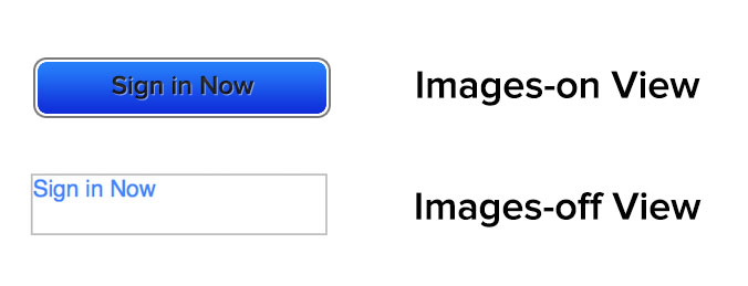
The ALT attribute, which provides alternative text for images, is crucial for email accessibility, especially since many email clients block images by default. The ALT text allows screen readers to describe images to visually impaired users and provides context when images fail to load.
To use it correctly, determine if an image is functional (e.g., a button), illustrative (conveys information), or decorative. All images require an ALT attribute; for purely decorative images, use a null ALT attribute (alt="") to prevent screen readers from announcing them. Reviewing your email with images off can help identify which images need descriptive ALT text and which can be null.
Employ role="presentation" and aria-hidden="true" for Layout Tables:
Historically, tables have been used extensively in email design for layout purposes due to client limitations (e.g., Outlook). To prevent screen readers from misinterpreting these layout tables as data tables and reading out each cell, apply role="presentation" to layout tables.
Additionally, aria-hidden="true" can be used on elements that are purely visual and should be entirely hidden from screen readers. This ensures that only meaningful content is announced, streamlining the experience for assistive technology users.
Email Accessibility in Action: Real-World Examples
The Litmus community offers inspiring examples of accessible email design:
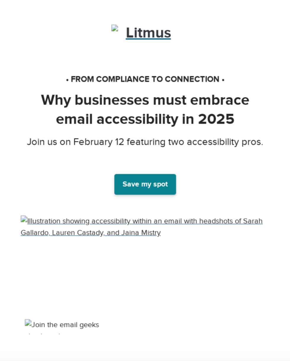
- One email example allows subscribers to increase text size by up to 200% without breaking the design, and features an animated GIF that stops after three cycles (within five seconds) to prevent photo-sensitive seizures.
- Another email by Eyal Bitton uses descriptive link copy that makes sense out of context and includes hidden text at the end to signal blind subscribers.
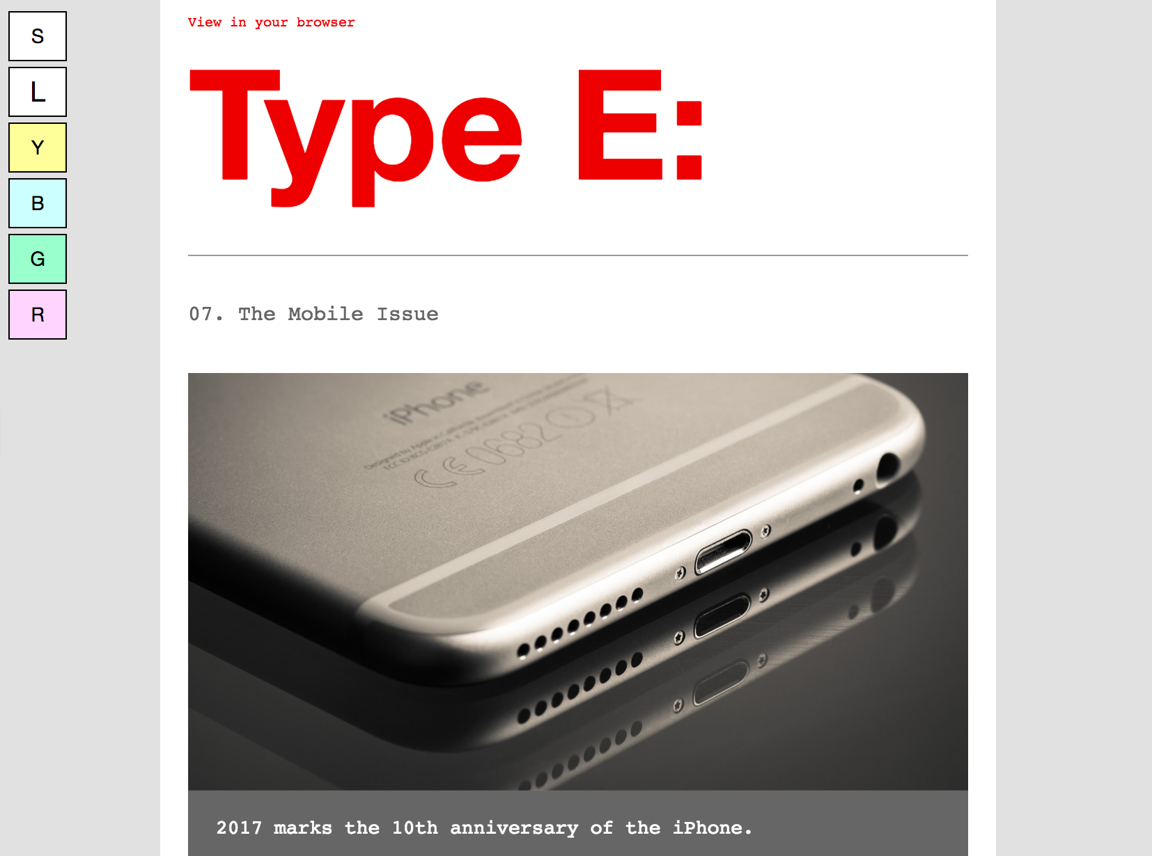
- Paul Airy’s "Type E" newsletter utilizes an interactive progressive enhancement, allowing subscribers to choose between standard or large text sizes. It also includes an opt-in option for tinted backgrounds, benefiting users with certain visual disabilities.
These examples demonstrate that even small, thoughtful adjustments can significantly enhance accessibility and improve the email experience for everyone.
Fostering an Accessible Culture: Team Education and Tools
Scaling accessibility adherence within an organization requires more than just individual effort; it demands a cultural shift and strategic implementation. Educating teams on the business value of accessibility is paramount. With email boasting an impressive ROI of 36:1 and people with disabilities controlling a trillion-dollar market, ignoring accessibility is a significant missed opportunity.
Key steps to integrate accessibility into your workflow include:
- Accessible Templates: Develop email templates that inherently follow best practices, such as live text, strong color contrast, and proper semantic structure. This provides a consistent foundation for all campaigns.
- Continuous Training: Implement regular training sessions to keep design, development, and marketing teams updated on the latest WCAG standards and accessibility best practices.
- Collaborative Planning: Integrate accessibility considerations from the initial stages of campaign planning, involving design, development, and legal teams to ensure compliance and optimal user experience.
Tools like Litmus can significantly streamline this process. Its built-in accessibility checker scans emails for over 40 accessibility areas, providing detailed reports and guidance. Visual impairment filters allow marketers to preview emails through the lens of various color vision deficiencies (deuteranopia, protanopia, tritanopia, achromatopsia). Furthermore, NVDA screen reader integration, supporting over 80 languages, helps verify how emails are perceived by assistive technologies, aided by the lang attribute for accurate transcription.
Broader Implications and Future Outlook
Email accessibility is no longer a niche concern but a fundamental requirement for effective and ethical digital communication. By embracing accessible design, businesses not only comply with evolving legal mandates but also tap into a vast, loyal, and economically powerful audience. The commitment to inclusivity enhances brand reputation, drives engagement, improves deliverability, and ultimately contributes to a more equitable digital world. As digital platforms continue to evolve, the principles of accessibility will remain at the forefront, shaping how businesses connect with all their customers. The future of email marketing is intrinsically linked to its ability to be truly universal.