Popup forms, those small overlay windows that appear on websites to capture email addresses, represent one of the most potent tools in a digital marketer’s arsenal for rapid list expansion. However, their efficacy is profoundly bifurcated: when implemented judiciously, they are unparalleled in their ability to convert passive visitors into engaged subscribers. Conversely, a poorly executed popup can swiftly alienate potential customers, leading to immediate site abandonment and a tarnished user experience. The critical distinction between success and failure in this domain hinges not on the mere presence of a popup, but rather on the nuanced considerations of when, where, and how often it makes its appearance.
The Core Challenge: Balancing Conversion with User Experience
The pervasive issue undermining the performance of many popup forms stems from a fundamental misunderstanding of user psychology and digital etiquette. All too often, these forms are configured to appear prematurely, with excessive frequency, and indiscriminately across every page of a website. Visitors are confronted with an immediate request for their personal information—typically an email address—before they have had the opportunity to engage with any content, ascertain the site’s value proposition, or develop even a rudimentary level of trust. This approach is not a sophisticated conversion strategy; it is an interruption. It prioritizes the marketer’s immediate objective over the visitor’s experience, often resulting in frustration, elevated bounce rates, and a negative perception of the brand.
Building a popup that genuinely converts requires a paradigm shift, moving from an intrusive tactic to a respectful invitation. It demands a deliberate effort to align the timing and context of the popup with the user’s journey and demonstrated interest. The goal is to present an offer that feels timely, relevant, and valuable, rather than an arbitrary demand for data. This nuanced approach acknowledges that a positive user experience is intrinsically linked to long-term engagement and successful conversions.
Leveraging AI for Streamlined Popup Creation: The AWeber AI Signup Form Builder
In response to the growing complexity of optimizing popup strategies, modern marketing platforms are increasingly integrating artificial intelligence to simplify and enhance the creation process. A notable example is the AI Signup Form Builder offered by AWeber, which represents a significant leap forward in designing high-converting popups with minimal effort. This innovative tool empowers users to generate entire popup forms from simple text descriptions, effectively democratizing advanced design and implementation.

The process is remarkably intuitive: a user describes their business, specifies the value proposition or offer, and indicates the desired timing for the form’s appearance. For instance, a command such as "I run a marketing blog. Offer a free email checklist. Show the form after 30 seconds" is sufficient for the builder to generate a complete popup. The AI autonomously crafts compelling copy, designs an aesthetically pleasing layout, selects appropriate fields, and suggests a call to action, all tailored to the user’s specifications. Marketers retain full editorial control, with the option to refine any element or deploy the AI-generated form as-is, significantly reducing the time and technical expertise traditionally required for popup creation.
Beyond design, the AI Builder seamlessly integrates with existing AWeber email lists. Upon submission, new subscribers are automatically added to the designated list and can immediately enter any pre-configured automation sequences, such as welcome series or drip campaigns. This end-to-end solution eliminates the need for coding, external design tools, or third-party plugins, streamlining the entire lead capture and nurturing process. This innovation, highlighted as a recent development as of May 27, 2026, underscores the industry’s trend toward making sophisticated marketing tools more accessible and efficient for businesses of all sizes. Regardless of whether one leverages AI or opts for manual design, the foundational principles of effective popup creation remain paramount.
Anatomy of a High-Converting Popup: Design Principles
The visual and textual elements of a popup form play a critical role in its ability to convert. Every component, from the headline to the close button, must be meticulously crafted to communicate value, inspire action, and maintain a positive user experience.
-
Start with a Specific Headline: The headline is the visitor’s first interaction with your offer, and it must convey immediate value in fewer than ten words. Vague phrases like "Subscribe to our newsletter" are ineffective because they fail to articulate a tangible benefit. Instead, a headline such as "Get the weekly marketing checklist" clearly states what the visitor will receive, allowing them to understand the offer before reading further. Industry data consistently shows that specificity in headlines can increase conversion rates by as much as 20-30% compared to generic calls to action. Naming the deliverable and being explicit about its content—e.g., "Free email marketing checklist" versus "Join our list"—is crucial for immediate comprehension and perceived value.
-
Add a Value Statement (Optional): Below the headline, a concise, one-sentence value statement can provide crucial context, build urgency, or establish credibility. Examples include "Sent to your inbox in 60 seconds" to highlight immediate gratification, or "Used by 5,000+ small business owners" to leverage social proof. This element is optional; if the headline is sufficiently clear and compelling on its own, its omission can prevent unnecessary cognitive load and maintain brevity, which is often beneficial for popups.
-
Keep the Form to One or Two Fields: Simplicity is paramount in popup design. The primary objective is to initiate a relationship, and for this, an email address is typically the only required field. If personalization is a key component of your email strategy, adding a field for the visitor’s first name can be justified. However, this should generally be the absolute maximum for a popup form. Extensive A/B testing across various industries consistently demonstrates that every additional field beyond the email address significantly reduces completion rates. Data suggests that conversion rates can drop by 5-10% for each extra field added. More detailed information, such as company size, industry, or specific preferences, should be collected later through progressive profiling in welcome emails, segmentation surveys, or a dedicated preference center, allowing the initial interaction to be as frictionless as possible.

-
Use Action Language on the Button: The call-to-action (CTA) button is the final prompt for conversion, and its language must be specific, action-oriented, and directly tied to the offer. Generic terms like "Submit" are notably less effective than phrases such as "Send me the checklist" or "Get my free guide." Furthermore, research in conversion psychology often indicates that first-person language (e.g., "Get my free guide") tends to outperform second-person language (e.g., "Get your free guide") in A/B tests, as it fosters a sense of ownership and personal benefit. The CTA should clearly articulate the immediate outcome of clicking the button.
-
Make the Close Button Obvious: A critical, yet often overlooked, aspect of user experience is providing a clear and easily accessible option to dismiss the popup. This means avoiding tiny "X" icons tucked away in a corner or, worse, guilt-tripping dismiss links like "No, I don’t want more customers." A visible, appropriately sized close button is essential. If a visitor chooses not to subscribe at a particular moment, respecting that decision by allowing them to leave gracefully is crucial for building trust and maintaining a positive brand perception. Trapping visitors not only frustrates them but also damages the potential for future engagement.
The Art of Timing: When to Present Your Offer
Timing is perhaps the single most influential factor in determining whether a popup is perceived as a helpful offer or a hostile intrusion. A popup that appears within the first few seconds of a visitor landing on a page signals that the website owner values email addresses more than the visitor’s experience or content consumption. Conversely, a popup that waits until a visitor has demonstrated genuine engagement—by scrolling significantly down a page or spending a meaningful amount of time reading—is perceived as a relevant offer presented at an opportune moment. The three most effective and widely adopted triggers for popup forms are scroll depth, time on page, and exit intent.
-
Scroll-Based Triggers: These triggers activate the popup after a visitor has scrolled a predetermined percentage of the page content. For informational content like blog posts, a scroll depth between 40% and 60% is generally considered optimal. At this point, the visitor has invested enough time and effort into consuming the content to have formed an opinion about its value and the site’s relevance. Presenting an offer related to the content at this stage leverages their demonstrated interest, making the popup feel less arbitrary and more contextual. Data suggests that scroll-triggered popups can yield conversion rates significantly higher than immediately displayed ones, often ranging from 3-7%.
-
Time-Based Triggers: Time-based triggers deploy the popup after a set number of seconds has elapsed since the visitor landed on the page. An interval of 15 to 30 seconds typically provides sufficient time for most visitors to engage with the initial content and assess its utility. Any duration under ten seconds often feels aggressive and can replicate the negative impact of an immediate popup. The optimal time frame can vary by content type and audience, necessitating A/B testing to fine-tune. For instance, a site with short, impactful content might benefit from a shorter delay, while a long-form article might require a longer one.
-
Exit-Intent Triggers: Widely lauded as one of the least intrusive and most effective popup strategies, exit-intent triggers detect when a visitor’s cursor movements indicate an intention to leave the page—typically by moving towards the browser’s close button, back button, or address bar. The popup then appears just before their departure, presenting a final opportunity to capture their interest. The fundamental advantage of exit-intent popups is that they do not interrupt the active reading or browsing experience. They target individuals who were already on the verge of leaving, offering them a last-minute incentive to stay connected. Studies consistently show that exit-intent popups achieve higher conversion rates, often between 5-10%, compared to time-based or immediate popups, precisely because they intervene at a non-disruptive, high-intent moment.
These triggers are not mutually exclusive; they can be combined for a layered approach. For example, an engaged reader who scrolls deep into a blog post might receive a scroll-based popup, while visitors who show no such engagement but attempt to leave could be targeted with an exit-intent offer. This strategy ensures that different user behaviors are met with appropriately timed and relevant invitations to subscribe, maximizing conversion opportunities while respecting user flow.
Respecting User Choices: The Importance of Frequency Capping
Once a visitor has interacted with and closed a popup, immediately re-presenting the same form on the next pageview is a sure-fire way to cultivate annoyance and train them to abandon the site. This aggressive tactic not only undermines trust but also actively sabotages the potential for future engagement.
Implementing a robust frequency cap is critical for maintaining a positive user experience and optimizing long-term conversion rates. This involves setting parameters for how often a popup will appear to a specific user. Common best practices include displaying the popup only once per session or, for a more conservative approach, once every seven days. The precise duration can be determined by the nature of the content, the frequency of new offers, and user feedback, but the principle remains constant: respect the user’s decision to decline an offer. Repeated, unheeded popups do not convert resistant visitors; they merely reinforce their decision to leave and can actively deter them from returning. Modern marketing platforms facilitate the setting of these caps through cookie-based tracking, ensuring that visitors who have closed a popup are not immediately bombarded again, thereby preserving site usability and fostering goodwill.
Precision Targeting: Where and to Whom Popups Should Appear
The blanket application of a single popup across an entire website dilutes its impact and inevitably frustrates visitors who encounter it repeatedly in disparate contexts. Strategic targeting, both by page content and device type, is essential for maximizing relevance and effectiveness.
-
Page Targeting: The principle of relevance dictates that a popup’s offer should align directly with the content being consumed. A popup promoting a "blog writing checklist" is highly pertinent on a blog post discussing content marketing strategies. However, the same popup would be entirely irrelevant and potentially disruptive on a pricing page or a product features page. By showing popups only on pages where the offer provides immediate, contextual value, marketers can significantly boost conversion rates. A generic "join our newsletter" popup, lacking specific context, rarely performs as well as a targeted offer directly tied to the page’s subject matter. If a user is actively reading about email automation, offering a resource specifically on email automation leverages their current interest and increases the likelihood of subscription. This tailored approach enhances the perceived value of the offer and improves the overall user journey.

-
Device Targeting: The proliferation of mobile browsing necessitates a distinct approach to popup design and deployment. A popup that functions seamlessly and looks aesthetically pleasing on a desktop monitor can become an intrusive, screen-covering impediment on a smartphone. Google has formally recognized the negative impact of "intrusive mobile interstitials" and, since January 2017, has incorporated them as a negative ranking signal in its search algorithms. Full-screen popups that immediately obscure all content upon mobile page load can severely penalize a website’s search rankings. However, popups triggered by a time delay, scroll depth, or exit intent are generally not subject to these penalties, as they are considered less disruptive.
To comply with Google’s guidelines and provide an optimal mobile experience, marketers should opt for less intrusive formats on smartphones, such as smaller banners, slide-ins, or sticky bars that remain visible without covering primary content. Full-screen popups should generally be reserved for desktop users. Crucially, regardless of the device, the close button must be prominently displayed and easily tappable or clickable, ensuring users can dismiss the form without frustration.
Beyond the Basic Popup: Innovative Formats for Engagement
While traditional popups remain effective, innovative formats can further enhance engagement and conversion rates by adding an element of interactivity or perceived value. The AWeber AI Signup Form Builder supports the creation of several such dynamic formats:
-
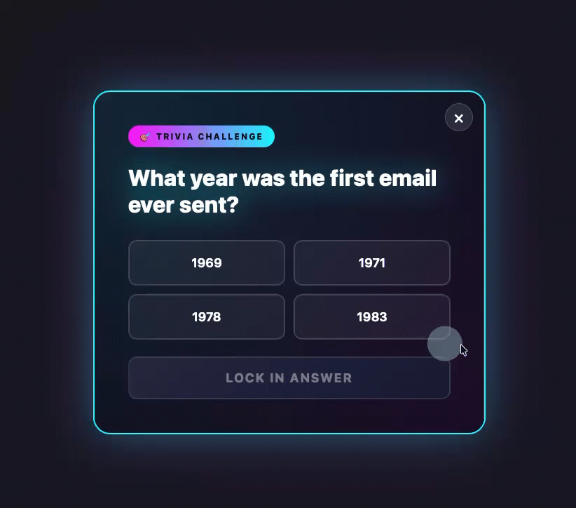
Gamified Popups: These forms transform the subscription process into an engaging experience, such as a quiz, a trivia question, or a "spin-to-win" wheel. Visitors interact with the gamified element before being prompted for their email address. This pre-commitment stage increases engagement and curiosity, making the subsequent request for an email feel less transactional and more like a natural progression of the game. For instance, offering a discount or a free resource as a "prize" for spinning a wheel can significantly boost opt-in rates by leveraging a sense of play and potential reward.
-
Discount Offers: Particularly effective for e-commerce sites, discount offer popups, often appearing as spin-to-win wheels or direct coupon offers, are strategically deployed just as a visitor indicates an intent to leave. The visitor enters their email address to "claim" the prize or discount, providing a powerful incentive to convert a departing user into a lead. This immediate gratification, coupled with the potential for savings, can turn a near-loss into a valuable subscription.
-
Multi-Step Forms: Multi-step forms break down the subscription process into several smaller, less daunting steps. The visitor first makes a low-commitment decision (e.g., answering a simple question, selecting an interest category). By the time they reach the field requesting their email address, they have already invested some effort and made an initial "yes" decision, making them more likely to complete the final step. This technique leverages the psychological principle of consistency, where individuals are more likely to follow through on a larger request after agreeing to smaller ones.

-
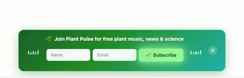
Sticky Bars: Also known as floating bars, sticky bars are thin banners that remain fixed at the top or bottom of the browser window as the user scrolls. These unobtrusive elements typically contain a form field and a call-to-action button, offering a persistent yet non-blocking way to capture leads. Sticky bars are always visible but never obscure content, making them an excellent choice for a continuous, low-friction lead generation tool, especially for mobile users where screen real estate is at a premium. They provide a constant reminder of the offer without interrupting the user’s flow.
The versatility of tools like the AI Signup Form Builder enables marketers to experiment with these diverse formats, allowing them to describe the desired format, set timing parameters, and let the AI handle the design and implementation, thereby democratizing sophisticated lead capture techniques.
The Broader Landscape: Popups in a Holistic Email Marketing Strategy
While popups are powerful individual tools, their true potential is unlocked when integrated into a comprehensive email marketing strategy. They serve as the initial gateway to building an email list, which remains one of the most valuable assets for any business in the digital age. Email marketing consistently delivers a high return on investment (ROI), with studies often citing figures of $36 for every $1 spent. Popups are the frontline soldiers in acquiring these valuable contacts.
Beyond initial acquisition, a well-managed email list facilitates ongoing communication, customer relationship management, and targeted promotions. The data collected through popups (primarily email addresses, and sometimes names) allows businesses to segment their audience, personalize content, and nurture leads through automated sequences. This strategic approach moves beyond mere data collection, aiming to build long-term customer loyalty and drive repeat business.
Furthermore, the ethical considerations of data collection and privacy regulations (such as GDPR and CCPA) necessitate transparency and user consent. Effective popups not only seek an email address but also implicitly or explicitly communicate the value exchange and respect for user data, often including a link to a privacy policy. This builds trust and ensures compliance, reinforcing the notion that popups are not just about immediate conversions but about fostering a sustainable, respectful relationship with the audience.
Conclusion
Popup forms, when approached with strategic intent and a deep understanding of user experience, are indispensable for accelerating email list growth and fortifying digital marketing efforts. The transition from intrusive interruptions to valuable, timely invitations is critical for success. By adhering to meticulous design principles, leveraging intelligent timing triggers, implementing judicious frequency caps, and employing precise targeting, businesses can transform these often-maligned elements into powerful conversion engines. The advent of AI-powered tools, such as AWeber’s AI Signup Form Builder, further empowers marketers to deploy sophisticated, high-performing popups with unprecedented ease and efficiency. Ultimately, the future of successful lead capture lies in balancing aggressive marketing goals with a profound respect for the user journey, ensuring that every popup contributes positively to both conversion rates and brand perception.