Mastering the art of email list growth through popup forms has become a critical differentiator for businesses in the digital age, yet the nuanced balance between effective conversion and visitor experience remains a significant challenge. As of May 27, 2026, the landscape of lead generation is being redefined by intelligent tools that empower marketers to deploy sophisticated, user-centric popup strategies, moving beyond the intrusive tactics of the past. The fundamental principle is clear: a popup form, a small overlay window designed to collect email addresses, represents the fastest pathway to list expansion when executed correctly, but conversely, it can be the quickest route to visitor abandonment if mishandled. The distinction between success and failure hinges not on the mere presence of a popup, but on its precise timing, contextual relevance, and frequency of appearance.
The evolution of digital marketing has seen popup forms transition from universally reviled internet nuisances to refined, data-driven conversion assets. Early iterations often appeared instantaneously upon page load, overwhelming users before they could even grasp the site’s content. This aggressive approach, while sometimes yielding high initial capture rates, came at a significant cost: elevated bounce rates, negative brand perception, and a frustrated user base. This historical context underscores why many popup forms still fail today; they are deployed too early, too often, and indiscriminately across every page. A visitor who hasn’t read a single sentence yet being prompted for their email address is not experiencing a conversion strategy; they are experiencing an interruption. The modern imperative is to cultivate a popup strategy that not only converts effectively but also genuinely respects the person on the other side of the screen.
The Rise of AI in Popup Form Creation
A significant development in streamlining this process is the introduction of AI-powered tools designed to simplify the creation and deployment of these sophisticated forms. AWeber, a prominent player in email marketing, has launched its AI Signup Form Builder, signaling a new era of accessibility for advanced lead capture techniques. This innovative builder allows users to design an entire popup form simply by describing their desired outcome in plain text. For instance, a command such as "I run a marketing blog. Offer a free email checklist. Show the form after 30 seconds," prompts the AI to generate the complete copy, design, layout, and necessary fields. This democratizes the creation of highly optimized forms, traditionally requiring design and coding expertise, enabling businesses of all sizes to implement best practices effortlessly.

Once generated, these AI-created forms seamlessly integrate with AWeber email lists, automatically adding new subscribers and initiating any pre-built automation sequences. This eliminates the need for manual coding, separate design tools, or third-party plugins, drastically reducing the technical barriers to effective list building. The shift towards AI-driven form creation marks a pivotal moment, enabling marketers to focus on strategy and content rather than the mechanics of form development. However, whether utilizing an AI builder or designing manually, the underlying principles of effective popup strategy remain constant and are paramount for achieving optimal results.
Core Principles of High-Converting Popup Design
The effectiveness of a popup form begins with its fundamental design elements, each meticulously crafted to maximize engagement and conversion without alienating the visitor.
1. Start with a Specific, Benefit-Oriented Headline:
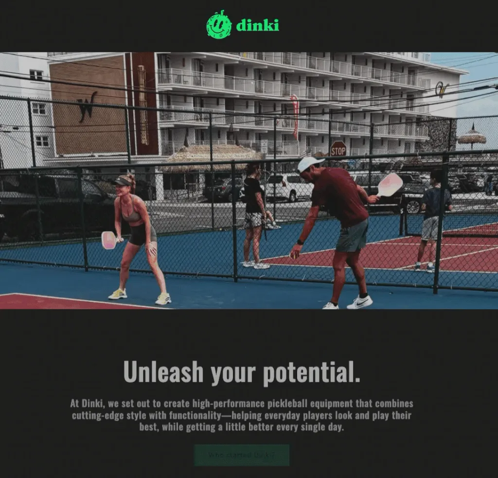
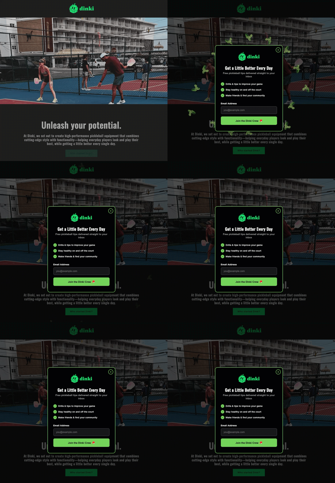
The headline is the cornerstone of a popup’s appeal, serving as the immediate value proposition. It must articulate what the visitor will receive in under ten words. Generic calls to action like "Subscribe to our newsletter" are significantly less effective than specific, benefit-driven statements such as "Get the Weekly Marketing Checklist" or "Unlock Your Free E-commerce Guide." The visitor should instantly grasp the offer’s value before reading any further, creating an immediate incentive to engage. Industry data consistently shows that headlines emphasizing a clear benefit or deliverable can increase conversion rates by as much as 30% compared to vague alternatives.
2. Add a Value Statement (Optional but Recommended):
Following the headline, a concise, one-sentence value statement can provide crucial context, building urgency or credibility. Phrases like "Sent to your inbox in 60 seconds" or "Trusted by 5,000+ small business owners" reinforce the offer’s appeal. This line can address common user hesitations regarding time commitment or social proof. However, if the headline is exceptionally clear and compelling on its own, this element can be omitted to maintain brevity and reduce cognitive load.
3. Keep the Form to One or Two Fields:
Simplicity is paramount in popup design. The email address is the singular essential field required to initiate a relationship. If personalization is a key component of the marketing strategy, adding a name field can be justified, but this should be considered the absolute maximum for a popup. Every additional field introduces friction and significantly reduces completion rates. Studies have shown that reducing the number of form fields from four to two can boost conversion rates by over 20%. Any further information, such as demographic data or preferences, should be collected later through welcome emails, progressive profiling, or a dedicated preference center, allowing the initial interaction to remain as frictionless as possible.
4. Use Action Language on the Button:
The Call-to-Action (CTA) button is where the final conversion takes place, and its language must be precise and action-oriented. "Send me the checklist" consistently outperforms generic terms like "Submit." Furthermore, research indicates that first-person language ("Get my free guide") often resonates more effectively than second-person ("Get your free guide") in A/B testing scenarios, as it creates a sense of direct ownership and agency for the user. The CTA should explicitly relate to the offer, reinforcing the benefit promised in the headline.
5. Make the Close Button Obvious:
A fundamental aspect of user-friendly design, often overlooked, is a clear and easily accessible close option. This means avoiding tiny, barely visible ‘X’ icons or guilt-tripping dismiss links like "No, I don’t want more customers." A prominent, visible close button respects the visitor’s choice and prevents frustration. Trapping visitors within a popup, even inadvertently, erodes trust and negatively impacts the overall user experience, often leading to immediate site abandonment.
Strategic Timing: The Art of Non-Intrusive Interruption
The timing of a popup is perhaps the most critical factor determining whether it is perceived as helpful or hostile. A popup that appears within the first three seconds of a visit conveys a message that the site owner prioritizes email collection over user experience. Conversely, a popup that waits until a visitor has scrolled halfway down a page or spent 30 seconds engaging with content appears at a moment of demonstrated interest, making the offer feel more relevant and less intrusive. The three most effective and widely adopted triggers for popup forms are scroll depth, time on page, and exit intent.
1. Scroll-Based Triggers:
These triggers activate a popup after a visitor has scrolled a specific percentage of the page. For content-rich pages like blog posts, a scroll depth of 40% to 60% is often optimal. At this point, the visitor has invested enough time to consume a significant portion of the content, indicating genuine engagement and a potential interest in further resources or information. This strategy targets already-interested readers without immediately interrupting their initial browsing.
2. Time-Based Triggers:
Time-based triggers display the popup after a predetermined number of seconds. An ideal window typically ranges from fifteen to thirty seconds, providing ample time for most visitors to engage with the content. Anything under ten seconds tends to feel aggressive and can lead to higher bounce rates. The exact timing can be refined through A/B testing to identify the sweet spot for a specific audience and content type.
3. Exit-Intent Triggers:
Considered the least intrusive and often most effective trigger, exit-intent technology detects when a visitor’s cursor moves toward the browser’s close button, back button, or address bar, signaling an imminent departure. The popup appears precisely at this critical moment, offering a "last chance" incentive to stay connected. Exit-intent popups consistently achieve higher conversion rates, frequently ranging from 5% to 15%, because they do not interrupt the active reading or browsing experience. They target users who were already leaving, providing a final, value-driven reason to reconsider or engage.
Many advanced strategies involve combining these triggers. For instance, a scroll-based popup can be presented to deeply engaged readers, while an exit-intent popup is reserved for all other visitors. This ensures that readers immersed in content receive an offer when their interest is piqued, while those preparing to leave are given one final, compelling reason to stay connected, thereby maximizing lead capture opportunities across different user behaviors.
Frequency Capping: Respecting User Preferences
Aggressive frequency is a primary driver of negative user experience and diminished conversion rates. Once a visitor has closed a popup, immediately displaying it again on the next pageview is a sure way to train them to leave the site entirely. Implementing a frequency cap is crucial for maintaining a positive user experience and long-term visitor retention. Best practices suggest setting the popup to appear once per session or, more conservatively, once every seven to thirty days. Repeated, incessant popups do not convert resistant visitors; instead, they solidify their decision to abandon the site. Respecting a user’s initial decision to dismiss the popup for at least the remainder of their visit, if not longer, is a cornerstone of user-centric marketing.
Targeting for Relevance and Compliance
Beyond timing and frequency, the strategic placement and adaptability of popup forms are vital for maximizing impact and ensuring compliance with evolving web standards.
1. Page Targeting:
Not every page on a website requires a popup, and showing the same generic form everywhere dilutes its effectiveness and frustrates visitors who encounter it repeatedly in different contexts. Popup offers should be highly relevant to the content on the page. For example, a popup offering a "blog writing checklist" is perfectly appropriate on a post about content marketing but would be out of place on a pricing page. Targeted offers, such as a resource on email automation offered to someone reading about email automation, significantly outperform generic "join our newsletter" calls to action, leading to higher quality leads and improved conversion rates.
2. Device Targeting and Google’s Stance:
Popups behave differently across various devices, and this necessitates careful device targeting. A full-screen popup that appears acceptable on a desktop monitor can entirely obscure content on a mobile phone, leading to a poor user experience. This issue gained significant importance when Google introduced a penalty for "intrusive mobile interstitials" in January 2017. This update specifically targets full-screen popups that cover content immediately upon mobile page load, potentially harming a site’s search rankings. Google’s rationale was to prioritize mobile user experience, ensuring content is easily accessible.
It’s important to note that not all mobile popups are penalized. Popups triggered by a time delay, scroll depth, or exit intent are generally not affected, nor are small banners that don’t cover the main content, legal notices, age verification requests, or cookie consent forms. The key distinction lies in immediate, content-blocking overlays. Therefore, it is best practice to display smaller banners or slide-in forms on mobile devices, reserving full-screen popups for desktop users. Regardless of device, the close button must be easy to find and tap, ensuring a seamless user experience across all screen sizes.
Innovative Popup Formats: Beyond the Basic Box
The AI Signup Form Builder facilitates the creation of a diverse range of popup formats, allowing businesses to experiment with innovative approaches to engagement:
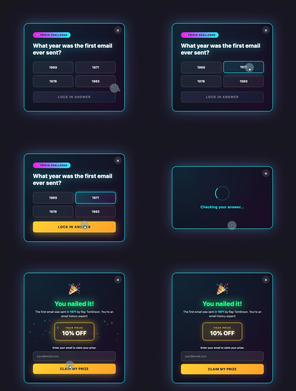
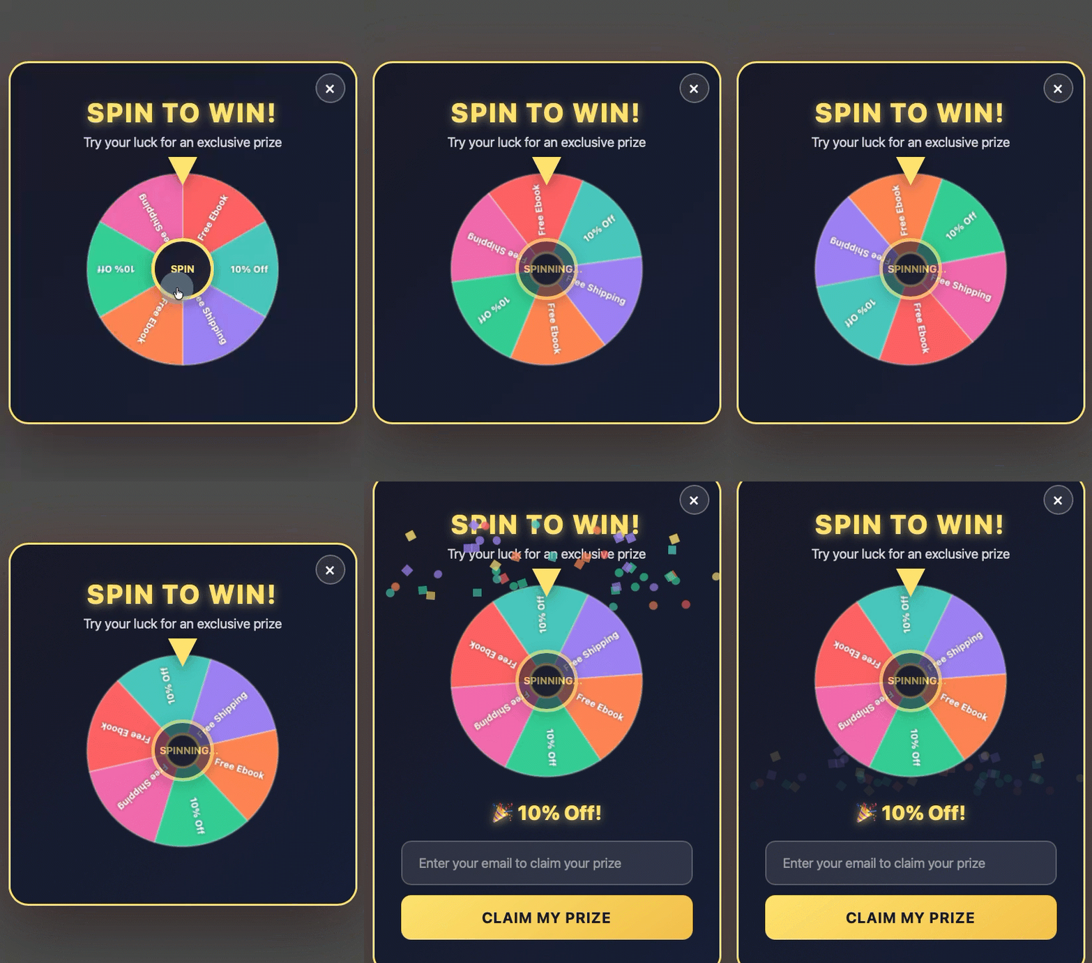
- Gamified Popups: These forms transform the lead capture process into an interactive experience, such as a quiz, trivia question, or a "spin-to-win" wheel. By engaging visitors in a low-stakes game before revealing the email field, gamification leverages psychological principles of reward and play, often resulting in higher engagement and conversion rates.
- Discount Offer Popups: Particularly effective for e-commerce sites, these often appear as a spin-to-win wheel or a coupon code offer, frequently triggered by exit intent. Visitors are incentivized to provide their email address in exchange for a prize or discount, serving as a powerful tool for reducing cart abandonment and acquiring new customers.
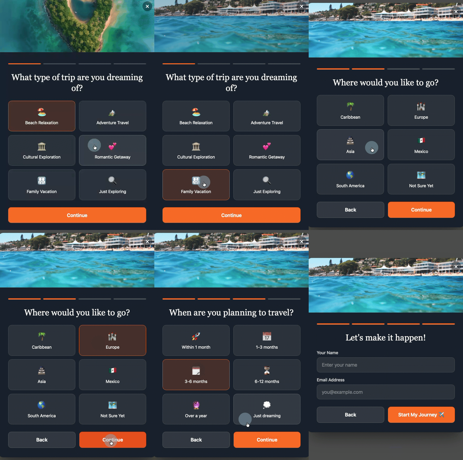
- Multi-Step Forms: This format breaks down the commitment by asking visitors to make a low-commitment decision first, such as selecting a category of interest, before presenting the email field. By the time they reach the email input, they have already invested a small amount of effort and affirmed their interest, making them more likely to complete the form. This "micro-commitment" strategy significantly reduces perceived friction.
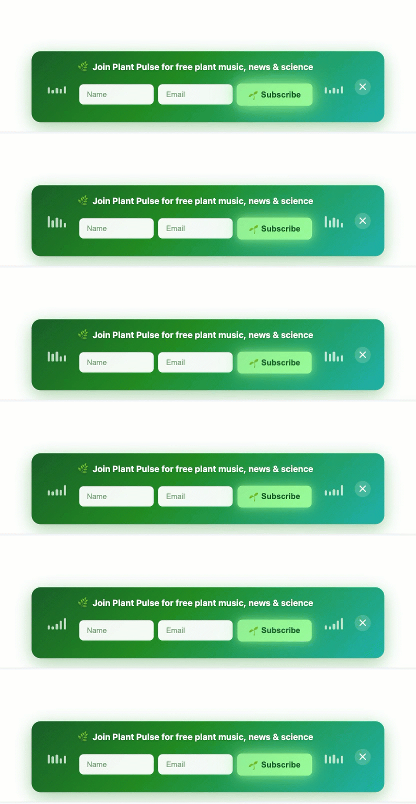
- Sticky Bars: A non-intrusive alternative, sticky bars are thin banners positioned at the top or bottom of the page. They remain visible as the user scrolls, featuring a form field and a clear CTA button. They capture leads without ever blocking content, making them an excellent choice for maintaining an uninterrupted user experience while still providing a constant call to action.
These advanced formats, traditionally requiring complex coding or specialized design, are now accessible through AI-powered builders, enabling businesses to deploy sophisticated strategies with ease. By simply describing the desired format and timing, the AI handles the technical execution.
Broader Implications and the Future of Lead Capture
The integration of AI into popup form builders signifies a crucial step in the ongoing evolution of digital marketing. It shifts the focus from simply having a popup to having an intelligent popup strategy. This evolution empowers businesses to personalize lead capture, optimize for user experience, and make data-driven decisions more effectively. The careful balance between marketing effectiveness and user experience will continue to be a defining challenge, but AI tools are increasingly providing the means to navigate this complexity successfully.
Email marketing remains one of the most powerful and cost-effective channels for customer engagement and retention. As such, efficient and respectful list building will continue to be a cornerstone of digital strategy. The strategic implementation of popup forms, guided by principles of relevance, timing, and user experience, and amplified by AI capabilities, ensures that businesses can not only grow their audience but also cultivate a loyal and engaged community. The future of lead capture is intelligent, user-centric, and ultimately, more effective.
Sean Tinney, a seasoned content marketer at AWeber with over 15 years of experience working directly with small business owners on email strategy, list building, and automation, emphasizes that "the difference between a valuable conversion tool and an irritating interruption lies entirely in thoughtful implementation." His insights underscore the industry’s collective move towards more sophisticated, user-friendly approaches that prioritize long-term customer relationships over short-term gains. This strategic shift, facilitated by advancements like AI form builders, promises a more harmonious and productive digital ecosystem for both businesses and their audiences.