The architecture of an e-commerce website often dictates the boundary between a bounce and a conversion, with the product category page serving as the most critical junction in the digital consumer journey. While homepages establish brand identity and product detail pages (PDPs) finalize the sale, the category page—or Product Listing Page (PLP)—is responsible for the heavy lifting of navigation, filtering, and product discovery. Industry data suggests that a significant portion of site exits occur at the category level, often due to cognitive overload or technical friction. As global e-commerce sales are projected to exceed $6.3 trillion by the end of 2024, the optimization of these intermediary pages has transitioned from a design preference to a commercial necessity.
The Strategic Importance of the Product Listing Page
In the modern retail ecosystem, the category page acts as a digital concierge. Its primary function is to organize a brand’s inventory into a logical, digestible format that aligns with the shopper’s intent. When a user lands on a cluttered or slow-loading category page, the "paradox of choice" often takes hold; presented with too many undifferentiated options and insufficient filtering tools, the consumer frequently chooses to leave the site entirely.
Retail giants like Sephora and ASOS have demonstrated that a high-performing category page must balance aesthetic appeal with functional utility. The objective is to reduce the "time to product"—the duration it takes for a user to identify an item they wish to purchase. Achieving this requires a multi-faceted approach involving psychological triggers, technical SEO, and rigorous data analysis.
Establishing Frameworks: Defining Clear Performance Objectives
Before a single pixel is moved, retailers must establish a data-driven foundation for their category pages. This process begins with a comprehensive audit of the target audience’s behavioral patterns. Market research indicates that modern consumers expect a personalized experience; therefore, identifying whether a customer is a "browser" (seeking inspiration) or a "searcher" (seeking a specific item) is paramount.
To measure the success of a category page, industry experts focus on several key performance indicators (KPIs):
- Conversion Rate (CR): The percentage of visitors who move from the category page to a product page and ultimately complete a purchase.
- Bounce Rate: The frequency with which users leave the site after viewing only the category page.
- Average Order Value (AOV): Influenced by how well the page displays high-margin items or bundles.
- Revenue per Visitor (RPV): A holistic metric that accounts for both conversion and spend.
By setting measurable targets for these metrics, brands can move away from subjective design choices and toward a strategy rooted in empirical evidence. For instance, increasing the visibility of "upsell" items on a category page can directly correlate with an uptick in RPV, provided the layout does not become cluttered.
Structural Excellence: Optimizing the Page Layout
The layout of a category page serves as the visual roadmap for the consumer. Professional journalistic analysis of top-tier e-commerce sites reveals a recurring structure that prioritizes clarity and speed.
Header and Category Precision
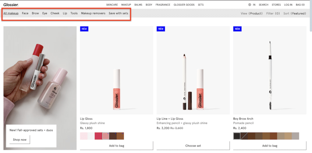
The header should feature a clear, SEO-optimized title. Brands like Glossier utilize minimalist nomenclature—using terms like "Face" or "Eyes" rather than industry jargon. This not only aids in user orientation but also ensures that the page aligns with common search engine queries. A well-defined header establishes the context of the page immediately, reducing the cognitive load on the visitor.
Advanced Filtering and Faceted Search
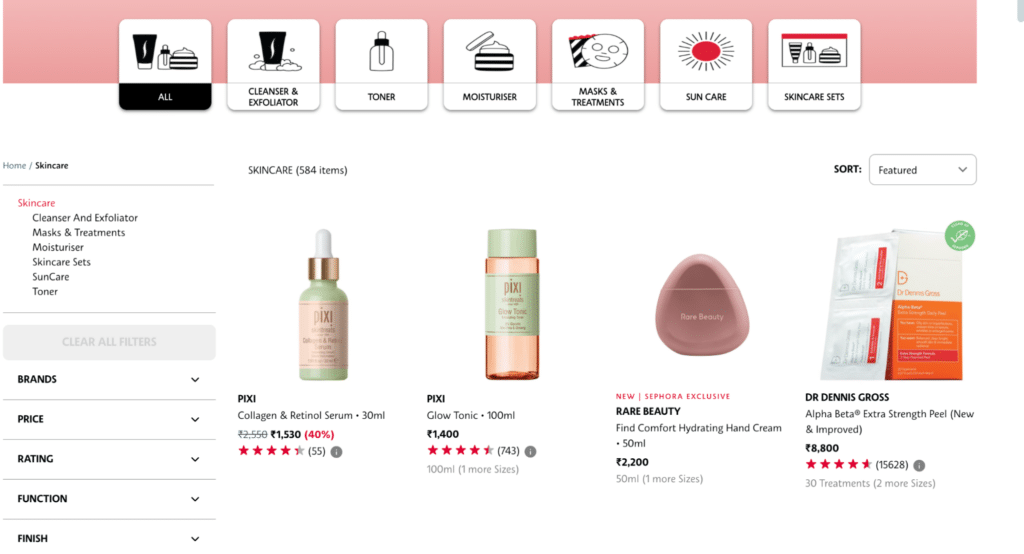
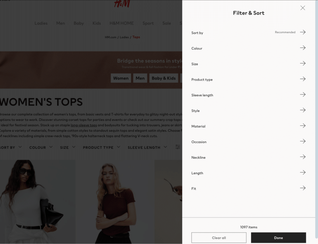
As inventories grow, the necessity for robust filtering becomes absolute. Research from the Baymard Institute shows that high-performing sites offer "faceted search," allowing users to filter by size, color, material, price range, and occasion simultaneously. H&M provides a benchmark in this area, offering granular filters that allow users to narrow down thousands of products to a handful of relevant choices in seconds. This level of customization is essential for maintaining engagement in high-volume sectors like fashion and electronics.
High-Fidelity Product Listings
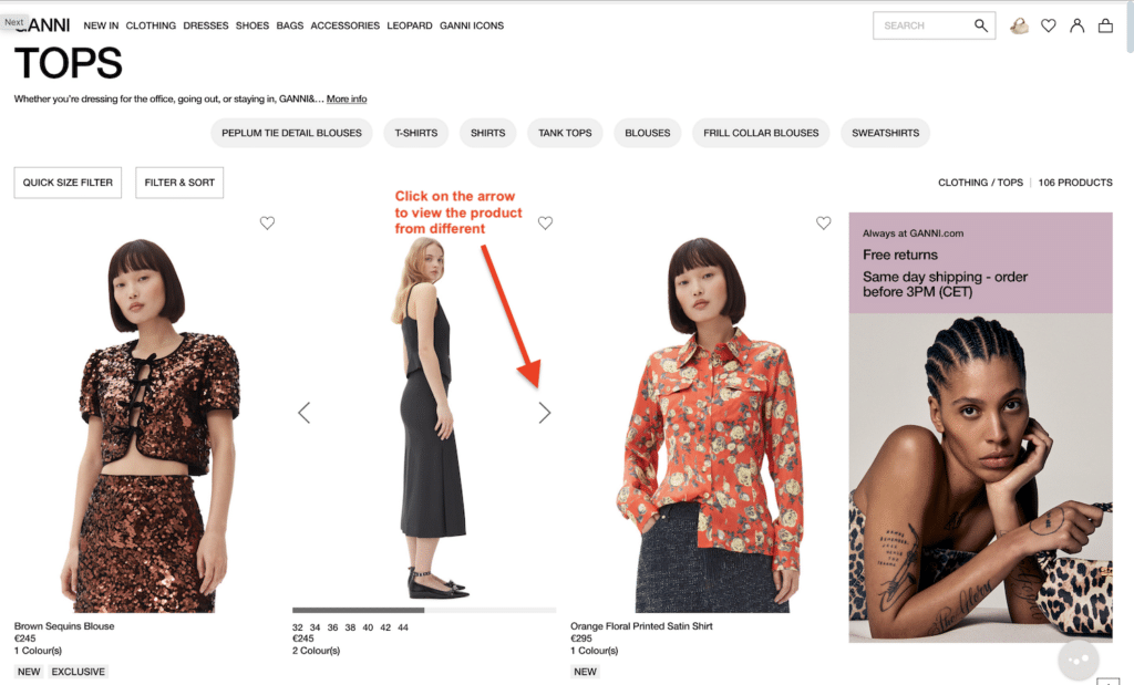
The product grid is the heart of the category page. Best practices dictate the use of high-quality, uniform imagery that allows for "hover-zoom" or secondary image views (e.g., a model wearing the garment) without leaving the page. Ganni, a contemporary fashion label, utilizes this technique to provide a comprehensive look at the product’s fit and texture directly from the listing. This transparency builds trust and reduces the likelihood of returns.
The Mobile-First Mandate
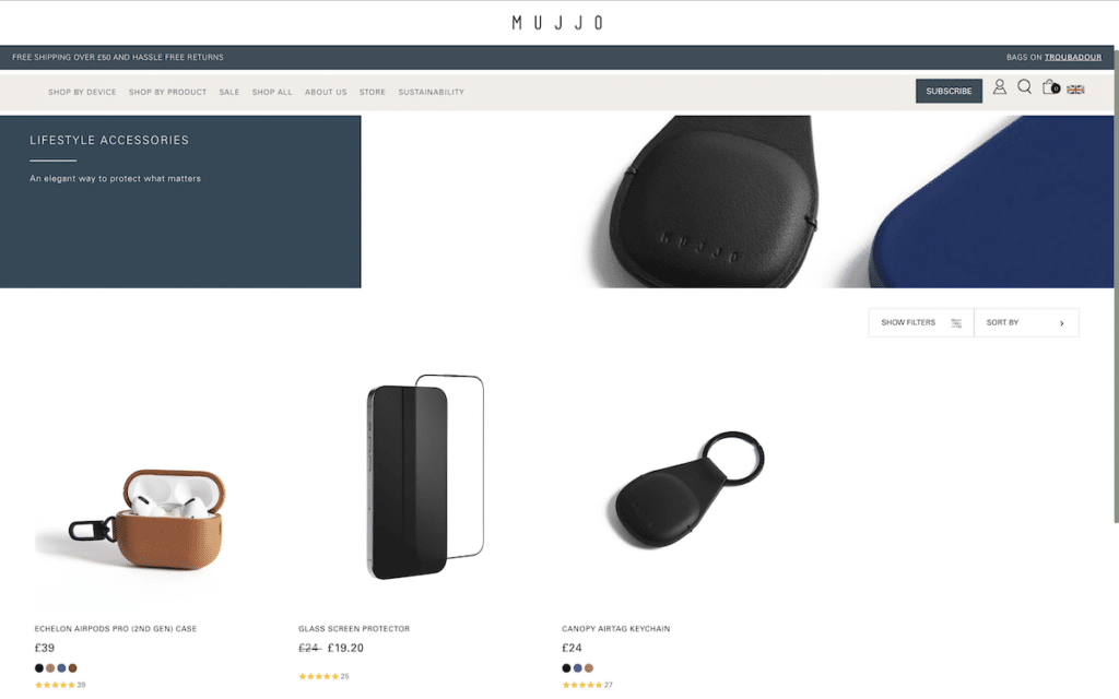
With mobile commerce expected to account for approximately 79% of all e-commerce sales by 2025, responsive design is no longer optional. A mobile-optimized category page must account for "thumb-friendly" navigation, ensuring that buttons are large enough to be tapped easily and that the vertical scroll is fluid. Brands like Mujjo have mastered this by utilizing ample white space and simplified grids that prevent the mobile interface from feeling cramped.
Enhancing the User Experience through Navigation and Flow
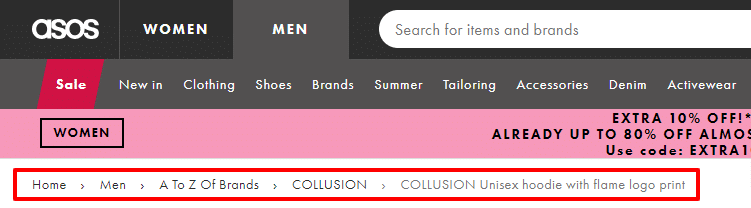
User experience (UX) in e-commerce is defined by the absence of friction. A critical component of this is the implementation of "breadcrumb" navigation. Breadcrumbs provide a hierarchical trail (e.g., Home > Men’s Shoes > Running), allowing users to understand their location within the site’s architecture and navigate back to broader categories without using the browser’s back button.
Furthermore, the "Back to Top" button is a simple yet vital tool for long-form category pages. As users scroll through hundreds of items, providing an easy way to return to the navigation menu or filters prevents "scroll fatigue." The integration of "Quick View" modals—which allow users to see product details and even add items to their cart without leaving the category page—is another high-impact UX strategy that streamlines the path to purchase.
Content Strategy: Engagement and SEO
While imagery dominates the category page, text remains the primary vehicle for both consumer persuasion and search engine visibility.
Strategic Category Descriptions
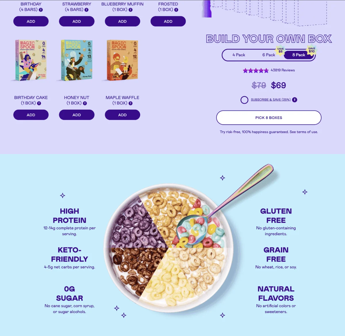
Effective category descriptions serve a dual purpose: they inform the customer of the collection’s value proposition and provide search engines with context. Keywords should be woven naturally into the text. For example, Magic Spoon, a high-protein cereal brand, uses its category text to highlight health benefits like "keto-friendly" and "low-carb," targeting specific consumer segments while boosting its ranking for those terms.
Psychological Triggers and Promotions
The category page is an ideal location for "nudges." ASOS frequently utilizes the top of its category pages to announce limited-time discounts or free shipping thresholds. By framing these as urgent (e.g., "While stocks last"), retailers can leverage the psychological principle of scarcity to drive immediate action. Including "Best Seller" or "Trending" badges on specific product thumbnails further guides the consumer’s decision-making process through social proof.
Technical Optimization: The Role of SEO and Data Analytics
Search Engine Optimization (SEO) for category pages is often more complex than for individual product pages. Because category pages are dynamic and constantly changing as inventory fluctuates, they require stable technical foundations.
Keyword Research and Metadata
Using tools like SEMrush or Ahrefs, retailers can identify high-volume "short-tail" keywords that represent broad categories. These keywords must be integrated into the H1 tags, alt-text for images, and meta descriptions. A meta description that is both concise (under 160 characters) and persuasive can significantly improve the Click-Through Rate (CTR) from search engine results pages.
Continuous Iteration through Analytics
The final stage of category page design is never truly finished. It involves a cycle of "Analyze and Adjust." Conversion optimization tools such as FigPii allow retailers to utilize heatmaps and session recordings to see exactly where users are clicking—or where they are getting stuck.
If a heatmap reveals that users are ignoring a specific filter, it may need to be redesigned or moved. If session recordings show users repeatedly scrolling to the bottom and then leaving, it may indicate that the "Load More" button is not prominent enough or that the products displayed do not match the category intent. A/B testing different layouts—such as comparing a three-column grid versus a four-column grid—can reveal subtle preferences that lead to significant gains in conversion over time.
Broader Implications for the Global Retail Landscape
The refinement of e-commerce category pages reflects a broader shift in the retail industry toward "frictionless commerce." As competition intensifies and customer acquisition costs (CAC) rise, the ability to retain and convert existing traffic is the difference between profitability and loss.
The implications extend beyond mere sales. A well-organized category page reduces the strain on customer service by providing clear information upfront and lowers the environmental and financial impact of returns by ensuring customers find the right product the first time. As artificial intelligence begins to integrate more deeply with e-commerce, we can expect category pages to become even more dynamic, showing different product arrangements to different users based on their browsing history and predicted preferences in real-time.
In conclusion, the e-commerce category page is a sophisticated engine of growth. By defining clear objectives, optimizing for mobile, leveraging SEO, and committing to iterative data analysis, brands can transform these intermediary pages into powerful tools for consumer engagement and revenue generation. The digital storefront is no longer just a place to list items; it is a curated experience that must be engineered for excellence.