The digital marketplace has undergone a radical transformation over the last two decades, evolving from simple online catalogs to sophisticated, AI-driven ecosystems designed to anticipate consumer needs. At the heart of this transformation lies the e-commerce category page, a critical junction in the user journey that often determines whether a visitor converts into a customer or exits the site in frustration. Industry data suggests that category pages frequently serve as the primary entry point for organic search traffic, often outperforming individual product pages in terms of search engine visibility. Consequently, the optimization of these pages has become a cornerstone of modern conversion rate optimization (CRO) and user experience (UX) design strategies.
The Fundamental Shift in Digital Navigation Strategy
The primary challenge for contemporary retailers is to define the precise purpose of their category pages before implementing design changes. Historically, these pages were viewed as mere "middlemen"—conduits to move users from the homepage to the product detail page (PDP). However, modern behavioral analysis reveals that category pages must fulfill three distinct roles: facilitating browsing, aiding in decision-making, and enabling direct purchases.
When a category page is browsing-focused, the user is typically in an exploratory phase, asking, "What options are available to me?" Introducing high-friction conversion actions, such as an "Add to Cart" button, during this phase can inadvertently trigger decision conflict. Psychological studies on cognitive load suggest that when an interface demands a higher-commitment decision than the user is prepared to make, the result is often "analysis paralysis," leading to site abandonment. For these users, the interface must prioritize clear navigation, visual hierarchy, and information scent over immediate transactional prompts.
Chronology of E-commerce Navigation and Design Trends
The evolution of category page design can be traced through several distinct eras of the internet. In the early 2000s, as seen in the legacy strategies of retailers like Circuit City, the focus was on sheer volume and basic taxonomy. Navigation was often deep and cumbersome, reflecting the technical limitations of the time.
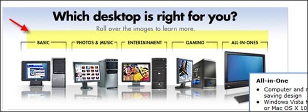
By the 2010s, the "Mobile First" movement, championed by tech giants and reflected in the UI updates of companies like Best Buy, shifted the focus toward streamlining. The rise of faceted navigation allowed users to filter products by attributes like resolution, size, or price without reloading the page.
In the current era, the focus has shifted to "Guided Selling." Modern category pages utilize "wizards" or buying guides to help users navigate complex product landscapes. This transition reflects a deeper understanding of the customer’s "Jobs to be Done" (JTBD) framework, where a shopper isn’t just looking for a "laptop" but is looking for a "gaming machine" or a "remote work tool."
Data-Driven Evaluation: The Role of Analytics in Page Design
To understand the efficacy of a category page, retailers must look beyond simple conversion rates and examine more granular data points. Exit rates are particularly telling; a high exit rate on a category page indicates a disconnect between user intent and page content. Industry benchmarks suggest that category page exit rates should ideally align with the site-wide average. If they exceed this average, it is a signal that the design is failing to provide the necessary "information scent" to lead the user deeper into the funnel.
Supporting data from the Baymard Institute indicates that nearly 42% of e-commerce sites lack a clear category hierarchy, which significantly impairs the user’s ability to find products. Furthermore, research shows that 70% of users prefer to use filters to narrow down their search results rather than navigating through multiple sub-level menus. This data underscores the importance of both structural hierarchy and dynamic filtering systems.
Structural Integrity: The Rule of Three Levels
A common pitfall in e-commerce architecture is the failure to properly segment products. While broad categories like "Electronics" are necessary for top-level navigation, they are too expansive for effective browsing. Expert consensus recommends breaking these down into subcategories, but with a strict limit.
The "Rule of Three" in information architecture suggests that retailers should not exceed three levels of sub-categories. Beyond this point, the user experience becomes fragmented, and the risk of "pogo-sticking"—where a user must constantly jump back and forth between levels—increases. Effective design also involves highlighting "child" categories within the parent category page, providing a visual roadmap for the user’s next steps.
Feature-Based Filtering and the Psychology of Selection
Consumer behavior is often driven by specific product attributes rather than brand names alone. For instance, a shopper looking for a television is likely more concerned with screen size and resolution than the specific manufacturer. When retailers identify the main features people ask for, they can create more effective filtering mechanisms.
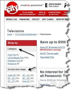
In the consumer electronics sector, features like media compatibility (e.g., audiobooks vs. physical copies) or use-case scenarios (e.g., photo editing vs. basic office use) serve as vital pivot points for the user. By integrating these features into the category page’s navigation, retailers can effectively regroup products in real-time, matching the user’s specific search criteria and reducing the cognitive effort required to find a match.
Official Responses and Industry Sentiment
Market analysts and UX specialists have long advocated for a more "human-centric" approach to category design. "The category page is the digital equivalent of a store aisle," says one senior UX researcher at a leading e-commerce consultancy. "If the aisle is cluttered or poorly labeled, the customer leaves. But if the aisle provides helpful signage and organizes products by how people actually use them, the customer stays."
Statements from digital marketing firms emphasize that the category page is also a vital tool for SEO. By optimizing these pages for "head terms" (e.g., "Men’s Running Shoes") rather than just "long-tail keywords" (specific shoe models), brands can capture users at the beginning of their search journey. This dual role—serving both the search engine and the human user—requires a delicate balance of keyword-rich content and clean, functional design.
Broader Impact and Future Implications
The implications of optimized category pages extend far beyond immediate sales. In an era of rising customer acquisition costs (CAC), the ability to retain a visitor and guide them to a product they actually want is essential for maintaining healthy margins. Moreover, the integration of AI and machine learning is set to further revolutionize this space.
We are already seeing the emergence of "Dynamic Category Pages," where the product sort order and even the available filters change based on the individual user’s past behavior and predicted intent. If a user has previously searched for sustainable materials, the category page may automatically prioritize eco-friendly products.
However, the core principles remain unchanged:
- Define the Purpose: Align the page design with the user’s current intent.
- Understand Expectations: Balance what the brand wants with what the user expects.
- Analyze and Iterate: Use data and heatmaps to identify friction points.
- Simplify the Journey: Keep hierarchies shallow and filters intuitive.
Conclusion: The Iterative Nature of UX
The final and perhaps most crucial step in category page optimization is the recognition that no design is permanent. The most successful e-commerce brands utilize continuous A/B testing to refine their approach. What works for a luxury fashion brand may not work for a hardware retailer.
For instance, a retailer might find that adding a "need-based" filter at the top of the page—such as "Shop by Activity"—receives zero engagement, despite the team’s high expectations. In such cases, the data must override intuition. By removing underperforming features and doubling down on what the analytics show is working, retailers can create a streamlined, high-converting environment that meets the evolving demands of the modern consumer.
As the digital landscape continues to shift, the category page will remain the battleground where the ease of navigation meets the complexity of choice. Those who master the balance of information, functionality, and psychological alignment will be the ones who lead the next generation of e-commerce.