

The digital marketing landscape has reached a critical inflection point where the cost of acquiring a single click often exceeds the immediate profit margin of the product being sold. As competition intensifies across platforms like Google Ads, Meta, and TikTok, the efficiency of the post-click experience has become the primary determinant of a brand’s survival. For many marketing teams, a significant portion of paid budgets is effectively wasted by directing high-intent traffic to generic product pages—interfaces designed for browsing rather than conversion. This structural inefficiency has given rise to the product landing page, a specialized tool engineered to bridge the gap between a compelling advertisement and a successful transaction.
The Strategic Shift from Product Pages to Landing Pages
In traditional e-commerce, the product detail page (PDP) serves as a digital catalog entry. It is designed to be comprehensive, offering site-wide navigation, links to related categories, social media feeds, and various footers. While excellent for organic search and general browsing, these elements act as "leakage points" for paid traffic. Research into user behavior suggests that when a visitor clicks a specific ad for a specific product, any distraction—no matter how helpful it seems—increases the cognitive load and provides an exit opportunity.
The product landing page (PLP) operates on a fundamentally different philosophy: the 1:1 conversion ratio. This principle dictates that for every one campaign, there should be one page with one specific goal and one clear call to action (CTA). By removing the global navigation bar and external links, marketers can funnel the visitor’s attention toward the value proposition. This is not merely a design preference but a mathematical necessity for optimizing Return on Ad Spend (ROAS).
Comparative Analysis: The Kettle & Fire Case Study
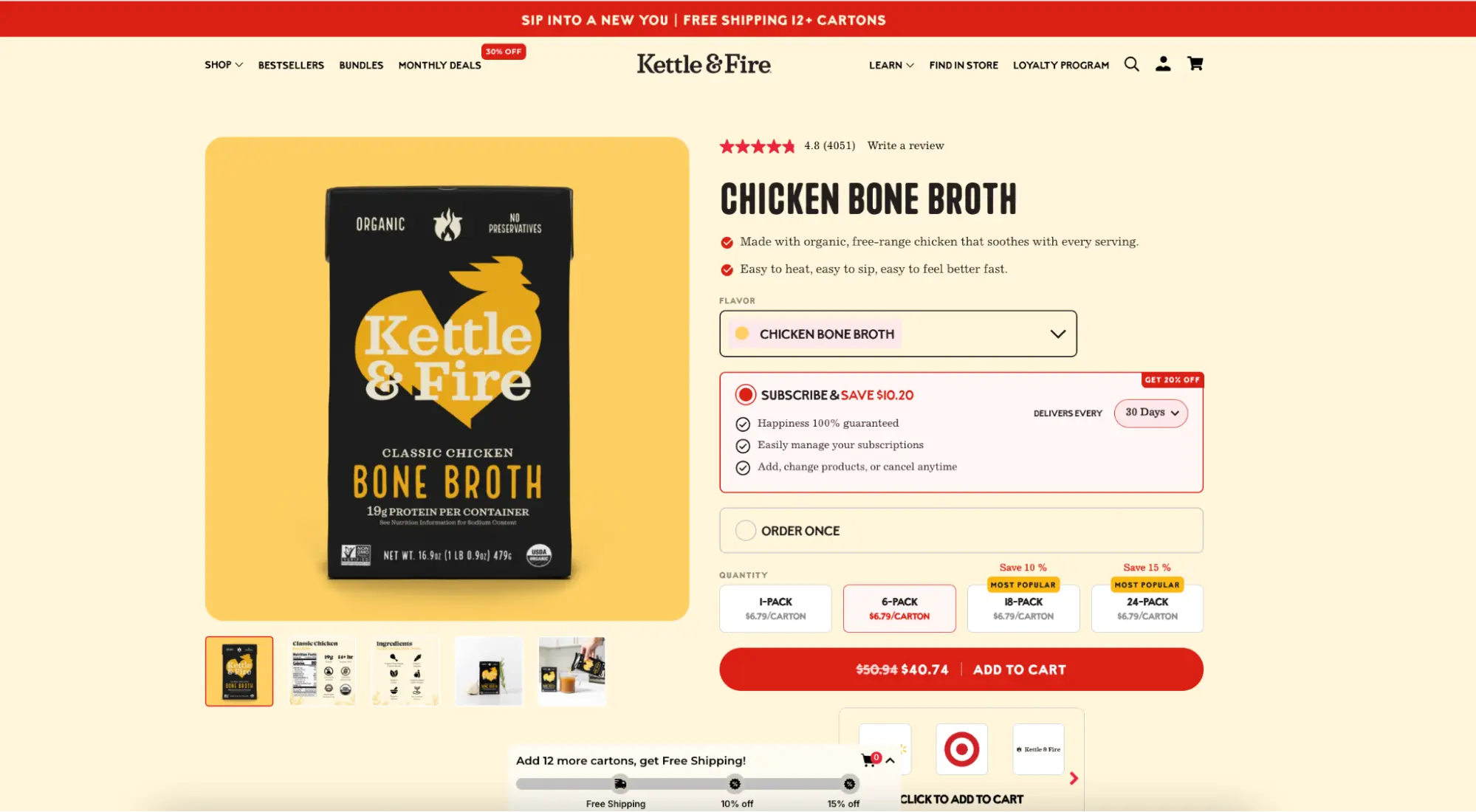
To understand the practical impact of this shift, industry analysts often point to brands like Kettle & Fire, a bone broth company that utilizes both standard product pages and dedicated landing pages simultaneously. A standard Kettle & Fire product page is feature-rich, containing a full navigation menu, a dropdown for 12 different product variants, a "More Kettle & Fire" section, and a footer with dozens of links. While functional for a returning customer, it presents over 30 different ways for a new visitor to leave the site without making a purchase.

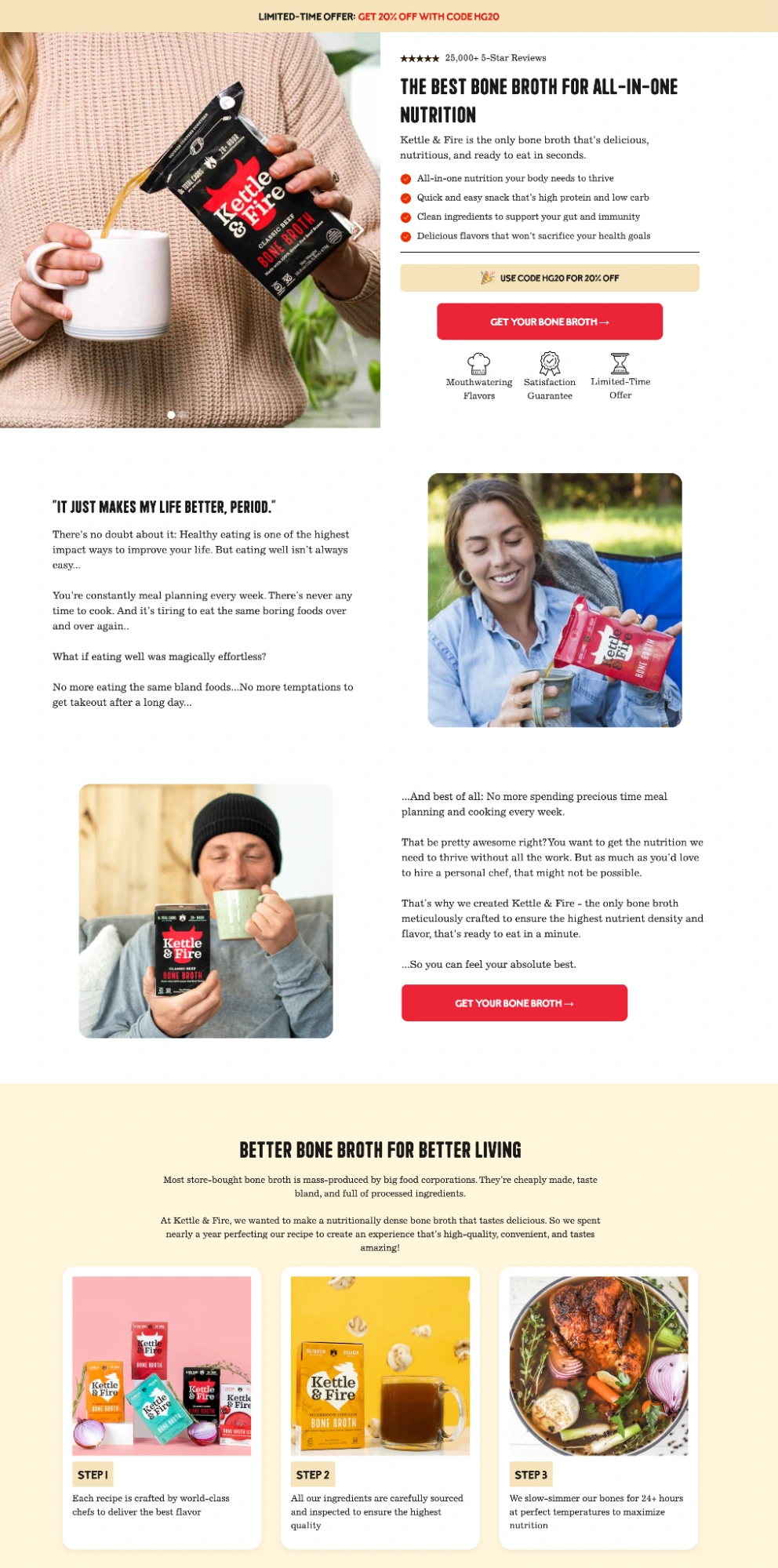
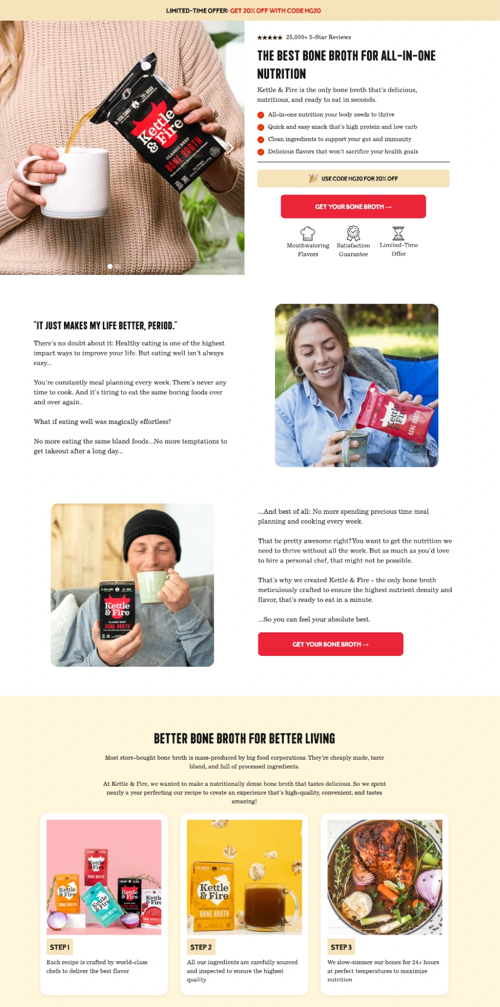
In contrast, their dedicated landing page—hosted on a separate subdomain—is a closed environment. It utilizes a limited-time discount to create urgency, features expert endorsements from health figures to build immediate credibility, and offers a 100% satisfaction guarantee to mitigate purchase risk. Every link on this page either scrolls the user to a more detailed section or leads directly to the checkout. Data suggests that this focused approach significantly lowers the cost per acquisition (CPA) compared to sending traffic to the main site.
The Mechanics of Conversion: Design Principles and Data
The efficacy of a product landing page is rooted in psychological and technical factors that have been validated by extensive eye-tracking and behavioral research.
Above-the-Fold Prioritization
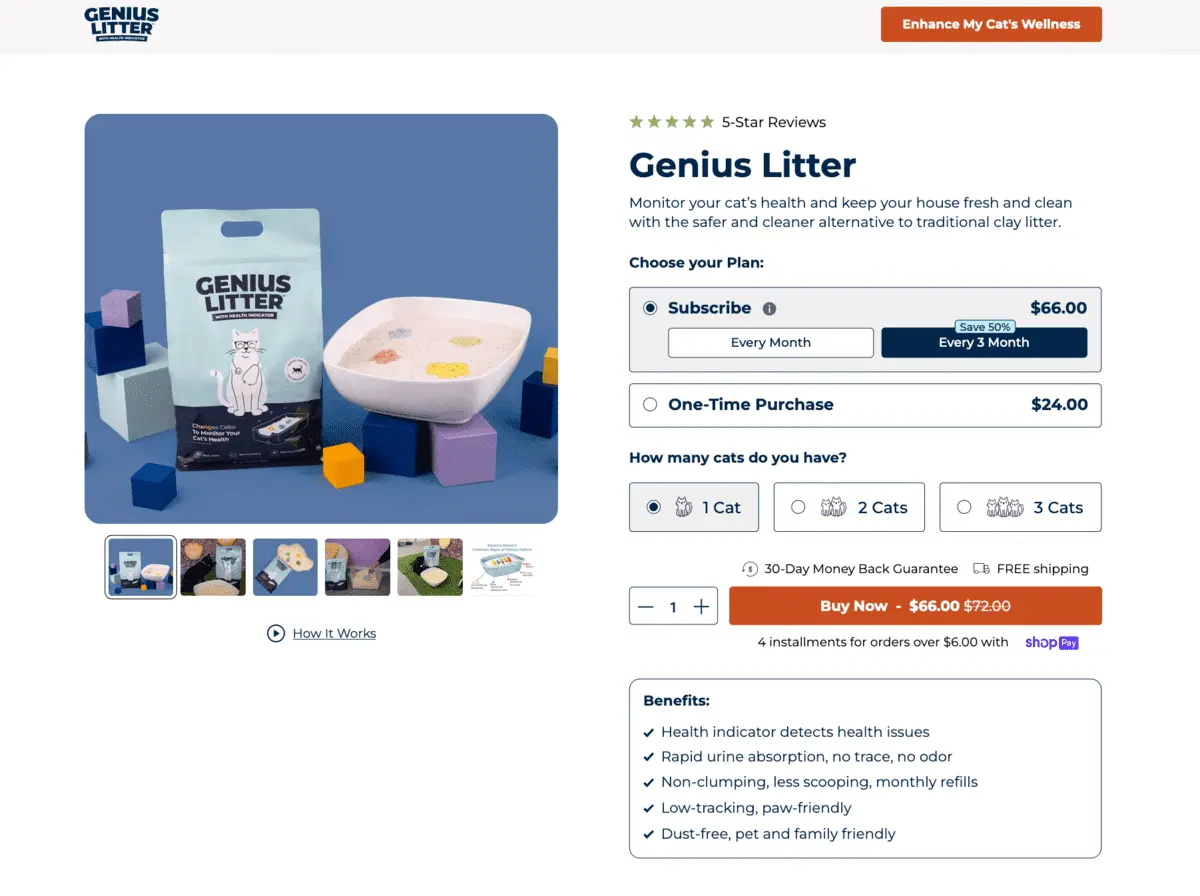
Research from the Nielsen Norman Group consistently indicates that content located "above the fold"—the area visible without scrolling—receives the vast majority of user attention. High-converting pages ensure that the headline, primary benefit, and CTA are all visible immediately. This allows "ready-to-buy" visitors to convert instantly, while providing enough context to encourage "information-seeking" visitors to scroll further.
The Message Match Requirement
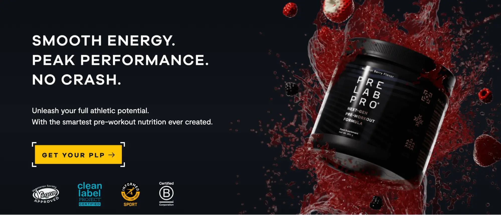
One of the most common failures in digital advertising is the "disconnect" between the ad creative and the landing page. If an ad promises a "minimalist leather wallet" but the landing page opens with a generic "Welcome to Our Store" banner, the visitor experiences cognitive dissonance. Maintaining a strict "message match" in terms of language, visual tone, and offer is not only vital for user experience but is also a key signal used by Google to determine Quality Scores, which directly impacts ad costs.
Technical Performance and Core Web Vitals
In the mobile-first era, page speed is a financial metric. Data from Google indicates that for every second of delay in mobile load times, conversion rates can drop by double digits. The introduction of Core Web Vitals—specifically Largest Contentful Paint (LCP), Interaction to Next Paint (INP), and Cumulative Layout Shift (CLS)—has turned technical performance into a competitive advantage. Platforms like Instapage have responded to this by developing specialized engines, such as the Thor Render Engine, to ensure that complex landing pages load at near-instantaneous speeds without requiring manual optimization by developers.
Minimizing Form Friction
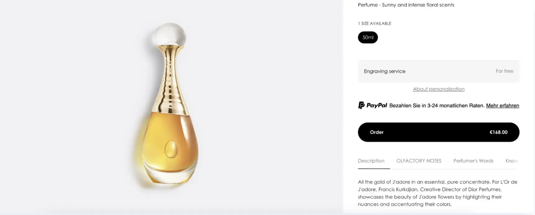
The Baymard Institute’s research into checkout flows reveals that approximately 18% of users abandon a purchase due to overly complex forms. The most successful product landing pages ask for the absolute minimum amount of information required to complete the transaction. Each additional field added to a form represents a potential point of abandonment.

A Categorized Analysis of Market-Leading Examples
To understand how these principles are applied across different industries, it is helpful to categorize product landing pages by their campaign objectives.
1. Single-Product Landing Pages
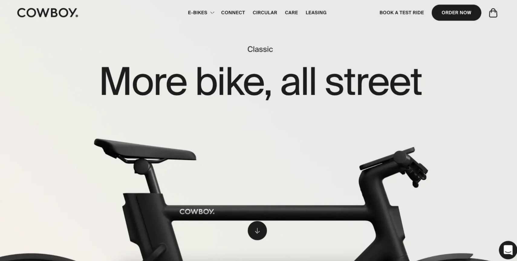
These are built around a single SKU and are most effective when the ad targets a highly specific intent.

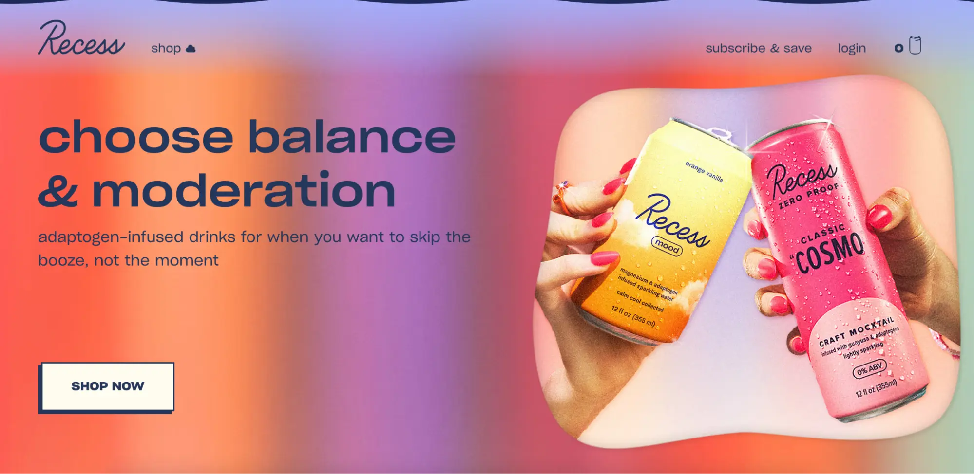
- Recess: This hemp-infused sparkling water brand uses a hero section that defines the audience immediately—people looking to "unwind without the alcohol." By making the benefit the headline, they allow the user to self-select, which increases the quality of the leads.
- Oura Ring: For a premium, high-tech wearable, the Oura Ring page uses a minimalist aesthetic to signal sophistication. It addresses multiple use cases—sleep, fitness, and recovery—in a scannable format that doesn’t overwhelm the user.
2. Multi-Product and Category Pages
When an ad targets a broader keyword (e.g., "men’s skincare"), a multi-product landing page helps the user navigate to the correct item within a brand’s ecosystem.
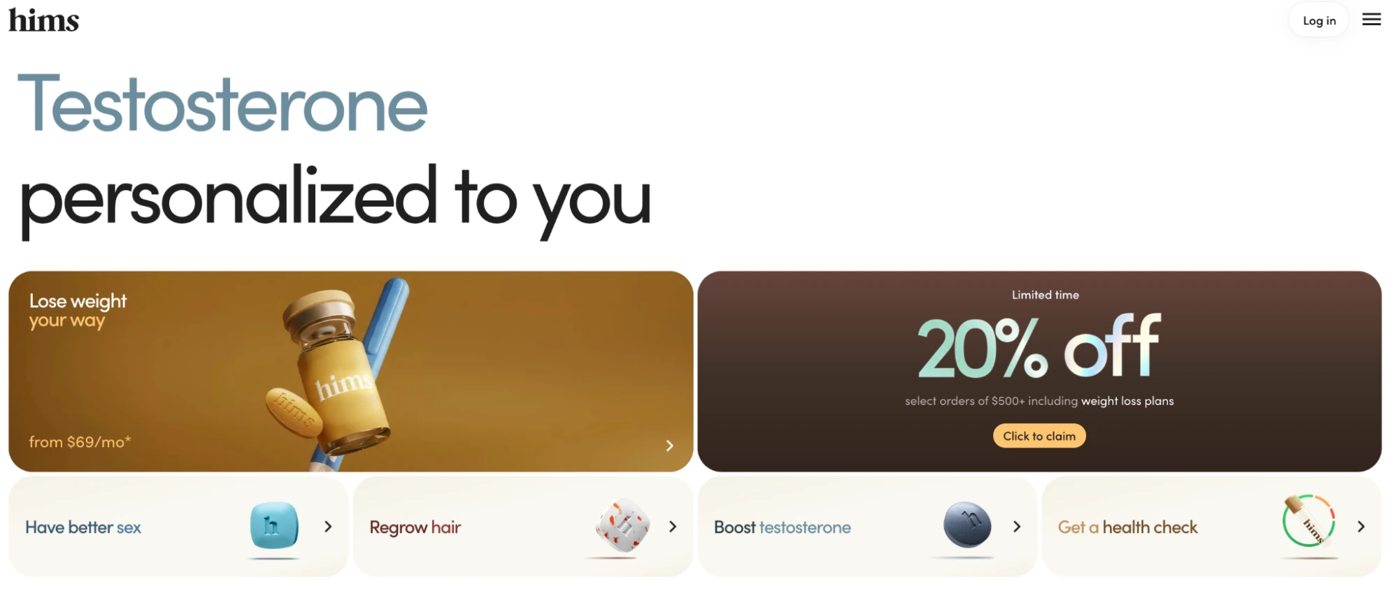
- Hims: By using a condition-targeted headline ("Testosterone personalized to you") and following it with self-selection tiles (hair, skin, sex, etc.), Hims manages to maintain a personal feel while offering a wide range of medical solutions.
- Ridge: Known for their minimalist wallets, Ridge uses multi-product pages to showcase different materials and designs. They anchor the page with heavy social proof—thousands of reviews—to justify the premium price point of their accessories.
3. Product Launch and Acquisition Pages
These pages are designed to capture interest, pre-orders, or sign-ups for a product that is either new or has a specific entry barrier.

- Airbnb: Their host acquisition page is a masterclass in objection handling. It targets potential hosts by answering three core questions: Is this for me? Is it worth it? Is it safe? By focusing exclusively on these concerns, they convert curious visitors into active hosts.
- Turtle (Tierra): For their recycled plastic backpacks, the brand uses a waitlist strategy. By offering a 30% discount in exchange for an email address on a pre-launch page, they build a qualified list of buyers before the product even hits the warehouse.
The Implementation Roadmap: Building for Success
Building a high-performing product landing page has transitioned from a developer-heavy task to a marketing-led process. The standard workflow for modern teams involves several key stages:

- Goal Definition: Identifying the single conversion action (e.g., "Start Trial" vs. "Buy Now").
- Structural Assembly: Utilizing no-code, drag-and-drop builders to create the visual hierarchy. This includes placing the problem-focused headline at the top, followed by benefit-driven copy and trust indicators.
- AI-Assisted Content Generation: Leveraging AI tools to generate multiple variations of headlines and CTAs. This allows teams to scale their experimentation without increasing headcount.
- Collaboration and Review: Using integrated feedback tools to ensure stakeholders can approve designs without the friction of email chains or PDF mockups.
- Deployment: Publishing to custom domains with a focus on server-side performance.
Measurement and the Optimization Loop
A product landing page is a living asset. The initial launch is merely the baseline for future improvements. To accurately measure performance, organizations focus on a specific set of Key Performance Indicators (KPIs):

- Conversion Rate: The primary metric of success.
- Cost Per Conversion: The total ad spend divided by the number of successful actions on the page.
- Heatmap Data: Visual representations of where users click and how far they scroll. If users are dropping off before reaching the CTA, the page length or messaging may need adjustment.
- A/B Testing Results: Systematically testing one variable at a time (e.g., a green button vs. a yellow button) to find the optimal combination for the specific audience.
The Broader Impact on Enterprise Strategy
The move toward dedicated product landing pages represents a broader shift in digital commerce toward "experience-led growth." As consumers become more discerning and ad platforms more automated, the only remaining lever for many marketers is the quality of the destination. Organizations that invest in the ability to create, test, and scale personalized landing pages at the speed of their ad campaigns are seeing significantly lower customer acquisition costs and higher lifetime values.
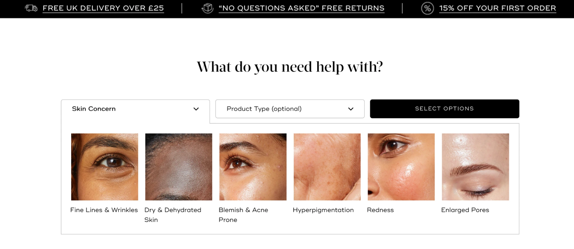
In conclusion, the product landing page is no longer an optional "extra" for a marketing campaign; it is the infrastructure of modern sales. By eliminating distractions, matching the ad’s promise, and focusing on a single user action, these pages transform expensive clicks into sustainable revenue. For any brand spending money on paid traffic, the transition from generic product pages to high-performance landing pages is perhaps the most impactful optimization they can undertake in the current fiscal year.







