
In the dynamic landscape of digital marketing, the humble newsletter signup form remains a critical gateway, serving as the singular point of entry between a curious website visitor and a burgeoning email list. Far from being a mere technical formality, this form is a strategic asset that collects vital subscriber information, integrating it into an email platform to facilitate consistent communication. Despite its pivotal role, many small businesses often deploy a basic form and cease further optimization, a common oversight that can severely hinder list growth. This approach frequently results in forms that demand excessive information, articulate insufficient value propositions, and are relegated to obscure locations on a website, collectively presenting multiple points of friction that can deter potential subscribers before they ever receive their first email. Strategic refinement of these elements is not just beneficial; it is imperative for maximizing conversion rates and fostering a robust subscriber base.
The Enduring Power of Email Marketing and Its Entry Point
Email marketing has consistently demonstrated one of the highest returns on investment (ROI) among digital channels, with studies often citing figures ranging from $38 to $42 for every dollar spent. This remarkable efficacy stems from email’s direct, personal, and permission-based nature, allowing businesses to cultivate an owned audience free from the algorithms and ever-changing policies of social media platforms. In an era where digital noise is pervasive, a subscriber’s explicit consent to receive communications signifies a valuable level of engagement and trust. The signup form, therefore, is not merely a data collection tool; it is the first tangible interaction in a potentially long and profitable customer journey. A poorly designed or positioned form inadvertently communicates a lack of value or an obstacle, undermining the very foundation of this powerful channel. Conversely, an optimized form signals professionalism, respect for the user’s time, and a clear understanding of the mutual benefits of subscription.
The Evolution of Subscriber Capture: A Brief Chronology
The journey of email list building has evolved significantly since the early days of the internet. Initially, simple email address fields were sufficient, often placed unassumingly on web pages. As email marketing matured in the late 1990s and early 2000s, businesses began experimenting with additional fields, driven by the desire for more granular customer data for segmentation and personalization. This often led to bloated forms demanding names, demographics, and even postal addresses, inadvertently creating significant friction. The mid-2000s saw a rise in the understanding of conversion psychology, with marketers realizing that every additional field decreased signup rates. This led to a movement towards minimalist forms, focusing primarily on the email address. The subsequent advent of sophisticated email service providers (ESPs) and CRM systems allowed for more dynamic personalization using minimal initial data, reinforcing the "less is more" philosophy for initial capture. More recently, with advancements in artificial intelligence and machine learning, platforms like AWeber are introducing AI-powered form builders that intelligently tailor forms based on website content and brand identity, marking a new era of intelligent, context-aware subscriber acquisition. This chronological progression underscores a continuous refinement driven by user experience, data insights, and technological innovation.
Optimizing Form Fields: The Delicate Balance of Data and Friction
The primary objective of a newsletter signup form is to secure a subscriber’s email address. Any deviation from this minimum requirement must be strategically justified. Research consistently shows that conversion rates decrease with each additional field. For instance, studies by marketing analytics firms often reveal that forms with 1-2 fields convert at significantly higher rates (e.g., 10-15%) compared to those with 5+ fields (e.g., 2-5%). The psychological principle at play is "cognitive load" – the more information a user is asked to provide, the more mental effort is required, increasing the likelihood of abandonment.

The Strategic Inclusion of a First Name Field: A first name field earns its place only when there is a concrete plan to leverage personalization in subsequent email communications. Addressing a subscriber as "Hey [First Name]" can indeed enhance open rates and engagement, creating a more personal connection than a generic "Hey there." However, this benefit materializes only if the email content actively uses a merge tag for personalization. If the intention is merely to collect data without utilizing it, the first name field becomes an unnecessary barrier. Marketing strategist Dr. Evelyn Reed emphasizes, "Every extra field on a signup form represents a mental hurdle for the user. Unless that data is immediately actionable and provides tangible value to the subscriber, it’s best left off to maintain conversion velocity."
Fields to Resolutely Exclude from Newsletter Forms: Certain data points, such as phone number, company name, job title, or physical address, are almost universally detrimental to newsletter signup conversion rates. These fields are more appropriate for lead capture forms associated with gated content, sales inquiries, or B2B outreach where a more substantial commitment is expected. On a newsletter form, they create a perception of intrusiveness, signaling that the business seeks significant information before delivering any reciprocal value. This imbalance of perceived value often triggers immediate abandonment. The guiding principle should always be: if the data cannot be immediately and effectively used to enhance the subscriber’s experience or the value delivered, it should not be collected at the initial point of entry.
Strategic Placement: Maximizing Visibility and Contextual Relevance
The visibility of a signup form is as critical as its design. Even the most perfectly crafted form will fail to grow a list if it remains unseen. Strategic placement ensures that the form is presented to visitors at optimal moments, aligning with their intent and browsing behavior.
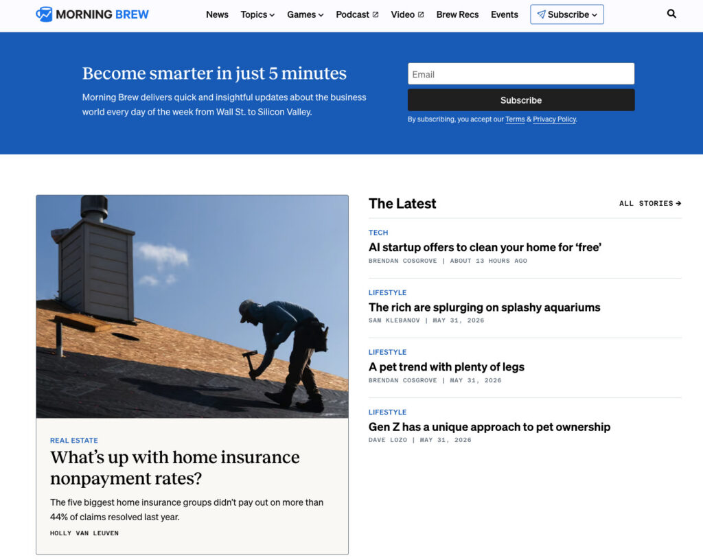
Above the Fold on Your Homepage: This placement offers immediate visibility without requiring users to scroll. Its effectiveness largely depends on the primary purpose of the website. For businesses where the newsletter is the product – think media entities like Morning Brew or The Hustle – an above-the-fold form is paramount, as subscribing is the explicit reason visitors arrive. In such cases, the form often dominates the hero section, clearly articulating the newsletter’s value proposition. For businesses where the newsletter supports a product or service, a homepage form remains valuable but must be integrated thoughtfully, complementing the primary calls to action rather than competing with them. It should be positioned where it naturally flows with the site’s main message, perhaps as a secondary CTA.
Sidebar Signup Form: A sidebar form offers persistent visibility as users navigate content. Particularly effective on desktop, it allows the subscription option to remain in view without interrupting the reading flow. If a visitor is engaging with content related to the newsletter’s theme, a readily available sidebar form provides a convenient pathway to subscribe. However, it’s crucial to acknowledge its limitations on mobile devices, where responsive design typically collapses sidebars below the main content. Therefore, for mobile users, this placement should be augmented by other form locations.
Dedicated Signup Page: A standalone page exclusively dedicated to the newsletter provides ample space to articulate the full value proposition without competing distractions. This format is ideal for showcasing testimonials, outlining benefits in detail, and providing a comprehensive overview of what subscribers can expect. It serves as an excellent destination for external promotional efforts, such as links in social media bios, podcast show notes, guest post bylines, or email signatures. Alexandra Franzen, a renowned business strategist who built her audience almost entirely through email, famously describes her newsletter as "an art project," emphasizing the need to "make it so good that every reader goes and tells ten friends about it." A dedicated signup page is the canvas for painting this compelling picture, selling an experience rather than just a subscription.
Header or Top Navigation Bar: A compact, persistent form or a prominent link to a signup form in the header or top navigation ensures constant visibility across every page of a site. This is particularly effective for content-rich websites where visitors browse multiple pages, as it keeps the subscription option readily accessible. The key here is conciseness: an email field and a clear button are usually sufficient to avoid cluttering the navigation.
Footer Signup Form: The footer acts as a "safety net" for engaged visitors who have scrolled through an entire page and are looking for more information or next steps. Placing a newsletter signup form here caters to those who weren’t ready to subscribe initially but, having consumed the content, are now sufficiently interested. It’s a low-friction, high-intent placement for visitors who have demonstrated engagement.
Exit-Intent Popup: An exit-intent popup triggers when a visitor’s cursor indicates an intention to leave the page. This serves as a final, strategically timed opportunity to present the newsletter offer. To be effective and avoid annoyance, popups must be implemented carefully: displayed only once per session, featuring a clear and easily accessible close button, and offering a highly specific, benefit-driven value proposition. For example, "Get weekly email tips for your small business" will significantly outperform a generic "Subscribe to our newsletter." Studies indicate that well-executed exit-intent popups can capture an additional 3-5% of abandoning visitors, providing a measurable boost to list growth.
Crafting High-Converting Copy: The Art of Persuasion
Beyond placement and fields, the language used on a signup form is paramount. Three critical elements drive conversions: a clear promise of value, transparent frequency expectations, and minimal effort requested from the user.
Lead with the Benefit, Not the Action: The most common and significant mistake in signup form copy is defaulting to phrases like "Subscribe to our newsletter." This tells the reader what to do but fails to answer the fundamental question in their mind: "What’s in it for me?" The word "subscribe" describes a mechanical action, devoid of emotional or practical benefit. A benefit-driven headline, conversely, immediately addresses this core query. For instance, "Get one email per week with strategies to grow your small business" directly answers what the subscriber will receive, how often, and its relevance. This clarity allows visitors to make an informed decision in seconds, significantly reducing cognitive friction. Sarah Chen, owner of ‘Artisan Bakes,’ shared, "Changing our button from ‘Subscribe’ to ‘Get Weekly Recipes’ boosted our signups by 15%. It’s all about clarity and instantly communicating value."
Set Frequency Expectations at Signup: This is a frequently overlooked but crucial element for long-term subscriber retention. Explicitly stating the mailing frequency – "every Tuesday," "twice a month," "weekly" – establishes a transparent contract between the sender and receiver. When subscribers opt-in with full knowledge of the sending schedule, they are far less likely to feel overwhelmed or surprised by incoming emails, which is a leading cause of early unsubscribes. This upfront honesty builds trust from the very first interaction, fostering a healthier and more engaged email list.
Use a Specific Call-to-Action Button: The call-to-action (CTA) button is the final prompt before a visitor commits. Generic text like "Submit" or even a vague "Subscribe" often underperforms. The most effective button text mirrors and reinforces the benefit promised in the form’s headline. If the headline states, "Weekly email marketing strategies for small businesses," the button could compellingly read, "Get weekly strategies" or "Send me the tips." This transforms the button from a mere mechanical instruction into a confirmation of the value the subscriber is about to receive. Incorporating social proof, such as "Join 1,200 readers," can also leverage herd mentality, indicating that others have already found value in subscribing. Conversely, ambiguous CTAs like "Learn more" or "Get started" should be avoided, as they introduce uncertainty about the immediate outcome of clicking.
The Role of Technology: Intelligent Form Builders and AI

For years, the standard advice for creating signup forms involved selecting a template, customizing colors and logos, and then publishing. However, this approach often falls short because templates are inherently generic, built for a broad audience rather than a specific business. They impose a predefined layout and field structure, forcing businesses to adapt their unique offering to a pre-existing design. This often results in a form that feels disconnected from the brand’s true voice and value proposition.
The advent of AI-powered form builders, such as AWeber’s AI Signup Form Builder, represents a significant leap forward. Instead of starting with a blank template, users describe their newsletter’s purpose and content. The AI then analyzes the website, understands the brand’s voice and industry, and generates a fully customized form that seamlessly integrates with the site’s aesthetic and messaging. This intelligent approach ensures that the form’s design, copy, and field structure are uniquely tailored to the business, enhancing brand consistency and improving conversion potential without requiring extensive manual design or coding. These forms can be embedded on any page, deployed as standalone landing pages, or configured as popups, with direct connection to the subscriber list for immediate integration. This shift from generic templates to intelligent, context-aware design empowers businesses to create highly effective forms with minimal effort.
Measuring Success: Data-Driven Optimization
The deployment of a signup form is merely the first step; continuous tracking and analysis of its performance are crucial for ongoing optimization. Without data, it is impossible to ascertain whether placement, copy, or field choices are yielding the desired results.
Conversion Rate by Placement: Tracking conversion rates for each form placement provides invaluable insights into which locations are most effective at driving subscriptions. For example, a form embedded within a high-traffic blog post might convert at 3%, while a footer form on the same site converts at 0.5%. This granular data allows businesses to identify high-performing areas and allocate resources more effectively, perhaps by refining the copy or design of underperforming forms or by replicating successful strategies in new locations. Tools like AWeber’s AI Signup Form Builder often integrate this tracking directly, simplifying the analysis process.
Unsubscribe Rate in the First 30 Days: A high unsubscribe rate within the first month of subscription is a strong indicator of a misalignment between subscriber expectations set by the form and the actual content or frequency of the emails received. This metric serves as a critical feedback loop, prompting a review of the form’s copy against the actual email content and sending schedule. Discrepancies between what was promised and what was delivered are the most common culprits for early churn. Addressing these misalignments is vital for building a healthy, engaged, and sustainable email list.
Broader Impact and Implications
Effective newsletter signup form optimization extends far beyond simply increasing subscriber numbers. It directly contributes to overall business growth by cultivating a high-quality, engaged audience that is more likely to convert into loyal customers. A well-managed email list reduces dependence on paid advertising, offers a direct channel for customer feedback and product launches, and strengthens brand loyalty through consistent, valuable communication. The increasing sophistication of digital marketing tools, particularly those leveraging AI, signals a future where subscriber acquisition becomes even more personalized, efficient, and data-driven, further cementing email marketing’s status as a cornerstone of digital strategy. By embracing these best practices and leveraging advanced tools, businesses can transform their signup forms from passive data collectors into powerful engines for sustainable growth and deeper customer relationships.