

The digital marketplace has undergone a radical transformation over the last decade, evolving from a simple repository of products into a highly sophisticated ecosystem where user experience (UX) dictates commercial success. In this competitive landscape, the e-commerce category page serves as the critical bridge between a consumer’s initial curiosity and the final transaction. Industry data suggests that while homepages attract traffic, category pages are where the heavy lifting of product discovery and selection occurs. When these pages are cluttered, slow, or difficult to navigate, the result is a measurable spike in bounce rates and abandoned sessions. Conversely, a well-engineered category page functions as a silent salesperson, guiding the user through a curated journey that balances variety with ease of use.

The Strategic Foundation of Category Management
The development of a high-performing category page begins long before the first line of code is written or the first image is uploaded. It starts with the definition of clear, data-driven objectives. Professional e-commerce architects emphasize that understanding the target audience is the primary prerequisite for design. This involves a multi-faceted approach to market research, including the analysis of customer demographics, browsing habits, and pain points.
Setting measurable objectives is the next step in this strategic phase. Success is not merely defined by a page "looking good"; it is measured through specific Key Performance Indicators (KPIs). These include Click-Through Rate (CTR) to product pages, the average time spent on the category level, and the conversion rate. Furthermore, modern retailers are increasingly focusing on "Revenue per Visitor" (RPV). By integrating upsell and cross-sell opportunities directly into the category layout, businesses can increase the average order value before a customer even selects a specific item. Industry benchmarks indicate that even a 1% improvement in category page navigation can lead to a significant double-digit increase in downstream conversions.
Layout Optimization and the Science of Visual Hierarchy
A category page is a digital storefront that must communicate value instantaneously. The layout must be structured to reduce the "cognitive load" on the shopper—the mental effort required to process information.
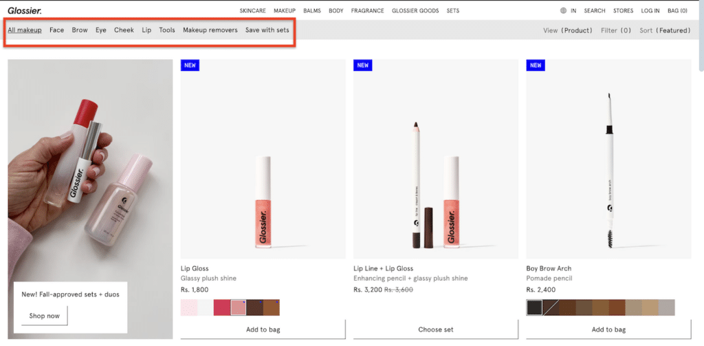
The header of the page serves as the primary anchor. It must feature a clear, precise category title that serves two masters: the human user and the search engine algorithm. Leading brands like Glossier have mastered this by using intuitive labels such as "Face" or "Eyes" rather than technical jargon. This clarity ensures that users immediately confirm they are in the right place, while simultaneously boosting Search Engine Optimization (SEO) by matching common search queries.
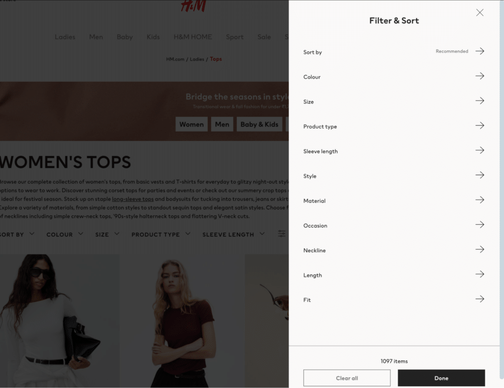
Below the header, the implementation of robust filtering and sorting options is non-negotiable for inventories exceeding a few dozen items. Retail giants like H&M provide a blueprint for this, offering granular filters that include size, color, price, material, and even specific occasions. This level of detail allows the consumer to narrow down thousands of options to a manageable selection in seconds. From a psychological perspective, this prevents "choice paralysis," a phenomenon where an overwhelming number of options leads to a consumer failing to make any decision at all.
The Mobile Imperative and Technical Performance
The chronology of e-commerce evolution shows a decisive shift toward mobile-first browsing. Projections indicate that by 2025, nearly 79% of all e-commerce sales will be conducted via mobile devices. This shift necessitates a fundamental change in how category pages are designed. A layout that works on a 27-inch desktop monitor will rarely translate effectively to a 6-inch smartphone screen without significant optimization.
Responsive design is no longer a luxury; it is a baseline requirement. Mobile-optimized category pages must feature large, "thumb-friendly" buttons, collapsible filter menus that do not obstruct the view, and high-resolution images that are optimized for fast loading. Page speed remains a critical factor in user retention. Research from Akamai suggests that a mere one-second delay in page load time can result in a 7% reduction in conversions. For a category page featuring hundreds of product thumbnails, techniques such as "lazy loading"—where images are only loaded as the user scrolls down—are essential to maintaining high performance.
Enhancing User Experience Through Intuitive Navigation
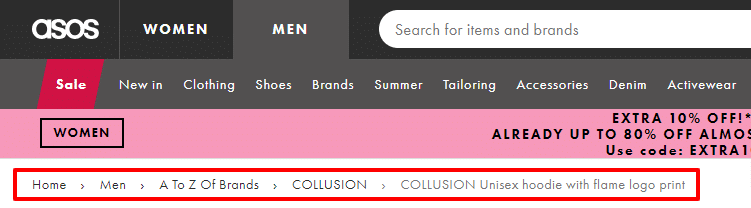
User experience extends beyond the visual layout into the functional flow of the website. One of the most effective tools for orientation is the "breadcrumb trail." This navigational aid shows the user exactly where they are in the site hierarchy (e.g., Home > Women’s Shoes > Running Shoes). Not only does this help users navigate backward without using the browser’s back button, but it also provides search engines with a clear map of the site’s internal structure.
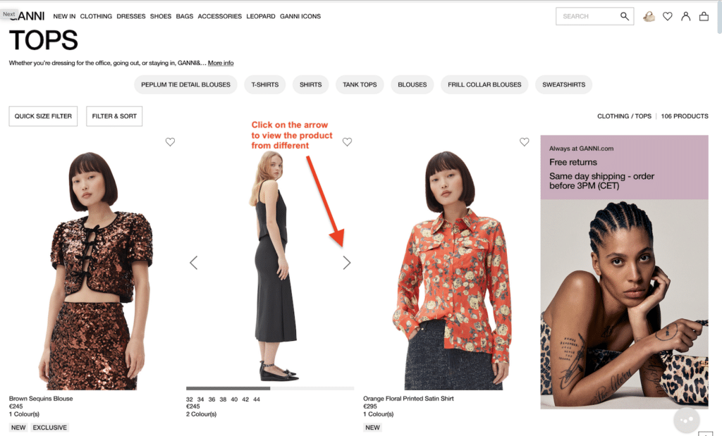
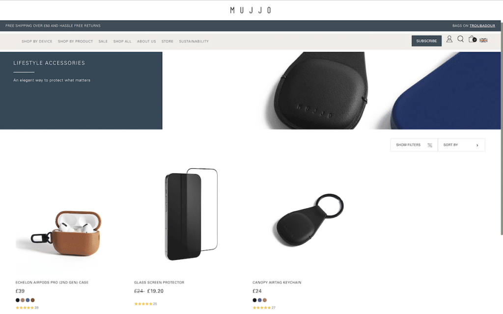
Furthermore, the inclusion of "Back to Top" buttons on long-scrolling pages and "Quick View" features—which allow users to see product details in a pop-up without leaving the category page—significantly reduces friction. Expert UI/UX designers argue that the goal is to keep the user in a "flow state," where the transition from browsing to basket-adding is as seamless as possible.
Content Strategy: Beyond Product Listings
Effective category pages do more than just display a grid of products; they provide context and incentive through engaging content. Category descriptions play a dual role here. First, they inform the customer about the unique value proposition of that specific collection. Second, they provide an opportunity to incorporate long-tail keywords that improve organic search rankings.
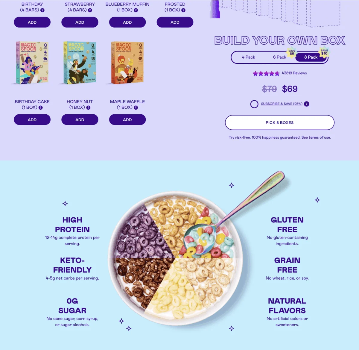
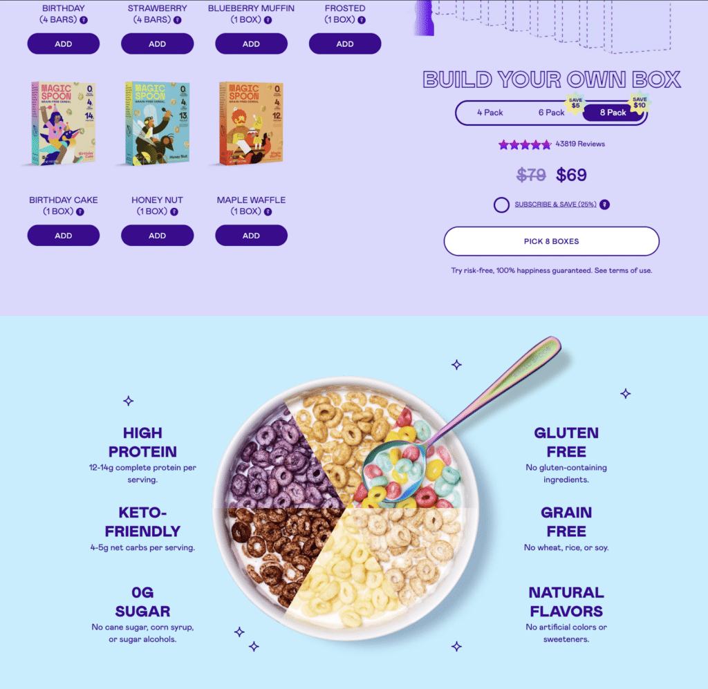
Case studies of brands like Magic Spoon, a specialized cereal retailer, show the power of combining SEO-friendly language with a distinct brand voice. By using terms like "keto-friendly" and "high-protein" within their category descriptions, they capture high-intent search traffic while reinforcing their brand identity.
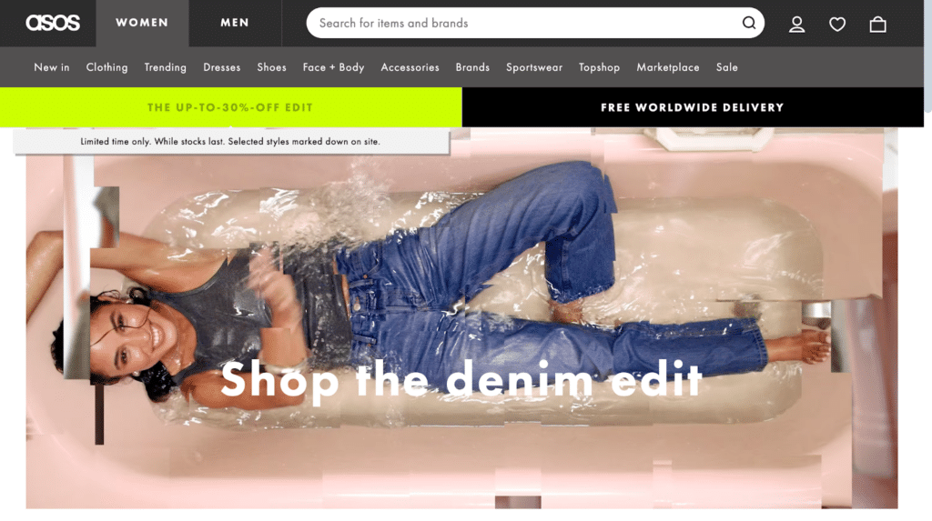
In addition to descriptive text, promotional placement is a powerful tool for driving urgency. Industry leader ASOS frequently utilizes the top of category pages to highlight limited-time offers or delivery incentives. Statements from retail analysts suggest that "scarcity cues," such as "while stocks last" or "limited time only," when placed at the category level, can increase the click-through rate to specific products by as much as 20%.
Search Engine Optimization as a Growth Lever
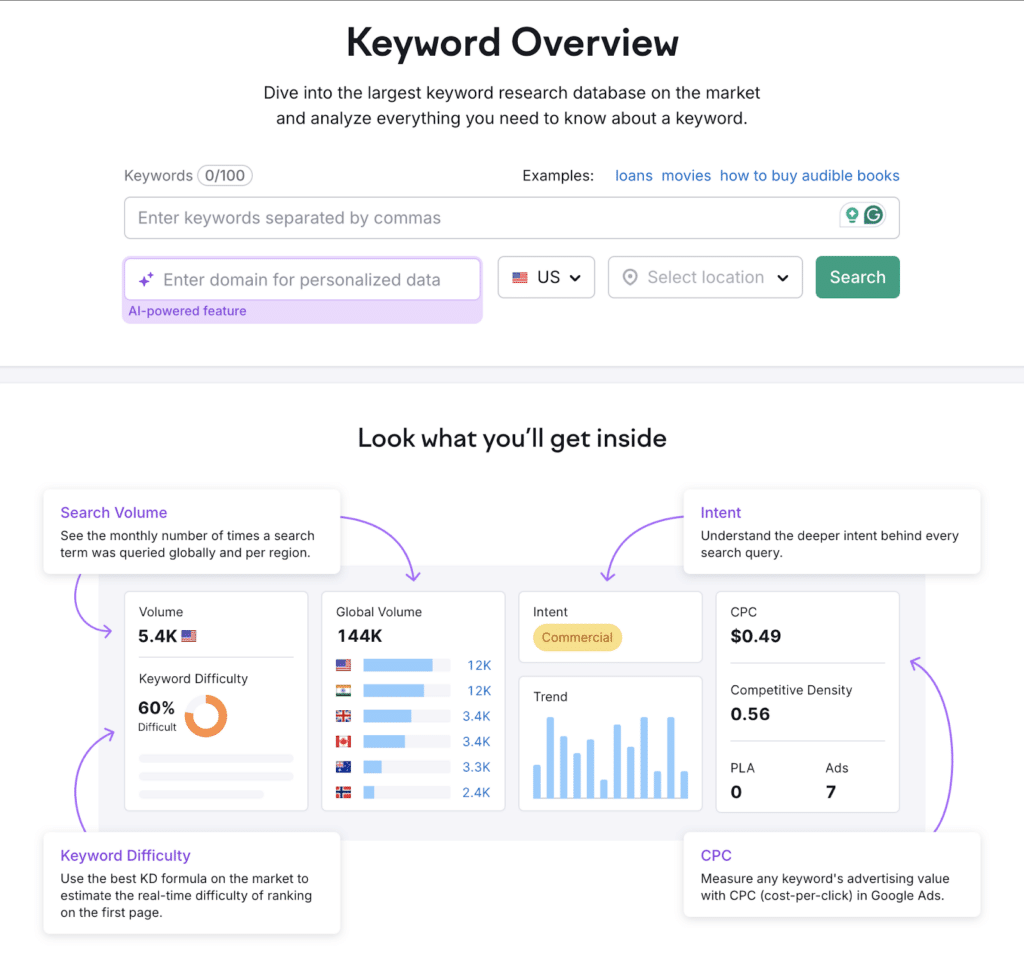
SEO is the engine that drives sustainable, organic traffic to e-commerce category pages. The process begins with rigorous keyword research using professional tools like SEMrush, Ahrefs, or Google Keyword Planner. The objective is to identify terms with high search volume and manageable competition.
Once keywords are identified, they must be strategically integrated into:
- Title Tags and Meta Descriptions: These are the first things a user sees on a Search Engine Results Page (SERP). They must be persuasive and include the primary keyword within 160 characters.
- H1 and H2 Tags: These headers help search engines understand the hierarchy of the page content.
- Alt Text for Images: Since search engines cannot "see" images, alt text provides a textual description, which is also vital for web accessibility for visually impaired users.
- Internal Linking: Linking to relevant sub-categories or popular products from the category description helps distribute "link equity" throughout the site.
The Iterative Cycle: Analysis, Testing, and Adjustment
The launch of a category page is not the end of the process, but rather the beginning of a cycle of continuous improvement. Professional e-commerce managers rely on sophisticated analytics and conversion rate optimization (CRO) tools to monitor performance.
Heatmaps and session replays, provided by platforms such as FigPii or Hotjar, offer invaluable insights into user behavior. For instance, a heatmap might reveal that users are frequently clicking on an image that isn’t linked to a product, or that they are ignoring a filter that the design team thought was essential.
A/B testing is another pillar of modern category page management. By running two versions of a page simultaneously—perhaps one with a "Add to Cart" button on the category grid and one without—merchants can make data-backed decisions about which features actually drive revenue. Key metrics to monitor during these tests include:
- Bounce Rate: The percentage of visitors who leave the site after viewing only the category page.
- Exit Rate: The point at which users drop out of the funnel.
- Filter Usage: Which filters are most popular and which are cluttering the UI.
Broader Impact and Industry Implications
The optimization of e-commerce category pages represents a broader shift in the retail industry toward "hyper-personalization" and "frictionless commerce." As artificial intelligence (AI) becomes more integrated into e-commerce platforms, we are seeing the rise of dynamic category pages that reorder products based on an individual user’s past browsing history and purchase behavior.
In conclusion, the category page is the "engine room" of the e-commerce website. By defining clear objectives, optimizing for both desktop and mobile layouts, prioritizing user experience, and committing to an iterative process of SEO and data analysis, retailers can transform these pages from simple lists into powerful engines of growth. In an era where consumer attention is the most valuable currency, the ability to help a customer find exactly what they need with minimal effort is the ultimate competitive advantage. The brands that master this architectural challenge are the ones that will define the future of digital commerce.







