The landscape of data analytics underwent a significant transformation throughout 2017 as organizations transitioned from static, manual reporting to dynamic, interactive visualizations. This shift was largely catalyzed by the adoption of Google Data Studio, a tool that has bridged the gap between complex data processing and accessible visual narratives. By enabling both business professionals and data journalists to synthesize information from disparate sources into cohesive dashboards, the platform has redefined how insights are communicated across industries. This analysis explores the implementation of high-performance visualizations in both corporate and journalistic contexts, highlighting the technical methodologies and strategic outcomes of early adopters.
The Evolution of Business Intelligence through Automated Reporting
For years, corporate reporting was characterized by labor-intensive processes involving manual data extraction from platforms like Google Analytics, followed by tedious formatting in spreadsheet software. The emergence of Google Data Studio provided a streamlined alternative, allowing for real-time data synchronization through native connectors.
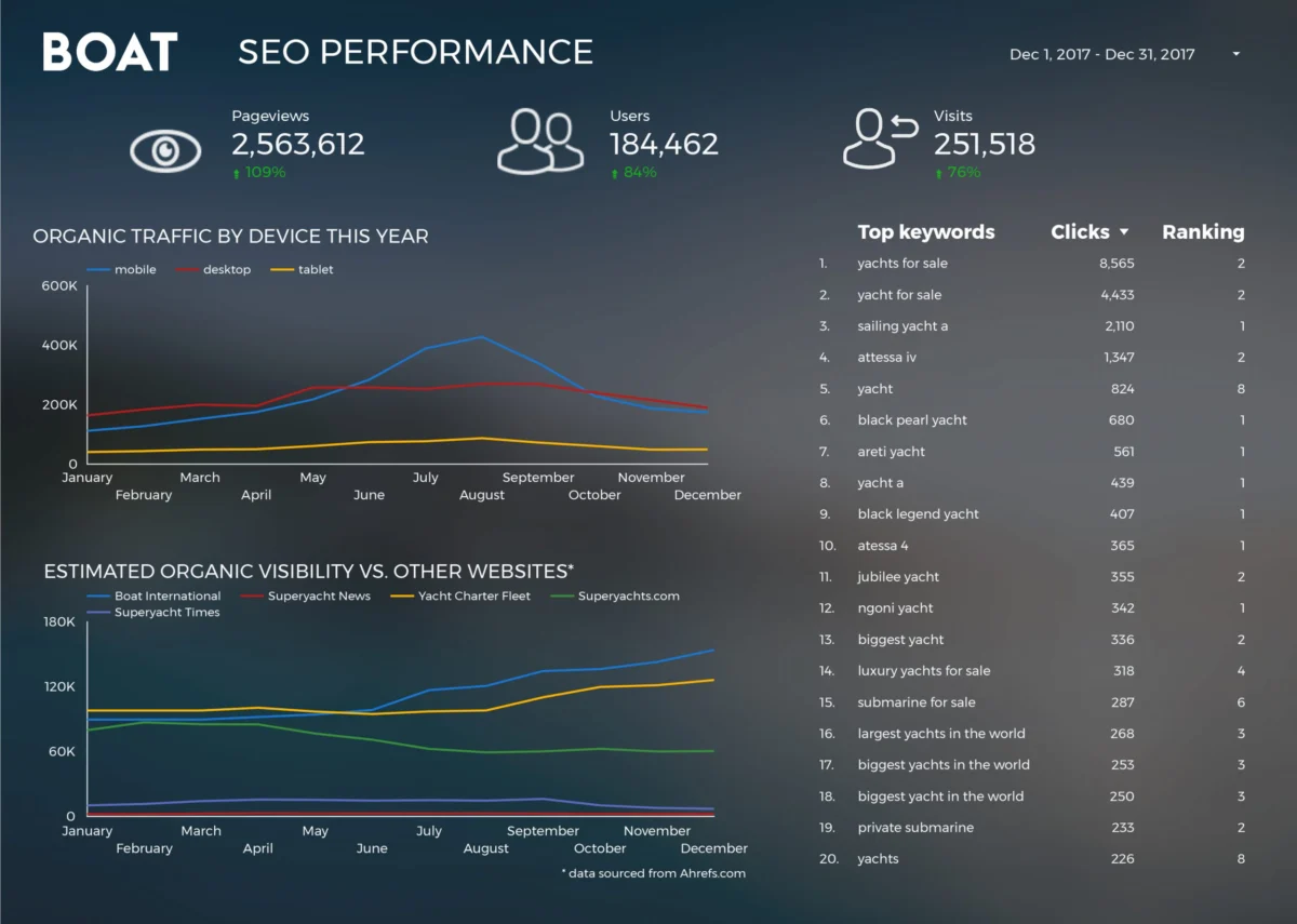
One of the most prominent examples of this efficiency gain is observed in the case of Boat International Media. The organization faced a common industry challenge: the production of comprehensive SEO performance reports for clients was a multi-day endeavor. By migrating their reporting infrastructure to Data Studio, the team, led by Fanni Takacs and Drew Broomhall, successfully reduced a five-day manual process to a mere fifteen minutes. This 99% reduction in production time was achieved by focusing on clear key insights and eliminating visual clutter. The resulting dashboards were designed with a dual-purpose philosophy: they functioned as interactive online tools for real-time monitoring while maintaining a professional aesthetic suitable for PDF distribution to high-level stakeholders.
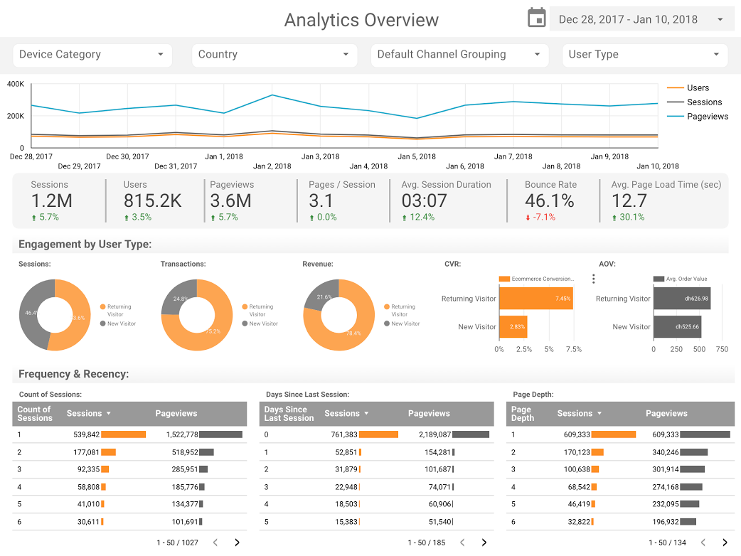
The technical success of these business dashboards often hinges on the use of specialized templates. Organizations like ClickInsight have developed standardized Google Analytics Web Activity Overview templates that allow companies to visualize user behavior without building infrastructure from scratch. These templates utilize specific data dimensions—such as session duration, bounce rates, and conversion paths—to provide an immediate health check of digital properties. Similarly, Sunil Attri of E-Nor has demonstrated how compact, interactive reports can consolidate massive datasets into a single-page overview, utilizing Data Studio’s ability to filter information by date range, geography, and device type.

Advanced Analytical Techniques: The Role of Comparative Visuals
Beyond simple data presentation, advanced practitioners have utilized Data Studio to implement sophisticated benchmarking techniques. Analytics Pros, for instance, pioneered the use of bullet charts to measure page-level engagement. Unlike standard bar charts, bullet charts allow analysts to compare current performance against both historical data (such as the previous year’s metrics) and specific target benchmarks.
This methodology provides a layered understanding of performance. A scorecard might show a high number of visits, but the bullet chart places that number in context: is it reaching the quarterly goal? Is it underperforming compared to the same period last year? By integrating these comparative visuals with engagement metrics like time-on-page and scroll depth, businesses can move from descriptive analytics (what happened) to diagnostic analytics (why it happened and how it compares to expectations).
Data Journalism: Transforming Public Data into Interactive Narratives
While business visualizations focus on internal efficiency and ROI, the application of Data Studio in journalism has opened new avenues for public engagement. Data journalism—the practice of telling stories through the lens of statistics—requires a balance between technical accuracy and compelling design.
The cinematic industry has proven to be a fertile ground for such storytelling. A comprehensive analysis of the Marvel vs. DC Cinematic Universes reveals the staggering economic scale of modern entertainment, with a combined global box office exceeding $27 billion. Visualizations in this sector allow fans and industry analysts to track the "war for the hearts of audiences," comparing critical reception (Rotten Tomatoes scores) against commercial success. This type of visualization transforms raw financial data into a cultural narrative, illustrating the dominance of specific franchises over time.
Similarly, the "Data Behind Star Wars" project by ClickInsight demonstrates the platform’s capacity for multi-layered storytelling. By utilizing "tabs" within a Data Studio report, journalists can guide readers through different facets of a complex universe—comparing starship speeds, character demographics, and planet characteristics. This interactive format encourages exploration, allowing the user to become an active participant in the data discovery process rather than a passive consumer of a static graphic.

Technical Integration: BigQuery and the Open Source Ecosystem
One of the most significant technical milestones for Data Studio was its integration with Google BigQuery, a serverless data warehouse designed for massive datasets. This connection was expertly utilized by Google Developer Advocate Felipe Hoffa to analyze the open-source landscape.
By pulling "PushEvents" from GitHub’s public datasets into BigQuery, Hoffa was able to visualize the contributions of thousands of developers and corporations in 2017. This project highlighted the "democratization of code," showing which languages were gaining traction and which organizations were leading the charge in open-source development. The ability to process terabytes of data in BigQuery and visualize the results in Data Studio in near real-time represents a significant leap forward for researchers and technology analysts. It removes the hardware limitations that previously prevented individuals from conducting large-scale data audits.
Societal Trends: Historical Data and Longitudinal Analysis
The utility of data visualization extends into the realm of sociology and history. An in-depth analysis of 150 years of marriage and divorce trends in the United Kingdom, conducted by researchers including Lizzie Silvey, serves as a prime example of longitudinal data storytelling.
By mapping over a century of records, the visualization identifies clear correlations between external shocks—such as World Wars and legislative changes—and domestic trends. For instance, the data illustrates how the introduction of the Divorce Reform Act of 1969 led to a measurable spike in filings, reflecting a shift in societal values and legal accessibility. These visualizations answer critical questions about who seeks divorce and why, providing a factual basis for discussions that are often dominated by anecdote or speculation.
Timeline of Development and Industry Impact
The adoption of Google Data Studio follows a clear chronology of technological maturation:
- Mid-2016: Google introduces Data Studio as part of the Google Analytics 360 Suite, initially restricted to enterprise users.
- Late 2016: A free version is released, allowing individuals and small businesses to create up to five reports.
- 2017: Google removes the report limit for the free version, leading to an explosion of community-created templates and public data stories.
- 2018: The platform focuses on deeper integrations, including enhanced BigQuery support and community visualizations, allowing for custom JavaScript-based charts.
The impact of this trajectory is two-fold. First, it has lowered the barrier to entry for high-end data visualization, which was previously the domain of expensive tools like Tableau or Microsoft Power BI. Second, it has fostered a culture of transparency. When organizations and journalists publish their dashboards, they often include the data sources, allowing for peer review and further exploration by the public.
Broader Implications for the Future of Data Communication
The case studies presented—from SEO reporting for luxury media brands to the historical analysis of UK social trends—underscore a fundamental shift in communication. In an era of "information overload," the ability to synthesize data into a visual format is no longer a niche skill; it is a professional necessity.
The implications for the business world are clear: organizations that fail to automate their reporting will be left behind by competitors who can make decisions in fifteen minutes rather than five days. For the world of journalism and public discourse, these tools provide a safeguard against misinformation. By presenting data in an interactive, verifiable format, storytellers can build higher levels of trust with their audience.
As we move further into a data-driven decade, the focus is expected to shift toward predictive modeling and artificial intelligence integration within these dashboards. However, the core principle remains the same: the most powerful visualizations are those that prioritize clarity, utilize appropriate chart types for the data at hand, and tell a story that resonates with the viewer. Whether tracking the performance of a global SEO strategy or the box office trajectory of a superhero franchise, Google Data Studio has established itself as a pivotal tool in the modern analytical toolkit.