The landscape of B2B software procurement has undergone a fundamental shift, moving away from traditional sales-led models toward a buyer-centric, research-heavy paradigm. In this environment, the "comparison page"—long a staple of the SaaS marketing playbook—is being forced to evolve. Historically, these pages were designed as thinly veiled sales pitches, utilizing biased feature tables and "Checklists of Doom" to portray a competitor as inferior. However, data suggests that today’s buyers are increasingly skeptical of such tactics, favoring transparency and objective guidance over aggressive persuasion.
Industry research from the Harvard Business Review indicates that between 40% and 60% of B2B deals today are lost not to a competitor, but to customer indecision. This "status quo bias" is often fueled by a lack of trustworthy information during the evaluation phase. When buyers encounter biased comparison pages, their skepticism increases, often leading to a total cessation of the purchasing process to avoid the risk of a "bad buy." Consequently, the modern SaaS comparison page must function less like a billboard and more like a buyer enablement tool.
The Evolution of the B2B Buying Process
The traditional buyer journey was once a linear path controlled by sales departments. Today, Gartner reports that B2B buyers spend only 5% of their time with a sales representative when considering a purchase. The vast majority of their time is spent on independent research. This shift has elevated the importance of the landing page, specifically the comparison page, which often serves as the final gate before a prospect requests a demo or starts a trial.
Landing page expert Tas Bober notes that the most effective comparison pages are built on integrity. They do not merely describe a product; they help the buyer understand which solution fits their specific team, budget, and workflow. This is particularly critical in a market where software budgets are under intense scrutiny and internal champions must justify every dollar spent.

Strategic Categorization of Comparison Content
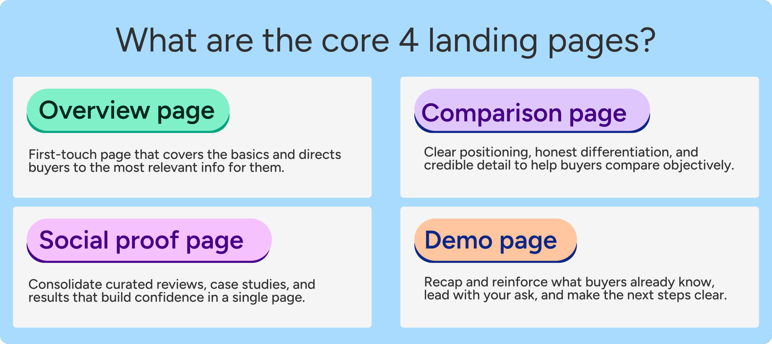
To effectively support the buyer journey, SaaS organizations must recognize that not all comparisons are created equal. Different stages of the consideration phase require different types of content:
1. Comparison Overview Pages
These serve as a high-level guide for buyers who are still defining their requirements. These pages answer the foundational question: "What are my options for solving this specific problem?" An overview page does not just compare direct competitors; it evaluates manual workarounds, custom-built internal solutions, and different categories of software. For example, a project management tool might compare itself against spreadsheets, specialized task managers, and enterprise resource planning (ERP) systems.

2. One-to-One Competitor Matchups
This is the classic "[Your Brand] vs. [Competitor]" format. These pages target high-intent buyers who have narrowed their shortlist. To maintain credibility, these pages must acknowledge the strengths of the competitor while clearly articulating the specific use cases where their own product excels.
3. Competitor Alternative Pages
These target "switchers"—buyers who are currently using a specific tool but are dissatisfied with its price, complexity, or feature set. These pages often target keywords like "Alternatives to [Competitor]" and are essential for capturing traffic from established legacy players in a market.
The Role of Keyword Strategy in Buyer Trust
The intersection of SEO and product positioning is where many comparison pages fail. Often, marketing teams target high-volume keywords without considering the intent behind them. A successful strategy involves analyzing sales call recordings and deal data to understand the language buyers use.
Key questions for marketers include:
- Which competitors are mentioned most frequently in "lost deal" reports?
- What specific pain points drive users away from a legacy incumbent?
- Are buyers looking for a "cheaper" version or a "more robust" version?
By aligning the page’s copy with the buyer’s actual vocabulary, the page feels less like an advertisement and more like a relevant resource. Furthermore, as search engines and Large Language Models (LLMs) like Google’s Gemini and OpenAI’s ChatGPT become more sophisticated, they prioritize content that demonstrates "helpfulness" and "objectivity." Pages that are overly biased or contain thin content are increasingly likely to be buried in search results or ignored by AI-driven search summaries.
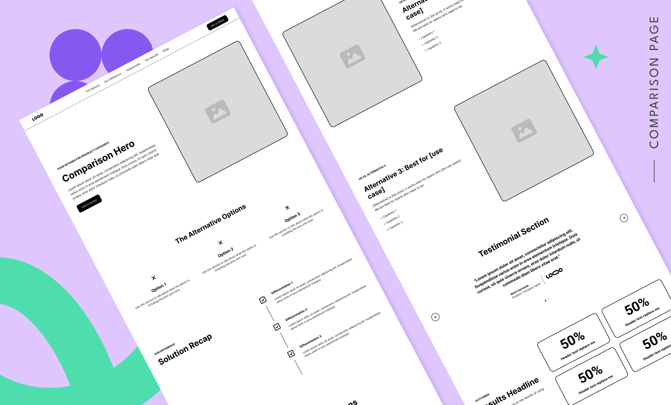
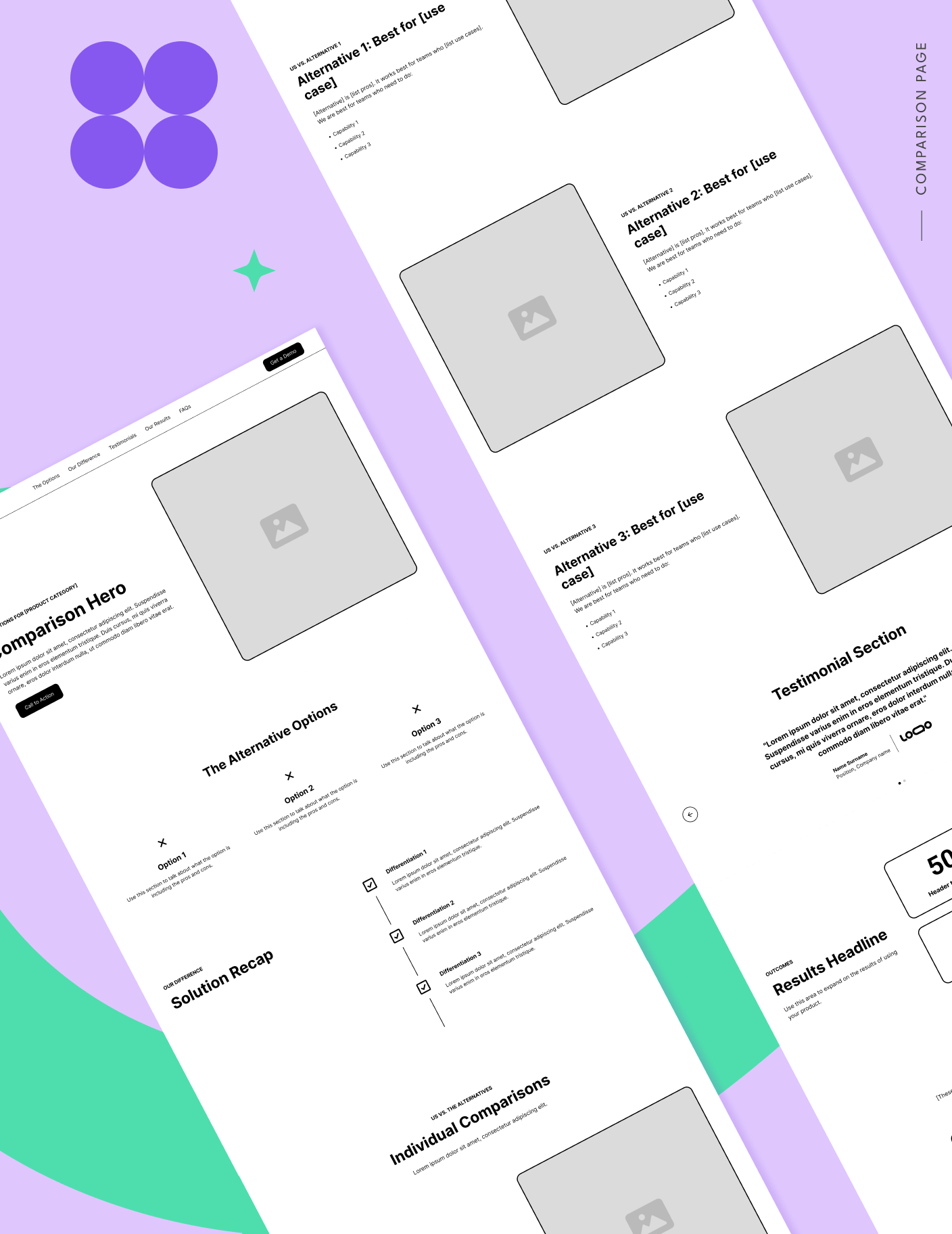
Anatomy of a High-Trust SaaS Comparison Page
According to Tas Bober’s framework, a high-converting, trust-based comparison page should be structured around several key blocks:
Navigation and User Experience
In light of Google’s recent ad quality prediction model updates, landing pages should no longer be "dead ends." Navigation that allows a user to explore related resources or return to a main site actually improves ad performance. On comparison pages, anchor links should allow buyers to jump directly to sections relevant to their specific concerns, such as "Pricing Comparisons" or "Security Features."
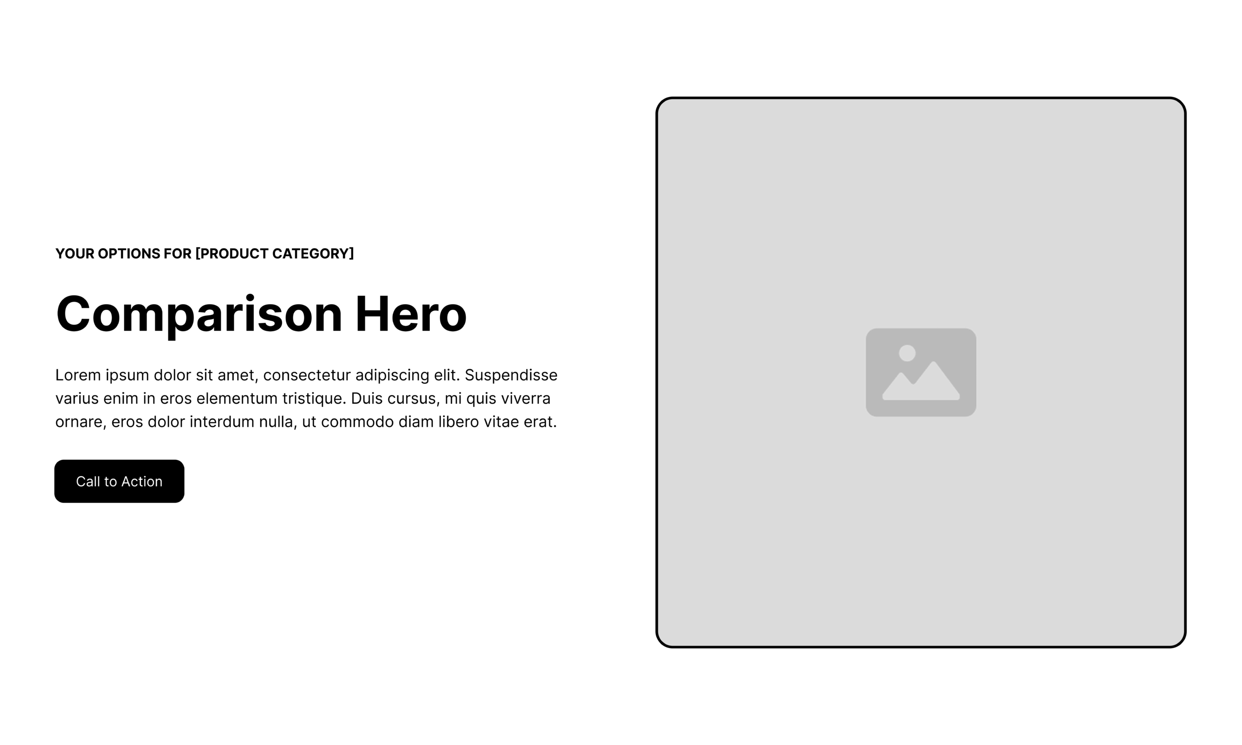
The Comparison Hero
The "above-the-fold" content must immediately validate the user’s search intent. Rather than a generic "We are the best" headline, the hero section should pose a question that reflects the buyer’s dilemma: "Which [Category] software is right for your team’s specific workflow?" This framing positions the brand as a consultant rather than a vendor.
Objective Solution Differentiation
Instead of a simple list of features, this section should focus on the "pros and cons" of various approaches. Acknowledging a competitor’s strength—for example, noting that a competitor might be better for individual freelancers while your tool is built for enterprise teams—builds massive credibility. It signals to the buyer that you are not trying to "trick" them into a purchase that won’t work for them.
Evidence-Based Social Proof
Generic testimonials are often ignored. High-trust pages utilize "migration stories"—testimonials specifically from customers who switched from the competitor featured on the page. These stories should highlight the measurable impact of the switch, such as "Reduced onboarding time by 30% after moving from [Competitor]."
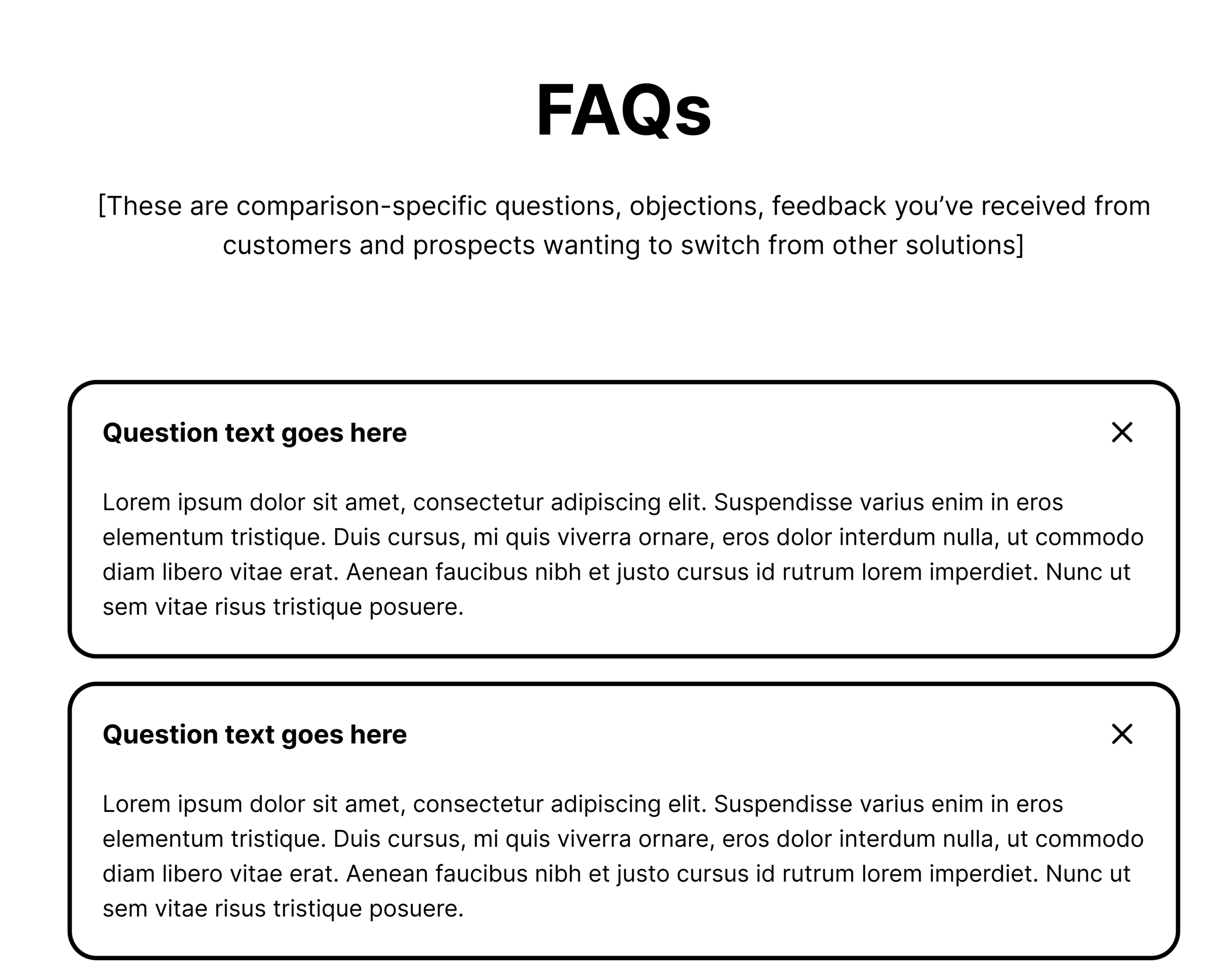
The Frequently Asked Questions (FAQ) Block
The FAQ section is an underutilized tool for handling objections. It should address the logistical hurdles of switching, such as data migration, API integrations, and the learning curve for new users.
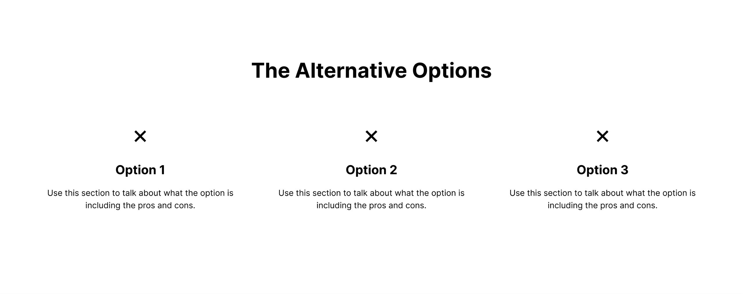
The Decline of the Standard Comparison Table
One of the most controversial elements of Tas Bober’s advice is the omission of the traditional comparison table (the grid of checks and Xs). While common, these tables are often viewed by buyers as inherently biased. They are frequently reductive, failing to capture the nuance of how a feature actually works. A "check" next to "Reporting" doesn’t tell the buyer if the reporting is easy to use or if it requires a data scientist to configure. Bober suggests replacing these tables with descriptive sections that explain the philosophy and depth of features, providing more value to a sophisticated evaluator.
Case Studies: Integrity in Action
Four industry examples illustrate how different brands approach comparison content with varying degrees of integrity:
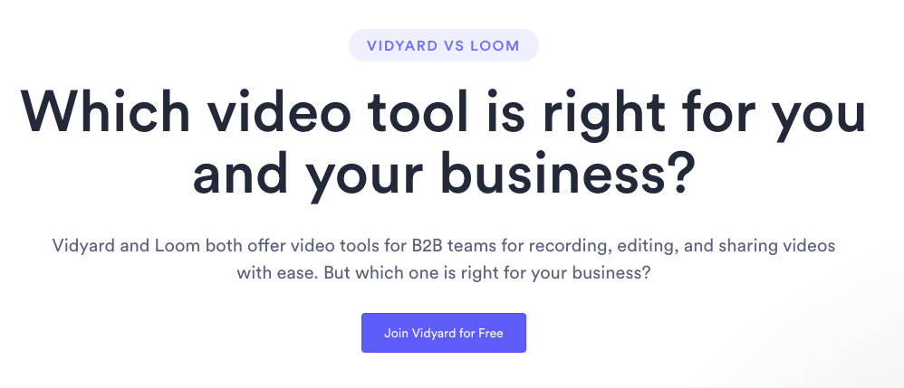
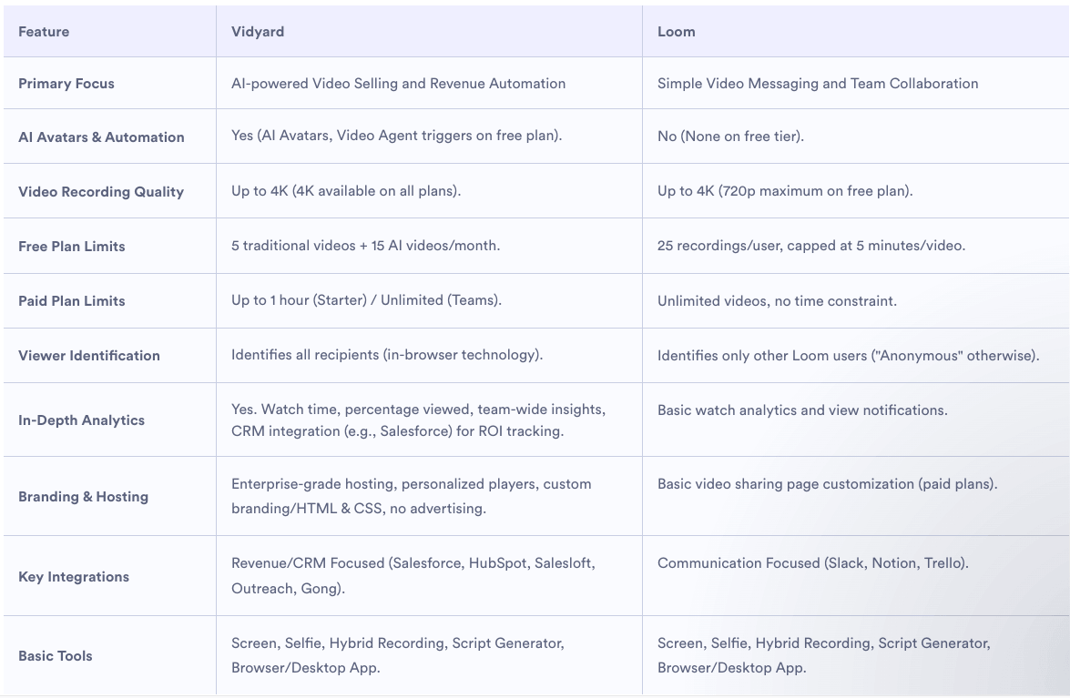
- Vidyard vs. Loom: Vidyard’s hero section explicitly asks, "Which video tool is right for you?" This neutral framing immediately reduces buyer defensiveness. Their feature table describes the focus of each platform, acknowledging that one may be better for internal comms while the other is optimized for sales.
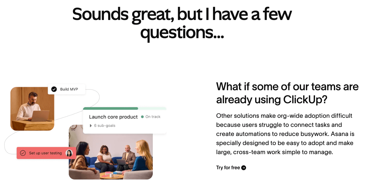
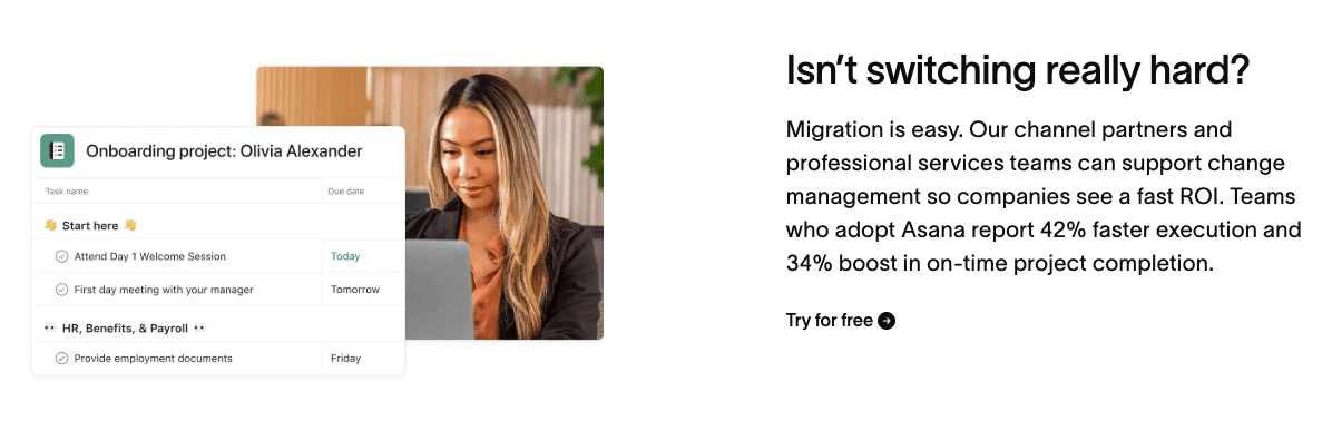
- Asana vs. ClickUp: Asana excels in its FAQ section, which focuses heavily on the migration process. By addressing the "pain of change," Asana helps buyers overcome the primary hurdle to adoption: the fear of a messy transition.
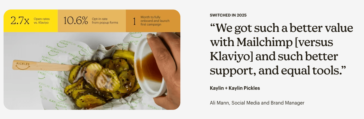
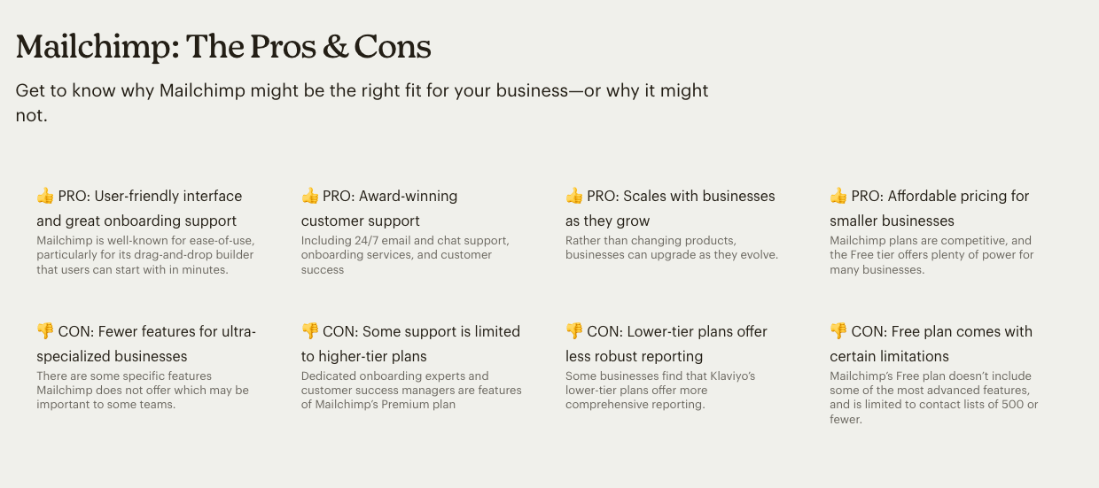
- Mailchimp vs. Klaviyo: Mailchimp provides a masterclass in honesty by calling out its own gaps. By admitting that certain specialized businesses might find Klaviyo’s reporting more comprehensive on lower-tier plans, Mailchimp earns the buyer’s trust for the areas where they do claim superiority.
- Zendesk vs. Freshdesk: Zendesk utilizes independent third-party research to ground its claims. By citing interviews conducted by an outside firm, they distance the claims from the marketing department, providing a layer of objective proof that is difficult for a competitor to refute.
Implications for the Future of SaaS Marketing
The move toward high-integrity comparison pages is not just a trend; it is a necessity driven by the "information parity" between buyer and seller. In an era where a prospect can find a product’s weaknesses on Reddit, G2, or TrustRadius in seconds, a biased comparison page becomes a liability.
For SaaS organizations, the implications are clear: the marketing team must work closer with Sales and Customer Success to understand the reality of the product’s position in the market. Marketing must have the courage to say "we are not the best fit for everyone." By doing so, they ensure that the leads they do generate are highly qualified, have realistic expectations, and are more likely to become long-term, successful customers.
Ultimately, building a SaaS comparison page that buyers trust is an investment in brand equity. In a crowded marketplace, transparency is becoming the ultimate differentiator. When a brand helps a buyer make a confident decision—even if that decision is to choose another tool—they establish a level of professional respect that often leads to future opportunities when that buyer’s needs evolve.