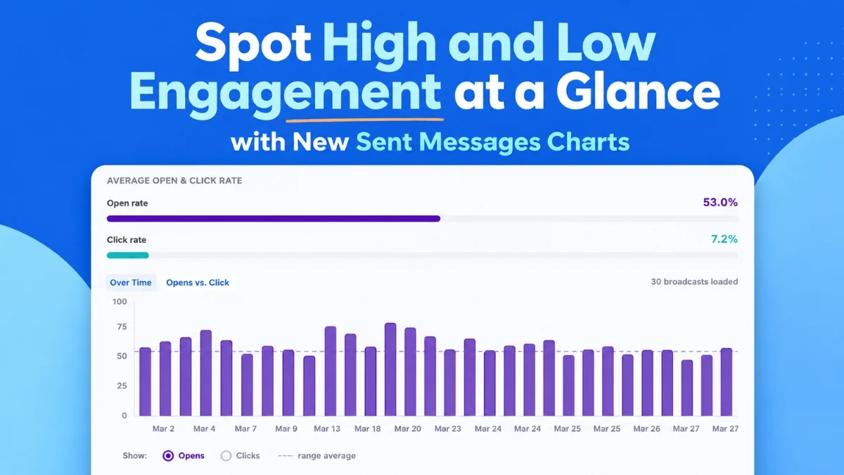
AWeber, a long-standing innovator in email marketing solutions, today, August 6, 2026, announced a significant enhancement to its analytics dashboard, introducing a suite of powerful visual tools designed to provide marketers with instant, actionable insights into their email campaign performance. These updates, prominently featuring "Opens and Clicks Over Time" and "Opens vs. Clicks" charts, aim to streamline data analysis, enabling users to swiftly identify successful strategies, pinpoint areas for improvement, and optimize future outreach with unprecedented clarity. The release underscores AWeber’s commitment to equipping businesses, from solopreneurs to small enterprises, with sophisticated yet intuitive tools to navigate the complexities of digital communication.
The core of this enhancement lies in transforming raw email performance data into easily digestible visual formats. Marketers often grapple with vast datasets, spending valuable time sifting through numbers to identify trends and outliers. AWeber’s new dashboard directly addresses this challenge by presenting open rates, click rates, and email comparisons in dynamic charts that reveal patterns and anomalies at a glance, eliminating the need for extensive manual data processing. This immediate visibility is crucial for agile marketing strategies, allowing for rapid iteration and improvement.
Visualizing Engagement Trends Over Time
A cornerstone of the new analytics suite is the "Opens and Clicks Over Time" chart. This intuitive bar chart visually plots up to 100 of a user’s most recent email broadcasts along a chronological timeline. The interactive toggle feature allows marketers to effortlessly switch between viewing open rates and click rates, facilitating a direct comparison of performance across different sends. This functionality is invaluable for discerning long-term trends and understanding the impact of various campaign elements.
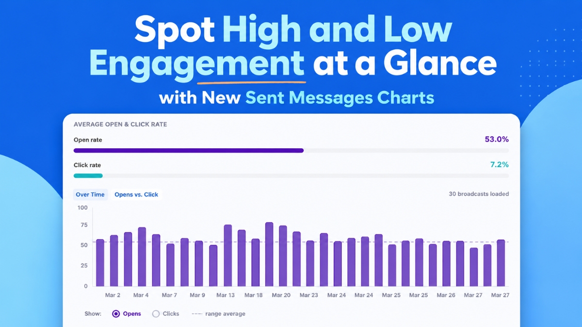
For instance, a consistent spike in open rates on emails sent on a particular day of the week, or a recurring pattern of high engagement linked to specific subject line themes, becomes immediately apparent. This visual representation helps marketers move beyond individual campaign analysis to a strategic understanding of their audience’s behavior over time. If emails sent on Tuesdays consistently yield higher open rates than those sent on Fridays, marketers can adjust their scheduling to leverage this insight. Similarly, identifying subject lines that consistently drive strong opens—even if the content within might need refinement—provides a clear directive for future content creation.
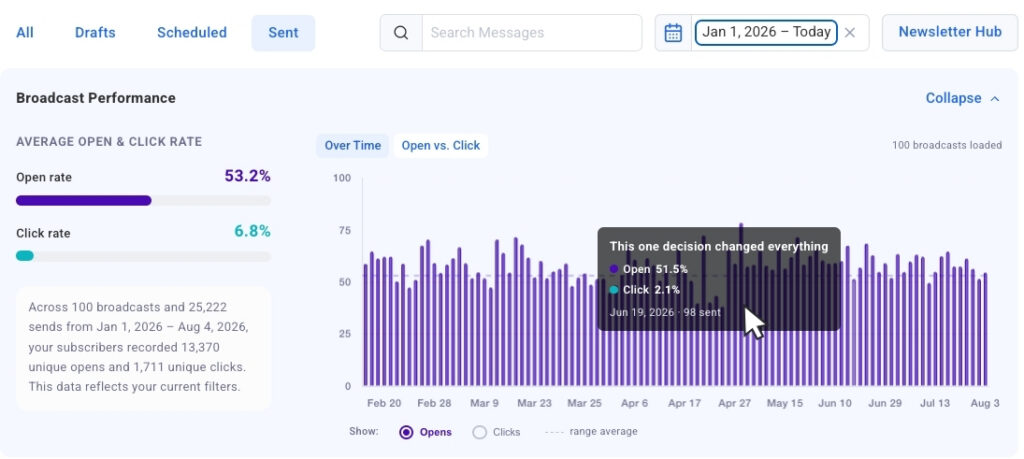
The chart is designed for seamless interaction. Each bar within the "Opens and Clicks Over Time" chart functions as a "click-to-jump" link, instantly navigating the user from a visualized data point to the precise broadcast entry in the detailed table below. This eliminates the tedious process of cross-referencing, allowing marketers to move from a high-level trend observation to a granular examination of a specific message in mere seconds. The chart loads automatically and populates dynamically as users scroll through their broadcast history, ensuring that the visual context remains consistent with the underlying data. This dynamic loading capability ensures that the most recent and relevant data is always at the forefront of the analysis, providing an up-to-date snapshot of campaign efficacy.
Comparing Strongest and Weakest Sends Side-by-Side
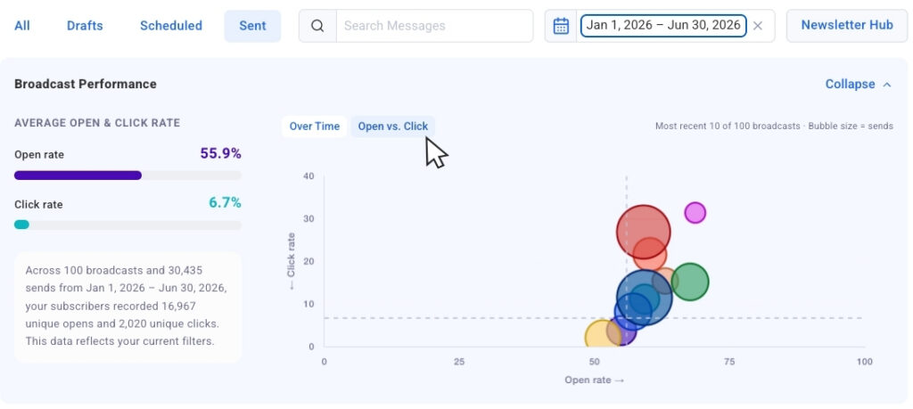
Complementing the chronological view, the "Opens vs. Clicks" bubble chart offers a powerful comparative analysis tool. By switching to this view, users can see their most recent broadcasts plotted together on a two-dimensional graph. Each individual broadcast is represented as a bubble, with its size dynamically adjusted to reflect the send volume or audience size of that particular email. This crucial detail allows marketers to compare results across campaigns that may have targeted different segments or subscriber counts, ensuring that context is never lost.
This bubble chart is particularly effective at surfacing outliers quickly. Marketers can easily identify broadcasts that achieved strong open rates but generated fewer clicks, indicating a compelling subject line but perhaps a less engaging call to action or body content. Conversely, emails that drove both high opens and clicks clearly highlight successful combinations of subject, content, and call to action. Such insights are gold for refining future campaigns, enabling marketers to understand "what to repeat and what to adjust" with tangible data supporting their decisions. For example, a large bubble positioned high on the opens axis but low on the clicks axis would signal a need to re-evaluate the internal content or links of that particular email, despite its initial success in capturing attention.
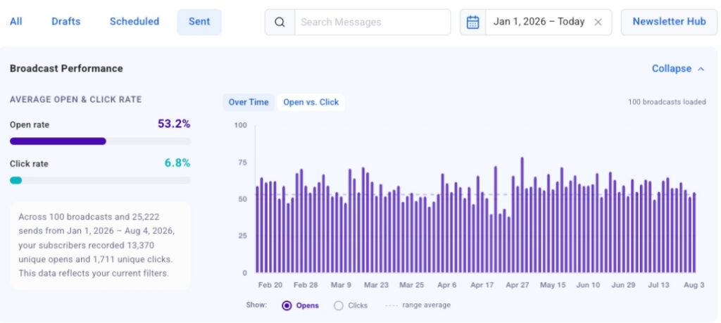
To maintain focus and flexibility, the analytics dashboard also incorporates a collapsible chart view. This feature allows users to temporarily hide the visual charts, giving them an uncluttered view of the numerical data in the table when detailed scrutiny is required. The charts can be expanded again at any time, instantly restoring the visual context and comparative power. This thoughtful design ensures that users can toggle between different modes of analysis based on their immediate needs, optimizing their workflow.
Precision Filtering for Targeted Measurement
Understanding that effective analysis requires precise data segmentation, AWeber has integrated robust filtering capabilities into the new dashboard. Date presets offer quick access to performance data from the past 30 days, 90 days, or a full year with a single click. The charts and tables instantly update to display only the sends within the selected timeframe, allowing for focused period-over-period analysis or a broad historical overview.
Going further, dynamic search filtering empowers users to refine their analysis with remarkable specificity. By typing keywords into the search bar, the charts and tables narrow down to display only broadcasts that contain that particular word or phrase in their subject line. This feature is invaluable for marketers conducting A/B tests on subject lines, comparing performance across themed campaigns, or tracking the effectiveness of specific promotional language. For instance, a marketer could search for "webinar" to assess the cumulative performance of all webinar-related emails, or compare campaigns featuring "discount" versus "free offer" in their subject lines.
Looking ahead, AWeber has announced that segment name filtering will be introduced soon. This forthcoming capability will allow marketers to isolate chart and table data by specific audience segments. This is a critical enhancement, as engagement metrics naturally vary significantly across different audience demographics, interests, or stages in the customer journey. The ability to analyze segment-specific performance will enable highly targeted optimization, ensuring that marketing efforts are tailored to resonate most effectively with each distinct group.
The Strategic Imperative of Data-Driven Email Marketing
These advancements by AWeber arrive at a time when data-driven decision-making is no longer a luxury but a fundamental necessity in digital marketing. Email marketing continues to boast one of the highest returns on investment (ROI) among digital channels, with studies frequently citing figures around $36 to $42 for every $1 spent. However, this impressive ROI is contingent upon continuous optimization, which relies heavily on robust analytics. With billions of emails sent daily, the competition for inbox attention is fierce. Marketers must move beyond simply sending emails; they must understand what resonates, what drives action, and what needs adjustment.
Industry benchmarks for email performance typically range, on average, from 20-30% for open rates and 2-5% for click-through rates, though these figures can fluctuate widely depending on the industry, audience, and content type. Without detailed and easily accessible analytics, identifying why certain campaigns exceed these benchmarks while others fall short becomes a time-consuming, often manual, and sometimes guesswork-filled endeavor. AWeber’s new tools aim to convert this guesswork into informed strategy, providing clear indicators of success and opportunities for growth.
AWeber’s Commitment to User Empowerment and Innovation
AWeber, founded in 1998, has consistently positioned itself as a champion for small businesses and entrepreneurs, providing accessible yet powerful email marketing tools. This latest analytics overhaul aligns perfectly with its mission to simplify marketing and empower users to achieve better results. By integrating these visual and filtering capabilities directly into the dashboard, AWeber is ensuring that its users have immediate access to the insights needed to refine their content strategy, optimize send times, and improve overall campaign effectiveness.
According to AWeber spokespersons, these new tools represent a direct response to the evolving needs of modern marketers who demand efficiency and clarity in their data analysis. "Our goal is to transform raw data into a clear narrative, enabling every AWeber user to understand their audience better and craft more impactful campaigns," stated a company representative. "This update is not just about showing numbers; it’s about fostering intelligent decision-making, helping our customers maximize their email marketing ROI with minimal effort."
The strategic importance of this update is further highlighted by its integration with the AWeber MCP app for ChatGPT and Claude.ai, which was previously announced. This connection suggests a broader vision where AI-powered insights can further interpret the patterns revealed by the new charts, guiding users towards even more sophisticated optimizations and content generation strategies. This synergy positions AWeber at the forefront of combining intuitive data visualization with advanced AI capabilities, offering a truly holistic approach to email marketing intelligence.
Broader Market Implications and Future Outlook
The introduction of such comprehensive and user-friendly analytics by AWeber is likely to raise the bar across the email marketing platform landscape. As marketers increasingly expect sophisticated data tools that are easy to use, competitors will face pressure to enhance their own offerings. This trend ultimately benefits businesses, as it drives innovation and provides access to more powerful resources for engaging with their audiences.
From an operational efficiency standpoint, streamlined analytics translate directly into better resource allocation. Marketers can spend less time compiling reports and more time on strategic planning, content creation, and A/B testing. The ability to quickly identify high-performing elements—be it a specific type of subject line, a particular call to action, or an optimal send day—means that successful tactics can be scaled and replicated, while underperforming ones can be swiftly abandoned or refined. This agility is paramount in today’s fast-paced digital environment.
Ultimately, the goal of these advanced analytics is to drive higher conversion rates and foster stronger audience relationships. By understanding what resonates with subscribers, marketers can deliver more relevant and valuable content, leading to increased engagement, loyalty, and ultimately, business growth. The new AWeber Sent Messages charts are live now, making these powerful insights immediately available to all users. This release marks a significant step forward in making sophisticated email marketing intelligence accessible and actionable for businesses of all sizes, ensuring that every email sent has the best possible chance of success.