The journey from a casual website visitor to a loyal subscriber hinges critically on the efficacy of the newsletter signup form. Far from being a mere digital formality, this interface represents the singular point of entry into a business’s direct communication channel, collecting vital information to facilitate ongoing engagement and value delivery. Yet, a pervasive oversight among many small businesses is the tendency to deploy a basic form and subsequently neglect its strategic optimization. This static approach often results in forms that demand excessive information, inadequately articulate their value proposition, and are positioned in low-visibility areas, collectively presenting multiple hurdles that can deter potential subscribers before they ever receive a single email. Addressing these fundamental flaws is paramount for any entity serious about cultivating a robust and engaged email list.
The Foundational Elements of a High-Converting Signup Form
The design and content of a newsletter signup form are not arbitrary; they are critical components of a wider digital strategy. At its core, a signup form must balance the need for data collection with the imperative of minimizing user friction.
Streamlining Data Collection: The Essential Fields
The cardinal rule for newsletter signup forms is to start with the absolute minimum: an email address field and a subscribe button. This minimalist approach is rooted in user psychology and conversion rate optimization principles. Every additional field introduced into a form creates friction, demanding more cognitive effort and time from the visitor, which directly correlates with a reduction in signup rates. Industry studies consistently show that each additional field can decrease conversion rates by an average of 10%. For the vast majority of small business newsletters, an email address is the sole piece of information required to begin delivering value through regular communications.
Strategic Personalization: When to Add a First Name Field
The inclusion of a first name field on a signup form is justifiable only when a clear strategy exists for its subsequent use. Personalizing email greetings, such as "Hey Sean" instead of "Hey there," has been shown to increase email open rates by up to 26% and click-through rates by 14%. However, this benefit materializes only if the email content actively incorporates the subscriber’s name via a merge tag. If there are no concrete plans to leverage personalization in the email campaigns, the first name field should be omitted. Eliminating this single field removes a potential barrier, streamlining the signup process and reducing the likelihood of visitor abandonment. The decision to collect more data should always be driven by a specific, actionable purpose that enhances the subscriber’s experience.
Fields to Avoid: Maintaining Focus and Trust
Certain data fields, while valuable in other contexts, are almost universally detrimental to a newsletter signup form’s conversion rate. These include phone numbers, company names, job titles, and physical addresses. Such fields are typically reserved for lead capture forms associated with gated content, sales inquiries, or detailed customer segmentation, where the user implicitly understands a more significant transaction or engagement is being initiated. On a simple newsletter form, these requests often signal an unwarranted demand from the business before any value has been delivered in return. They can trigger privacy concerns and elevate the perceived effort required to subscribe, leading to significant drop-offs. The principle here is clear: if the collected data cannot be immediately and meaningfully utilized to enhance the newsletter experience, it should not be requested. Over-collection of data not only harms conversion but can also create compliance liabilities under regulations like GDPR and CCPA.
Optimizing Visibility: Strategic Placement of Signup Forms
The most impeccably designed signup form will fail to grow an email list if it remains unseen. Form placement is a critical determinant of its visibility and, consequently, its conversion potential. Different placements cater to different user behaviors and intentions, and a multi-pronged approach often yields the best results for small business websites.

High-Impact Placements Ranked by Conversion Potential:
-
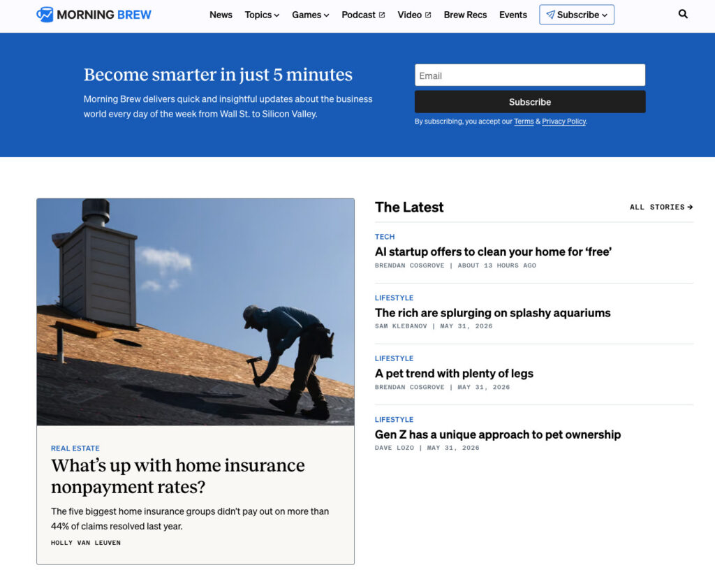
Above the Fold on Your Homepage: This premium real estate is most effective when the newsletter is the primary product, as exemplified by content-driven platforms like Morning Brew or The Hustle. In these cases, visitors arrive with the explicit intention to subscribe, making an immediate, prominent form essential. For businesses where the newsletter supports a core product or service, a homepage form remains valuable but must be positioned judiciously to complement, rather than overshadow, the primary calls to action. It serves as a clear invitation to those interested in ongoing content.
-
Sidebar Signup Form: A persistent sidebar form offers continuous visibility as users navigate content-rich pages. This placement is particularly effective for visitors who have arrived to consume specific content and might be interested in related topics delivered via a newsletter. On desktop interfaces, sidebars remain static alongside the main content, providing an unobtrusive yet ever-present option to subscribe. However, it is crucial to note that on mobile devices, most website themes collapse sidebars below the main content, rendering them less effective. Therefore, this placement should be augmented with other mobile-friendly options.
-
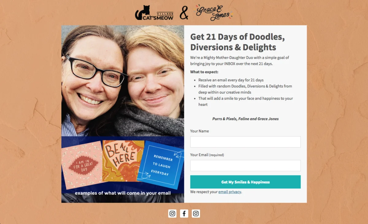
Dedicated Signup Page: A standalone page exclusively devoted to promoting the newsletter provides ample space to articulate its unique value proposition without competing distractions. This dedicated space allows for compelling copy, testimonials, and detailed descriptions of what subscribers can expect. Such pages are ideal for linking from external platforms like social media bios, podcast show notes, guest post bylines, and other mentions of the newsletter. Business strategists, like Alexandra Franzen, advocate for treating newsletters as "art projects," aiming for content so compelling that it drives organic sharing. A dedicated signup page is the canvas for selling this unique experience, emphasizing the benefits and community rather than just the act of subscribing.
-
Header or Top Navigation Bar: A compact, persistent form or a prominent link to a signup form within the header or top navigation bar ensures the subscription option is visible across every page of the website. This strategy is particularly effective for websites with extensive content, where visitors tend to browse multiple pages per session. The key is to keep the form concise – typically just an email field and a button – to avoid cluttering the navigation.
-
Footer Signup Form: The website footer serves as a common destination for visitors who have reached the end of a page and are seeking further engagement or information. Placing a newsletter signup form here acts as a "safety net," capturing individuals who may not have been ready to subscribe upon their initial arrival but have since consumed enough content to be convinced of the value. It caters to a user who has completed their primary task and is now exploring secondary options.
-
Exit-Intent Pop-up: An exit-intent pop-up is a powerful last-ditch effort to convert abandoning visitors. Triggered when a user’s cursor indicates an intention to leave the page (e.g., moving towards the browser’s close or back button), it presents a final, targeted offer. For optimal effectiveness and to avoid user annoyance, these pop-ups should be configured to appear only once per session, feature a clear and easily accessible close button, and offer a specific, benefit-driven value proposition. For instance, "Get weekly email tips for your small business" significantly outperforms a generic "Subscribe to our newsletter." When implemented thoughtfully, exit-intent pop-ups can capture an additional 2-8% of potential subscribers.
Crafting Compelling Copy: Driving Newsletter Signups
Beyond form fields and placement, the language used on a signup form is a primary driver of conversion. Three critical elements dictate its effectiveness: the promised benefit, the expected frequency of communication, and the minimal effort required from the user.
Lead with the Benefit, Not the Action:
A common pitfall is to use generic calls to action like "Subscribe to our newsletter." This phrasing instructs the visitor on what to do but provides no compelling reason why they should do it. The word "subscribe" denotes a mechanical action, failing to answer the fundamental question in a visitor’s mind: "What’s in it for me?"
Conversely, benefit-driven copy addresses this directly. "Get one email per week with strategies to grow your small business" immediately answers three crucial questions: What specific value will I receive? How often will I receive it? Is this content relevant to my interests? This clarity enables visitors to make an informed decision within seconds, significantly increasing the likelihood of conversion. For example, contrasting "Subscribe to our newsletter" with "Get our Tuesday email: one tactic to grow your list this week" highlights the difference. The latter provides specific details—a day, a promise, and a topic—leaving no room for ambiguity and making the value proposition instantly clear.
Setting Frequency Expectations Upfront:
This often-overlooked element can dramatically impact subscriber retention. Transparently stating the expected email frequency—e.g., "every Tuesday," "twice a month," or "weekly"—at the point of signup builds trust and reduces post-subscription unsubscribes. When subscribers receive emails they weren’t expecting in terms of timing or volume, the immediate reaction is often to unsubscribe. By setting clear frequency expectations, this negative reaction is largely mitigated. A subscriber who willingly opted in knowing they would receive a weekly email is far less likely to feel surprised or overwhelmed when that email arrives. This upfront communication establishes a clear contract between the sender and the recipient, fostering mutual understanding and building a foundation of trust from the very first interaction.
Using a Specific Call-to-Action (CTA) Button:
The CTA button is the final prompt a visitor encounters before committing to subscribe. Generic text such as "Submit" is uninformative, while "Subscribe" is marginally better but still vague. The most effective button text directly reinforces the benefit promised in the form’s headline. If the headline states, "Weekly email marketing strategies for small businesses," the button could confidently say, "Get weekly strategies" or "Send me the tips." This transforms the button from a mere mechanical action into a confirmation of the value proposition, reinforcing the decision to opt-in.
Incorporating social proof can further enhance CTA button effectiveness. Phrases like "Join 1,200 readers" leverage the psychological principle of conformity, signaling to new visitors that many others have already found value in subscribing. If a subscriber count is substantial and impressive, displaying it on the button can be a powerful motivator. Conversely, avoid ambiguous button text like "Learn more" or "Get started," which can confuse users about the immediate outcome of their click. The button’s text should make the consequence of clicking unequivocally clear.
Leveraging Technology: The Evolution of Signup Form Creation
Historically, the standard advice for creating newsletter signup forms involved selecting a template, customizing colors and logos, and publishing. The inherent limitation of this approach is that templates are inherently generic, designed for a broad audience and assuming a one-size-fits-all structure. This often leads businesses to work backward from a pre-defined design rather than forward from their unique value proposition. A generic template cannot account for a newsletter’s specific frequency, its niche audience (e.g., freelance designers, food industry entrepreneurs), brand voice, or unique selling points. The result is a form that requires significant manual adjustment and often feels disconnected from the brand it represents.
This challenge has spurred innovation, leading to advanced tools like the AI Signup Form Builder in AWeber. This new generation of form builders takes a fundamentally different approach. Instead of starting with a blank template, users describe their newsletter’s purpose and content. The AI then processes this information, analyzes the business’s existing website for content, tone, and branding, and generates a fully customized form. This intelligent automation ensures that the form’s design, copy, and field structure are contextually relevant and seamlessly integrated with the brand’s identity, eliminating the need to adapt a generic framework.
Such AI-powered tools can generate forms that can be embedded directly on any webpage, deployed as standalone landing pages, or configured as exit-intent pop-ups. The flexibility to display the form anywhere on a site is managed by simply instructing the AI. Critically, these forms are directly linked to the subscriber list, ensuring that new signups are immediately ready to receive the next scheduled newsletter, thereby optimizing the onboarding process.
Measuring Performance: The Continuous Cycle of Optimization
Creating an optimized signup form is the initial step; consistently tracking its performance is essential to confirm that placement, copy, and field choices are effectively driving subscriber growth. Data-driven insights enable continuous improvement.
Conversion Rate by Placement:

Monitoring signup rates for each form placement allows businesses to identify which locations are generating the most subscribers. For example, a form embedded within a highly trafficked blog post might yield a 3% conversion rate, while a footer form might convert at 0.5%. This data is invaluable for understanding where to focus optimization efforts and allocate resources. Platforms like AWeber’s AI Signup Form Builder often integrate such tracking capabilities, providing real-time insights into form performance across various placements.
Unsubscribe Rate in the First 30 Days:
A high unsubscribe rate within the first month post-subscription is a strong indicator of a mismatch between subscriber expectations set by the form and the actual content or frequency of the emails received. This metric necessitates a thorough review of the form’s copy, particularly its benefit statements and frequency expectations, against the actual email content and sending schedule. Discrepancies here are the most common culprits for early subscriber churn. Aligning promises with delivery is crucial for building long-term subscriber loyalty.
FAQs
What is a newsletter signup form?
A newsletter signup form is a dedicated web form, either embedded within a website or existing as a standalone page, designed specifically to capture visitor information for the purpose of adding them to a recurring email newsletter list. Unlike broader email signup forms that might funnel subscribers into various automated sequences, product updates, or transactional communications, a newsletter form has the singular objective of building a list for regular, content-focused email dispatches. The distinction is vital because the form’s design, copywriting, and field choices must precisely reflect the nature and value of the newsletter the subscriber is opting into. A misalignment, such as promising "weekly tips" but delivering "daily promotions," erodes trust before the first email even arrives.
How do I add a newsletter signup form to my website?
Using modern email marketing platforms like AWeber, the process is streamlined. Within the AI Signup Form Builder, you describe your newsletter’s content and purpose. The AI then generates a brand-aligned form. Once the design is approved, you simply copy the provided embed code and paste it into the HTML of your website where you wish the form to appear. Most popular website builders, including WordPress, Squarespace, and Wix, support the insertion of custom HTML blocks, making integration straightforward.
How do I add a newsletter signup to Facebook?
To add a newsletter signup option to your Facebook presence, first create your signup form within your email marketing platform (e.g., AWeber). Then, retrieve the form’s unique hosted URL. This link can be strategically placed on your Facebook page’s action button (e.g., "Sign Up"), within your profile’s bio section, or pinned as a prominent post. When visitors click this link, they are directed to your hosted signup form, allowing them to subscribe seamlessly without needing to leave their browser or the Facebook platform.
How do I create a newsletter signup form in HTML?
While it is possible to code a newsletter signup form from scratch in HTML, it is generally more efficient and secure to build the form using an email marketing platform like AWeber. These platforms automatically generate clean, functional HTML code that is pre-wired to your email list, handling the complex backend subscription logic. After generating the form, you can then copy its HTML version and customize the styling, field labels, and layout directly within the HTML code. This approach provides the flexibility of direct code manipulation without the burden of rebuilding the entire subscription infrastructure from scratch, ensuring data integrity and reliable list growth.
In conclusion, optimizing newsletter signup forms is not a one-time task but an ongoing strategic imperative for businesses seeking to cultivate engaged audiences and drive sustainable growth. By meticulously refining form fields, strategically placing forms for maximum visibility, crafting benefit-driven copy, and leveraging advanced AI tools for intelligent design, businesses can transform a often-overlooked digital component into a powerful engine for subscriber acquisition and retention. The continuous measurement of performance metrics, coupled with a commitment to iterative improvement, ensures that the newsletter signup form remains an effective, high-converting gateway to a thriving email community.