The landscape of digital analytics underwent a transformative shift throughout 2017 and early 2018 as organizations transitioned from static spreadsheets to dynamic, interactive data environments. Central to this evolution was the adoption of Google Data Studio, a tool that democratized data visualization by allowing both business analysts and data journalists to translate complex datasets into actionable insights. By examining a series of high-performance dashboards and narrative-driven visualizations, we can observe the critical intersection of design aesthetics, technical integration, and storytelling. These examples, ranging from search engine optimization (SEO) performance trackers to deep dives into cinematic universes and social trends, illustrate the burgeoning power of the Google Cloud ecosystem in reshaping how information is consumed across industries.
The Business Case for Real-Time Visualization
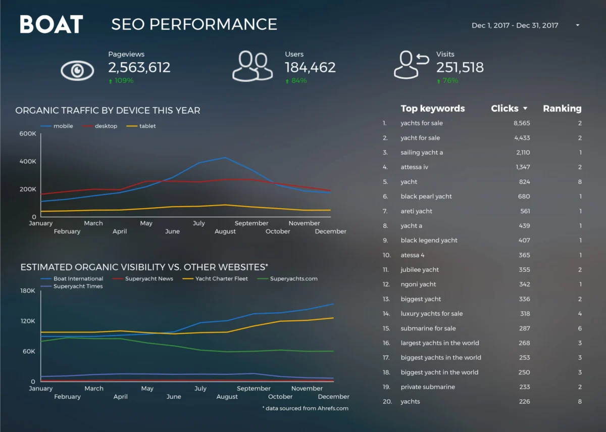
In the corporate sector, the primary value proposition of Google Data Studio lies in its ability to consolidate disparate data streams into a unified “single source of truth.” Historically, business reporting was a labor-intensive process characterized by manual data extraction and formatting. The case of Boat International Media serves as a benchmark for this transition. By implementing a dedicated SEO performance dashboard, the organization reportedly reduced its monthly client reporting timeline from five days to a mere fifteen minutes. This 99% increase in efficiency was achieved through the automation of data connectors, allowing strategists Fanni Takacs and Drew Broomhall to focus on high-level analysis rather than clerical data entry.
The design philosophy adopted by Boat International Media emphasizes the elimination of “data noise.” In a professional journalistic context, this is referred to as “signal-to-noise ratio optimization.” By utilizing clean formatting and focusing on key performance indicators (KPIs), the team ensured that their reports were not only functional for internal review but also aesthetically professional enough to be distributed to high-level stakeholders as PDF exports. This reflects a broader industry trend where the “visual” aspect of data visualization is treated with the same importance as the data itself.
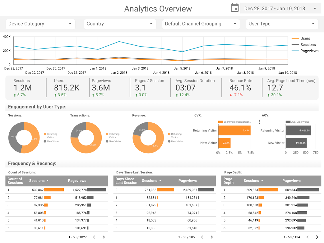
Furthermore, the role of standardized templates has accelerated the adoption of these tools. Organizations like ClickInsight and E-Nor have pioneered Google Analytics (GA) web activity templates that serve as a foundational architecture for businesses. Sunil Attri of E-Nor demonstrated how compact, interactive presentations can provide a comprehensive overview of web traffic without overwhelming the viewer. These templates leverage Google’s native connectors, which bypass the need for third-party middleware, thereby reducing the risk of data latency or security vulnerabilities.

Technical Innovation in Performance Benchmarking
A significant advancement in business visualization is the application of bullet charts for page-level engagement. Traditional gauges and bar charts often fail to provide the necessary context for performance. However, as demonstrated by the team at Analytics Pros, bullet charts allow for a three-layered comparison: current performance, historical data (such as the previous year’s metrics), and predefined benchmark targets.
This methodology provides a nuanced view of “engagement.” Instead of merely tracking sessions or page views, these dashboards incorporate scorecard metrics to measure the duration of user engagement. From a technical standpoint, this requires the integration of calculated fields within Data Studio to derive ratios that are not available in the standard Google Analytics interface. The ability to visualize these complex relationships in real-time has allowed marketing departments to pivot their strategies with greater agility, responding to underperforming content before it impacts the quarterly bottom line.
Data Journalism: Bridging the Gap Between Information and Narrative
Beyond the boardroom, Google Data Studio has emerged as a potent tool for data journalism. The medium allows journalists to present “living” stories that readers can interact with, moving away from the static infographics of the previous decade. One prominent example is the comparative analysis of the Marvel and DC Cinematic Universes. With the global box office for superhero films exceeding $27 billion, the data story provides a financial and critical roadmap of two competing intellectual properties. By embedding these visualizations directly into articles, publishers can offer readers a transparent look at the underlying data, fostering a greater sense of trust and engagement.
The application of data visualization to cultural phenomena extends to the Star Wars franchise. ClickInsight’s report on the “Data Behind Star Wars” demonstrates the capacity for Data Studio to handle non-traditional datasets. By categorizing starship speeds, character demographics, and planetary attributes, the visualization serves as a proof of concept for how complex, multi-dimensional databases can be simplified for a general audience. This type of “edutainment” highlights the versatility of the tool’s filtering capabilities, allowing users to toggle between different “tabs” or views within a single report.
Scaling Data with BigQuery: The GitHub Case Study
One of the most technically rigorous examples of Data Studio’s utility is found in the work of Felipe Hoffa, a Developer Advocate at Google. To answer the question of who contributed most to open-source software in 2017, Hoffa utilized the BigQuery connector to process millions of “PushEvents” published by GitHub.

BigQuery, Google’s serverless data warehouse, is capable of processing petabytes of data using SQL-like queries. By connecting this to Data Studio, Hoffa was able to visualize the contributions of thousands of individuals and companies in a way that would be impossible with traditional spreadsheet software. This visualization confirmed the critical role of corporate entities in the open-source ecosystem and provided a transparent look at the labor behind the modern web. The implication here is significant for the tech industry: data visualization is no longer limited by the size of the dataset, provided the underlying infrastructure can support high-speed querying.
Long-Form Social Analysis: 150 Years of UK Demographics
The transition of data visualization into the realm of social science is perhaps best exemplified by the analysis of marriage and divorce trends in the United Kingdom over a 150-year period. Created by researchers including Lizzie Silvey, this project utilized longitudinal data to map the impact of historical events—such as World Wars and legislative changes—on social structures.
The visualization addresses complex questions regarding why divorce rates spiked at specific historical intervals and how the legal landscape influenced marital stability. From a journalistic perspective, this represents a shift toward “evidence-based history.” By providing a visual timeline of social change, the report allows users to see the direct correlation between policy shifts (such as the Divorce Reform Act of 1969) and statistical outcomes. This level of analysis provides a factual counterpoint to anecdotal evidence often found in social commentary.
A Chronology of Google Data Studio’s Development
To understand the context of these 2018 visualizations, one must look at the rapid development cycle of the platform:
- May 2016: Google introduces Data Studio 360 as part of the Google Analytics 360 Suite, initially targeting enterprise-level clients with a paid model.
- Late 2016: A free version of Data Studio is launched, though it is initially limited to five reports per user, causing some friction in adoption.
- February 2017: In a landmark move for data democratization, Google removes the five-report limit, allowing users to create and share an unlimited number of reports for free. This led to an explosion of community-created content.
- Late 2017: The introduction of Community Connectors allows developers to build bridges to over 500 non-Google data sources, including Facebook Ads, LinkedIn, and Twitter.
- 2018: The platform focuses on “Data Storytelling” features, including improved embedding options and interactive filters, which paved the way for the examples cited in this report.
Broader Impact and Industry Implications
The rise of accessible visualization tools like Google Data Studio has profound implications for the global workforce. We are witnessing the “democratization of the data scientist” role. While deep statistical modeling still requires specialized expertise, the ability to communicate data-driven insights is becoming a required skill for marketers, journalists, and administrators alike.
From a market perspective, the success of Data Studio has forced competitors like Tableau and Microsoft (with Power BI) to re-evaluate their pricing models and ease of use. The “Google Ecosystem” advantage—where data flows seamlessly from a Google Sheet or an AdWords account into a visual dashboard—has created a low barrier to entry that is particularly attractive to small and medium enterprises (SMEs) that previously could not afford high-end business intelligence (BI) software.
Moreover, the shift toward interactive storytelling in journalism suggests a future where “the data is the story.” As public skepticism of media remains high, providing interactive, verifiable data sources allows news organizations to bolster their credibility. Whether it is tracking the financial success of movie franchises or analyzing a century of social trends, the move toward transparent, data-rich reporting is a vital development in the information age.
In conclusion, the visualizations of 2017 and 2018 represent more than just aesthetic achievements; they signify a fundamental change in how we interact with the digital world. By reducing the time required to generate insights and increasing the clarity of complex information, Google Data Studio has established itself as a cornerstone of modern digital strategy and journalistic integrity. As the tool continues to evolve, the boundary between “data” and “narrative” will likely continue to blur, leading to a more informed and data-literate society.