

The digital marketing landscape has undergone a significant transformation over the last decade, transitioning from generalized web presences to hyper-targeted, conversion-focused experiences known as landing pages. As of 2024, the efficacy of these standalone pages has become a cornerstone of high-growth marketing strategies, with data indicating that a polished, professional landing page can substantially improve conversion rates, while a cluttered or poorly designed one can actively diminish brand equity. A landing page, by definition, is a standalone web page created specifically for a marketing or advertising campaign, serving as the destination where visitors "land" after clicking a link in an advertisement, email, or social media post. Unlike homepages, which are designed for exploration and general information, landing pages are engineered with a singular focus: the Call to Action (CTA).

The Evolution of Conversion Rate Optimization
The history of landing pages is deeply intertwined with the rise of Conversion Rate Optimization (CRO). In the early days of the internet, marketers directed all traffic to their homepage, a practice that often led to "analysis paralysis" among users who were overwhelmed by choices. Industry pioneers, including the team at Unbounce, recognized that narrowing the user’s focus could lead to higher engagement. This led to the development of the "Single Conversion Goal" principle, which remains the gold standard for digital advertising today.
Market data supports this shift. Research suggests that landing pages incorporating video elements can increase conversion rates by as much as 86%. Furthermore, the move toward "no-code" builders has democratized the ability to create high-performing pages, allowing small businesses and large enterprises alike to deploy complex marketing funnels in a fraction of the time previously required for manual coding.
Analyzing High-Performing SaaS Landing Pages
Software as a Service (SaaS) companies often lead the way in landing page innovation due to the competitive nature of the industry and the need to explain complex digital products quickly.

Netflix: The Power of Simplicity
Netflix’s landing page is frequently cited by UX designers as a masterclass in minimalist design. By focusing on a killer value proposition—unlimited movies and TV shows—the page removes all friction. With over 300 million subscribers worldwide, Netflix utilizes a simple background and a clear, high-contrast CTA button. The strategy here is to address the primary benefit immediately, ensuring that the user understands the value before they have to scroll.

LinkedIn Premium: Targeted Benefit Alignment
LinkedIn utilizes landing pages to segment its massive user base. Their Premium signup page specifically targets job seekers, highlighting features like "Featured Applicant" status. By aligning the page’s copy with the specific anxieties and goals of a job seeker, LinkedIn increases the perceived value of its paid service.

Calm: Aesthetic and Emotional Resonance
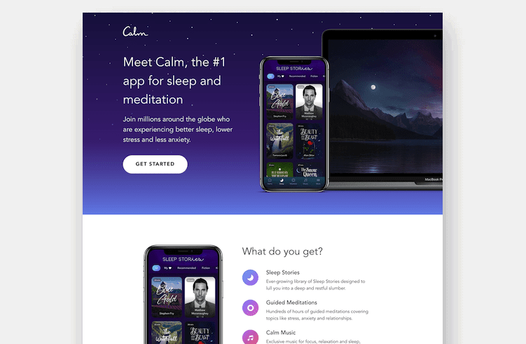
For health and wellness apps like Calm, the landing page must reflect the product’s experience. The use of soothing colors, high-quality nature imagery, and ample white space creates a sense of tranquility before the user even downloads the app. This emotional priming is a sophisticated psychological tactic used to align the brand’s promise with the visitor’s immediate experience.

Ecommerce and the Visual Journey
In the ecommerce sector, landing pages serve as digital storefronts that must work harder than traditional product pages to secure a sale or a lead.

Western Rise: High-Resolution Storytelling
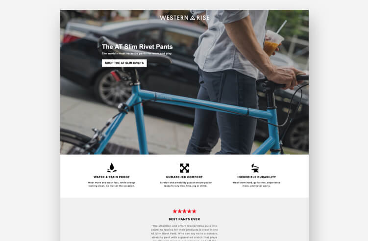
Clothing brand Western Rise uses its landing pages to bridge the gap between "lifestyle" and "utility." Through high-resolution photography and video backgrounds, the brand demonstrates the durability and fit of its apparel. Journalistic analysis of ecommerce trends shows that "benefit-driven" visuals—showing the product in action rather than just on a white background—significantly reduces the "bounce rate" of mobile users.

Goby: Establishing Trust through Social Proof
Goby, an electric toothbrush brand, leverages accolades and money-back guarantees to build immediate trust. For a direct-to-consumer (DTC) brand, overcoming the initial skepticism of a new customer is paramount. Their landing page features "as seen in" logos and customer testimonials, providing the necessary social proof to convert a window shopper into a buyer.

The Role of Marketing Agencies in Professional Design
Professional marketing agencies such as Webistry, MuteSix, and ConversionLab have become instrumental in pushing the boundaries of what a landing page can achieve. These agencies often utilize A/B testing—a method of comparing two versions of a webpage against each other to determine which performs better—to refine every element from headline font to button color.

The Webistry Approach: Panda7 and Perfect Keto
Agency-led designs for brands like Panda7 (insurance) and Perfect Keto (nutrition) demonstrate a focus on "friction reduction." For Panda7, the goal is to make the notoriously tedious process of getting car insurance seem fast and easy. For Perfect Keto, the emphasis is on nutritional transparency, highlighting "net carbs" to appeal to the specific dietary needs of their target audience.

ConversionLab: HomeLoanGurus and Campaign Monitor
ConversionLab’s work on HomeLoanGurus highlights the importance of the "Above the Fold" rule. By placing the most critical information and the primary lead form in the top section of the page, they ensure that users who do not scroll still have the opportunity to convert. This is particularly vital for mobile users, who represent an increasing share of web traffic.
Fundamental Elements of a Successful Landing Page
To achieve high conversion rates, professional marketers adhere to a set of core principles:
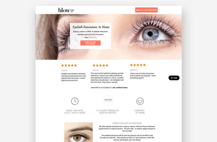
- Headline-Ad Match: The headline of the landing page should mirror the copy of the ad that brought the visitor there. This provides a "seamless transition" and confirms to the user that they are in the right place.
- Clear Value Proposition: Within seconds, a visitor should understand what is being offered and why it is beneficial to them.
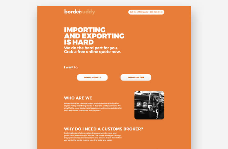
- Single CTA: Multiple competing goals can confuse the visitor. A single, clear action (e.g., "Sign Up Now," "Get a Quote") is essential.
- Social Proof: Testimonials, reviews, and trust badges help mitigate the perceived risk of a transaction.
- Mobile Optimization: With more than half of global web traffic coming from mobile devices, a page that does not load quickly or display correctly on a smartphone is a liability.
Chronology of a Landing Page Launch
The process of bringing a high-converting page to life follows a logical progression:
- Phase 1: Goal Identification. Defining whether the page is for lead generation, click-through to a sales page, or direct purchase.
- Phase 2: Audience Research. Identifying the pain points and motivations of the target demographic.
- Phase 3: Copywriting and Wireframing. Crafting the message and sketching the layout before adding visual elements.
- Phase 4: Design and Development. Using builders like Unbounce to create the page, integrating brand colors and high-quality assets.
- Phase 5: Integration. Connecting the page to CRM systems (like Salesforce or HubSpot) and email marketing tools.
- Phase 6: Testing and Iteration. Launching the page and using A/B testing to optimize performance based on real-world data.
Broader Impact and Industry Implications
The shift toward specialized landing pages has broader implications for the global economy and the future of digital commerce. By lowering the barrier to entry for effective marketing, small businesses can now compete with multinational corporations. A well-designed landing page allows a niche artisan or a local service provider to present a professional image that rivals that of a Fortune 500 company.
Furthermore, the integration of Artificial Intelligence (AI) into landing page builders is the next frontier. AI-driven tools can now suggest headlines, generate images, and even automatically adjust page layouts in real-time based on the visitor’s past behavior. This level of personalization was previously reserved for tech giants like Amazon or Facebook but is now becoming accessible to the general marketing public.

In conclusion, the 40 examples highlighted—ranging from the minimalist brilliance of Netflix to the community-focused design of Snackpass—serve as a blueprint for modern marketing success. While no single template fits every industry, the underlying principles of clarity, trust, and focus remain universal. As digital competition intensifies, the ability to create and optimize high-converting landing pages will remain a critical skill for any business looking to grow in the 21st century. Professionalism in this space is not merely about aesthetics; it is about creating a functional, user-centric environment that facilitates a mutually beneficial exchange between a brand and its audience.







