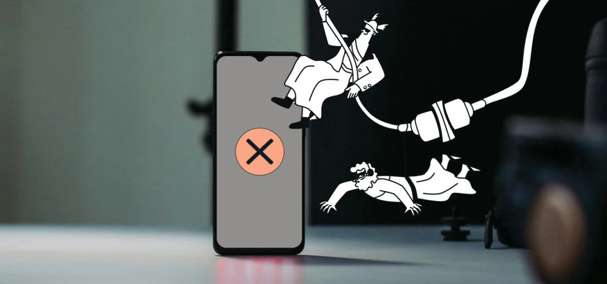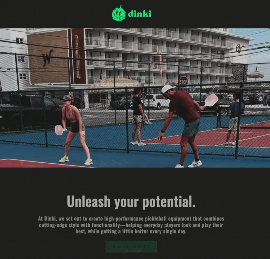
Popup forms, those small overlay windows designed to capture email addresses on websites, represent a double-edged sword in the realm of digital marketing. When implemented judiciously, they are arguably the most efficient mechanism for rapidly expanding an email subscriber list. Conversely, a poorly executed popup strategy can swiftly alienate visitors, leading to high bounce rates and diminished brand perception. The critical distinction between these outcomes lies not in the mere presence of a popup, but in its strategic deployment: precisely when, where, and how often it appears.
The prevalent failure of many popup forms stems from their indiscriminate application. Often, they are programmed to appear prematurely, with excessive frequency, and across every page of a website. This approach intercepts visitors before they have even engaged with the site’s content, transforming a potential conversion opportunity into an unwelcome interruption. In a competitive digital landscape, such tactics are counterproductive, prioritizing immediate data collection over a respectful and engaging user experience. The objective, therefore, is to craft popup forms that not only convert but also demonstrate an acute awareness of the user’s journey and intent.
The Evolution of Lead Capture: From Intrusive to Intelligent
The history of online lead generation has seen a significant evolution, mirroring the broader development of the internet itself. Early iterations of popups, often called "pop-ups" (opening in a new window) or "pop-unders" (appearing behind the current window), were notoriously aggressive. They prioritized sheer visibility over user experience, frequently appearing without warning and making it difficult for users to close them. This led to widespread user frustration and the development of browser-level popup blockers.
As digital marketing matured, the focus shifted towards more integrated and less disruptive methods. The contemporary "popup form" typically overlays the current page content rather than opening a new window, offering a more controlled experience. However, the fundamental challenge of balancing conversion goals with user comfort persisted. The advent of sophisticated analytics and A/B testing allowed marketers to refine their strategies, moving away from a "spray and pray" approach to a more data-driven, user-centric model. This evolution underscores a critical industry realization: long-term subscriber growth and brand loyalty are intrinsically linked to positive user interactions.

Leveraging AI for Streamlined Popup Development
In an effort to simplify and optimize the creation of high-converting, user-friendly popups, platforms like AWeber have introduced advanced tools such as the AI Signup Form Builder. This innovation addresses a significant pain point for businesses, particularly those without dedicated design or development teams. The AI builder enables users to generate an entire popup form simply by describing their requirements in natural language. For instance, a command like, "I run a marketing blog. Offer a free email checklist. Show the form after 30 seconds," prompts the AI to generate the complete copy, design, layout, and necessary input fields. This functionality significantly reduces the time and technical expertise required to deploy effective lead capture mechanisms.
Once generated, these AI-designed forms seamlessly integrate with existing email marketing lists, automating the subscriber addition process and initiating pre-built automation sequences. This integration eliminates the need for manual coding, external design software, or third-party plugins, streamlining the entire lead capture workflow. While AI tools accelerate the design phase, the underlying principles of effective popup strategy remain constant, dictating the success of both AI-generated and manually crafted forms.
Core Principles of Effective Popup Design
Successful popup forms adhere to several fundamental design tenets that prioritize clarity, value, and minimal friction for the user.
-
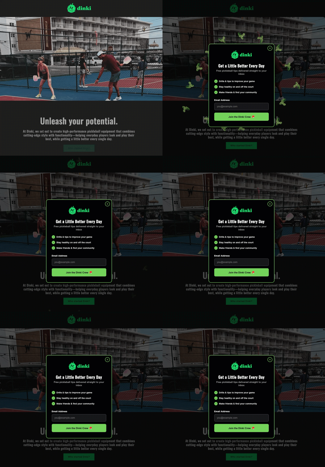
Specific and Value-Driven Headlines: The headline of a popup form is its most crucial element, serving as the immediate value proposition. It must communicate what the visitor stands to gain in ten words or less. Generic calls to action such as "Subscribe to our newsletter" are demonstrably less effective than specific offers like "Get the weekly marketing checklist." The objective is to convey the deliverable explicitly, ensuring the visitor comprehends the benefit before engaging further. Industry data consistently shows that specificity in headlines can boost conversion rates by an average of 15-20%, as users are more likely to commit when the perceived value is clear and immediate.
-
Strategic Value Statements (Optional): A concise, one-sentence value statement positioned below the headline can provide additional context, urgency, or credibility. Phrases like "Sent to your inbox in 60 seconds" or "Trusted by 5,000+ small business owners" can subtly influence a visitor’s decision. This element is particularly useful when the headline alone might lack sufficient persuasive power. However, if the headline is robust and self-explanatory, omitting this statement can maintain brevity and prevent information overload.
-
Minimal Form Fields: The cardinal rule for popup forms is simplicity. For initiating an email relationship, typically only the email address field is necessary. If personalization is a key strategy, adding a name field can be justified, but this should be considered the absolute maximum. Research indicates a direct inverse relationship between the number of form fields and completion rates; each additional field can reduce conversions by several percentage points. More extensive data, such as demographic information or preferences, should be collected progressively through subsequent interactions, such as welcome emails or dedicated preference centers, rather than at the initial point of contact. This "progressive profiling" approach respects the user’s time and reduces friction.
-
Action-Oriented Call to Action (CTA) Language: The button text of a popup form is the final prompt for conversion. It should employ action-oriented language that reinforces the offer. "Send me the checklist" consistently outperforms generic terms like "Submit." Furthermore, studies in conversion rate optimization frequently demonstrate that first-person language (e.g., "Get my free guide") often yields higher conversion rates than second-person language (e.g., "Get your free guide"). The CTA should be a specific, direct command that aligns perfectly with the value proposition presented in the headline.
-
Obvious and Respectful Close Button: A critical, yet often overlooked, design element is a clear and easily accessible close option. The close button should not be a tiny, obscure "X" hidden in a corner, nor should it employ "guilt-tripping" language such as "No, I don’t want more customers." Providing a prominent and straightforward way for visitors to dismiss the popup demonstrates respect for their autonomy. Trapping visitors or making it difficult to exit not only degrades the user experience but also erodes trust, potentially causing them to abandon the site entirely. A visible close option indicates that the website prioritizes user choice, fostering a more positive brand perception.
Strategic Timing: The Difference Between Helpful and Hostile
The timing of a popup’s appearance is paramount, determining whether it is perceived as a helpful resource or an unwelcome intrusion. A popup that appears within the first few seconds of a visitor landing on a page signals that the site’s primary concern is email capture rather than content engagement. Conversely, a popup that emerges after a visitor has demonstrated genuine interest – perhaps by scrolling halfway down a page or spending a significant amount of time reading – is more likely to be received positively.
The three most effective and widely adopted triggers for popup forms are scroll depth, time on page, and exit intent.
-
Scroll-Based Triggers: These triggers activate a popup once a visitor has scrolled through a predetermined percentage of the page content. For informational content such as blog posts, a scroll depth of 40% to 60% is often optimal. This threshold indicates that the visitor has consumed enough content to form an opinion about the site’s value and is likely engaged. This method avoids interrupting users who quickly realize the content isn’t for them, targeting those who have already invested time.
-
Time-Based Triggers: Time-based triggers deploy the popup after a specific number of seconds have elapsed since the visitor landed on the page. An interval of 15 to 30 seconds generally provides sufficient time for most visitors to engage with the content. Anything under 10 seconds typically feels aggressive and can pre-empt user engagement. The ideal timing can vary significantly based on content type and average user session duration, requiring careful A/B testing to optimize.
-
Exit-Intent Triggers: Considered one of the least intrusive and most effective popup strategies, exit-intent triggers detect when a visitor’s cursor movements indicate an intention to leave the page (e.g., moving towards the browser’s close button or address bar). The popup appears precisely at this moment, offering a final opportunity to capture their interest before departure. Exit-intent popups consistently achieve higher conversion rates than time-based popups because they do not interrupt the active reading or browsing experience. They target users who are already disengaging, providing a last-chance value proposition. Industry benchmarks often show exit-intent popups converting at rates 2-4 times higher than other trigger types.
An advanced strategy involves combining these triggers. For highly engaged readers, a scroll-based popup might be deployed. For all other visitors who eventually decide to leave, an exit-intent popup can serve as a safety net. This multi-trigger approach ensures that the offer is presented at a point of maximum receptiveness for different user behaviors.
Frequency Capping: Respecting User Decisions
One of the quickest ways to train visitors to abandon a site is to repeatedly display the same popup immediately after they have closed it. Implementing a frequency cap is essential for maintaining a positive user experience. A common practice is to set the popup to appear once per session, or once every seven days for a more conservative approach.
Persistent, repetitive popups do not magically convert resistant visitors; instead, they reinforce a negative impression and confirm the user’s decision to leave. This can lead to "popup blindness," where users instinctively close popups without even reading them, or worse, they may leave the site out of sheer annoyance. Respecting a visitor’s decision to close a popup, at least for the remainder of their current visit, is fundamental to building trust and fostering a positive long-term relationship.
Targeting Strategies: Relevance and Responsiveness
The effectiveness of a popup form is also heavily influenced by its relevance to the specific content being viewed and the device being used.
-
Page Targeting: Not every page on a website warrants a popup, and a one-size-fits-all approach dilutes impact and frustrates users. Popups should be strategically matched to the content on the page. For example, a popup offering a "blog writing checklist" is highly relevant and valuable on a post discussing content marketing strategies, but entirely inappropriate on a pricing page or a "contact us" page. Generic "join our newsletter" popups are inherently less effective than targeted offers that align with the user’s current interest. By offering resources directly relevant to the content being consumed (e.g., an email automation guide on a post about email automation), businesses can significantly increase conversion rates and demonstrate a deeper understanding of their audience’s needs.
-
Device Targeting and SEO Implications: The behavior of popups differs significantly between desktop and mobile devices. A popup that functions well on a desktop monitor can become a full-screen, intrusive obstruction on a smartphone. This distinction is not merely an aesthetic concern but a critical SEO factor. Since January 2017, Google has explicitly identified "intrusive mobile interstitials" as a negative ranking signal. Full-screen popups that immediately cover all content upon mobile page load can adversely affect a website’s search engine rankings. However, popups triggered by time delays, scroll depth, or exit intent are generally not penalized, as they are considered less intrusive or appear after the user has engaged. Therefore, best practice dictates using smaller, less intrusive formats like banners or slide-ins on mobile devices, reserving full-screen popups for desktop users. Regardless of device, the close button must be easily discoverable and tappable.

Advanced Popup Formats for Enhanced Engagement
Beyond standard overlay forms, several advanced popup formats leverage psychological principles to boost engagement and conversions:
-
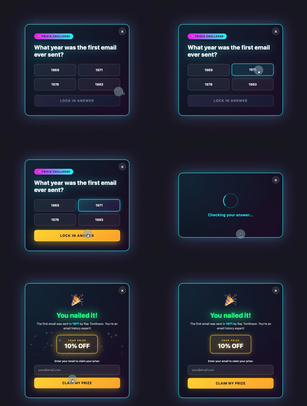
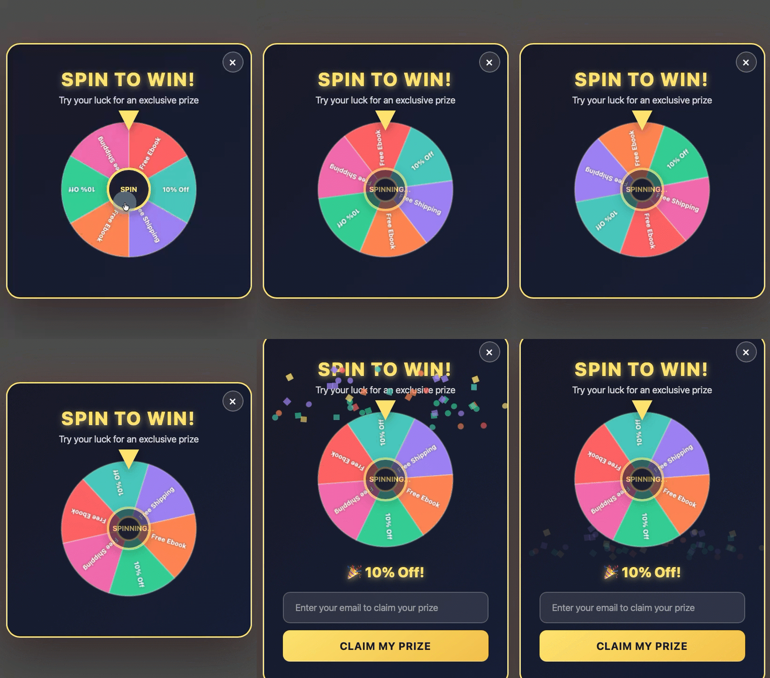
Gamified Popups: These forms transform the lead capture process into an interactive experience, such as a quiz, trivia question, or a "spin-to-win" wheel. By introducing an element of play and reward, visitors are encouraged to engage before being presented with the email field. This approach leverages intrinsic motivation and the thrill of potential reward, making the act of providing an email address feel less like a transaction and more like part of an enjoyable interaction.
-
Discount Offer Popups: Often implemented as exit-intent triggers, these popups offer a discount, coupon, or special prize (sometimes via a gamified wheel) just as a visitor is about to leave. The visitor enters their email address to claim the reward, providing a compelling last-minute incentive to convert, particularly for e-commerce sites experiencing cart abandonment. This strategy taps into the fear of missing out (FOMO) and the desire for a good deal.
-
Multi-Step Forms: Multi-step forms break down the conversion process into smaller, less daunting steps. The visitor makes a low-commitment decision first (e.g., answering a simple question or selecting a preference) before being presented with the email field. By the time they reach the email input, they have already invested some effort and are psychologically more committed to completing the process. This "foot-in-the-door" technique reduces perceived friction and can significantly improve completion rates for more complex offers.
-
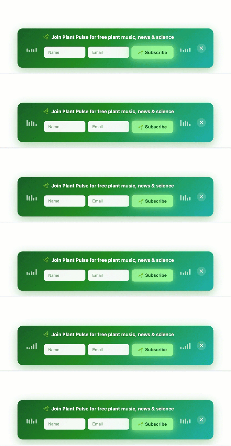
Sticky Bars: A sticky bar is a thin, non-intrusive banner fixed to the top or bottom of the page. It remains visible as the user scrolls, offering a persistent yet unobtrusive call to action. These bars typically contain a concise offer and an email field or a button leading to a form. They are an excellent alternative for mobile devices or for websites that prioritize an uninterrupted reading experience, as they never block the main content.
The versatility of modern AI-powered form builders, such as AWeber’s, allows businesses to experiment with these advanced formats without extensive technical overhead. By simply describing the desired format and timing, these tools democratize access to sophisticated lead generation strategies, enabling businesses of all sizes to implement highly effective and user-friendly popups.
Conclusion: The Strategic Imperative of User-Centric Popups
The contemporary digital landscape demands a sophisticated approach to lead generation. While popup forms remain an invaluable tool for email list growth, their efficacy is entirely dependent on strategic, user-centric implementation. The days of aggressive, omnipresent popups are over, replaced by a nuanced understanding of timing, relevance, and user psychology.
By adhering to best practices in design—employing clear headlines, minimal fields, and action-oriented CTAs—and by deploying forms intelligently through scroll, time, or exit-intent triggers, businesses can transform popups from interruptions into helpful, contextually relevant offers. Furthermore, respecting user decisions through frequency capping and tailoring forms for different devices and page content not only optimizes conversion rates but also reinforces brand credibility and improves overall user experience. The integration of AI tools further empowers businesses to implement these advanced strategies efficiently, ensuring that lead capture aligns with, rather than detracts from, the overarching goal of building lasting customer relationships in the digital age.