In the rapidly evolving landscape of global digital retail, the category page—often referred to as the Product Listing Page (PLP)—has emerged as the critical architectural hinge between initial discovery and final conversion. While much of the industry’s focus traditionally centers on the homepage for brand storytelling or the Product Detail Page (PDP) for conversion, data from leading user experience (UX) research firms suggests that the category page is where the most significant drop-offs in the customer journey occur. As e-commerce sales are projected to reach new heights globally, the necessity of refining these middle-funnel interfaces has become a top priority for digital strategists and conversion rate optimization (CRO) specialists.
The Evolution of Digital Navigation: A Chronology of the Category Page
The history of e-commerce navigation has undergone several distinct phases, moving from simple digital catalogs to the highly sophisticated, data-driven environments seen today. In the early 2000s, category pages were little more than static lists of hyperlinks. By 2010, the "Grid View" became the industry standard, popularized by early giants like Amazon and eBay. However, as mobile traffic began to surpass desktop traffic in the mid-2010s, the "Infinite Scroll" and "Faceted Search" became the dominant paradigms.
Today, we are entering the era of "Intent-Based Categorization." This phase recognizes that a visitor’s needs on a category page are not monolithic. Modern design must account for a spectrum of user intents, ranging from casual window shopping to urgent, specific procurement. Industry analysts note that brands failing to adapt to these shifting user expectations see a direct correlation with rising exit rates and diminishing return on ad spend (ROAS).
Defining Strategic Purpose: Browsing, Deciding, and Buying
Before a single line of code is written or a layout is adjusted, stakeholders must define the specific psychological role a category page plays in the user journey. Most digital storefronts serve three primary functions, each requiring a distinct design philosophy.
Browsing-Focused Interfaces
On pages where the primary goal is browsing, users are essentially asking, "What are my options, and where should I focus next?" The cognitive load at this stage should remain low. Research indicates that introducing high-commitment conversion actions, such as an "Add to Cart" button, can paradoxically decrease sales on browsing-focused pages. When a user is prompted to make a final purchase decision before they have fully explored their options, it creates "decision conflict." This interruption causes friction, leading the user to slow down, backtrack, or abandon the site entirely rather than moving forward in the funnel.

Decision-Centric Layouts
For users who have narrowed their search but are comparing two or three specific items, the category page must transition into a comparison tool. This involves highlighting key differentiators—such as price, rating, and primary features—directly within the grid view. In this context, the page acts as a filter, helping the user discard irrelevant options.
Direct Conversion Paths
In certain niche markets or for repeat purchasers, the category page serves as a "Quick Buy" portal. For commodity goods—such as office supplies or basic apparel—an "Add to Cart" button is not a distraction but a convenience. The challenge for modern e-commerce managers is identifying which of these three roles their specific audience requires at any given moment.
The Intersection of User Intent and Business Objectives
A common pitfall in digital design is focusing exclusively on what the brand wants the user to do (e.g., "Buy Now") while ignoring what the visitor expects to find. A professional audit of user behavior often reveals a disconnect: while a brand may want to push a specific high-margin item, the visitor may be looking for technical specifications that are hidden two clicks away.
Market data suggests that for high-involvement purchases—such as electronics or luxury furniture—the majority of users will not purchase directly from a category page. They require the detailed information, social proof, and high-resolution imagery found on the Product Detail Page. Conversely, for low-involvement or repeat purchases, a streamlined "Add to Cart" functionality on the category page can increase conversion rates by up to 15%. The most successful digital retailers utilize a hybrid approach, offering "Quick View" modals that provide essential details without forcing the user to leave the category environment.
Leveraging Analytics to Identify Design Failures
To determine the efficacy of a category page, digital analysts look beyond simple conversion rates. The "Exit Rate" is perhaps the most telling metric. While a high exit rate on a "Thank You" page is expected, a high exit rate on a category page is a red flag indicating a failure in navigation or relevance.
Industry benchmarks suggest that a healthy category page should have an exit rate close to the site’s average. If the rate is significantly higher, it suggests that visitors are hitting a dead end. This could be due to several factors:
- Information Overload: Too many products without adequate filtering.
- Slow Load Times: Category pages with high-resolution images can often lag, leading to abandonment.
- Lack of Visual Hierarchy: The eye does not know where to land, causing "choice paralysis."
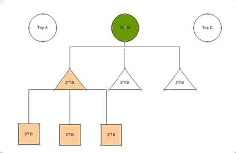
The Rule of Three: Structural Hierarchy in Information Architecture
A fundamental principle in e-commerce UX is the "at least one level further" rule. Broad categories, such as "Electronics" or "Home Decor," are often too vast to be useful. However, there is a limit to how deep a hierarchy should go. UX experts generally recommend a maximum of three levels of sub-categories.
As a visitor navigates through these levels, the interface should dynamically highlight "child" categories. For instance, if a user clicks on "Computers," the page should immediately present visual cues for "Laptops," "Desktops," and "Tablets." This progressive disclosure keeps the interface clean while guiding the user toward a more specific selection.
Feature-Based Navigation and the Power of Filters
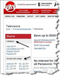
Consumers frequently shop based on specific attributes rather than brand names. In a study of consumer electronics shoppers, it was found that resolution and screen size were the primary drivers for television purchases, often outweighing brand loyalty.
Effective category pages must therefore implement robust faceted search capabilities. These filters should be context-specific:
- For Books: Filter by genre, format (hardcover vs. audiobook), and release date.
- For Fashion: Filter by size, color, material, and occasion.
- For Technical Goods: Filter by wattage, dimensions, and compatibility.
When a retailer like Best Buy or the now-defunct Circuit City implemented need-based filtration—such as "Gaming" vs. "Home Office"—they were leveraging psychographic segmentation. This allows the user to self-select into a category based on their specific problem rather than a technical specification they might not fully understand.
Reducing Information Asymmetry through Buying Guides
For complex product categories, the category page should serve an educational purpose. Information asymmetry—where the seller knows more about the product than the buyer—often leads to "buyer’s remorse" or hesitation. To combat this, leading e-commerce sites are increasingly integrating buying guides or "wizards" directly into their category pages.
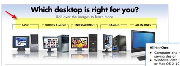
These tools act as digital sales assistants, asking the user a series of questions to narrow down the most appropriate sub-category. This not only improves the user experience but also positions the brand as an authority in the space, fostering trust and long-term loyalty.
The Scientific Approach: A/B Testing and Heatmapping
The final and most crucial step in category page optimization is the rejection of "gut feeling" in favor of data-driven iteration. Digital environments are dynamic; what worked for a holiday sale in December may not work for a clearance event in July.
Tools such as heatmaps (which track where users click and scroll) and session recordings provide invaluable insights into how users actually interact with category layouts. A common discovery in heatmapping is that "Need-Based" filters at the top of a page—while logically sound—are often ignored by users who prefer the traditional sidebar. In such cases, the data dictates that the prime real estate at the top of the page should be used for something else, such as high-performing sub-category icons or promotional banners.
Broader Implications and Future Trends
As we look toward the future of e-commerce, the category page is set to become even more personalized. With the advent of Artificial Intelligence and Machine Learning, we can expect "Dynamic Reordering," where the products displayed on a category page are tailored to the individual user’s browsing history and predicted preferences in real-time.
Furthermore, the rise of "Headless Commerce"—the decoupling of the front-end presentation layer from the back-end commerce engine—allows for faster, more experimental category page designs. This agility will be essential as brands compete in an increasingly crowded global marketplace.
In conclusion, the optimization of e-commerce category pages is not a one-time task but a continuous process of alignment between user intent and design execution. By defining the page’s purpose, leveraging deep analytics, and committing to rigorous testing, brands can transform these often-overlooked pages into powerful engines for growth and customer satisfaction. The difference between a mediocre category page and a strategically optimized one is often the difference between a bounced visitor and a loyal customer.