The landscape of digital journalism and data analysis has undergone a significant transformation with the introduction of advanced embedding features within Google Data Studio, a move that empowers content creators to integrate live, interactive reports directly into their editorial environments. This development addresses a long-standing limitation in the field of data visualization where analysts were often forced to rely on static screenshots or external links, which frequently disrupted the reader’s journey and diminished engagement. By allowing iFrame-based embedding, Google has provided a mechanism for journalists to present complex datasets—such as the ongoing box-office and critical performance rivalry between Marvel and DC Comics—in a format that is both accessible and responsive to various device categories.
The Evolution of Data Presentation in Digital Media
For years, data journalists faced a technical hurdle: the “siloing” of interactive content. A data scientist or analyst might spend weeks crafting a sophisticated dashboard in a business intelligence tool, only to find that the primary method of sharing those insights on a public-facing blog or news site was via a low-resolution JPEG or a hyperlink that took the user away from the article. This “suboptimal” experience, as noted by industry experts, often led to high bounce rates and a failure to communicate the depth of the underlying data.
The update to Google Data Studio represents a shift toward a more integrated web experience. By enabling report embedding, Google allows for the creation of “data stories” where the narrative text and the interactive evidence coexist. This is particularly relevant in the context of high-interest topics like the “Marvel vs. DC war” on the big screen, where fans and analysts alike demand granular details regarding budget, box office revenue, and critical reception across dozens of films.
Chronology of the Marvel vs. DC Cinematic Rivalry
To understand the practical application of these embedding tools, one must look at the data being visualized. The rivalry between Marvel Studios (under Disney) and DC Films (under Warner Bros.) has become the definitive case study for franchise management in the 21st century.
The chronology of this data story began in earnest in 2008 with the release of Iron Man, which launched the Marvel Cinematic Universe (MCU). Since then, the dataset has expanded exponentially. By 2017, the period during which the embedding feature was popularized, the MCU had already established a dominant lead with over 15 interconnected films. DC, attempting to catch up with its DC Extended Universe (DCEU), launched Man of Steel in 2013, followed by a rapid succession of titles including Batman v Superman: Dawn of Justice, Suicide Squad, and the critically acclaimed Wonder Woman.
The inclusion of five new movies in recent updates—such as Guardians of the Galaxy Vol. 2, Spider-Man: Homecoming, and Justice League—added new layers to the visualization. Analysts using Google Data Studio were able to show, in real-time, how Marvel’s consistent “winning” streak in terms of average Rotten Tomatoes scores compared to DC’s more volatile critical reception, even as both franchises continued to generate billions in global revenue.
Technical Implementation: Enabling Interactive Reports
The process of transitioning from static imagery to interactive embedding involves several critical technical steps designed to ensure both security and accessibility. According to technical documentation and practical applications, the workflow for analysts involves a three-stage process:
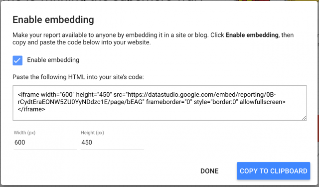
- Enabling Embedding Permissions: Within the Google Data Studio interface, users must explicitly grant permission for a report to be embedded. This is a security measure to prevent unauthorized sites from scraping proprietary data.
- Adjusting Sharing Settings: For a report to be visible to the general public, the sharing settings must be updated to “Public on the web” or “Anyone with the link can view.” Failure to synchronize these settings often results in broken iframes for the end-user.
- Configuring Iframe Dimensions: The tool provides an HTML snippet (an iframe) that can be adjusted for width and height. To maintain a professional look, journalists must align these dimensions with their website’s content area—typically around 640px for standard blog layouts.
A crucial aspect of this implementation is the “Fit to Width” display mode. Given that modern audiences access news via a spectrum of devices—from high-resolution desktop monitors to compact smartphones—responsiveness is no longer optional. The “Fit to Width” setting ensures that the visualization scales appropriately, maintaining legibility and interactivity regardless of the user’s hardware.
Supporting Data: Analyzing the “Marvel vs. DC” Insights
When examining the data through an embedded lens, several key trends emerge that define the current state of the superhero genre. As of the latest updates provided by analysts, the MCU generally outperforms the DCEU in terms of Return on Investment (ROI) and critical consistency.
- Marvel’s Consistency: The MCU has maintained a high floor for critical reception, with very few films falling below the “Fresh” threshold on review aggregators. This consistency has created a “brand halo” effect, where audiences are more likely to attend a film based on the franchise name alone.
- DC’s Peak and Valley Strategy: DC’s data shows more significant fluctuations. While films like Wonder Woman achieved critical and commercial heights comparable to Marvel’s best, other entries faced steep second-week box office drops and polarized reviews.
- The Volume Factor: By 2017, Marvel had a significantly larger sample size. The “5 new movies” update mentioned in the source material highlighted how Marvel was able to release multiple films per year without succumbing to “superhero fatigue,” a phenomenon often speculated upon by industry critics but rarely supported by the actual revenue data.
Breaking Down Data for Digestibility
A significant insight for data journalists is the strategy of “breaking down” a massive visualization into digestible chunks. A single, comprehensive dashboard containing 20 different charts can be overwhelming for a reader and may slow down page load times.
Modern best practices suggest embedding specific pages of a report to highlight individual insights. For example, a journalist might embed a single chart comparing the box office of Spider-Man: Homecoming against Wonder Woman in one section of an article, while saving a comprehensive table of all franchise budgets for the conclusion. Currently, Google Data Studio requires the creation of separate reports or the use of multi-page navigation within a single iframe to achieve this, a “piece of cake” for analysts familiar with the platform but a necessary consideration for editorial planning.
Industry Reactions and Broader Implications
The ability to embed live data has seen a positive reception from the data journalism community. Organizations such as ProPublica and the Associated Press have long advocated for “show your work” journalism, where the raw data behind a headline is accessible to the reader. Google’s democratization of these tools allows smaller outlets and independent analysts to compete with the visualization departments of major newspapers.
The implications of this technology extend beyond the film industry. In political journalism, live-embedded reports allow for real-time election result updates. In finance, they enable the tracking of market fluctuations within an editorial context. The common thread is the empowerment of the reader; they are no longer passive consumers of a static narrative but active participants who can filter, hover, and drill down into the data to form their own conclusions.
Conclusion: The Future of Interactive Narratives
As the “Marvel vs. DC” war continues to evolve with new phases and cinematic universes, the tools used to track their progress will become increasingly sophisticated. The transition from static screenshots to embedded, responsive Google Data Studio reports marks a significant milestone in the maturity of digital storytelling.
For analysts and journalists, the goal remains clear: to share insights quickly and effectively. By merging the “passion for data visualization” with “the art of the story,” creators are making the internet a more informed and interesting place to read. The “referee” in the fight between rival franchises—and indeed, in the fight for reader attention—is no longer just the author’s opinion, but the data itself, presented transparently and interactively for all to see. In this new era of digital media, the ability to “play with the data” is what transforms a simple article into an authoritative resource.