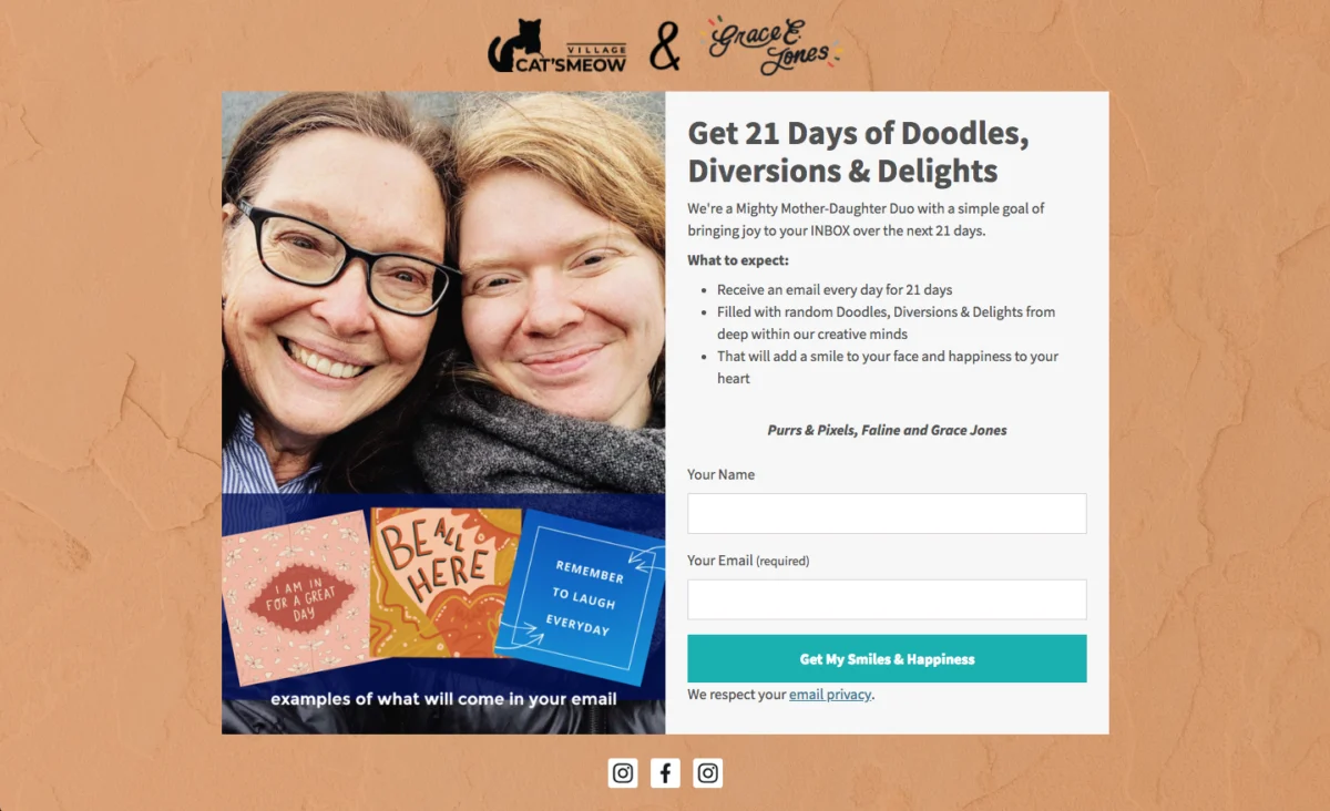
The email signup form stands as a pivotal gateway between a casual website visitor and a potential long-term subscriber, fundamentally dictating the growth and vitality of an email list. Far from a mere formality, its design, placement, and persuasive content are critical determinants in converting fleeting interest into enduring engagement. This article delves into the proven methodologies and psychological principles that underpin high-converting email signup forms, offering a comprehensive guide for businesses aiming to enhance their digital outreach.
The Enduring Significance of Email Marketing and List Building

In an era dominated by transient social media trends and ever-changing algorithm priorities, email marketing remains a steadfast and highly effective channel for direct communication and relationship building. Unlike rented digital spaces, an email list represents owned media, providing businesses with direct access to their audience, independent of external platforms. This direct line fosters stronger customer relationships, facilitates targeted marketing campaigns, and consistently delivers a high return on investment (ROI). Data consistently demonstrates that email marketing outperforms many other digital channels in terms of conversion rates and customer retention. According to various industry reports, the average ROI for email marketing ranges from $36 to $42 for every dollar spent, underscoring its unparalleled value. Consequently, the initial point of contact – the signup form – becomes the linchpin of this strategic advantage, necessitating meticulous attention to its construction and deployment.
Typology and Strategic Application of Email Signup Forms
Effective list building is not a one-size-fits-all endeavor; it requires a nuanced understanding of various signup form types, each serving distinct purposes and suited for different stages of the visitor journey. The optimal choice hinges on the desired user experience, content context, and conversion objectives.
-
Inline Forms:
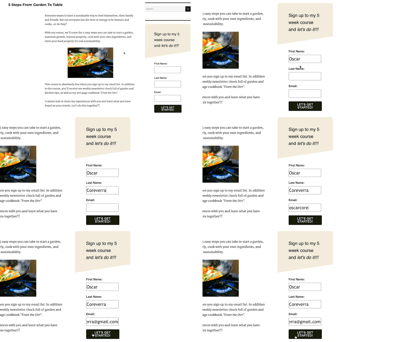
Inline signup forms are seamlessly integrated within the natural flow of a webpage’s content, appearing as an organic component of the user’s reading or browsing experience. They can be strategically placed at the top of a blog post, embedded within the body of an article, positioned in a sidebar, or situated at the bottom of content. Their primary advantage lies in their non-intrusive nature, allowing visitors to engage with the primary content before being prompted to subscribe. This contextual relevance often leads to higher-quality leads, as the visitor is already demonstrating interest in the surrounding subject matter. For instance, an inline form offering a downloadable guide on "advanced SEO techniques" embedded within an article discussing "beginner SEO tips" provides immediate, relevant value to an engaged reader. While inline forms may exhibit slightly lower conversion rates compared to more assertive pop-up forms (industry averages often show inline forms converting between 0.5% and 2%), their ability to capture highly qualified leads who have actively consumed content makes them indispensable for content-heavy websites. They are particularly effective when combined with a compelling lead magnet that directly complements the page’s theme.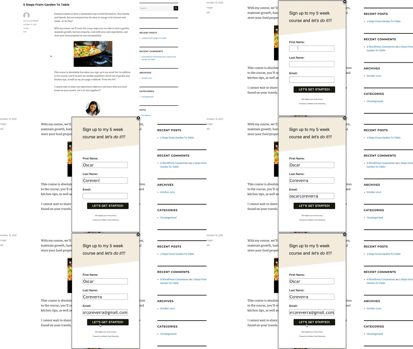
-
Pop-up Forms:
Pop-up forms are designed to command immediate attention by appearing dynamically over or alongside webpage content at predefined junctures during a user’s visit. Their effectiveness stems from their prominence, making it difficult for visitors to overlook the subscription opportunity. Various iterations allow for tailored deployment:- Time-Delayed Pop-ups: These forms emerge after a user has spent a specified duration on a page, allowing initial content consumption before the subscription prompt. Analyzing web analytics to determine average time on page is crucial for setting an optimal delay, typically just before the average session duration to maximize visibility without premature interruption.
- Scroll-Delayed Pop-ups: Activated once a user scrolls to a certain percentage of a page, these forms capitalize on demonstrated engagement. A visitor who has scrolled halfway or more down a page is likely invested in the content, making them more receptive to an offer.
- Exit-Intent Pop-ups: Perhaps one of the most powerful pop-up variations, exit-intent forms are triggered when a user’s mouse movement indicates an intention to leave the website. This represents a final opportunity to capture a potentially lost lead, often by presenting an irresistible offer, such as a discount, a free resource, or a personalized recommendation, to encourage a second thought. Studies have shown exit-intent pop-ups can recover a significant percentage of abandoning visitors, with conversion rates often reaching between 2% and 8%.
- Two-Step Pop-ups: These forms appear only after a visitor actively clicks on a specific link, button, or image on the page. This pre-qualification step, driven by explicit user action, results in exceptionally high conversion rates (often exceeding 10-15%) because the user has already expressed interest in the offer, reducing perceived intrusiveness.
While pop-up forms are undeniably effective in boosting subscriber acquisition, their implementation requires careful consideration to avoid negatively impacting user experience, particularly on mobile devices where large overlays can be penalized by search engines. Thoughtful design, clear closing options, and frequency capping are essential to mitigate potential friction.
-
Landing Page Forms:
Distinct from forms embedded within a broader website, landing page forms are the sole focus of a dedicated, standalone webpage. These pages are meticulously designed with a singular objective: to convert visitors into subscribers. Devoid of navigation bars, external links, or other distractions common on typical websites, landing pages present visitors with a clear binary choice: subscribe or leave. This focused environment, combined with compelling visuals, persuasive copy, and a strong value proposition, allows landing pages to achieve some of the highest conversion rates in digital marketing, often ranging from 5% to 25% or even higher for highly optimized campaigns. They are particularly effective for specific campaigns, product launches, or lead magnet distribution, ensuring that all visitor attention is directed towards the conversion goal.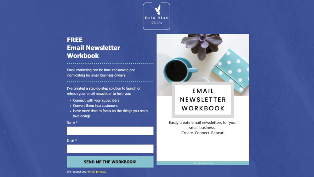
Strategic Placement: Optimizing Visibility and Context
Beyond choosing the right form type, its placement on a webpage is paramount. The goal is to identify locations that are both highly visible and contextually relevant, minimizing interruption while maximizing conversion potential.
-
Inline Form Placement:
Every website should feature an inline form in consistent locations such as the footer or sidebar, ensuring a passive subscription opportunity regardless of the page visited. These broader forms should offer universally appealing incentives, like a general newsletter, a welcome discount, or essential tips. For content-specific pages (e.g., blog posts), inline forms should be placed mid-content or at the end, offering lead magnets directly related to the article’s topic. Analytics tools like Google Analytics are invaluable for identifying frequently visited pages where such targeted inline forms would yield the best results. -
Pop-up Form Placement:
The homepage, often the entry point for a significant portion of website traffic, is an ideal location for a prominent pop-up form promoting a primary incentive. Additionally, deploying pop-ups on other high-traffic pages, identified through analytics, can significantly increase subscriber capture. The key is to align the pop-up’s offer with the content of the page, making it feel like a natural extension of the user’s current interest rather than a random interruption. For instance, an exit-intent pop-up on an e-commerce product page could offer a discount on that specific product or related items, leveraging the user’s immediate interest.
The Art of Persuasive Copy: Turning Visitors into Subscribers
The language used within a signup form is arguably as critical as its visual design. Compelling copy transforms a simple data entry field into an enticing invitation, highlighting the tangible benefits of subscription.
-
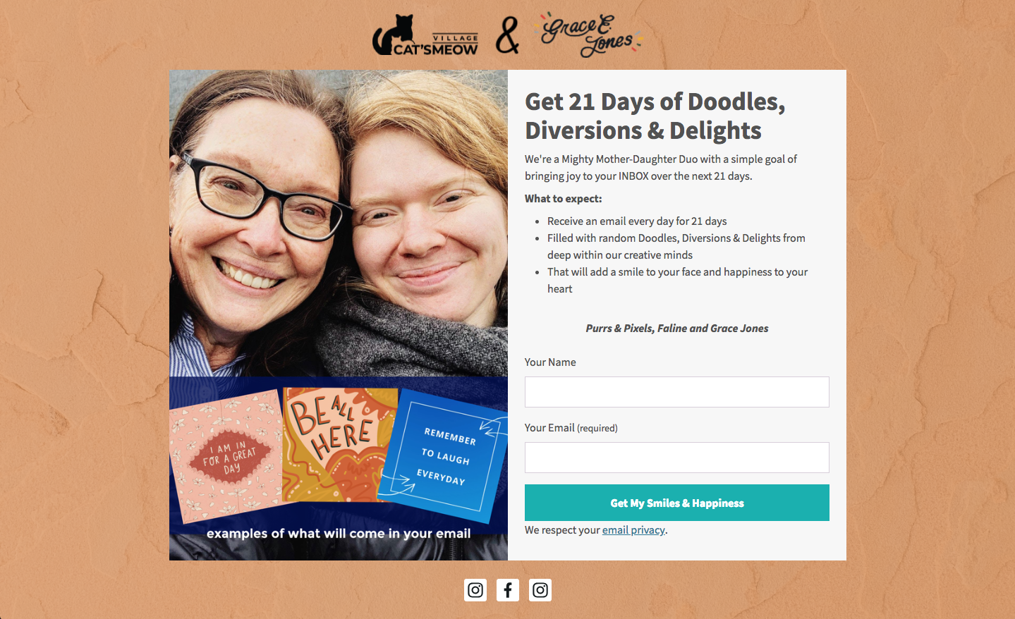
Clear, Concise, and Benefit-Oriented Headlines: The headline is the form’s first impression. It must immediately communicate the core offer and its value proposition. Instead of generic phrases like "Sign Up," a powerful headline like "Unlock Your Free 7-Day Fitness Plan" instantly conveys what the subscriber will gain. The headline should be direct, actionable, and resonate with the visitor’s needs or desires.
-
Articulating Undeniable Value: Below the headline, the form copy must expand on the benefits, explaining how the offer solves a problem, fulfills a need, or provides exclusive access. This can be achieved through a succinct paragraph or a bulleted list outlining key advantages. For example, "Receive weekly strategies to boost your productivity, exclusive access to expert interviews, and a complimentary guide to time management." This approach moves beyond features to emphasize tangible outcomes.
-
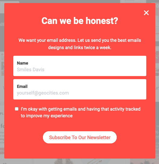
Setting Clear Expectations for Trust and Compliance: Transparency is paramount. The form should clearly state what subscribers will receive (e.g., "weekly newsletter," "exclusive deals"), how often (e.g., "every Tuesday," "monthly updates"), and what kind of content to expect. This proactive communication builds trust, reduces spam complaints, and aligns with data privacy regulations like GDPR, ensuring a healthy and engaged list.
-
Embracing Conversational and Relatable Language: Injecting personality into form copy can significantly enhance engagement. Phrases like "Hey there, future entrepreneur!" or "Ready to level up your skills?" create a more personal and approachable tone than generic business jargon. This conversational style breaks down barriers, making the interaction feel less transactional and more human.
-
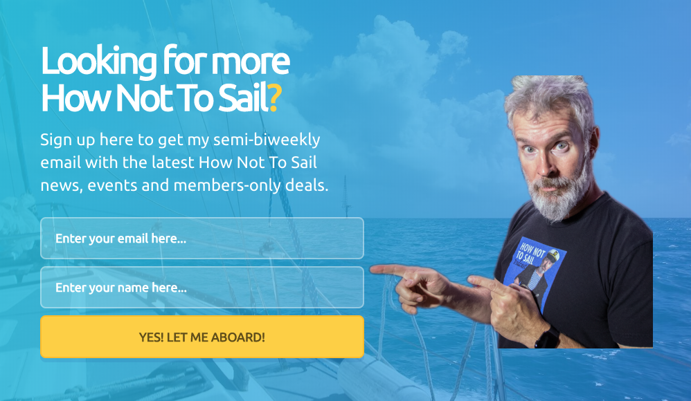
Leveraging Creativity, Wit, and Humor: A distinctive brand voice can make a signup form memorable. Creative, witty, or humorous copy can forge an emotional connection with visitors, making them more inclined to subscribe. For instance, a travel blog’s CTA button might read, "Embark on the Adventure!" instead of "Subscribe." This reflects the brand’s identity and creates a more engaging experience.
-
The Power of Social Proof: Humans are inherently influenced by the actions of others. Including social proof, such as "Join over 50,000 satisfied subscribers" or displaying trust badges, validates the value of your offer and reassures potential subscribers that they are making a popular and reliable choice. This psychological trigger significantly boosts confidence and conversion rates, as visitors perceive the brand as trustworthy and valuable.

Designing for Optimal Conversion: Aesthetics Meet Functionality
The visual presentation of a signup form profoundly influences a visitor’s first impression and willingness to engage. Thoughtful design minimizes friction and guides the user effortlessly toward subscription.
-
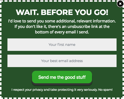
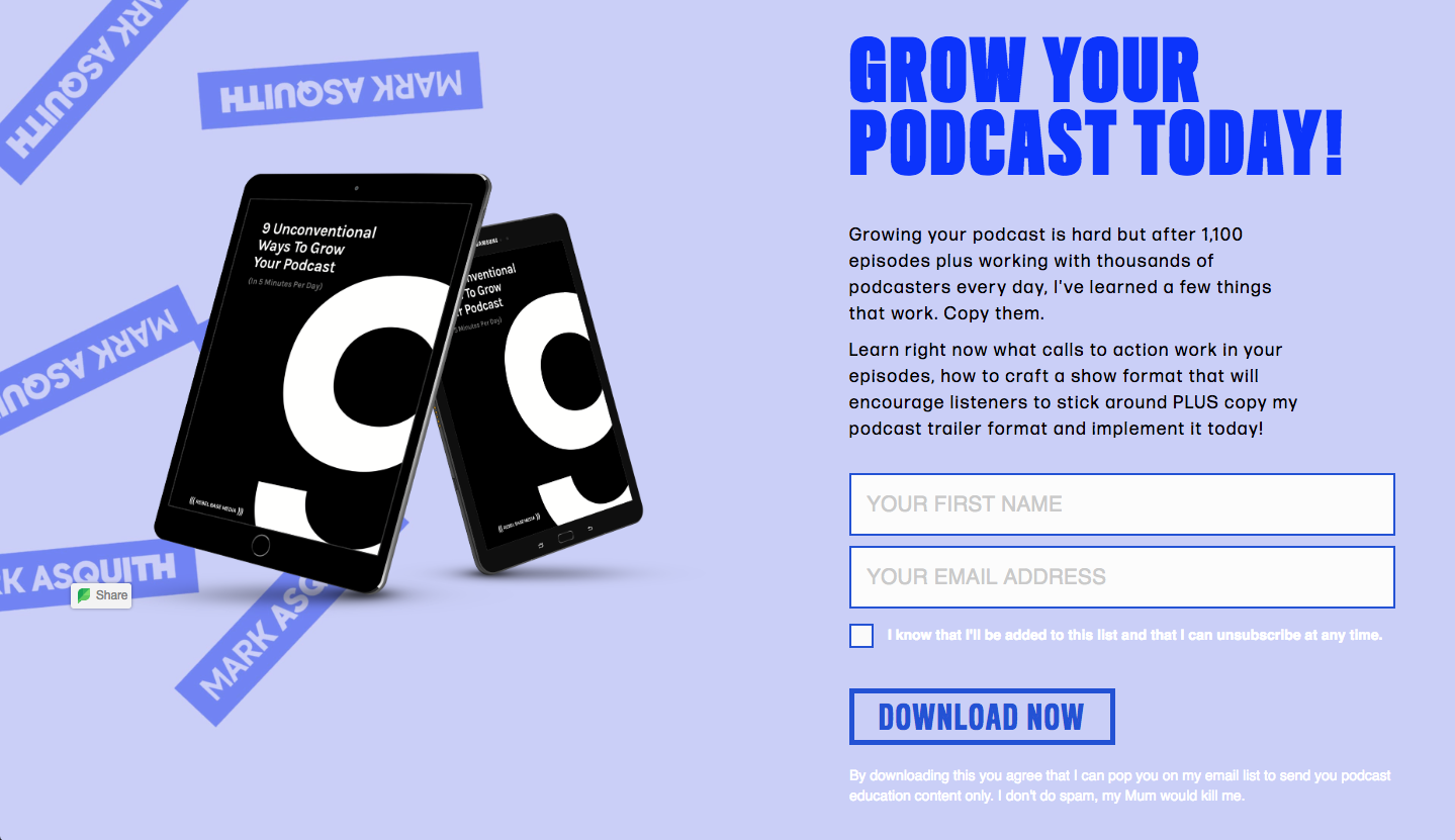
Minimizing Form Fields: Every additional field in a signup form introduces friction and increases the likelihood of abandonment. Research consistently shows that forms asking only for an email address convert significantly better than those requiring multiple data points. For initial list building, prioritizing email address alone is often the most effective strategy. Additional demographic or preference data can be gathered later through progressive profiling or post-signup surveys, once trust has been established.
-
Crafting Clear and Action-Oriented Calls to Action (CTAs): The CTA button is the final prompt for conversion. Generic "Submit" or "Sign Up" buttons are often missed opportunities. Instead, the CTA text should be specific, benefit-driven, and use possessive language. Examples include "Send Me My Free Guide," "Start My 30-Day Challenge," or "Yes, I Want Exclusive Updates!" Incorporating urgency (e.g., "Join Now!") or personal pronouns ("Get My Discount") further encourages immediate action. The button itself should be visually prominent, using contrasting colors and sufficient size to be easily clickable, especially on mobile devices.

-
Adhering to Typographic Hierarchy: A well-structured typographic hierarchy guides the reader’s eye, emphasizing key information. The headline should be the largest and most prominent text, followed by subheads, and then the descriptive body copy in decreasing font sizes. Limiting the form to one or two complementary font types enhances readability and maintains a professional aesthetic.
-
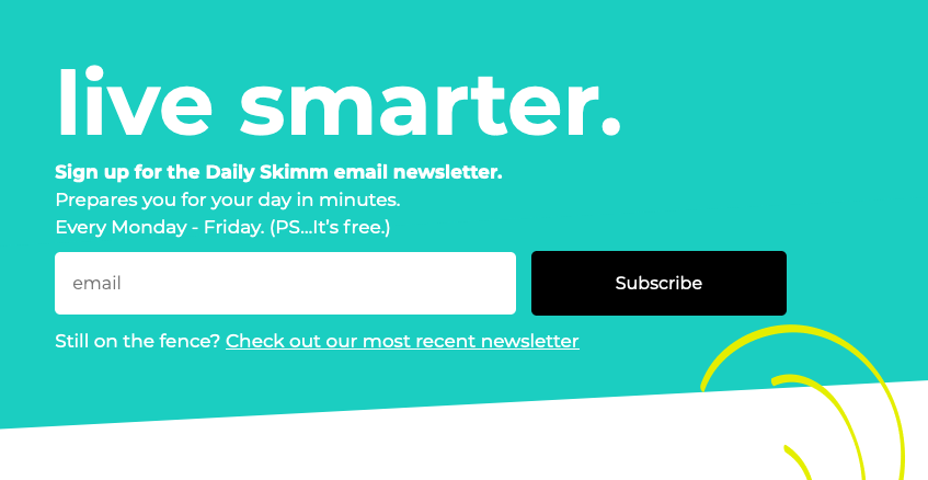
Strategic Use of Color Contrast: Colors play a powerful psychological role in design. Employing contrasting colors for the form itself against the background webpage, and for the CTA button against the form, draws attention and highlights the most important elements. This visual emphasis makes the form stand out and directs the user’s focus towards the desired action.
-
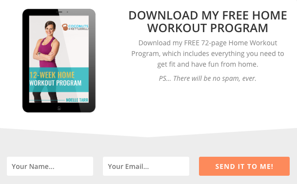
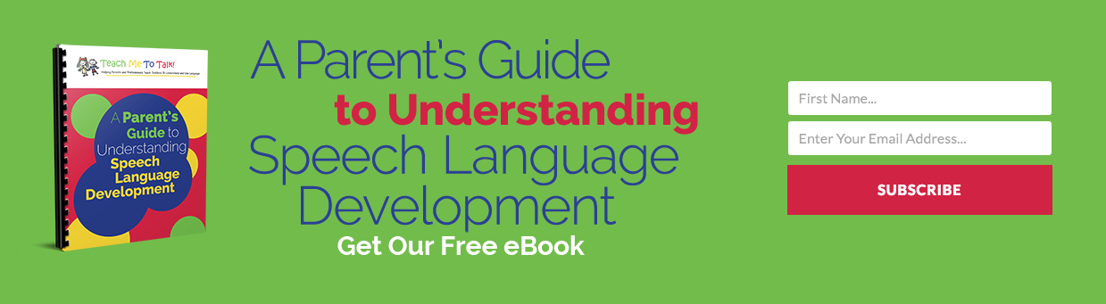
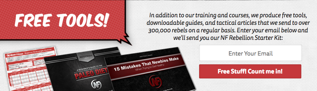
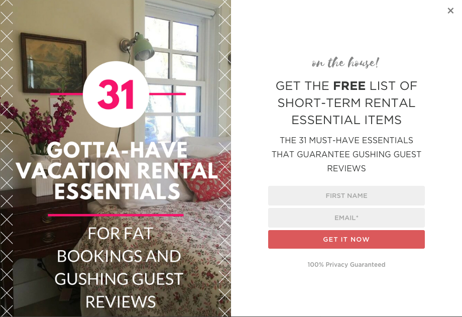
Visually Representing the Incentive: Humans are highly visual creatures. Including an image or graphic that visually represents the lead magnet or incentive (e.g., a mockup of an e-book cover, an icon for a checklist) significantly increases perceived value and appeal. Forms with compelling visuals tend to attract more attention and drive higher conversion rates.
-
Empowering Subscribers with Preference Choices: Offering subscribers the ability to select their content preferences (e.g., "weekly tips," "monthly product updates," "event invitations") leads to higher engagement rates and fewer unsubscribes. This personalization ensures that individuals receive content most relevant to their interests, fostering a more valuable relationship.
-
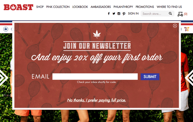
The "Unfavorable Alternative" Tactic: This psychological strategy, particularly effective for pop-up forms, presents a less desirable option if the visitor chooses not to subscribe. For example, an exit-intent pop-up offering a 15% discount might have a "No thanks, I prefer paying full price" option. This leverages loss aversion, making the subscription option the clearly superior choice.
-
Prioritizing Mobile-First Design and Large CTA Buttons: With over half of global website traffic originating from mobile devices, responsive design is non-negotiable. Signup forms must be optimized for smaller screens, ensuring readability, easy data entry, and large, tappable CTA buttons to accommodate touch interactions. A large, prominent button reduces user effort and frustration.

-
Leveraging White Space for Clarity and Professionalism: Ample white space around text, images, and form fields is crucial for readability and visual appeal. It prevents clutter, reduces cognitive load, and imparts a sense of professionalism and trustworthiness, making the form less intimidating and easier to complete.
Leveraging Technology: The Rise of AI in Form Building

The complexities of designing and optimizing signup forms, encompassing copywriting, visual design, and technical integration, can be daunting for many businesses. Recognizing this challenge, advancements in artificial intelligence are revolutionizing form creation. AI signup form builders, such as those integrated into platforms like AWeber, can automate much of this process. By simply providing a brief description of a business or its offer, the AI can generate a complete signup form, incorporating brand colors, a compelling headline, descriptive copy, appropriate input fields, and an optimized layout. This capability significantly democratizes access to high-quality form design, allowing users to rapidly prototype and deploy effective forms without extensive design or copywriting expertise. While AI provides a robust starting point, every element remains editable, empowering users to fine-tune the form to perfectly match their brand voice and specific campaign objectives. Crucially, these AI-generated forms seamlessly integrate with email marketing automation workflows, ensuring that new subscribers are immediately channeled into welcome sequences or targeted campaigns, streamlining the entire lead nurturing process.
The Imperative of Continuous Testing and Optimization
The deployment of a signup form is not the culmination but the initiation of an ongoing optimization cycle. To maintain and improve conversion rates, continuous testing and refinement are essential.
A/B Testing (Split Testing): This methodology involves creating two distinct versions of a form (A and B) and testing them simultaneously with different segments of website traffic to determine which performs better against a defined metric (e.g., conversion rate). Virtually any element of a signup form can be A/B tested, including:
- Headlines and Subheads: Experimenting with different value propositions or emotional appeals.
- Body Copy: Testing concise vs. detailed descriptions, bullet points vs. paragraphs.
- Call to Action Text: Variations like "Get My Free Ebook" vs. "Download Now."
- Number of Form Fields: Comparing forms asking for just email vs. email and name.
- Form Placement: Testing top-of-page vs. mid-content vs. sidebar.
- Color Schemes: Different background colors, button colors, and font colors.
- Imagery: Presence or absence of visuals, and different types of images.
- Offer/Lead Magnet: Testing the appeal of different incentives.
- Social Proof Elements: Different phrasing, placement, or quantity of testimonials/subscriber counts.
- Unfavorable Alternative Wording: Refining the deterrent message.
Preventing Form Blindness: Over time, visitors may become accustomed to seeing a particular signup form, leading to "form blindness" where they subconsciously ignore it. Periodically refreshing the form’s design, copy, or even the underlying offer can re-capture attention and reignite conversion rates. This iterative process of testing, analyzing, and refining ensures that signup forms remain effective and relevant to evolving audience preferences.
Case Study: Elevating Engagement Through Personalization
A compelling illustration of the power of optimization and personalization comes from AWeber’s own experience with their "What to Write in Your Emails" course. Facing feedback indicating a desire for both more and less frequent emails, AWeber implemented a strategic change: allowing subscribers to choose their preferred email frequency directly on the signup form. This simple yet profound adjustment, enabled by email automation, delivered the course content at a pace tailored to individual subscriber preferences. The results were remarkable: open rates increased by an impressive 47%, and click-through rates soared by 150%. This case study underscores the significant impact that giving subscribers control over their experience can have on engagement metrics. It highlights that in a landscape where 94% of small business owners craft their own marketing emails, empowering subscribers with personalization options represents one of the most high-impact changes marketers can implement to their signup forms.
Broader Impact and Implications
The diligent application of these strategies for optimizing email signup forms extends far beyond mere subscriber numbers. A well-crafted form is a foundational element for sustainable business growth, directly impacting customer acquisition costs, customer lifetime value, and overall brand equity. By reducing friction, clearly communicating value, and building trust from the very first interaction, businesses cultivate higher-quality leads who are more likely to convert into loyal customers. Conversely, poorly designed or intrusive forms can deter potential customers, erode brand perception, and waste valuable marketing spend. In a competitive digital ecosystem, the optimized email signup form is not just a tool for collecting data; it is a strategic asset that underpins effective communication, fosters strong customer relationships, and drives long-term commercial success. It represents an investment in the future of direct marketing, ensuring that businesses can consistently reach and engage their most valuable audience.