 Pevita Pearce
The landscape of B2B software procurement has undergone a fundamental shift, moving away from sales-led discovery toward a buyer-centric research model. In this evolving environment, the traditional SaaS comparison page—long characterized by biased feature tables and "winner-takes-all" rhetoric—is facing a crisis of credibility. As modern buyers become increasingly skeptical of marketing-heavy content, a new framework for comparison marketing has emerged, prioritizing transparency, objective evaluation, and buyer fit over aggressive persuasion.
According to industry analysis, the modern B2B buyer is often 70% to 80% of the way through their decision-making process before they ever engage with a sales representative. During this independent research phase, comparison pages serve as critical touchpoints. However, data from Harvard Business Review suggests that between 40% and 60% of B2B deals are currently lost to "no decision" or buyer indecision. This suggests that the primary obstacle for SaaS companies is no longer just the competition, but the buyer’s inability to confidently distinguish between available options.
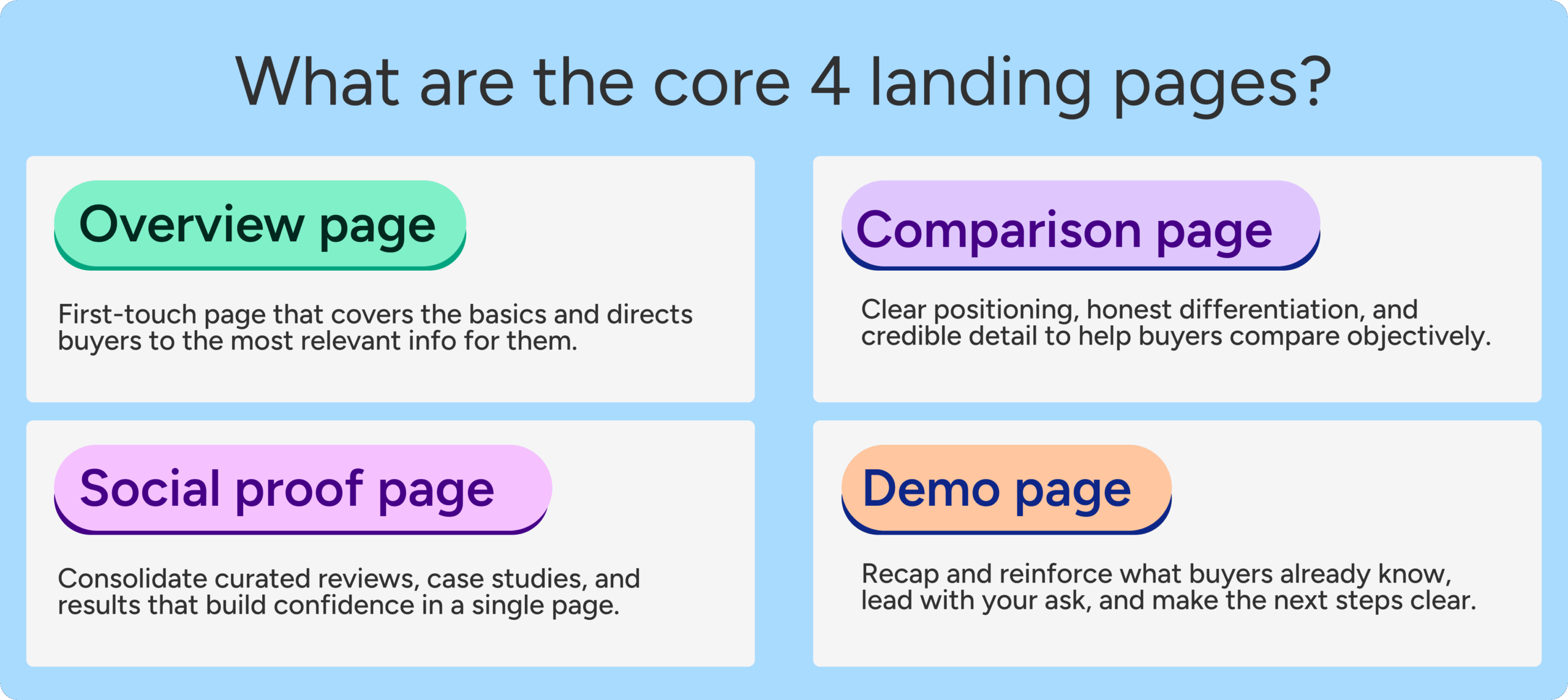
The Evolution of the Comparison Strategy
For years, the standard SaaS comparison playbook was simple: create a side-by-side table where your product has a row of green checkmarks and the competitor has a series of red Xs. While this approach was designed to simplify the choice, it has largely backfired with sophisticated buyers. Today’s procurement teams recognize that every software solution involves trade-offs. A page that claims a product is superior in every conceivable category—price, ease of use, enterprise features, and customer support—is frequently dismissed as untrustworthy.
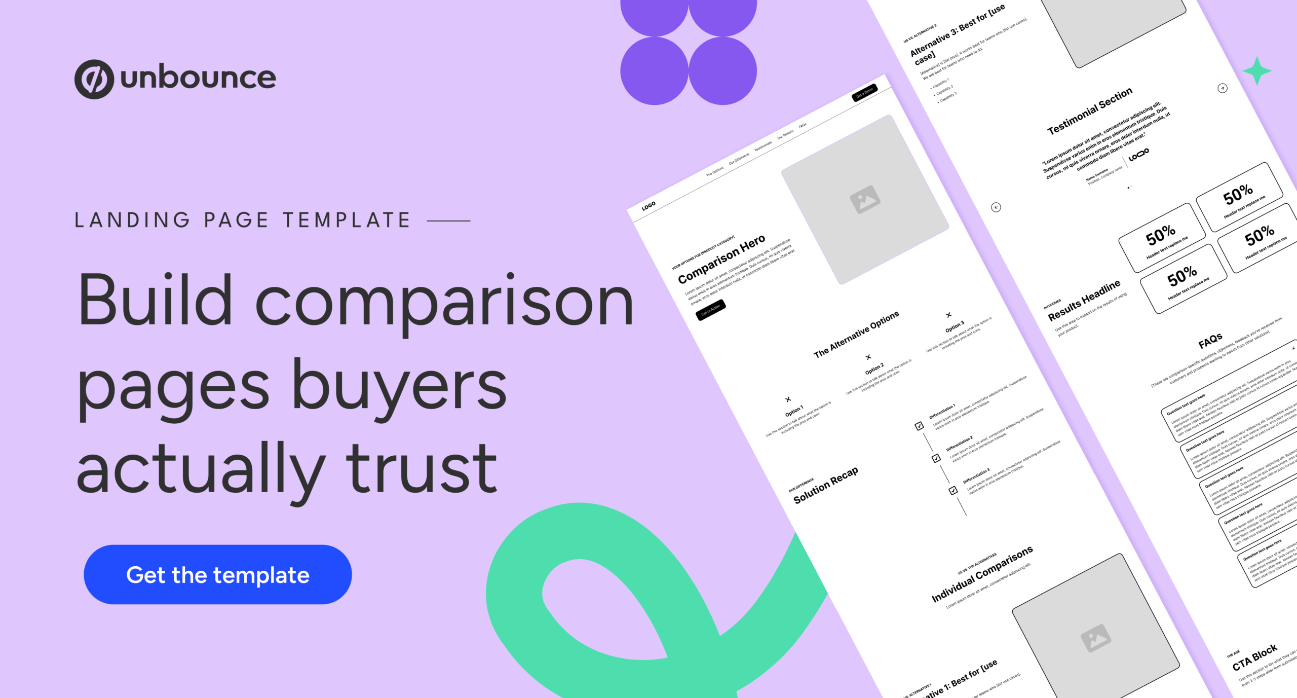
Landing page expert Tas Bober argues that the strongest SaaS comparison pages do not attempt to pressure buyers into a decision. Instead, they function as a roadmap for the "right" buyers. By acknowledging where a product might not be the best fit—such as for smaller teams or specific niche workflows—a brand actually increases the conversion rate of its ideal customer profile (ICP). This strategic pivot from "persuasion" to "guidance" is the cornerstone of building trust in a crowded marketplace.

The Three Pillars of Comparison Architecture
To effectively support the buyer journey, SaaS marketers must categorize their comparison content into three distinct types, each serving a different stage of the evaluation process:
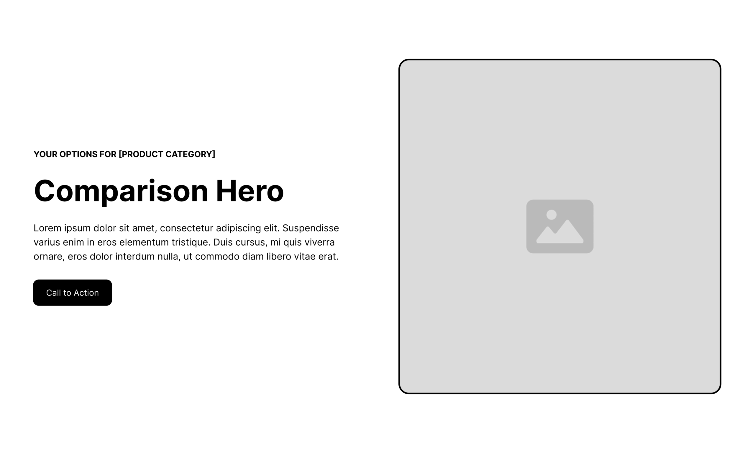
1. Comparison Overview Pages
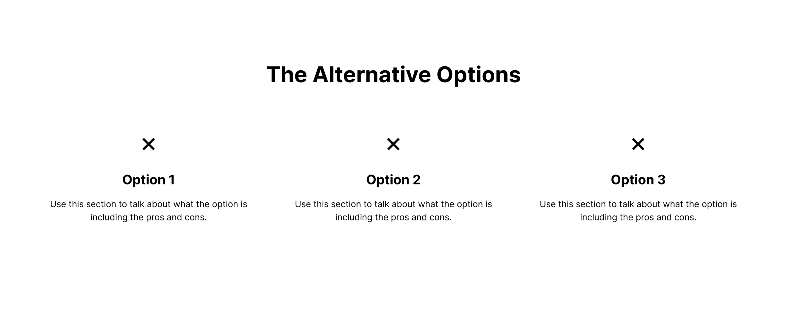
These are top-of-funnel assets designed for buyers who are still defining the category. They answer the broad question: "What are my options for solving this problem?" A high-integrity overview page doesn’t just list direct competitors; it includes manual workarounds (like Excel or Google Sheets), custom-built internal solutions, and legacy providers.
2. One-to-One Competitor Matchups
These pages target buyers who have already narrowed their shortlist. The intent here is high, and the search terms are specific (e.g., "Brand A vs. Brand B"). The objective of this format is to provide a nuanced side-by-side evaluation that respects the competitor’s strengths while highlighting the specific use cases where the host brand excels.
3. Competitor Alternative Pages
Specifically designed for "switcher" traffic, these pages target users who are unhappy with their current provider. The messaging focuses on the "why"—why a buyer might be outgrowing a legacy tool or why a specific pricing model no longer makes sense for a growing enterprise.
Data-Driven Insights: Why Buyers Stall
The necessity for better comparison content is backed by shifts in search engine behavior and buyer psychology. Research indicates that "information overload" is a leading cause of stalled deals. When a buyer encounters three different vendors all claiming to be the "No. 1 rated solution," the resulting cognitive dissonance often leads to inaction.
Furthermore, search engines and Large Language Models (LLMs) are increasingly prioritizing "helpful content" over keyword-stuffed marketing copy. Pages that provide objective data, cite third-party research, and address frequently asked questions with depth are more likely to achieve high organic visibility. In the age of AI-driven search, transparency has become an SEO requirement.
Anatomy of a High-Trust Comparison Page
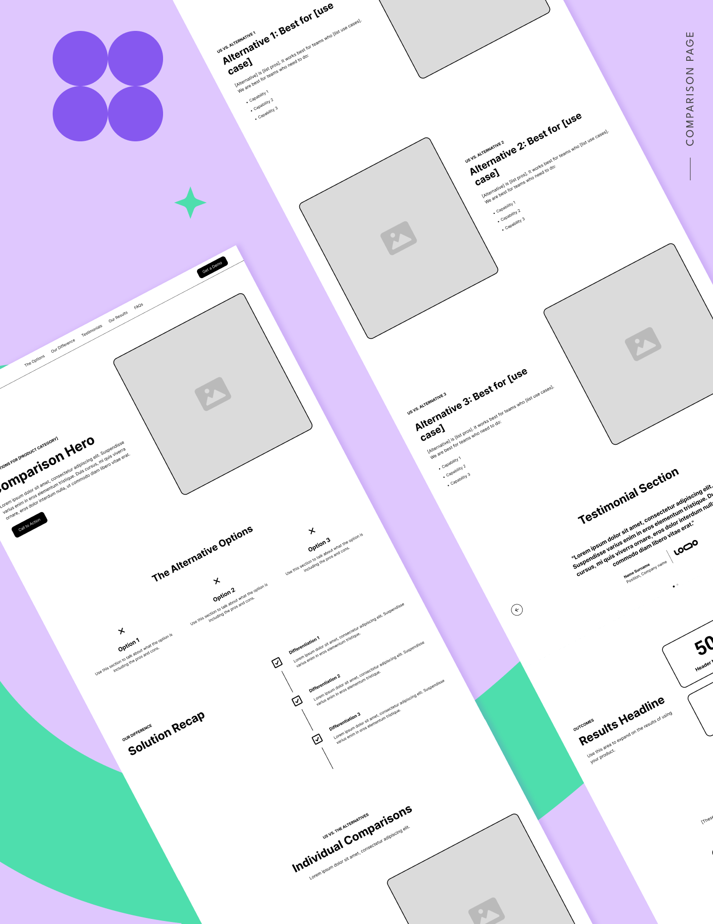
A trusted comparison page is structured to reduce friction and provide immediate utility. Based on the "Core Four" framework developed by Tas Bober, several key components are essential:
- Contextual Navigation: Unlike traditional "dead-end" landing pages, modern comparison pages should allow buyers to navigate to relevant sub-sections or related resources. This aligns with Google’s recent ad quality updates, which reward pages that satisfy search intent without forcing a bounce.
- The "Buyer Fit" Hero Section: The headline should immediately confirm the user’s search intent and frame the comparison around the buyer’s specific needs rather than the product’s ego.
- Objective Differentiation: Instead of trashing a competitor, effective pages use "Solution Differentiation" blocks to summarize how their philosophy differs. For instance, a tool might prioritize "speed of deployment" while a competitor prioritizes "granularity of control." Both are valid strengths depending on the buyer’s priority.
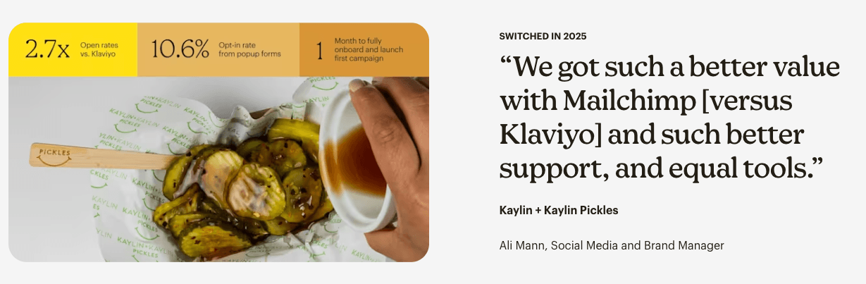
- Social Proof with Context: Generic testimonials are no longer sufficient. High-performing pages feature "migration stories"—quotes from customers who specifically switched from the competitor mentioned on the page.
Case Studies in Integrity-Based Comparison
Several B2B leaders have set a new standard for how to handle competitive comparisons without sacrificing brand reputation:
Vidyard vs. Loom
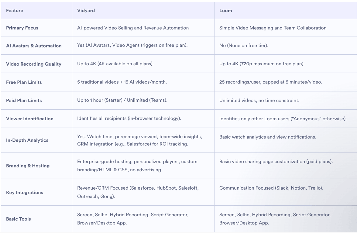
Vidyard’s approach is notable for its use of a "nuanced" feature table. Rather than using simple binary checks, they describe the primary focus of each platform. By acknowledging that Loom is excellent for quick, internal communication while Vidyard is optimized for external sales and marketing, Vidyard builds credibility with the professional sales teams they are targeting.
Mailchimp vs. Klaviyo
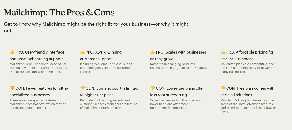
Mailchimp’s comparison strategy involves a rare level of honesty regarding product gaps. Their pages have been known to call out where their own reporting might be less comprehensive than a specialized tool like Klaviyo for certain e-commerce niches. This transparency ensures that the customers who do sign up are less likely to churn, as they have a realistic understanding of the tool’s capabilities.

Asana vs. ClickUp
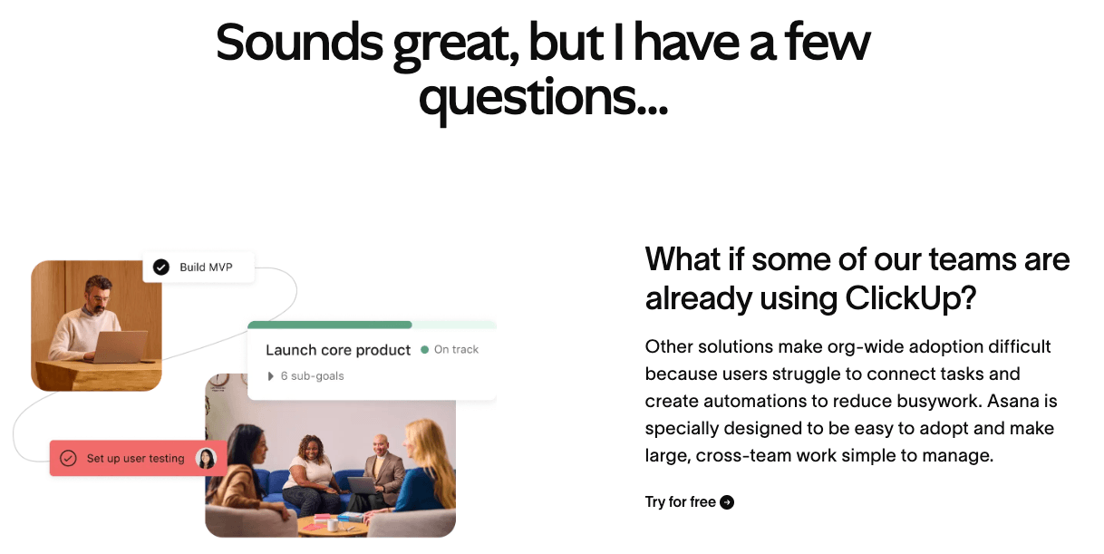
Asana focuses heavily on the "migration hurdle." Recognizing that the biggest competitor to a new project management tool is the pain of moving data, their comparison pages prioritize FAQs about the transition process. By addressing the technical and cultural challenges of switching, they position themselves as a partner in the change management process.
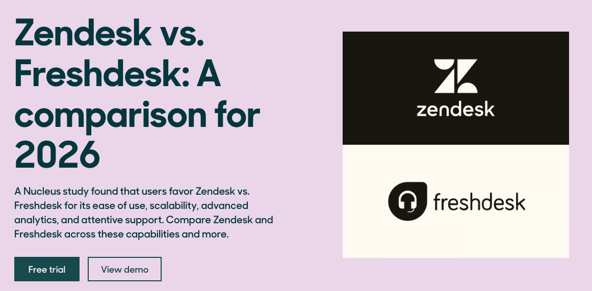
Zendesk vs. Freshdesk
Zendesk has successfully utilized third-party research to anchor its comparison pages. By commissioning independent firms to interview users of both products, they move the "bias" away from their own marketing department and toward an objective third-party data set.
The Role of the FAQ and the "Anti-Table"
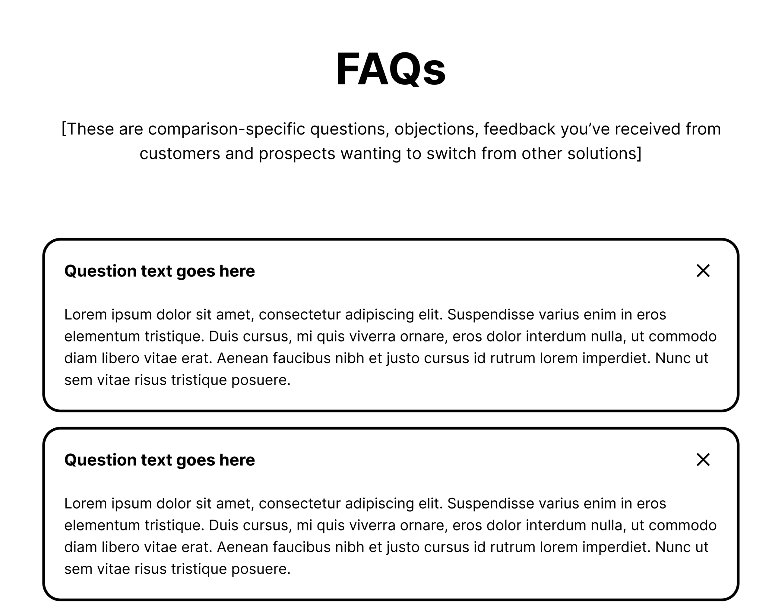
A significant point of contention among SaaS marketers is the use of the comparison table. While tables are easy to scan, they often lack the context required for enterprise decisions. Bober and other experts suggest that if a table is used, it should be secondary to a robust FAQ section.
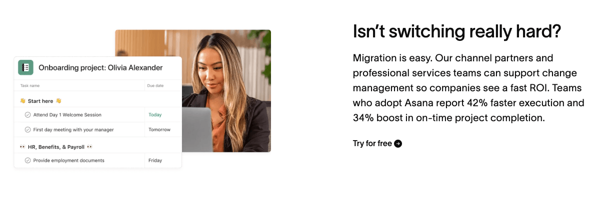
The FAQ is where the real "sales" happen in a modern B2B environment. It is the place to address the "Yes, but…" questions: "Doesn’t the competitor also have this feature?" "How long does it really take to implement?" and "What happens to my data if I switch?" Answering these questions with specificity—such as "An expert will reach out within 24 hours to assist with data mapping"—creates a level of accountability that a checkmark cannot convey.
Broader Impact and Future Implications
As the SaaS market continues to saturate, the ability to build trust through comparison content will become a primary competitive advantage. Companies that continue to rely on "takedown" pages risk alienating the very buyers they are trying to attract.
In the long term, the rise of AI-assisted procurement will only accelerate this trend. As AI agents begin to "crawl" comparison pages to summarize options for human decision-makers, they will be programmed to look for data, evidence, and objective specifications. Marketing fluff will be filtered out. The future of SaaS growth lies in the hands of those who can provide the clearest, most honest path for the buyer, even if that path occasionally leads away from their own product.
By adopting a journalistic and helpful tone, SaaS brands can transform their comparison pages from defensive marketing assets into offensive trust-building engines. The goal is no longer to win the argument, but to help the buyer win their internal business case with confidence.

 Nila Kartika Wati
 Evan Lee Salim