

In the increasingly competitive digital landscape, the distinction between a high-performing marketing campaign and a failed investment often rests upon a single, standalone web page: the landing page. As digital marketing matures, industry leaders have identified a fundamental starting principle: a polished, professional landing page serves as a primary catalyst for conversion rates, while fragmented or disorganized designs actively diminish ROI. This report examines forty of the most effective landing page examples across diverse sectors, including SaaS, ecommerce, and professional services, to identify the specific design elements and psychological triggers that drive modern consumer behavior.

The Strategic Role of the Landing Page in Modern Marketing
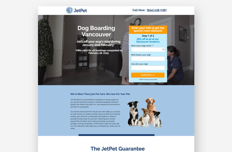
A landing page is defined as a standalone web page created specifically for a marketing or advertising campaign. Unlike a general homepage, which serves as a navigational hub for a brand’s entire ecosystem, a landing page is designed with a single, focused objective—converting visitors into leads or customers. This conversion-centric design is critical because it minimizes the "Paradox of Choice," a psychological phenomenon where an abundance of options leads to consumer paralysis.
Industry data suggests that the implementation of specific multimedia elements can drastically alter performance. For instance, the inclusion of video content on a landing page has been shown to increase conversion rates by as much as 86%. This underscores a broader shift toward interactive and visually-driven marketing strategies that prioritize immediate value demonstration over long-form text.
Chronology of Landing Page Evolution
The evolution of landing pages has moved through three distinct eras. In the early 2000s, landing pages were largely text-heavy and functioned as extended sales letters. By the 2010s, the "minimalist movement" took hold, championed by early SaaS pioneers who focused on clean lines and singular Call to Action (CTA) buttons.

In the current mid-2020s landscape, landing pages have entered the "Personalization and Performance" era. Modern pages, such as those built on the Unbounce platform, utilize dynamic text replacement and AI-driven optimization to tailor the experience to the specific ad or email the visitor clicked. This creates a seamless "message match" that reassures the user they have arrived at the correct destination.

Sector-Specific Analysis: High-Performance Examples
SaaS and Digital Entertainment
The SaaS industry remains the gold standard for landing page efficiency. Netflix, currently boasting over 300 million subscribers worldwide, utilizes a minimalist landing page that reinforces a simple value proposition: unlimited content for a low monthly fee. By removing complex navigation, Netflix reduces friction, making the signup process feel instantaneous.

Similarly, Spotify and LinkedIn Premium demonstrate the power of brand recognition. Because these brands are household names, their landing pages do not waste space explaining the service. Instead, they focus on the "upgrade" or "start streaming" action. LinkedIn, specifically, targets job seekers by highlighting how its Premium service provides a competitive edge in a crowded market, a tactic that appeals directly to the user’s professional anxieties and ambitions.

Health, Wellness, and Subscription Services
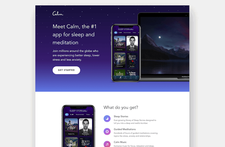
The health and wellness sector requires a different psychological approach, often focusing on tranquility and trust. Calm, a meditation and sleep app, uses its landing page to immediately invite relaxation through soft color palettes and a clear path to engagement.

In the subscription box and nutrition space, brands like Smalls (cat food) and Perfect Keto utilize high-grade social proof and transparency. Smalls, for example, addresses the "humanization of pets" trend by offering "human-grade" quality food, a specific marketing angle that differentiates it from grocery store competitors. This is supported by "problem awareness" copy, which educates the consumer on the benefits of fresher ingredients before presenting the purchase option.

Ecommerce and Visual Storytelling
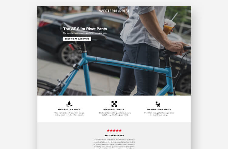
Ecommerce landing pages, such as those for Western Rise and Woolx, rely heavily on high-resolution photography and video backgrounds. For these brands, the goal is to sell an experience or a lifestyle rather than just a product. Western Rise uses "elevated" copy to market its apparel, moving beyond the technical specs of the fabric to focus on the versatility and style the clothing provides to the modern traveler.

The Role of Marketing Agencies and Expert Strategy
Much of the success seen in these high-converting examples is the result of specialized agency interventions. Agencies such as MuteSix, Webistry, and J7 Media have pioneered the "whole-funnel" context for landing pages.

Cameron Gawley, co-founder and CEO of BuzzShift, noted in a strategy analysis that most brands have a significant opportunity to lower their Cost Per Acquisition (CPA) by focusing more on the awareness and consideration phases of the customer journey. For the brand Mooala, Gawley’s team utilized a landing page to capture emails via a coupon offer, treating the page as a "soft conversion" tool to nurture leads through a longer sales cycle.

Webistry’s work with Panda7 (car insurance) and NANOR (scented candles) highlights the importance of industry-specific aesthetics. While the insurance page focuses on speed and ease of comparison to alleviate the "chore" of buying insurance, the candle page focuses on luxury and sensory appeal, proving that the "magical x-factor" of a landing page is its ability to mirror the consumer’s intent.
Supporting Data and Conversion Benchmarks
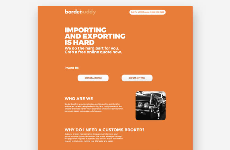
According to the latest Conversion Benchmark Reports, the average conversion rate varies significantly by industry, but the top 10% of landing pages see conversion rates of 11.45% or higher. Key elements found in these top-tier pages include:
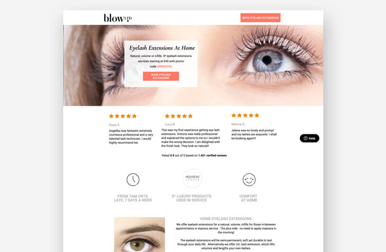
- Above the Fold Value: The most critical information and the primary CTA are visible without scrolling.
- Message Match: The headline of the landing page matches the copy of the referring advertisement.
- Reduced Friction: Forms are kept to the minimum number of fields necessary to qualify a lead.
- Social Proof: Authentic testimonials, "as seen in" media bars, and trust badges (such as money-back guarantees) are utilized to build immediate credibility.
The success of Bariatric Eating, which achieved a conversion rate of over 39% through a colorful and friendly design by Sevah Creative, demonstrates that deviating from clinical or "standard" designs can often yield higher engagement if it makes the subject matter more approachable.
Broader Impact and Future Implications
The shift toward specialized landing pages reflects a broader change in how businesses interact with the internet. The traditional website is increasingly becoming a secondary resource, while the landing page has become the primary "storefront" for targeted traffic.
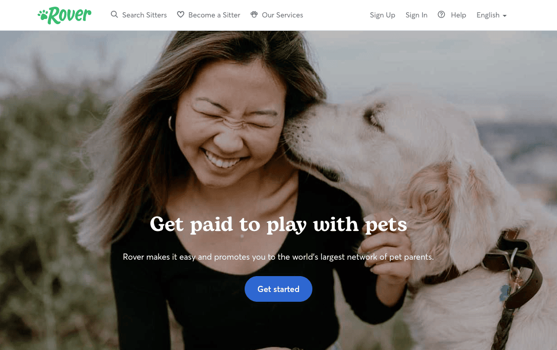
As artificial intelligence continues to integrate with marketing technology, the next phase of landing page development will likely involve "generative personalization," where the page’s layout, imagery, and copy change in real-time based on the visitor’s demographic data and browsing history. This will further blur the line between advertising and a personalized concierge service.

Conclusion: The Michael Jordan of Marketing
The pursuit of the "perfect" landing page is a continuous process of testing and iteration. As seen in the example of Amazon—which often breaks traditional design rules by including multiple exit links and disjointed art styles—brand equity and an irresistible offer can sometimes override standard best practices. However, for the majority of marketers, the path to success lies in clarity, professional design, and a deep understanding of the target audience.
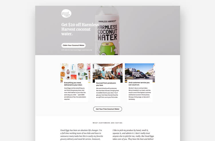
By analyzing the strategies of the 40 best examples, it becomes clear that high-converting pages are not merely about aesthetics; they are about psychology and the strategic reduction of barriers between a consumer and a solution. Whether through the use of drag-and-drop builders like Unbounce or custom-coded experiences from top agencies, the goal remains the same: to turn a simple click into a lasting customer relationship.

FAQ: Industry Standards for Conversions
What is the primary difference between a landing page and a homepage?
A landing page is a focused, standalone page for a specific campaign with one goal. A homepage is a general hub for the entire business.
How many CTAs should a landing page have?
Ideally, a landing page should focus on one primary Call to Action to prevent "decision fatigue." If the page is long, the same CTA can be repeated in different sections.

What does "above the fold" mean?
This refers to the portion of the webpage that is visible to the user before they have to scroll down. It is the most valuable real estate on the page.

Why is A/B testing important?
A/B testing allows marketers to compare two versions of a page to see which elements (headlines, colors, or images) perform better, allowing for data-driven optimization rather than relying on intuition.







