The rapid evolution of business intelligence (BI) tools has fundamentally altered how organizations and journalists interpret complex datasets, shifting the paradigm from static, manual reporting to dynamic, interactive storytelling. Since its initial beta release in mid-2016 and its subsequent rise to prominence throughout 2017 and 2018, Google Data Studio—now known as Looker Studio—emerged as a pivotal platform in this transformation. By integrating seamlessly with the broader Google Cloud and Marketing Platform ecosystems, the tool democratized data visualization, allowing both enterprise-level corporations and independent data journalists to transform raw numbers into actionable insights. This report examines the critical applications of Data Studio during its formative years, analyzing its impact on operational efficiency in the business sector and its role in enhancing public understanding of social and cultural trends through data journalism.
The Shift Toward Automated Business Intelligence
In the traditional corporate environment, data reporting was frequently characterized by significant latency. Analysts often spent days aggregating data from disparate sources, cleaning it in spreadsheets, and manually formatting charts for monthly or quarterly reviews. The introduction of Google Data Studio addressed these inefficiencies by providing direct connectors to platforms such as Google Analytics, BigQuery, and AdWords.
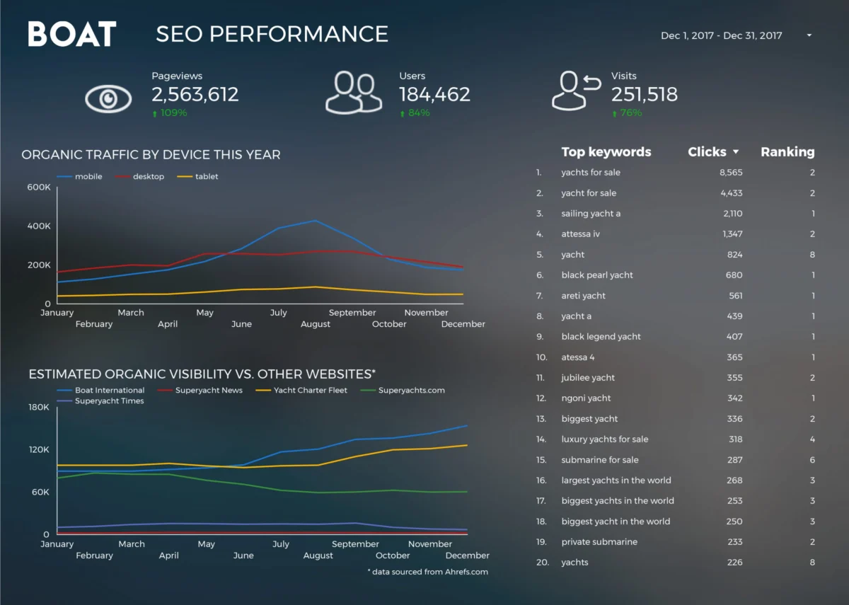
One of the most significant case studies in operational efficiency during this period was documented by Boat International Media. The organization, a leading authority in the luxury yachting industry, faced the challenge of managing complex SEO performance reports for high-value clients. Prior to adopting automated visualization tools, the monthly reporting process required five days of manual labor. By transitioning to Data Studio, the team—led by analysts Fanni Takacs and Drew Broomhall—reduced this timeframe to just fifteen minutes. This 99% reduction in "time-to-insight" highlights a broader industry trend where automation allows human talent to focus on strategy and interpretation rather than data entry. The design of these reports emphasized clarity and the avoidance of "chart junk," ensuring that key performance indicators (KPIs) remained the central focus for stakeholders.

Technical Frameworks for Performance Tracking
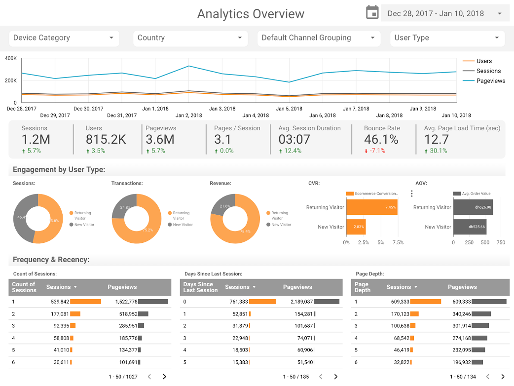
As businesses sought to refine their digital strategies, the demand for sophisticated dashboard templates grew. The ClickInsight team and E-Nor, represented by Senior Consultant Sunil Attri, were instrumental in developing frameworks that visualized Google Analytics web activity. These dashboards moved beyond surface-level metrics like page views, instead focusing on interactive components that allowed users to filter data by date range, geography, and device type.
A critical advancement in this space was the implementation of the "bullet chart," a visualization technique popularized by the team at Analytics Pros. Unlike standard bar charts, bullet charts provide a rich context by displaying a primary measure against a comparative measure (such as the previous year’s performance) and qualitative ranges (such as "poor," "satisfactory," and "excellent" benchmarks). For digital marketers, this meant they could see not only how many users visited a page but also how that performance compared to specific targets and historical averages in a single, compact view. This methodology proved essential for tracking page-level engagement and understanding the nuances of user behavior over time.
Data Journalism and the Democratization of Information
Parallel to its adoption in the boardroom, Data Studio became a favored tool for data journalists and hobbyists seeking to explore public datasets. This trend, often referred to as "data storytelling," aims to make complex information accessible and engaging for a general audience. The versatility of the platform allowed for the exploration of diverse topics ranging from entertainment to global technology trends.
In the realm of cinematic analysis, visualizations comparing the Marvel and DC Cinematic Universes provided a clear look at the economic scale of modern film franchises. With global box office revenues for these franchises exceeding $27 billion by 2018, data visualizations helped the public understand the relative success and audience reception of competing intellectual properties. Similarly, the "Data Behind Star Wars" report by ClickInsight utilized the platform’s tabbing feature to allow users to navigate through ship speeds, character demographics, and planetary data, demonstrating how interactive reports can serve as educational and entertainment resources.

Analyzing Global Technology and Social Trends
The integration of Google Data Studio with BigQuery, Google’s enterprise data warehouse, enabled the analysis of massive datasets that were previously inaccessible to the average user. A prominent example of this was provided by Google Developer Advocate Felipe Hoffa, who analyzed GitHub’s "PushEvents" from 2017. By processing millions of rows of data regarding open-source contributions, Hoffa was able to identify which companies and individuals were the most active participants in the global developer community. This analysis underscored the importance of open-source software in the modern web infrastructure and provided a data-driven look at the contributors shaping the future of technology.
Beyond technology, the platform was used to analyze long-term social trends. A comprehensive study of 150 years of marriage and divorce data in the United Kingdom, conducted by analysts including Lizzie Silvey, showcased the power of longitudinal data. This visualization explored how external factors—such as the World Wars, the Legal Aid Act of 1949, and subsequent changes in divorce legislation—impacted social structures over more than a century. The data revealed that peaks in divorce rates often correlated with legal reforms that made the process more accessible, while marriage rates showed significant fluctuations during periods of global conflict. This type of analysis provides a factual basis for sociological discussions, moving the conversation away from anecdote and toward empirical evidence.
Chronology of Development and Market Impact
To understand the context of these visualizations, it is necessary to look at the timeline of Google’s entry into the BI market:
- May 2016: Google announces Data Studio as part of the Google Analytics 360 Suite, offering a free version for individuals and small teams.
- 2017: The platform sees rapid adoption due to its "what you see is what you get" (WYSIWYG) editor and real-time collaboration features, similar to Google Docs.
- September 2018: Google Data Studio officially exits its beta phase, becoming a generally available (GA) product. This milestone marked the platform’s maturity, with improved stability and an expanded library of community connectors.
- Late 2022: In a strategic move to unify its business intelligence offerings, Google rebrands Data Studio as Looker Studio, integrating it more deeply with the Looker modeling layer.
The impact of this trajectory was felt across the industry. Competitors like Tableau and Microsoft Power BI were forced to refine their web-based editing capabilities as Google offered a powerful, cloud-native alternative that required no desktop installation and featured a lower barrier to entry for beginners.
Implications for the Future of Data Literacy
The visualizations produced during the 2017-2018 period served as a harbinger for the current state of data literacy. As tools like Data Studio made it easier to create professional-grade charts, the focus shifted from the technical challenge of building a report to the intellectual challenge of choosing the right data and the right visualization type.
Industry experts noted that the primary benefit of these tools was the "democratization of data." When data is no longer siloed within the IT department or restricted to specialized analysts, a "data-driven culture" can take root within an organization. Employees at all levels can access dashboards, ask questions of the data, and make decisions based on evidence rather than intuition. However, this shift also highlighted the need for better training in data ethics and visualization best practices to avoid the "misleading chart" phenomenon, where improper scaling or poor chart selection can lead to incorrect conclusions.
Conclusion
The transition from manual reporting to automated, interactive visualization represented a significant milestone in the information age. The examples from 2017 and 2018—ranging from SEO dashboards for luxury yacht media to historical analyses of UK social trends—demonstrate the versatility and power of Google Data Studio. By reducing the time required for data processing and increasing the clarity of data presentation, these tools have enabled a more informed approach to both business management and public discourse. As the platform continues to evolve under the Looker Studio brand, the principles of clear design, interactive storytelling, and automated integration remain the cornerstones of effective data communication. The shift observed during this period was not merely a change in software, but a fundamental change in how the world interacts with and understands the vast quantities of data generated every day.