The global ecommerce landscape faced a significant hurdle in 2025 as the average cart abandonment rate reached 70.22%, according to aggregated industry data. While primary research indicates that approximately 43% of these abandonments are attributed to users who never intended to purchase—individuals browsing for price comparisons or window-shopping for future gifts—the remaining segment represents a massive pool of lost revenue for digital retailers. For businesses looking to capture these high-intent shoppers who falter mid-transaction, the optimization of checkout page design has emerged as a critical strategic priority. By removing friction, reinforcing consumer trust, and streamlining the path to purchase, retailers can significantly improve conversion rates and recover billions in potentially lost sales.
![Checkout Page Design: 11 Ways to Reduce Cart Abandonment Rates [+Examples]](https://ceblog.s3.amazonaws.com/wp-content/uploads/2021/09/30141304/Checkout-Page-Design-guest-signin.png)
The Economic Impact of Checkout Friction
The "checkout bottleneck" remains one of the most expensive problems in the digital economy. Industry analysts suggest that trillions of dollars in merchandise are left in virtual carts annually. Research from the Baymard Institute highlights that the primary drivers of abandonment are often within a retailer’s control. Specifically, surprise costs at the final step account for 39% of drop-offs, while slow delivery estimates drive away 21% of potential buyers. Furthermore, 19% of shoppers cite a lack of trust in site security, and an equal number abandon the process when forced to create a mandatory account. These statistics underscore a fundamental reality in modern ecommerce: a well-designed checkout is not merely a functional necessity but a psychological tool used to maintain the buyer’s momentum.
1. Transparency in Pricing and Logistics
To combat the leading cause of abandonment—sticker shock—retailers must prioritize transparency regarding total costs and delivery timelines. Shoppers typically enter the checkout flow with a specific "tag price" in mind. When additional shipping fees, taxes, or handling charges are tacked on at the final moment, it creates a psychological barrier that often leads to immediate exit.
![Checkout Page Design: 11 Ways to Reduce Cart Abandonment Rates [+Examples]](https://ceblog.s3.amazonaws.com/wp-content/uploads/2021/09/30141200/Checkout-Page-Design-installment-payment.png)
Successful retailers like Wayfair have mitigated this by displaying full costs and estimated delivery dates directly on the product page, well before the user enters the checkout flow. This "pre-checkout" transparency ensures that by the time a user reaches the payment stage, they have already reconciled the total investment, reducing the likelihood of a last-minute reversal.
2. Implementing Guest Checkout and Single Sign-On (SSO)
The requirement for account creation is a major friction point, particularly for first-time buyers who have not yet established a relationship with a brand. Forcing registration adds unnecessary cognitive load and time to the transaction.
![Checkout Page Design: 11 Ways to Reduce Cart Abandonment Rates [+Examples]](https://ceblog.s3.amazonaws.com/wp-content/uploads/2021/09/30141517/Checkout-Page-Design-address-autocomplete.png)
Industry leaders like Etsy have addressed this by placing guest checkout options prominently on the initial sign-in page. To further streamline the process, many platforms now integrate Single Sign-On (SSO) capabilities through Google, Facebook, or Apple. Experts suggest that SSO can increase conversion rates by 20% to 50% by eliminating the need for manual data entry and password management. For businesses that require account creation for recurring billing or loyalty programs, the most effective strategy is to delay this request until the order confirmation page, after the transaction is secured.
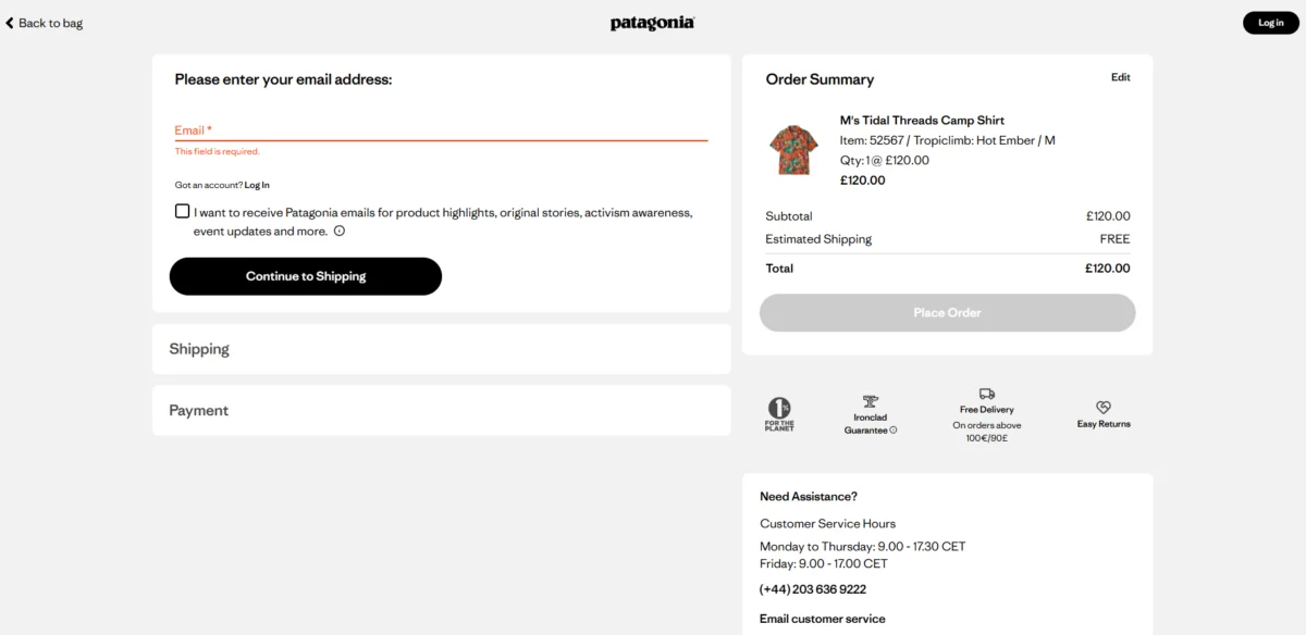
3. Minimizing Form Fields for Maximum Efficiency
Research from 2024 and 2025 indicates that the perceived effort of a checkout is directly correlated to the number of visible form fields. While some complex B2B or age-gated transactions require extensive data, a standard B2C checkout should ideally consist of only six to eight fields.
![Checkout Page Design: 11 Ways to Reduce Cart Abandonment Rates [+Examples]](https://ceblog.s3.amazonaws.com/wp-content/uploads/2021/09/30141608/Checkout-Page-Design-patagonia-email.png)
Fashion retailer ASOS has optimized this by utilizing address autocomplete tools, which can reduce the number of required keystrokes by up to 80%. Retailers can further trim fields by defaulting the billing address to match the shipping address and using a single "Full Name" field rather than separate "First" and "Last" name boxes. This reduction in manual input directly translates to a lower abandonment rate.
4. Eliminating Distractions and Navigational Exits
The sole objective of a checkout page is to facilitate a transaction. Consequently, any element that does not serve this goal should be removed. This includes the main site navigation, search bars, promotional banners, and social media icons.
![Checkout Page Design: 11 Ways to Reduce Cart Abandonment Rates [+Examples]](https://ceblog.s3.amazonaws.com/wp-content/uploads/2021/09/30141709/Checkout-Page-Design-cross-sell.png)
Patagonia serves as a benchmark for this "enclosed" checkout philosophy. Their header is stripped of all non-essential links, leaving only the brand logo and a "Back to Bag" option. By removing the exit routes, the retailer keeps the customer focused on the task at hand. However, it is essential to retain critical support information, such as customer service contacts and a condensed FAQ, to address lingering concerns without requiring the user to leave the page.
5. Architectural Strategy: Single-Page vs. Multi-Step Designs
The debate between single-page and multi-step checkouts depends largely on the complexity of the product and the target demographic.
![Checkout Page Design: 11 Ways to Reduce Cart Abandonment Rates [+Examples]](https://ceblog.s3.amazonaws.com/wp-content/uploads/2021/09/30141752/Checkout-Page-Design-linkedin-post.png)
- Single-Page Checkouts: These are highly effective for low-cost, impulsive purchases (e.g., consumer packaged goods). They minimize page loads and provide a sense of speed.
- Multi-Step Checkouts: These are often preferred for high-ticket items or complex orders. They leverage the "sunk-cost fallacy"—as users invest effort into each completed step, they become more committed to finishing the process.
A/B testing conducted by Shopify experts has shown that multi-step flows can sometimes yield higher Average Order Values (AOV) by providing logical breaks to introduce warranties or bundles. To prevent fatigue in multi-step flows, the inclusion of a progress bar is essential to tap into the "goal-gradient effect," where users accelerate their efforts as they perceive themselves getting closer to the finish line.
6. Security Reinforcement and Trust Signals
With nearly 20% of abandonments linked to a lack of trust, the visual communication of security is paramount. This is especially true for high-AOV (Average Order Value) sectors like luxury goods or electronics.
![Checkout Page Design: 11 Ways to Reduce Cart Abandonment Rates [+Examples]](https://ceblog.s3.amazonaws.com/wp-content/uploads/2021/09/30141823/Checkout-Page-Design-multistep-form.png)
Retailers like Saatva use a multi-layered approach to trust, displaying badges for secure payments alongside "satisfaction guarantees" like a 365-night trial or a lifetime warranty. These signals serve different psychological needs: the technical badges (SSL, Visa/Mastercard logos) reassure the user of data safety, while the service badges reassure them of the brand’s integrity.
7. Diversification of the Payment Ecosystem
The modern consumer expects a variety of payment options beyond traditional credit cards. A 2025 Stripe holdback experiment revealed that offering diverse payment methods, such as Apple Pay and PayPal, led to a 7.4% increase in conversion and a 12% boost in revenue.
![Checkout Page Design: 11 Ways to Reduce Cart Abandonment Rates [+Examples]](https://ceblog.s3.amazonaws.com/wp-content/uploads/2021/09/30141901/Checkout-Page-Design-express-checkout.png)
Furthermore, the rise of "Buy Now, Pay Later" (BNPL) services like Klarna and Afterpay has become a requirement for reaching younger demographics. Retailers like Decathlon ensure these options are visible immediately on the checkout page, rather than hidden in a dropdown menu, allowing users to select their preferred financial tool instantly.
8. Prioritizing Mobile-Native Design
As of early 2026, mobile devices account for approximately 74% of all ecommerce traffic, with some beauty and personal care sectors seeing rates as high as 93%. Despite this, mobile abandonment rates remain nearly 11 points higher than desktop rates.
![Checkout Page Design: 11 Ways to Reduce Cart Abandonment Rates [+Examples]](https://ceblog.s3.amazonaws.com/wp-content/uploads/2021/09/30141943/Checkout-Page-Design-payment-options.png)
To bridge this gap, checkouts must be designed with "thumb-friendly" interfaces. This includes large CTA buttons, numeric keypads for credit card and phone number fields, and the prioritization of express payment options like Shop Pay or Google Pay, which utilize biometric authentication (Face ID/Touch ID) to complete orders in seconds.
9. Call-to-Action (CTA) Visibility and Clarity
A common but overlooked cause of abandonment is the "false confirmation" error, where a user mistakes an order review page for a confirmation page and leaves before actually clicking "Place Order."
![Checkout Page Design: 11 Ways to Reduce Cart Abandonment Rates [+Examples]](https://ceblog.s3.amazonaws.com/wp-content/uploads/2021/09/30142034/Checkout-Page-Design-mobile-usage-chart.png)
To prevent this, Amazon utilizes high-contrast, sticky CTA buttons that remain visible as the user scrolls. The language must be unambiguous—"Proceed to Checkout" or "Buy Now"—to ensure the user understands exactly where they are in the process.
10. Real-Time Inline Validation
Waiting until the end of a long form to notify a user of an error is a major point of frustration. Inline validation provides real-time feedback as the user types, highlighting errors (such as an invalid zip code or missing digit in a credit card number) immediately.
![Checkout Page Design: 11 Ways to Reduce Cart Abandonment Rates [+Examples]](https://ceblog.s3.amazonaws.com/wp-content/uploads/2021/09/30142139/Checkout-Page-Design-mobile-checkout.png)
Marks & Spencer employs this strategy effectively, though experts note that for maximum efficiency, error messages should clear automatically as soon as the user begins correcting the information. This proactive approach reduces the cognitive load required to troubleshoot form failures.
11. Accessibility and Regulatory Compliance
Designing for accessibility is no longer just a moral or ethical choice; it is increasingly a legal mandate. The 2025 European Accessibility Act (EAA) requires ecommerce platforms selling within the EU to meet strict WCAG (Web Content Accessibility Guidelines) standards.
![Checkout Page Design: 11 Ways to Reduce Cart Abandonment Rates [+Examples]](https://ceblog.s3.amazonaws.com/wp-content/uploads/2021/09/30142331/Checkout-Page-Design-amazon-cart.png)
An audit in February 2026 found that over 95% of homepages still have detectable failures, suggesting that checkout pages are likely even further behind. Accessible design includes high color contrast, keyboard-only navigation, and screen-reader-friendly labels. Companies like Microsoft have set the standard here, ensuring that their checkout flows are usable by individuals with a wide range of disabilities.
The Broader Impact: Data-Driven Optimization
The shift toward highly optimized checkout pages represents a broader trend in ecommerce: the move from "intuition-based" design to "data-driven" iteration. Tools like heatmapping, session recordings, and conversion funnels allow retailers to see exactly where users hesitate.
![Checkout Page Design: 11 Ways to Reduce Cart Abandonment Rates [+Examples]](https://ceblog.s3.amazonaws.com/wp-content/uploads/2021/09/30142404/Checkout-Page-Design-amazon-checkout.png)
As the digital marketplace becomes increasingly crowded, the checkout page remains the ultimate moment of truth. Retailers who successfully reduce friction and build trust at this stage do more than just recover a single sale; they establish a foundation of user experience that drives long-term brand loyalty and customer lifetime value. In an era of 70% abandonment, even a 1% or 2% improvement in checkout efficiency can result in millions of dollars in incremental annual revenue.