Color, a ubiquitous element of human experience, stands as one of the most potent, yet often underestimated, tools in a marketer’s arsenal. Far beyond mere aesthetics, the psychology of color delves into how different hues influence human behavior, evoke specific emotions, and shape perceptions, fundamentally impacting marketing performance across all digital and physical touchpoints. This deep-seated connection between color and cognition dictates initial impressions, brand recall, and ultimately, consumer purchasing decisions. Studies consistently highlight the immediacy and power of visual cues: a staggering 90 percent of a subscriber’s first impression of an email message or a website is predicated on color or visual elements alone.
The strategic deployment of color in marketing is not merely an art; it is a science backed by extensive research into consumer psychology. Understanding the "why" behind color’s influence is crucial for effective implementation. For instance, data indicates that 84.7% of consumers surveyed deem color important when making a product purchase, underscoring its role in value perception and decision-making. Furthermore, a consistent and deliberate use of color can escalate brand recognition by a remarkable 80%. This profound influence transforms color into an indispensable component of brand identity, guiding everything from product packaging to digital interfaces. Consumers unconsciously form associations between brands and specific colors, creating a powerful mnemonic link. Consider iconic brands; their logos and primary branding colors are often instantly recognizable, triggering specific emotional and functional associations. The alignment between a brand’s chosen palette and its intended message is paramount to fostering a desired customer perception.
The Foundational Psychology of Color
The psychological impact of color stems from a complex interplay of evolutionary factors, cultural conditioning, and individual experiences. From a biological standpoint, our brains are wired to react to different wavelengths of light, translating them into colors that can stimulate or soothe. Historically, certain colors have been associated with specific phenomena—red with danger or ripeness, green with nature and growth. Culturally, these associations can vary, but broad psychological trends remain identifiable across many demographics. Understanding these universal and near-universal meanings is the first step toward leveraging color effectively.
Decoding Individual Color Meanings and Marketing Applications
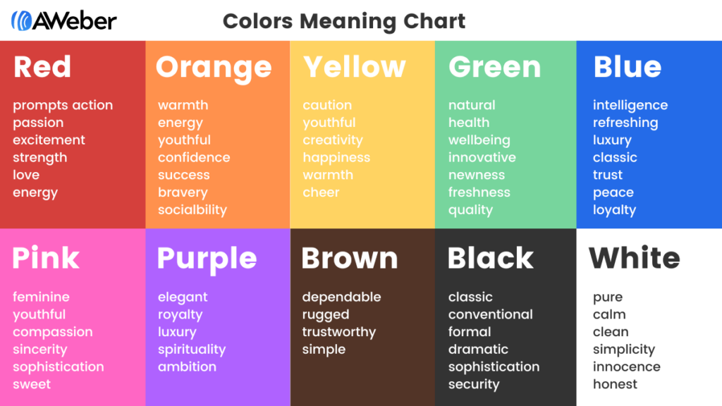
Each color carries a unique set of psychological connotations that marketers can harness to achieve specific objectives.
Blue: Trust, Serenity, and Professionalism
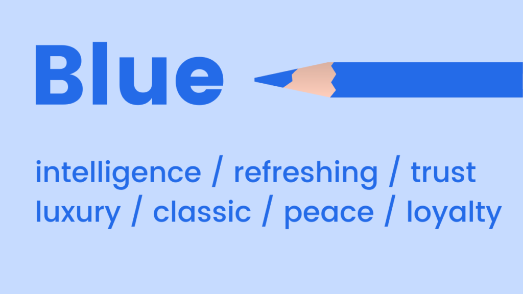
Blue is widely recognized for its mood-boosting properties, signaling calm, tranquility, and positivity. Light shades offer a refreshing ambiance, often used by brands to convey cleanliness or innovation. Darker blues, conversely, exude luxury, formality, and stability without the starkness of black. This duality makes blue a versatile choice, frequently employed by financial institutions, tech companies, and healthcare providers to build trust and authority. Its prevalence in corporate branding underscores its association with reliability and competence.
- Marketing Application: Ideal for industries requiring consumer trust (e.g., banking, insurance, IT). Light blue can denote freshness and modernity for new products or services. Dark blue lends itself to luxury goods, professional services, or corporate communications.
Pink: Youth, Sweetness, and Femininity
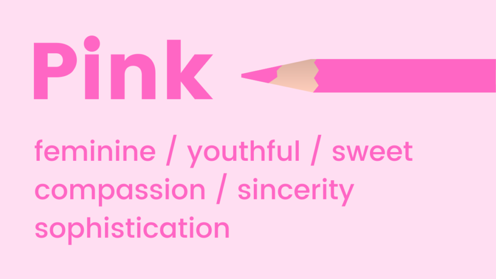
Pink tones inherently suggest youthfulness, playfulness, and excitement. It is a prominent color for emphasizing femininity, sweetness, and romance. Intriguingly, research suggests pink can even stimulate cravings for sugar, explaining its frequent use in confectionery and dessert branding. Its vibrant spectrum, from soft pastels to bold magentas, offers a range of expressions.
- Marketing Application: Excellent for brands targeting younger demographics, products related to beauty, fashion, confectionery, or any offering designed to evoke tenderness and warmth.
Green: Nature, Growth, and Well-being
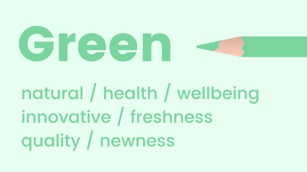
Green is intrinsically linked to natural elements, health, and environmental consciousness. It’s a soothing color that promotes feelings of relaxation, harmony, and balance. The human eye is particularly sensitive to green, making it easy to process and discern numerous shades. Its association with growth and renewal makes it an excellent choice for promoting new initiatives, fresh products, or features. Beyond nature, green also subtly communicates wealth and prosperity.
- Marketing Application: Perfect for eco-friendly brands, health and wellness products, financial services (growth, money), or any launch seeking to convey freshness and innovation.
Orange: Energy, Optimism, and Approachability
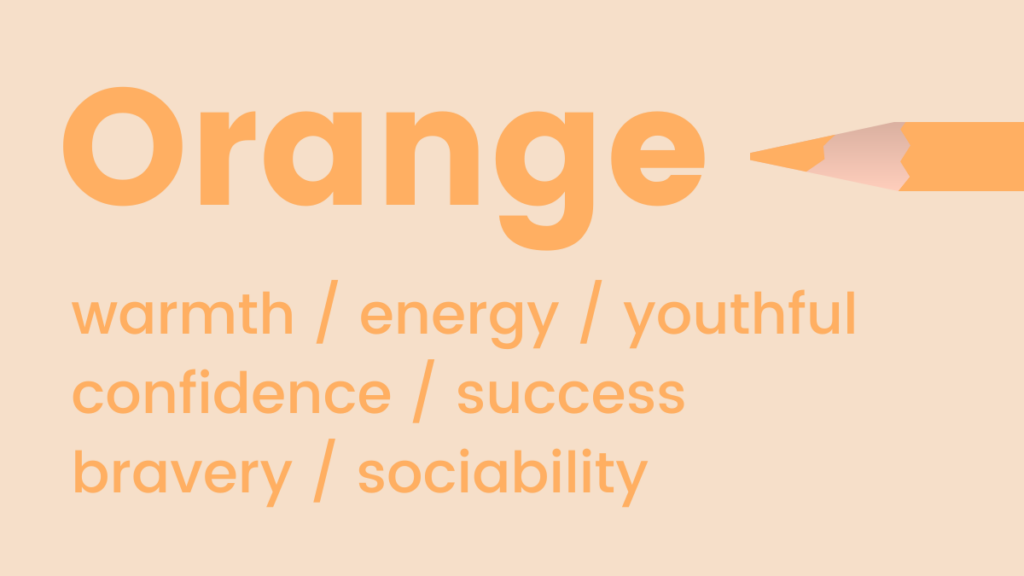
Orange radiates warmth, energy, and enthusiasm. Its flamboyant and fun nature often represents positivity, optimism, and creativity. A lesser-known but powerful association is with trust and safety, making it effective for call-to-action buttons that need to be both noticeable and reassuring. It’s a bold choice that can grab attention without the aggressive urgency of red.
- Marketing Application: Suited for brands wanting to appear friendly, innovative, and energetic. Effective for sports brands, creative services, and calls-to-action that encourage immediate but positive interaction. Marketers often use it to highlight special offers or limited-time promotions.
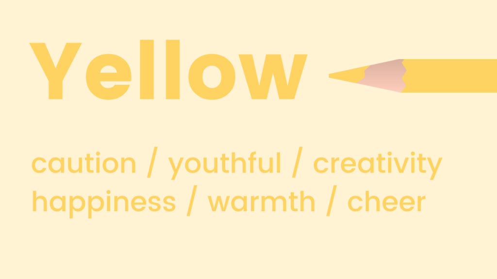
Yellow: Happiness, Optimism, and Alertness
Like orange, yellow is strongly associated with positivity and optimism, often dubbed the happiest color in the spectrum. Psychologically, yellow can activate memory, stimulate mental processes, and encourage communication, making it an engaging color. However, overuse or certain shades can also evoke caution or anxiety. Its brightness demands careful application.
- Marketing Application: Excellent for brands targeting children, leisure industries, or any product aiming to convey joy and accessibility. Can be used sparingly to highlight important information or provoke a sense of urgency without alarm.
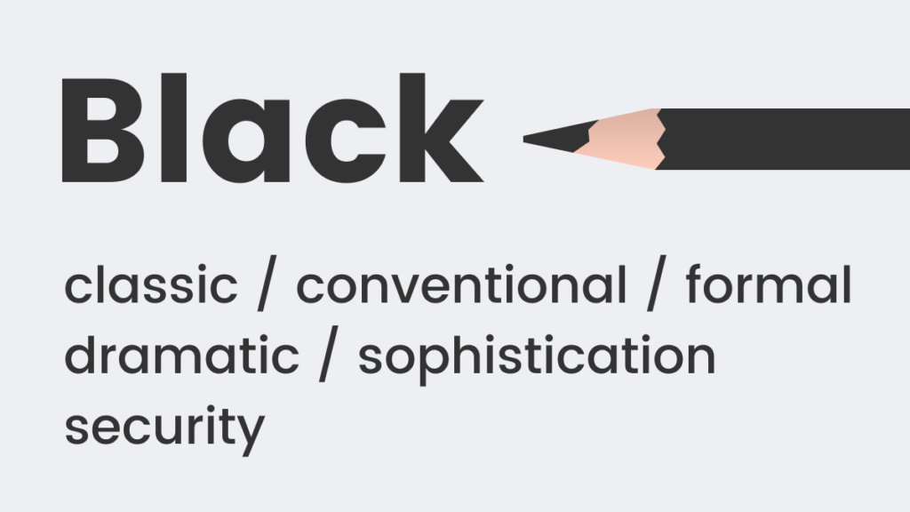
Black: Sophistication, Power, and Formality
Black is a timeless, classic choice that conveys formality, sophistication, and power. It often implies weight and substance; studies show people perceive a black box as heavier than a white one of the same size. In branding, black lends an air of exclusivity and luxury, often chosen by high-end fashion, automotive, and tech brands.
- Marketing Application: Ideal for luxury brands, high-end products, or services that want to project elegance, strength, and authority. Effective for creating strong contrast and highlighting other elements.
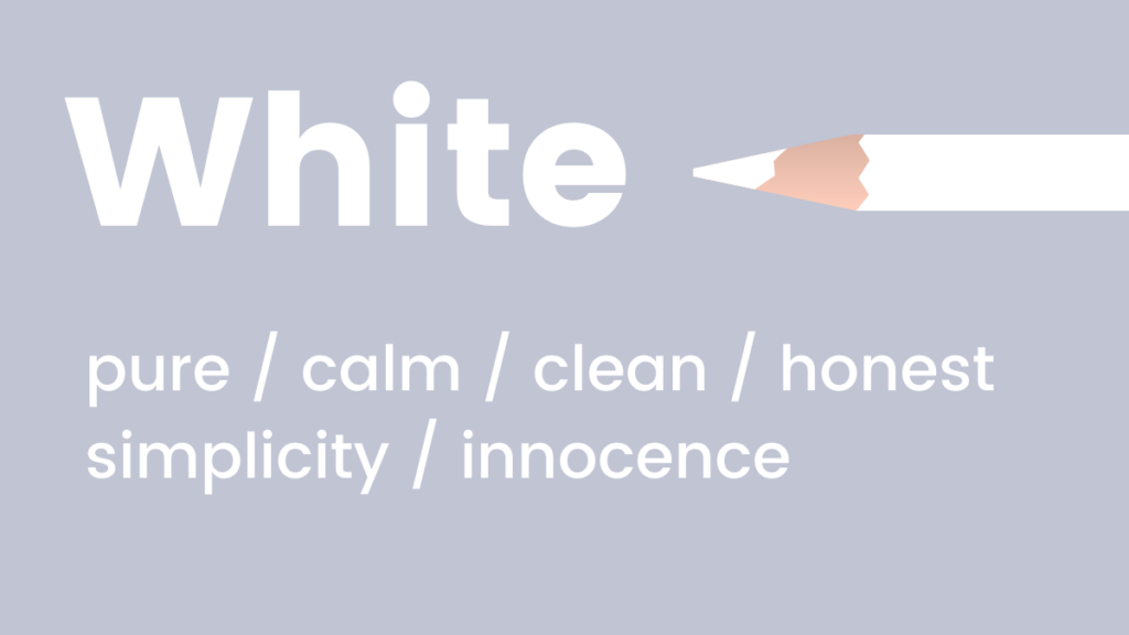
White: Purity, Simplicity, and Modernity
White signifies coolness, calm, and serenity. It is the quintessential color for brands aiming for a modern, clean, and fresh aesthetic. Its ability to create negative space allows other elements to breathe, enhancing readability and focus. White is often associated with purity, minimalism, and efficiency.
- Marketing Application: Universally applicable as a background color, promoting clarity and a modern feel. Essential for medical, tech, and minimalist lifestyle brands. Can be used to create a sense of spaciousness and openness.
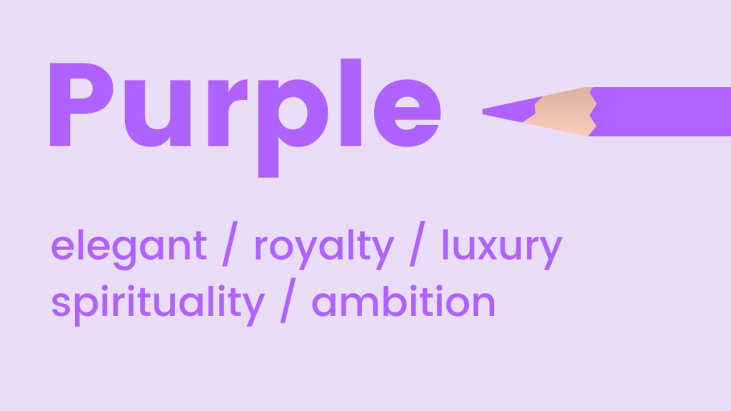
Purple: Luxury, Creativity, and Spirituality
Purple is an elegant and luxurious color, historically associated with royalty and wealth. It occupies a unique space between the stimulating warmth of red and the calming coolness of blue, fostering a sense of upliftment while maintaining serenity. Purple is also known to encourage creativity and imagination, making it a favorite in creative industries.
- Marketing Application: Suited for luxury products, creative industries, beauty brands, or any brand wishing to evoke sophistication, uniqueness, and artistic flair.
Red: Passion, Urgency, and Action
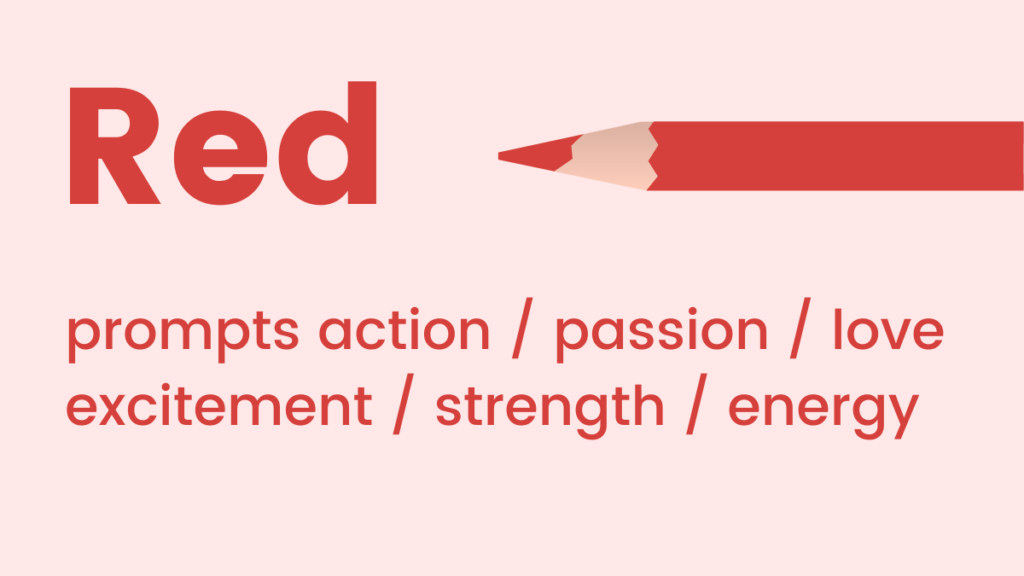
Red is a high-energy color that represents passion, excitement, and action. It can elevate heart rates and boost energy levels, making it highly effective for conveying urgency or stimulating immediate response. Its intensity ensures it grabs attention, but careful use is necessary to avoid evoking aggression or danger.
- Marketing Application: Excellent for sales, promotions, calls-to-action, and brands wanting to convey excitement or power (e.g., fast food, automotive, entertainment). Effective for drawing immediate attention to critical information.
Crafting Harmonious Color Schemes for Digital Platforms
Beyond individual color meanings, the interplay of colors within a scheme is critical for website and landing page design. Poor color combinations can lead to visual clutter, confusion, and a diminished user experience. Understanding basic color theory allows marketers to create aesthetically pleasing and psychologically effective palettes. Two primary color schemes are highly recommended for digital design:
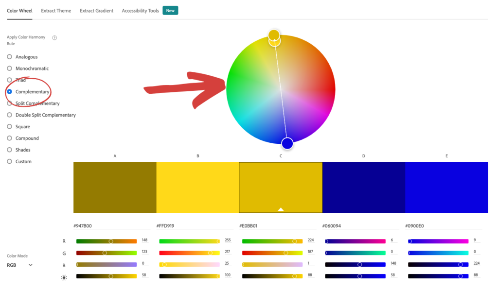
Analogous Colors: Seamless Harmony
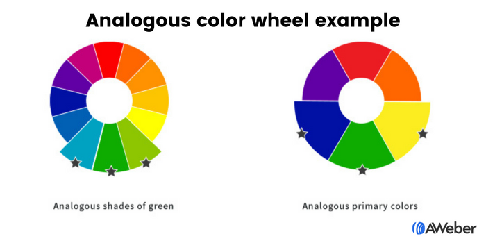
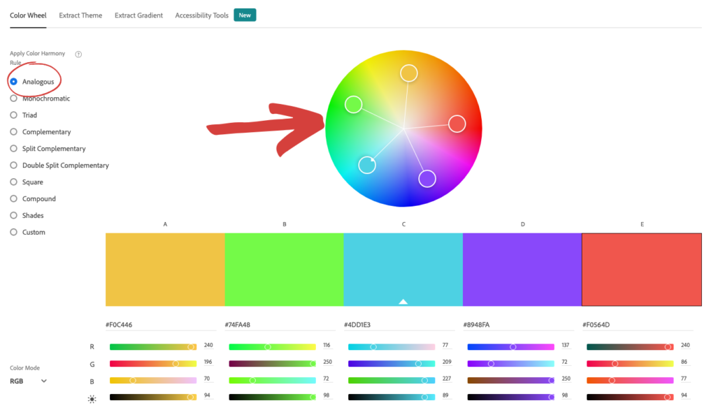
Analogous colors are those situated adjacent to each other on the color wheel. This proximity creates a naturally harmonious and serene aesthetic. For example, a palette comprising blue, green, and yellow, or different shades of a single color, offers a visually pleasing flow. This scheme is often perceived as sophisticated and easy on the eyes, making the design process more intuitive by providing a clear direction once a primary color is chosen. Tools like Adobe Color CC simplify the identification of analogous combinations, allowing designers to experiment with various harmonious palettes.

- Implication: Analogous schemes are ideal for designs where a calm, professional, and unified look is desired. They guide the user’s eye smoothly across the page without abrupt visual disruptions, fostering a sense of continuity.
Complementary Colors: Dynamic Contrast
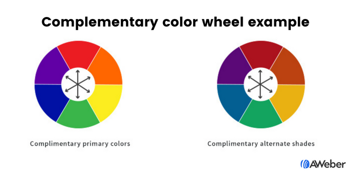
Complementary colors are positioned directly opposite each other on the color wheel, such as blue and orange, green and red, or purple and yellow. These pairings create a vibrant, high-contrast effect that can make elements pop and draw attention. When used thoughtfully, complementary schemes add visual interest and energy, making a website or landing page feel dynamic and engaging. While offering strong contrast, these combinations should be balanced, often using one color predominantly and the other as an accent. Adobe Color CC also facilitates the discovery of effective complementary pairs.

- Implication: Complementary schemes are excellent for highlighting key elements like call-to-action buttons or important sections, ensuring they stand out from the background. They are suitable for brands aiming for a bold, energetic, or visually striking presence.
Optimizing Sign-Up Forms with Color
Sign-up forms are critical conversion points, and their visibility and appeal are heavily influenced by color. The goal is to make forms irresistible, silently urging visitors to complete them.

Analogous and Complementary Approaches in Forms:
Applying analogous shades, such as three different greens, can create a cohesive and inviting form that blends seamlessly with the overall design while still being noticeable. Alternatively, using an analogous family of yellow and green shades can offer a slightly more varied yet harmonious look. For greater impact, complementary colors, like purple and yellow or green and red, can be employed to make the form itself or its crucial elements visually distinct.

Leveraging Contrasting Colors for Maximum Impact:
Contrast is paramount in drawing the eye to specific elements. There are two primary ways to utilize contrast in sign-up forms:

- Contrast between the form and the site: Making the sign-up form’s background a contrasting color to the main website background immediately draws attention to it. This acts as a visual break, guiding the user’s focus.
- Contrast within the form: Once the user’s attention is on the form, contrasting colors within the form itself—for fields, text, and especially the call-to-action button—directs their next action. A bold, contrasting button ensures it is highly noticeable, effectively communicating "click here." For instance, a form utilizing contrasting shades of black, yellow, and white can effectively guide the eye from the form to the fields and then to the button.
Strategic Color Use in Email Marketing
The purpose of an email should dictate its color scheme, ensuring that visual elements support the message rather than detract from it.
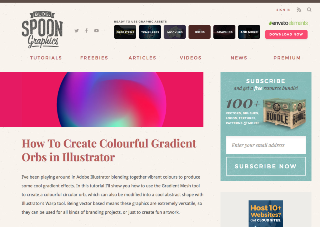
- Email Newsletters: These often prioritize content consumption. A predominantly white background with subtle splashes of brand colors ensures readability. Calls-to-action (CTAs) for external links (e.g., blog posts, videos) should be designed with contrasting colors to command attention.
- Welcome Emails: As a primary brand introduction, welcome emails should heavily feature brand colors to reinforce visual identity and create a memorable first impression.
- Sales Emails: Color choices here should align with the psychological associations of the offer. Red for urgency, blue for trust in high-value products, or pink for a playful discount.
Examples of Email Color Schemes:

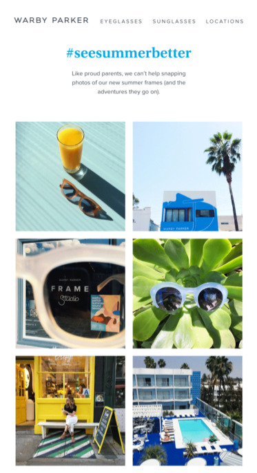
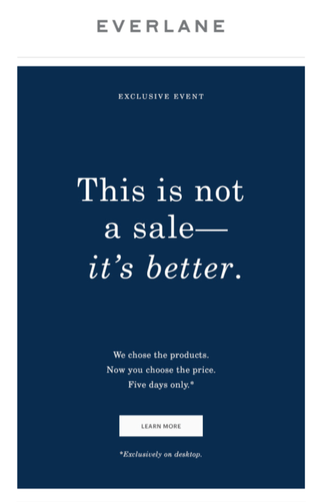
- Blue: Warby Parker uses pale blue for a refreshing vibe; Everlane uses dark blue for a luxurious, sophisticated look.
- Pink: Lyft employs pink in welcome emails to convey friendliness and approachability.
- Green: Offscreen uses green palettes to promote new products, evoking relaxation and freshness.
- Yellow: Lego leverages yellow as a background, appealing to children and reinforcing its playful brand.
- Black: Harry’s uses an all-black email to position its product as classic and sophisticated, with a white CTA for clear action.
- White: The Little White Company utilizes white extensively to portray a calm, pure, and clean brand image.
- Purple: Stuart Weitzman integrates its signature purple shoebox in abandoned cart emails, reinforcing its luxe and elegant brand.
Evolving Brand Aesthetics: Flexibility and AI Integration
For established brands, incorporating new color psychology principles may seem daunting, especially when adhering to existing brand guidelines. However, brand aesthetics are not static; they should evolve with the market, audience, and product offerings. Just as a person’s style changes over time, a brand’s visual identity can adapt without losing recognition. Adding new colors that complement existing ones, or even re-evaluating primary brand colors, can usher in a new, more effective era for a business. Tools like Coolors allow brands to upload their existing palette and generate harmonious complementary colors, fostering growth without radical departure.
The future of applying color psychology in marketing is increasingly being shaped by artificial intelligence. AI-powered design tools are democratizing sophisticated design principles, making them accessible to marketers without extensive design backgrounds. AWeber’s AI Signup Form Builder, for instance, allows users to describe their desired form’s look, feel, and vibe using natural language (e.g., "dark background with an orange button that pops"), and the AI constructs it. This technology understands color intent, enabling marketers to directly apply their knowledge of color psychology—such as orange signaling trust and action, or blue building credibility—into their prompts. This bespoke approach moves beyond generic templates, allowing for audience-specific, psychologically optimized designs.
Upcoming AI-powered email and landing page builders promise to extend this capability, allowing marketers to specify desired emotional responses and aesthetic details (e.g., "a clean, white newsletter layout with a red CTA" or "a purple, luxury-feel landing page with gold accents"). In this evolving landscape, the foundational principles of color psychology remain the essential input, while AI streamlines the execution, transforming complex design tasks into intuitive, descriptive processes. This fusion of psychological insight and technological prowess empowers marketers to unlock unprecedented levels of engagement and drive meaningful results.


 Ammar Sabilarrohman
 Asro
Asro