The landscape of data visualization underwent a significant paradigm shift throughout 2017 and into early 2018, as the democratization of business intelligence tools allowed both corporations and independent journalists to translate complex datasets into actionable insights. At the forefront of this movement was Google Data Studio, a platform that transitioned from a niche beta product into a cornerstone of digital reporting. By bridging the gap between raw data sources—such as Google Analytics, BigQuery, and SQL databases—and aesthetic, interactive interfaces, the tool redefined how information is consumed across the professional and public sectors. The emergence of high-impact visualizations during this period served as a harbinger for the modern era of the "no-code" data revolution, where the ability to tell a story with numbers became as critical as the ability to collect them.
The Shift from Manual Reporting to Real-Time Visualization
Prior to the widespread adoption of cloud-based visualization platforms, business reporting was characterized by labor-intensive manual processes. Marketing agencies and internal data teams frequently spent dozens of man-hours per month exporting CSV files, cleaning data in spreadsheets, and manually formatting slide decks for stakeholders. The transition to Google Data Studio represented a fundamental change in operational efficiency.
A primary example of this evolution was documented by Boat International Media. The organization, which manages high-end luxury lifestyle content, reported a drastic reduction in their monthly client reporting cycle. By utilizing automated data connectors to track Search Engine Optimization (SEO) performance, the team reduced a process that previously required five full days of labor to just fifteen minutes. This 99% increase in efficiency was not merely a matter of speed; it allowed analysts to pivot from the "production" of data to the "interpretation" of data. The ability to present clear, key insights without the clutter of traditional spreadsheets enabled more strategic decision-making and improved client transparency.
Strategic Business Applications: Beyond the Dashboard
The adoption of Data Studio in 2018 was driven largely by its integration with the broader Google Marketing Platform. Specialized firms like ClickInsight and E-Nor began developing sophisticated templates that allowed businesses to visualize Google Analytics data with unprecedented clarity. These templates were designed not just for aesthetic appeal but for functional depth, utilizing features like date-range comparisons, filter controls, and calculated metrics.

One of the most effective technical implementations observed during this period was the use of bullet charts for page-level engagement. Analytics Pros, a prominent data consultancy, demonstrated how combining bullet charts with scorecard metrics could provide a multi-dimensional view of performance. Unlike standard bar charts, bullet charts allowed companies to compare current performance against both historical data (last year’s numbers) and specific benchmark targets within a single, compact visual. This methodology allowed stakeholders to immediately identify which web pages were underperforming relative to their goals, rather than simply viewing traffic in a vacuum.
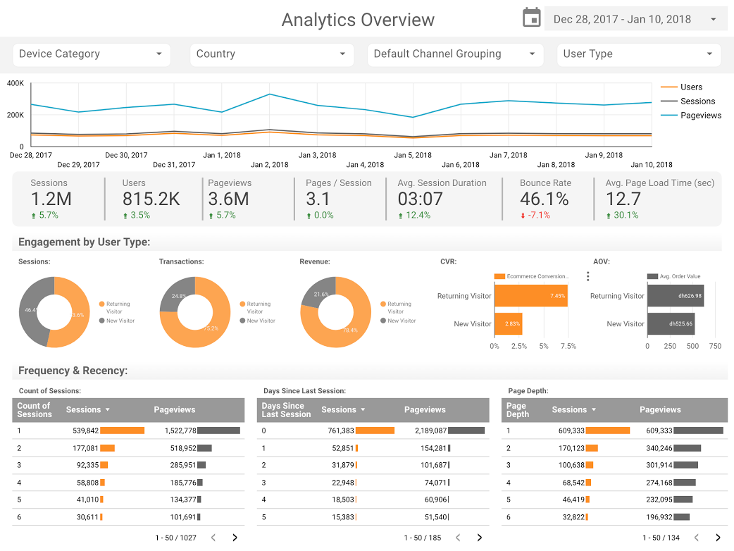
Furthermore, the "Analytics Overview" reports developed by consultants like Sunil Attri at E-Nor highlighted the importance of interactivity. By allowing users to drill down into specific dimensions—such as device category, geographic location, or traffic source—within the dashboard itself, organizations moved away from static PDF reports toward dynamic environments where stakeholders could explore data at their own pace.
Data Journalism: The Rise of Narrative Visualization
While business applications focused on ROI and efficiency, a parallel trend emerged in the realm of data journalism. Journalists and hobbyists began leveraging the same tools to tell "data stories" about popular culture, technology, and social trends. This transition marked the entry of professional-grade visualization into the public discourse, making complex information accessible to the general reader.
In the entertainment sector, the "Marvel vs. DC Cinematic Universes" visualization served as a case study in audience engagement. By aggregating box office data, critical reception scores, and release timelines, the visualization provided a comparative analysis of two media giants competing for a global market that had exceeded $27 billion in revenue. This type of reporting transformed dry financial figures into a competitive narrative, allowing fans and industry analysts to visualize the "war" for audience attention through interactive charts.
Similarly, the "Data Behind Star Wars" report by ClickInsight utilized the franchise’s massive lore to demonstrate the power of hierarchical data. By comparing starship speeds, character demographics, and planetary details, the report showcased how Data Studio could handle non-financial, categorical data to create educational and entertaining content.

Technical Integration: The Role of BigQuery and Open Source Data
The sophistication of 2018’s visualizations was largely supported by the backend power of BigQuery, Google’s enterprise data warehouse. The ability to process massive datasets in seconds and pipe them directly into a visualization layer allowed for much larger-scale stories than previously possible on the web.
A notable instance of this was the analysis of open-source contributions conducted by Google Developer Advocate Felipe Hoffa. By analyzing "PushEvents" published by GitHub throughout 2017, Hoffa was able to identify which companies and individuals contributed the most to the global coding community. This required processing millions of rows of data—a task that would have crashed traditional spreadsheet software. The use of the BigQuery connector in Data Studio allowed this data to be presented in a way that was both visually digestible and technically rigorous. This analysis provided the tech industry with a factual roadmap of the open-source landscape, highlighting the dominant roles of organizations like Google, Microsoft, and Red Hat in shaping the modern web.
Sociological Insights Through Longitudinal Data
Perhaps the most profound use of data visualization in this era was the analysis of long-term social trends. The project "150 Years of Marriages and Divorces in the UK," authored by data analysts including Lizzie Silvey, exemplified the "spirit of data journalism." By examining over a century of records, the visualization answered complex sociological questions regarding how external shocks—such as World Wars and changes in legislation—directly impacted the fabric of British society.
The data revealed clear correlations between the introduction of the Legal Aid and Advice Act of 1949 and spikes in divorce rates, as well as the precipitous drop in marriages during the height of global conflicts. This type of longitudinal analysis, when presented through interactive time-series charts, allowed the public to see the "long view" of history, moving beyond anecdotal evidence to empirical truth. It underscored the potential for data visualization to serve as a tool for public education and historical record-keeping.
Industry Reactions and the Shift in Data Literacy
The rapid proliferation of these tools did not go unnoticed by industry leaders. Analysts noted that the barrier to entry for high-quality data presentation had effectively collapsed. Where previously a firm might have needed a dedicated "Data Viz" specialist proficient in D3.js or complex Tableau configurations, the intuitive nature of Data Studio allowed generalist marketers and journalists to produce professional-grade work.
However, this shift also prompted a discussion about "data literacy." As it became easier to create charts, the responsibility to choose the correct charts became more paramount. Experts emphasized that the best visualizations—such as those featured in the 2017-2018 retrospectives—shared three common traits: a disciplined choice of charts (using the right tool for the right data type), intentional design (avoiding "chart junk" and using color to highlight insights rather than for decoration), and a cohesive narrative structure.
Broader Impact and the Legacy of 2018
The visualizations produced during this period laid the groundwork for what we now recognize as the modern business intelligence landscape. The success of these early adopters proved that data does not have to be intimidating or dry; when presented correctly, it is a powerful medium for persuasion, efficiency, and storytelling.
The transition of Google Data Studio into Looker Studio in later years was a direct result of the momentum built during this 2017-2018 window. The platform’s ability to handle diverse data sources—from the SEO performance of luxury media brands to the 150-year history of UK social trends—demonstrated its versatility.
As we look back at the "class of 2018" visualizations, the primary takeaway is the permanent shift in expectations. Clients no longer accept static, month-old reports; they expect real-time, interactive transparency. Readers no longer settle for vague claims; they expect to see the data behind the story. The democratization of these tools has ensured that whether the subject is the box office success of a superhero movie or the operational efficiency of a global enterprise, the data is no longer hidden in a spreadsheet—it is front and center, telling a story that everyone can understand.