The landscape of business intelligence and digital storytelling underwent a significant transformation throughout 2017 and into early 2018, marked by a decisive shift toward the democratization of data visualization. As organizations and independent analysts sought more efficient ways to translate complex datasets into actionable insights, Google Data Studio emerged as a pivotal tool in bridging the gap between raw data and narrative-driven reporting. This period saw a move away from static, manual spreadsheets toward dynamic, interactive dashboards that allowed users—ranging from SEO specialists to data journalists—to explore information in real-time. The rise of these visualizations signifies a broader trend in the digital economy: the requirement for speed, clarity, and aesthetic precision in communicating data to stakeholders and the general public alike.
The Chronology of Accessibility in Business Intelligence
The emergence of Google Data Studio as a market leader in 2017 was not an isolated event but the result of a multi-year effort to simplify the Business Intelligence (BI) stack. Historically, high-end data visualization was the domain of specialized software like Tableau or Microsoft Power BI, which often required significant licensing costs and steep learning curves. In mid-2016, Google introduced Data Studio in beta, offering a free, web-based alternative that integrated seamlessly with the Google Marketing Platform. By 2017, the platform had expanded its connector ecosystem, allowing users to pull data from BigQuery, Google Analytics, AdWords, and SQL databases without requiring complex middleware.
Throughout 2017, the platform’s adoption rate accelerated as companies realized the potential for significant overhead reduction. By automating the data retrieval and visualization process, businesses began to pivot from "data collection" to "data interpretation." This shift set the stage for the diverse range of use cases seen today, where the focus has moved from merely displaying numbers to telling a comprehensive story about performance and social trends.
Efficiency Gains in Business Reporting: From Days to Minutes
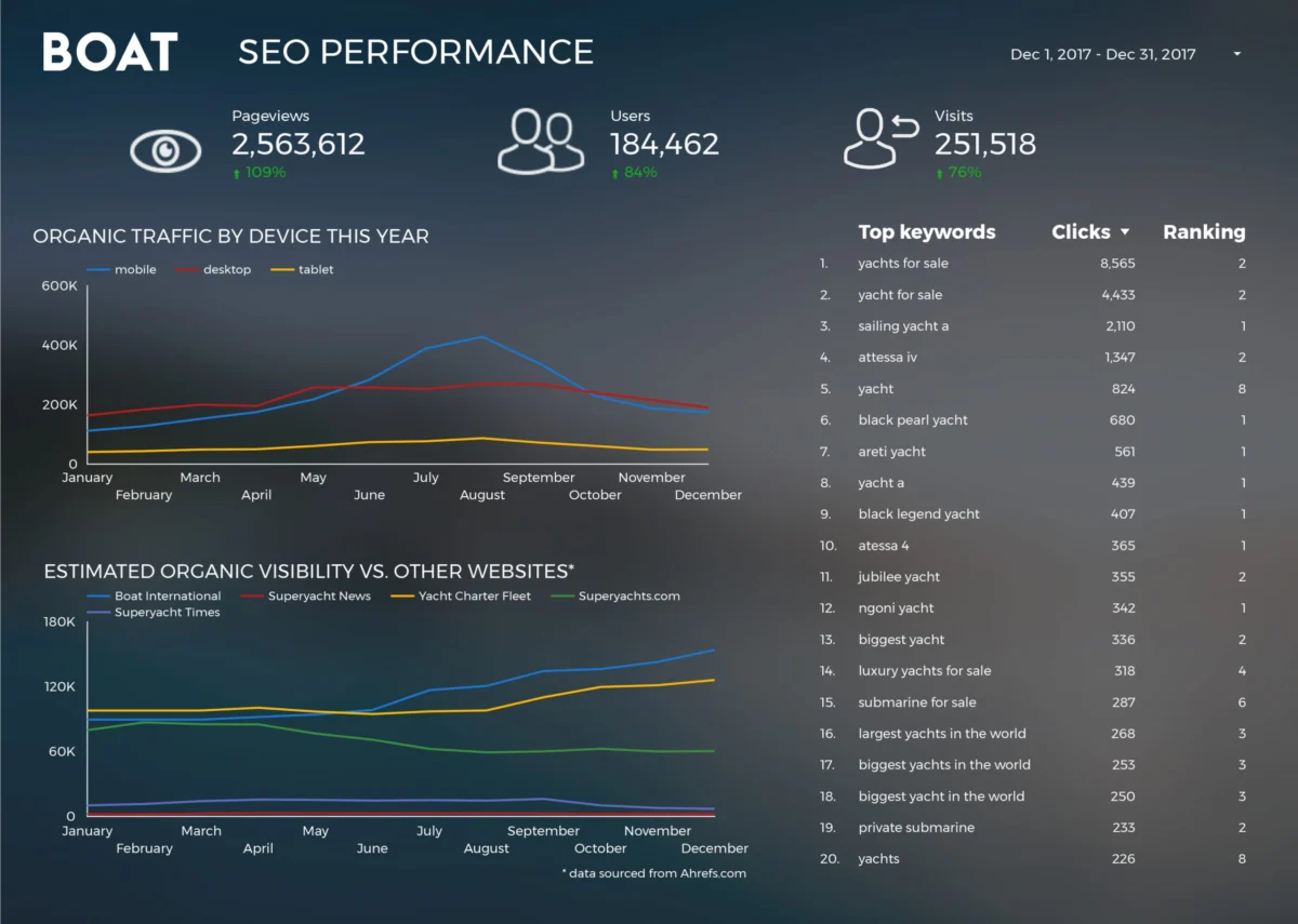
One of the most compelling arguments for the adoption of modern visualization tools is the drastic reduction in manual labor. A primary case study in this efficiency is Boat International Media. Prior to the implementation of automated dashboards, the organization’s SEO performance reporting was a grueling manual process that required five days of labor every month to compile, format, and verify. By leveraging Google Data Studio, the team—led by analysts Fanni Takacs and Drew Broomhall—reduced this timeframe to just fifteen minutes.

This 99% reduction in reporting time highlights a critical shift in the role of the modern analyst. When reporting is automated, analysts are no longer "data janitors" tasked with cleaning and moving rows of information; instead, they become strategic advisors. The Boat International Media report focused on clear key insights and a minimalist design, ensuring that the data was accessible as both an interactive online experience and a professional PDF for client distribution. This dual-purpose utility has become an industry standard for agencies looking to maintain transparency while maximizing billable hours for strategy rather than administration.
Advanced Methodology: The Role of Specialized Visualizations
Beyond simple bar and line charts, the evolution of Data Studio in 2017 allowed for the implementation of more sophisticated analytical frameworks. Analytics Pros, a prominent digital analytics consultancy, demonstrated this through the use of bullet charts for page-level engagement. The bullet chart, a variation of a bar chart developed by visualization expert Stephen Few, provides a rich context by showing a primary measure (such as current traffic) against a comparative measure (such as last year’s performance) and qualitative ranges (such as target benchmarks).
By integrating these charts into their dashboards, companies began to move beyond "vanity metrics." Instead of simply seeing that a page received 10,000 visits, stakeholders could immediately see if that number met their growth targets or if it fell short of historical averages. Furthermore, the inclusion of scorecard metrics allowed for a multi-dimensional view of user behavior, combining volume (visits) with quality (engagement time). This nuanced approach to data has become essential for organizations operating in highly competitive digital markets where marginal gains in user retention can lead to significant revenue increases.
Data Journalism: Bringing Public Datasets to Life
The impact of Google Data Studio extended far beyond the boardroom, finding a significant foothold in the realm of data journalism and public interest storytelling. This movement was characterized by the use of publicly available data to explore cultural and social phenomena.
The Economics of Entertainment: Marvel vs. DC
The global box office has long been a subject of intense public interest, particularly with the rise of cinematic universes. In a detailed analysis of the "war" for audience attention, visualizations created in late 2017 compared the financial and critical success of the Marvel Cinematic Universe (MCU) against the DC Extended Universe (DCEU). With the two franchises collectively generating over $27 billion in worldwide revenue at that time, the data revealed clear patterns in audience loyalty and regional performance. These visualizations allowed fans and industry analysts to see beyond the hype of individual film releases, providing a macro-view of how brand consistency impacts long-term fiscal health.

Technological Contributions: The Open Source Ecosystem
In the tech sector, data visualization has been used to map the evolution of software development. Felipe Hoffa, a Developer Advocate at Google, utilized the BigQuery connector to analyze millions of "PushEvents" on GitHub from 2017. His work highlighted which companies and individuals contributed the most to open-source projects, which are the backbone of the modern web. This type of analysis was previously difficult for the average user to perform, requiring significant SQL knowledge and computing power. By surfacing this data through Data Studio, Hoffa made the inner workings of the global developer community transparent, showing that open-source contribution is not just a hobbyist pursuit but a major corporate strategy for tech giants.
Sociological Trends: 150 Years of UK Social Fabric
Perhaps the most profound use of visualization in this period was the analysis of long-term social trends. An in-depth report by Lizzie Silvey and her colleagues examined 150 years of marriage and divorce data in the United Kingdom. This visualization went beyond simple statistics to answer complex sociological questions regarding how wars, legislative changes, and economic shifts influenced the family unit over more than a century. By plotting these trends against a historical timeline, the data told a story of a changing society—showing, for instance, how the liberalization of divorce laws in the 20th century led to spikes in filings that eventually stabilized into new social norms.
Technical Infrastructure and the Power of Connectors
The success of these visualizations is fundamentally tied to the underlying technology of data connectors. In the past, the "siloing" of data was a major barrier to comprehensive analysis. A company might have website data in Google Analytics, sales data in a CRM like Salesforce, and advertising data in Facebook Ads.
The development of third-party and native connectors in late 2017 allowed these disparate sources to be merged into a single "source of truth." For example, the ClickInsight team developed templates that allowed users to instantly visualize Google Analytics data, providing a turnkey solution for small businesses that lacked the budget for custom development. The ability to join a BigQuery dataset with a Google Sheet, and then overlay that data onto a geographical map, transformed Data Studio from a simple reporting tool into a powerful engine for discovery.
Implications for the Future of Data Communication
The trends established in 2017 and 2018 have permanent implications for how information is consumed. We have entered an era where "data literacy" is a required skill for professionals across all sectors. The move toward interactive dashboards suggests that audiences no longer want to be told what the data means; they want the tools to interrogate the data themselves.
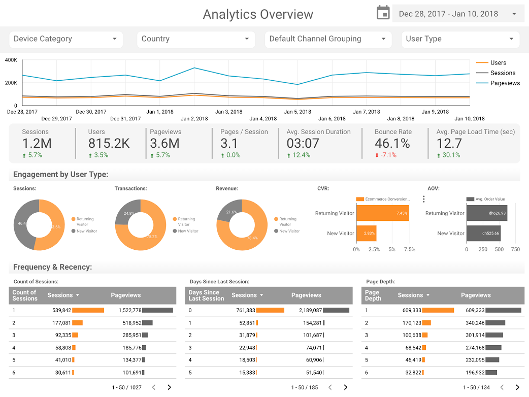
Furthermore, the emphasis on design and user experience in these reports indicates that the "aesthetic" of data is no longer secondary to the numbers. As seen in the work of E-Nor and Boat International Media, a well-designed report reduces the cognitive load on the viewer, making the insights more persuasive and easier to remember. In a world of information overload, the ability to present a clean, focused, and interactive narrative is a significant competitive advantage.
Conclusion and Industry Outlook
As we look back at the surge of creativity and technical proficiency that defined the 2017-2018 period, it is clear that Google Data Studio acted as a catalyst for a broader movement. By lowering the barrier to entry, it empowered a new generation of "data citizens" to explore everything from corporate SEO to the history of the Star Wars franchise.
For businesses, the mandate is clear: manual reporting is a relic of the past. The future belongs to those who can automate their data pipelines and focus their energy on high-level analysis. For the public, the rise of data journalism ensures a more informed discourse, where claims can be checked against historical data and global trends. As the tools continue to evolve—incorporating artificial intelligence and even more seamless integrations—the stories we tell with data will only become more complex, more beautiful, and more essential to our understanding of the world.