Popup forms, those ubiquitous overlay windows designed to capture email addresses, represent one of the most potent yet polarizing tools in a digital marketer’s arsenal. When deployed with precision and thoughtfulness, they are undeniably the fastest route to expanding an email list; conversely, a poorly executed popup can just as swiftly alienate a visitor, leading to immediate site abandonment and a tarnished brand perception. The critical distinction between these two outcomes lies not inherently in the popup itself, but rather in the nuanced strategy governing its appearance: specifically, when, where, and how often it engages the user.
The Evolution of a Digital Tool: From Intrusive Nuisance to Sophisticated Conversion Engine
The journey of the popup form has been marked by significant evolution. In its nascent stages, the internet was often plagued by aggressive, full-screen interstitials that disrupted browsing experiences without offering commensurate value. These early iterations, characterized by their abrupt appearance and difficult-to-locate close buttons, swiftly earned a reputation for being intrusive and user-unfriendly. This period fostered widespread user resentment and led to the proliferation of ad blockers, fundamentally challenging the efficacy of such direct marketing tactics.
However, as digital marketing matured, so too did the understanding of user experience (UX) and conversion psychology. Marketers began to recognize that sustainable growth hinged on a symbiotic relationship with their audience, where value exchange preceded any request for personal information. This realization spurred a shift from interruptive popups to more sophisticated, behaviorally triggered modals designed to appear at moments of genuine user engagement or intent. Today, advanced tools, including AI-powered builders, allow for highly customized and intelligent popup deployment, transforming them from mere interruptions into strategic touchpoints for lead generation. The industry consensus now firmly supports the principle that a popup should enhance, not detract from, the user’s journey, offering relevant value at an opportune moment.
The Core Principles of Effective Popup Design

Building a popup that converts effectively while maintaining respect for the user involves adhering to several foundational design principles. These guidelines ensure that the form feels like a helpful offering rather than an unwelcome intrusion.
1. Crafting Compelling Offers: Headlines, Value, and Lead Magnets
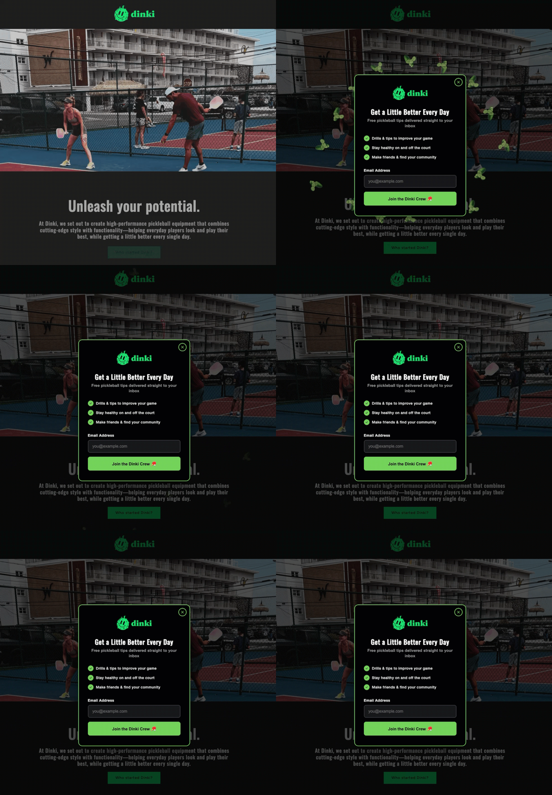
The headline is paramount, serving as the immediate value proposition. It must be concise, specific, and impactful, communicating what the visitor stands to gain in ten words or fewer. Generic calls to action like "Subscribe to our newsletter" consistently underperform compared to targeted offers such as "Get the Weekly Marketing Checklist" or "Unlock Your Free E-commerce Guide." The headline should unequivocally name the deliverable, clarifying precisely what will arrive in their inbox. This specificity activates the principle of reciprocity, where users are more willing to provide information when a clear, tangible benefit is offered in return.
An optional but often powerful addition is a brief value statement, typically a single sentence placed directly beneath the headline. This statement can serve to build urgency or establish credibility. Examples include "Sent to your inbox in 60 seconds" to emphasize speed, or "Trusted by 5,000+ small business owners" to leverage social proof. If the headline is sufficiently clear and compelling on its own, this additional context may not be necessary, ensuring the form remains uncluttered and direct.
2. Streamlining the User Journey: Minimal Fields and Clear Calls to Action
The conversion funnel is inherently sensitive to friction, and every additional field in a form introduces potential resistance. For a popup, the goal is often to initiate a relationship, making the email address the singular essential piece of information. While collecting a first name can facilitate personalization in subsequent communications, adding more than one or two fields is generally counterproductive for a popup. Industry data consistently shows that conversion rates decrease with each additional field. For instance, studies by marketing analytics firms often report a 2-5% drop in conversion for every extra field beyond email. More extensive information, such as company size or specific interests, can be gathered later through progressive profiling, welcome email sequences, or preference centers, once a baseline level of trust and engagement has been established.
The call-to-action (CTA) button demands equally meticulous attention. Generic terms like "Submit" or "Sign Up" are far less effective than action-oriented, benefit-driven language. Phrases such as "Send me the checklist" or "Get my free guide" clearly articulate the immediate outcome for the user. Furthermore, testing often reveals that first-person language ("Get my free guide") tends to outperform second-person language ("Get your free guide"), as it creates a stronger sense of ownership and immediate benefit for the individual. The CTA button is the final prompt for conversion; its language must be compelling and specific to the offer presented.
3. Prioritizing User Comfort: The Indispensable Close Button
A fundamental aspect of user-respectful design is providing a clear, obvious, and easily clickable close option. This means avoiding tiny, barely visible "X" icons tucked away in a corner, or worse, employing "guilt-tripping" dismiss links such as "No, I don’t want more customers." If a visitor chooses not to subscribe at a given moment, that decision must be respected. Trapping users within a popup not only frustrates them but also erodes trust, potentially leading to immediate site abandonment and a negative brand association. A clearly visible and functional close button signals respect for the user’s autonomy and contributes to a positive overall site experience.
The Art of Timing: When to Engage Your Audience
The precise moment a popup appears profoundly influences whether it is perceived as helpful or hostile. A popup that fires within the first few seconds of a visitor landing on a page, before they have even had a chance to consume any content, signals that the site owner prioritizes email collection over user experience. In contrast, a popup that waits until a visitor has scrolled a significant portion of the page, or spent a meaningful amount of time reading, is perceived as less intrusive because it appears when the user is already engaged with the content.
1. Understanding Behavioral Triggers: Scroll Depth, Time on Page, and Exit Intent
Three primary behavioral triggers have proven most effective in deploying popups strategically:
- Scroll-based triggers: These activate the popup once a visitor has scrolled a predetermined percentage down the page. For content-rich pages like blog posts, a scroll depth of 40% to 60% is often optimal. At this point, the visitor has invested enough time and attention to have formed an opinion about the content’s value, making them more receptive to an offer.
- Time-based triggers: These launch the popup after a set number of seconds has elapsed since the visitor arrived on the page. A waiting period of 15 to 30 seconds generally provides sufficient time for most visitors to engage with the initial content. Deploying a popup in under ten seconds often feels aggressive and premature.
- Exit-intent triggers: These are arguably the least intrusive and often the most effective. Exit-intent technology detects when a visitor’s cursor moves toward the browser’s close button, back button, or address bar, signaling an imminent departure. The popup appears precisely at this critical juncture, offering a last-chance incentive before the visitor leaves the site entirely. Exit-intent popups consistently demonstrate higher conversion rates compared to timed popups because they do not interrupt the active reading experience, targeting only those who were already on their way out.
2. The Strategic Advantage of Combined Triggers
Savvy marketers often combine these triggers for a multi-layered approach. For highly engaged readers who are deep into content, a scroll-based popup might be deployed. For those who browse briefly and then attempt to leave, an exit-intent popup can serve as a final engagement opportunity. This strategy ensures that different segments of visitors receive offers tailored to their engagement level, maximizing the chances of conversion while minimizing disruption. Visitors deeply immersed in content receive a relevant offer when their interest is piqued, while departing visitors are given one more compelling reason to stay connected.
Frequency and Respect: Nurturing Long-Term Relationships
Once a visitor closes a popup, immediately re-displaying it on the next pageview is a sure-fire way to frustrate them and encourage site abandonment. This relentless repetition signals a disregard for user preference.
Setting Intelligent Frequency Caps: To maintain a positive user experience, it is crucial to implement frequency caps. A common best practice is to show a popup only once per session or, for a more conservative approach, once every seven days. Repeated, uninvited popups do not magically convert resistant visitors; instead, they merely reinforce the decision to leave and damage the brand’s reputation. Respecting a user’s initial decision to close the popup for at least the remainder of their visit, if not longer, is fundamental to building trust and fostering a positive long-term relationship.
Precision Targeting: Delivering Relevance
The blanket approach of displaying the same popup on every page of a website significantly dilutes its impact and can lead to visitor fatigue. Effective popups are not just about timing; they are also about contextual relevance.
1. Page-Specific Offers: Contextualizing the Value
Not every page on a website warrants a popup, and certainly not the same generic one. The most effective popups are those that are hyper-relevant to the content being consumed. For instance, a popup offering a "blog writing checklist" makes perfect sense on a post discussing content marketing strategies. Conversely, the same popup would be entirely out of place and ineffective on a pricing page or a "contact us" page. Generic "join our newsletter" popups rarely perform as well as highly targeted offers that directly relate to the page’s content. If a visitor is reading an article about email automation, offering a resource specifically on email automation significantly increases the likelihood of conversion, as it aligns directly with their current interest and information needs.
2. Device Optimization: Navigating Mobile User Experience and SEO Penalties
The mobile landscape introduces unique considerations for popup deployment. A popup that appears perfectly balanced and functional on a desktop screen can easily become an intrusive, full-screen obstruction on a smartphone. Recognizing this, Google introduced its "intrusive mobile interstitials" penalty in January 2017. This update explicitly targets full-screen popups that cover all content immediately upon mobile page load, designating them as a negative ranking signal in mobile search results. This means that such aggressive mobile popups can actively harm a website’s search engine optimization (SEO) performance.
However, not all mobile popups are penalized. Google’s guidelines distinguish between intrusive interstitials and those triggered by user actions or appearing after significant engagement. Popups triggered by a time delay, scroll depth, or exit intent are generally not penalized, as they do not immediately obstruct content upon arrival. For mobile devices, it is strongly recommended to employ less intrusive formats, such as smaller banners, slide-ins, or sticky bars that remain visible without obscuring the main content. Furthermore, regardless of the format, the close button on any mobile popup must be large, easily tappable, and immediately accessible, ensuring a smooth user experience even on smaller screens. Prioritizing responsive design and mobile-first UX is critical for both user satisfaction and SEO health.
Leveraging Technology: The Rise of AI in Form Building
The process of designing and deploying effective popups has been significantly democratized and enhanced by technological advancements, particularly the advent of Artificial Intelligence (AI). Tools like AWeber’s AI Signup Form Builder exemplify this trend, simplifying what was once a complex, multi-step process.
This AI builder allows users to create entire popups from a simple text description. By inputting details such as their business type, the specific offer, and the desired timing (e.g., "I run a marketing blog. Offer a free email checklist. Show the form after 30 seconds."), the AI generates the complete copy, design, layout, and necessary form fields. This capability drastically reduces the time and technical expertise required, allowing marketers to focus on strategy rather than design minutiae. Users retain full editing control over any element or can choose to deploy the AI-generated form as-is.
Once created, these forms seamlessly integrate with the user’s AWeber email list. Upon submission, new subscribers are automatically added to the selected list and can immediately enter any pre-built automation sequences, such as a welcome series or lead nurturing campaign. This eliminates the need for coding, separate design tools, or third-party plugins, streamlining the entire lead capture and nurturing workflow. The principles of effective popup design, however, remain constant, whether the form is built manually or with AI assistance.
Innovative Popup Formats for Enhanced Engagement
Beyond the standard overlay, several innovative popup formats leverage behavioral psychology to increase engagement and conversion rates:
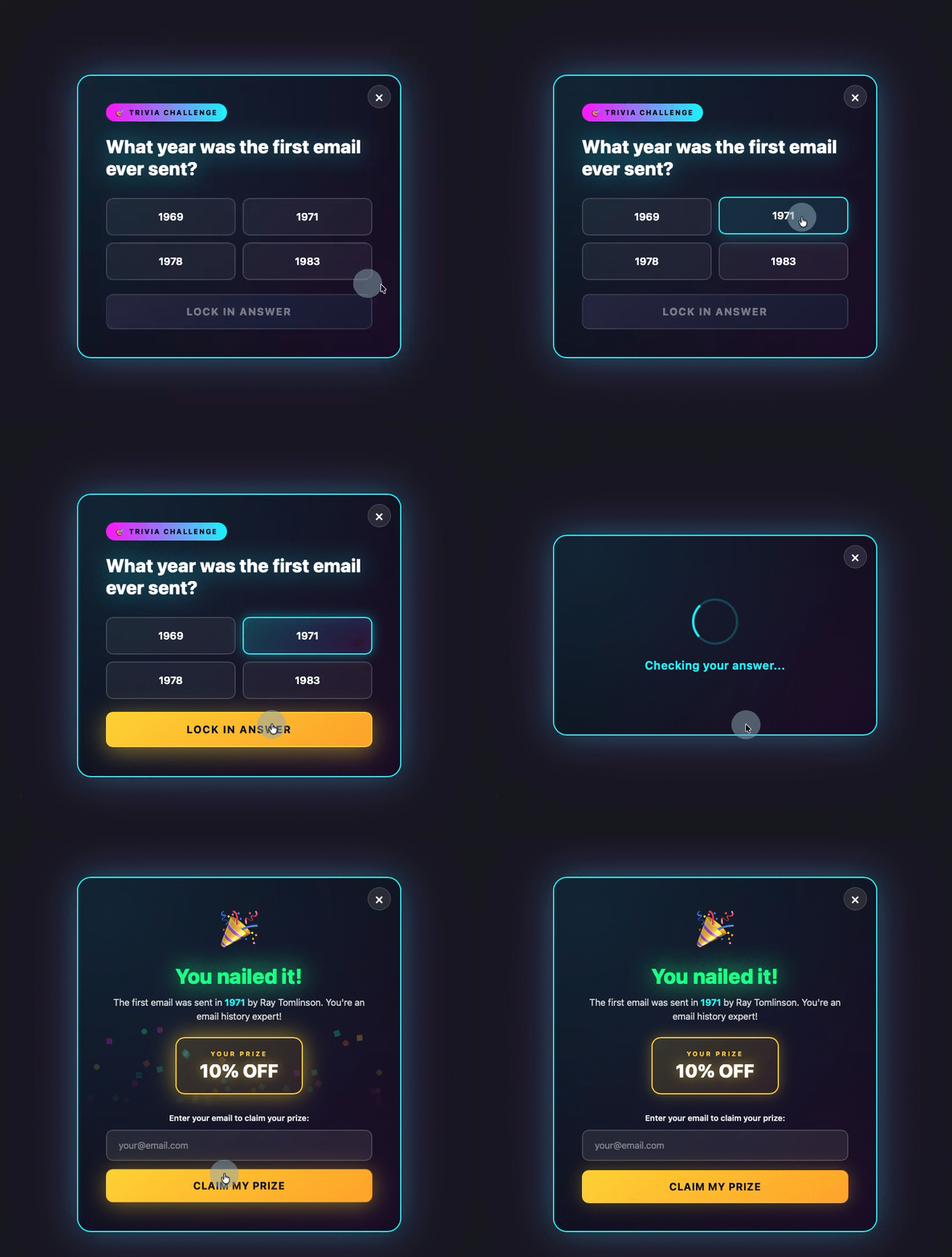
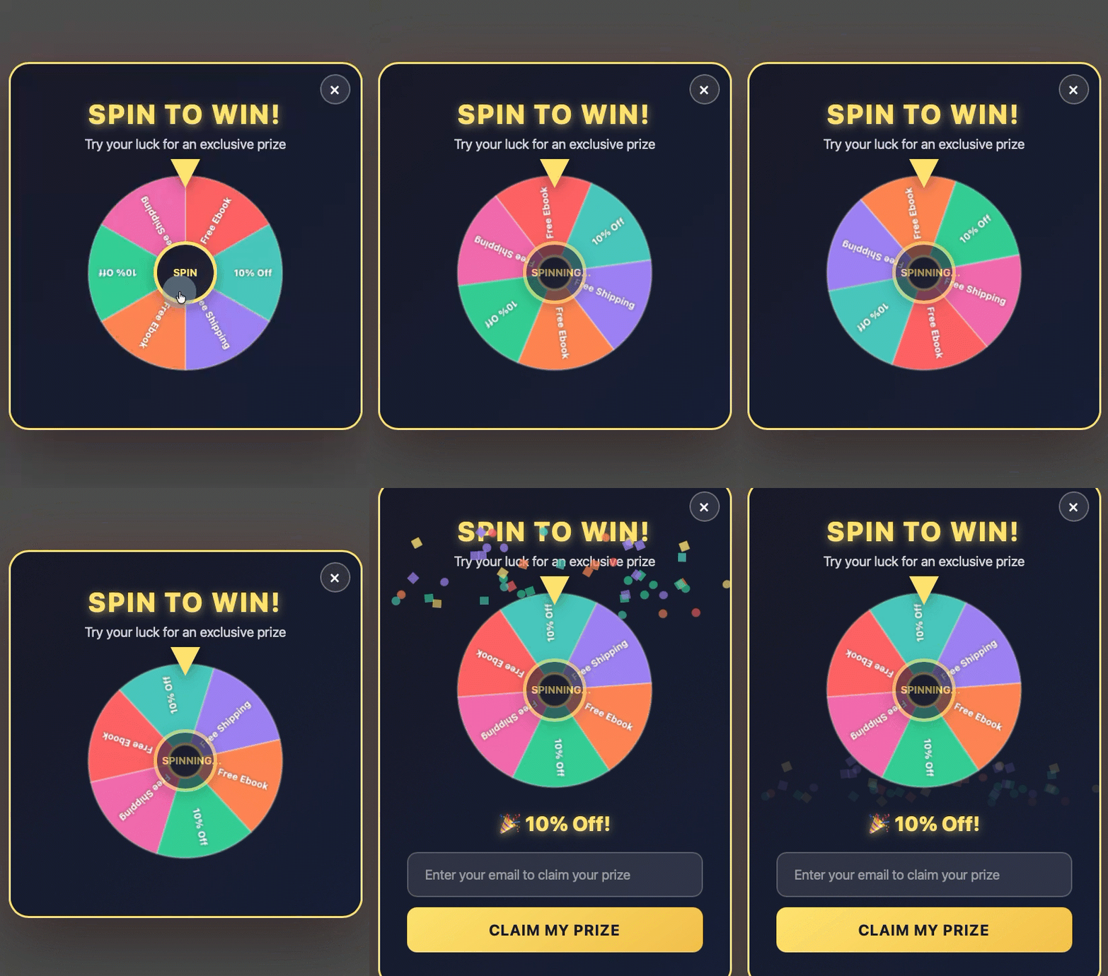
- Gamification: Turning the popup into an interactive experience, such as a quiz, trivia question, or a "spin-to-win" wheel, can significantly boost engagement. Visitors interact with the game before seeing the email field, increasing their psychological investment and making them more likely to provide their information to claim a prize or see their results.
- Discount Offers: A spin-to-win wheel or a direct coupon popup, particularly effective as an exit-intent trigger, provides a compelling incentive for visitors to stay and engage. The prospect of an immediate discount or prize encourages them to enter their email address to claim the reward.
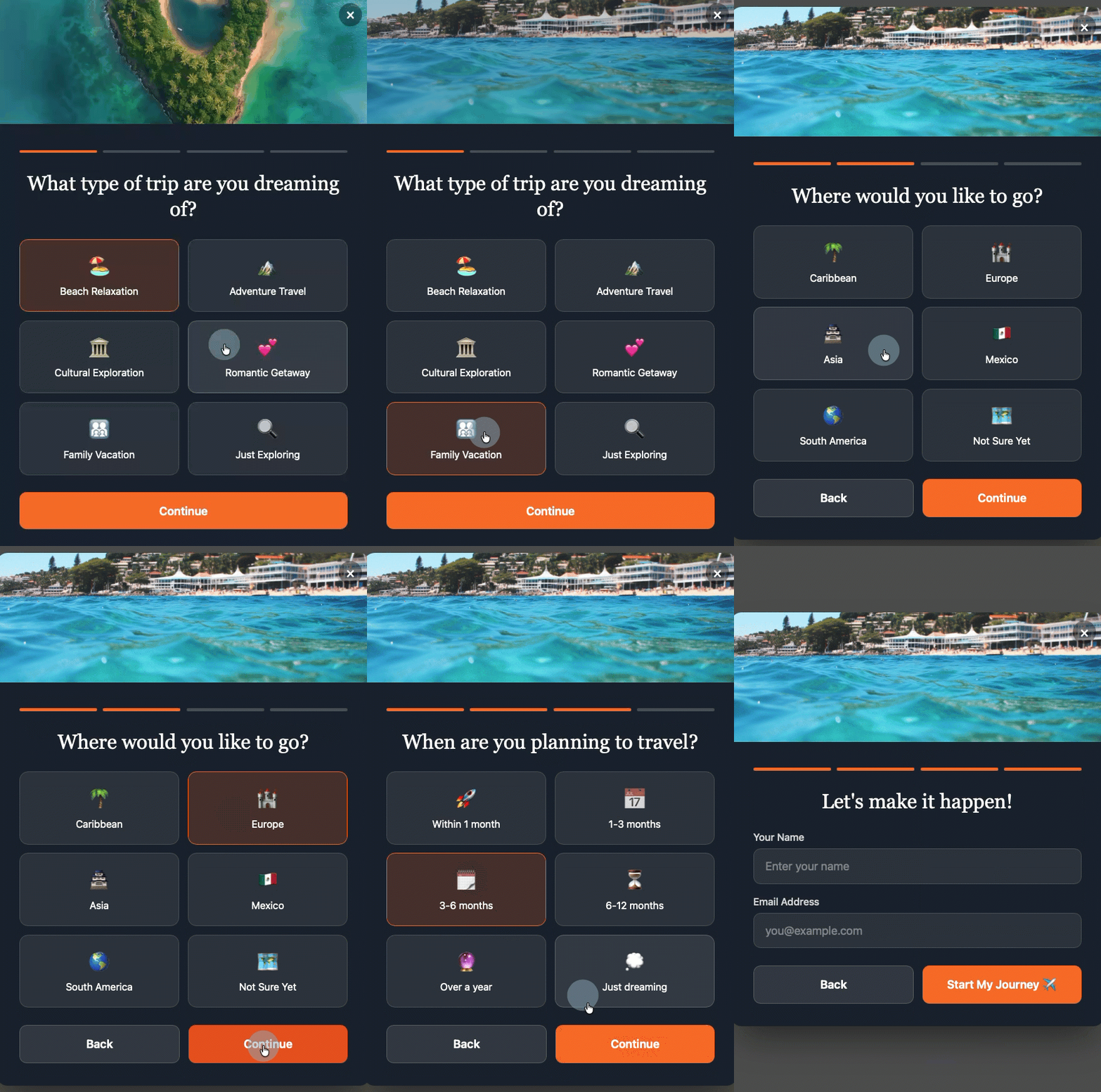
- Multi-Step Forms: These forms break down the commitment into smaller, less intimidating steps. The visitor makes a low-commitment decision first (e.g., selecting an interest category or answering a simple question). By the time they reach the email field, they have already invested some effort and made an initial "yes" decision, making the final step of providing an email address feel less daunting and increasing completion rates.
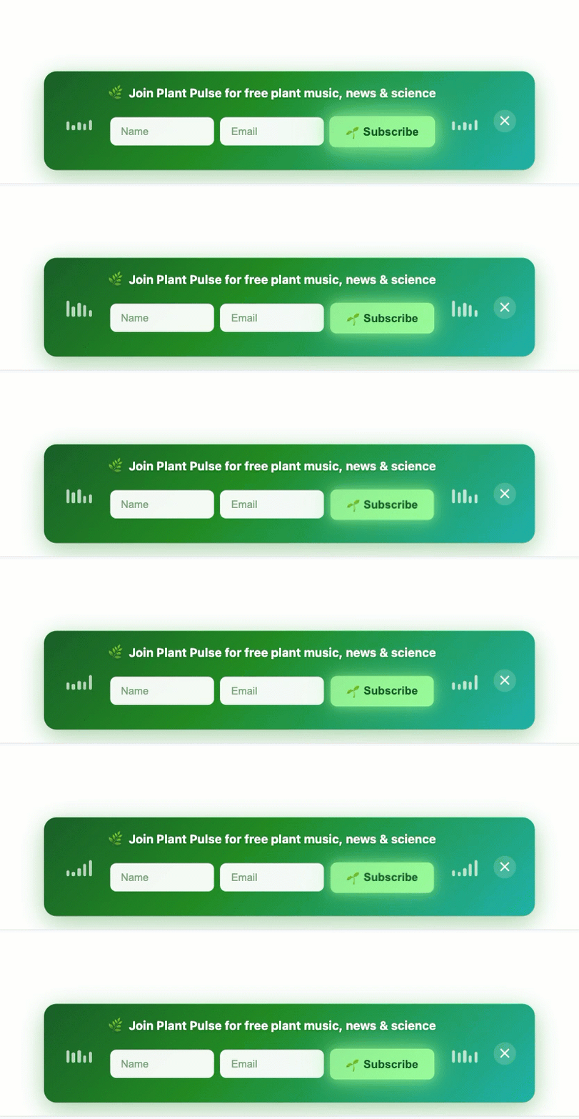
- Sticky Bars (or Floating Bars): A less intrusive alternative, a sticky bar is a thin, static banner positioned at the top or bottom of the page. It remains visible as the user scrolls, containing a concise offer, a form field, and a CTA button. Sticky bars capture leads without ever blocking content, making them a user-friendly option that maintains continuous visibility.
These diverse formats can all be configured and deployed using advanced form builders like the AI Signup Form Builder, allowing marketers to describe their desired format and timing, with the builder handling the technical execution.
Beyond the Popup: Integrating with Broader Marketing Strategies
An effective popup strategy is never an isolated endeavor; it is an integral component of a larger digital marketing ecosystem.
1. A/B Testing and Continuous Optimization: The most successful popup strategies are born from continuous experimentation. Marketers must routinely A/B test different elements: headlines, value statements, CTA button copy, color schemes, imagery, trigger timings, and even the number of form fields. Analyzing conversion rates for each variation provides invaluable data, allowing for iterative improvements that steadily optimize performance. What works for one audience or industry may not work for another, making data-driven decisions essential.
2. Seamless Integration with Email Marketing Automation: The true power of a popup lies in its ability to feed into a robust email marketing automation system. Once an email address is captured, it should immediately trigger a personalized welcome sequence, deliver the promised lead magnet, and segment the new subscriber based on the offer they opted into or the page they signed up from. This immediate follow-up is critical for nurturing the lead, building rapport, and moving them further down the sales funnel. Without a well-defined post-signup automation strategy, even the highest-converting popup will yield limited long-term value.
The Future of On-Site Engagement
As digital landscapes continue to evolve, so too will the strategies for on-site engagement. Challenges such as the increasing sophistication of ad blockers and growing user fatigue with digital solicitations will necessitate even more intelligent and respectful approaches. The future of popups likely involves even more predictive AI, capable of anticipating user needs and offering hyper-personalized content before a request is even made. Less intrusive formats, integration with voice search, and augmented reality elements could also emerge, pushing the boundaries of what on-site lead capture looks like.
Ultimately, the enduring lesson from the evolution of popup forms is the paramount importance of balancing marketing objectives with user experience. When deployed with strategic foresight, contextual relevance, and genuine respect for the visitor’s journey, popup forms transcend their historical reputation to become powerful, ethical, and highly effective tools for sustainable business growth in the digital age.

 Laily UPN
 Basiran