The landscape of data analytics underwent a significant transformation throughout 2017 and into early 2018, marked by a shift from static reporting to dynamic, interactive visualization. Central to this evolution was the adoption of Google Data Studio, a tool that transitioned from a niche component of the Google Analytics 360 Suite to a widely accessible platform for both enterprise-level business intelligence and public-interest data journalism. By allowing users to connect disparate data sources—ranging from Google Analytics and BigQuery to external CSV files—Data Studio democratized the ability to translate complex datasets into actionable insights and compelling narratives.
The rise of these visualizations reflects a broader industry trend: the demand for "data democratization." As organizations move away from siloed information, the ability to present real-time performance metrics in a visually digestible format has become a requirement rather than a luxury. This report examines the pivotal role of Data Studio through various case studies, ranging from high-end media SEO performance to long-term socio-economic trends in the United Kingdom.
Streamlining Enterprise Efficiency: The Business Case for Interactive Dashboards
In the corporate sector, the primary value proposition of Google Data Studio has been the drastic reduction in time-to-insight. Traditionally, monthly reporting for digital performance involved manual data extraction, spreadsheet manipulation, and the creation of static slide decks—a process that could consume several business days for complex accounts.
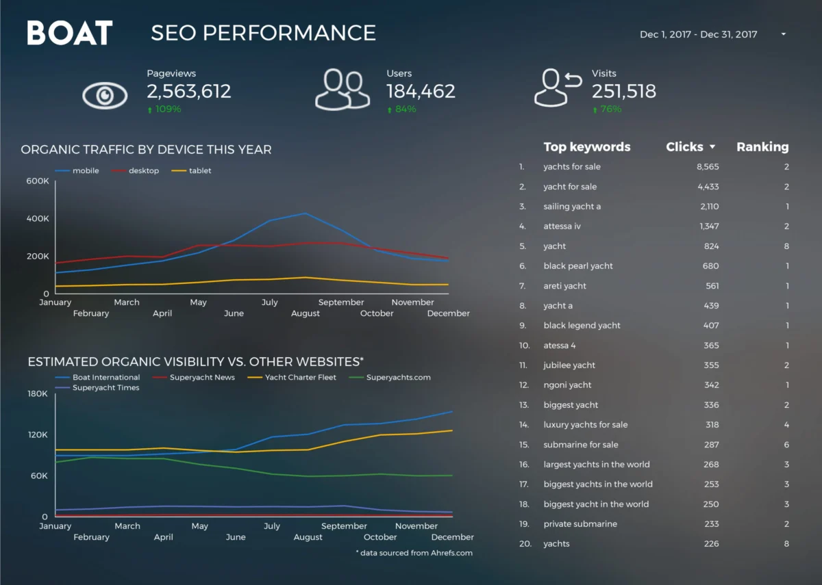
A prominent example of this efficiency gain is found in the operations of Boat International Media. The organization, which serves the global luxury yachting industry, faced the challenge of consolidating vast amounts of SEO and audience engagement data into a format suitable for high-level stakeholders. By implementing Data Studio, the team reduced their monthly client reporting cycle from five working days to approximately fifteen minutes. This 96% reduction in labor hours allowed analysts to pivot from data entry to strategic interpretation. The report focused on key performance indicators (KPIs) while maintaining a high standard of aesthetic design, ensuring that the data was not only accurate but also visually aligned with the premium branding of the luxury sector.

Furthermore, the role of templates has been instrumental in the widespread adoption of the tool. Organizations like ClickInsight developed standardized Google Analytics Web Activity templates, providing a framework for companies to visualize traffic patterns, bounce rates, and conversion funnels without needing to build architectures from scratch. These templates serve as a bridge for small to medium-sized enterprises (SMEs) that may lack dedicated data science departments but require professional-grade visualization.
Technical Integration and Advanced Analytics
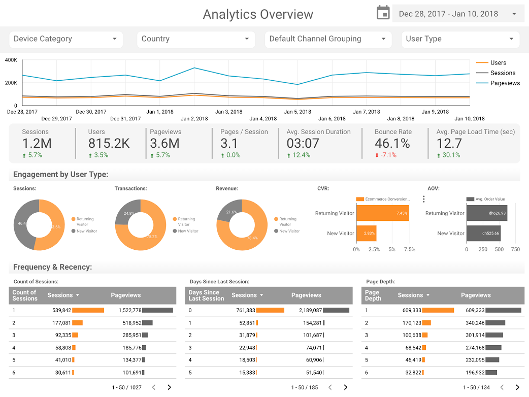
The technical robustness of Data Studio is largely attributed to its native connectors. For instance, the "Analytics Overview" reports designed by consultants at E-Nor demonstrate the platform’s ability to handle multi-dimensional data streams. By utilizing interactive filters and date range comparisons, these dashboards allow users to drill down into specific geographic regions, device categories, or traffic sources in real-time.
Advanced visualization techniques, such as the use of bullet charts, have also seen increased implementation. Analytics Pros utilized bullet charts to solve a common problem in business reporting: the lack of context. While a standard bar chart might show that a page received 10,000 views, a bullet chart compares that figure against the previous year’s performance and the current year’s benchmark targets. This provides an immediate visual cue as to whether a metric is "on track," "failing," or "exceeding expectations." When combined with scorecard metrics—such as average time on page and engagement rates—these visualizations provide a holistic view of content health rather than just raw volume.
Data Journalism: Bringing Public Datasets to Life
Beyond the boardroom, Data Studio has emerged as a powerful tool for data journalism and storytelling. The ability to embed interactive reports into articles has changed how audiences consume news and trivia. In 2017, the "Marvel vs. DC Cinematic Universes" visualization highlighted the massive financial scale of modern filmmaking. With the two franchises collectively generating over $27 billion in global box office revenue, the data story allowed fans and industry analysts to compare the commercial trajectory of the Marvel Cinematic Universe (MCU) against the DC Extended Universe (DCEU). This type of visualization moves beyond simple lists, allowing users to interact with the financial data of individual films to understand broader market trends.
Similarly, the "Data Behind Star Wars" report by ClickInsight demonstrated how complex fictional universes could be categorized and analyzed. By visualizing starship speeds, character demographics, and planet details, the report showcased Data Studio’s versatility in handling non-financial, categorical data.

Large-Scale Data Processing via BigQuery
One of the most significant technical milestones for Data Studio in 2018 was its integration with BigQuery, Google’s enterprise data warehouse. This connection allows for the visualization of massive datasets that would crash traditional spreadsheet software.
A notable application of this was conducted by Google Developer Advocate Felipe Hoffa, who analyzed the "PushEvents" published by GitHub throughout 2017. By pulling terabytes of data regarding open-source contributions into BigQuery and connecting it to Data Studio, Hoffa was able to identify which companies and individuals contributed most to the global coding community. This visualization provided a factual basis for discussions on the health of the open-source ecosystem, revealing the dominant roles of major tech entities in maintaining the web’s infrastructure.
Socio-Economic Analysis: 150 Years of UK Trends
Data Studio’s utility extends into the realm of historical and sociological research. An in-depth analysis of UK marriage and divorce trends spanning 150 years serves as a prime example of longitudinal data storytelling. Conducted by analysts including Lizzie Silvey, the study utilized Data Studio to map out how legal changes and major historical events impacted social structures.
The data revealed sharp fluctuations in marriage rates corresponding with the end of World War I and World War II, as well as the significant impact of the Divorce Reform Act of 1969. By visualizing these trends over a century and a half, the report answered complex questions regarding who seeks divorces and why, and how societal shifts are reflected in official government records. This use of Data Studio demonstrates its capacity to handle historical data, providing a visual timeline that makes academic research accessible to the general public.
The Broader Impact on Decision-Making
The transition toward tools like Google Data Studio signifies a shift in the "source of truth" for many organizations. When data is updated in real-time and accessible via a URL, it eliminates the "version control" issues associated with static PDF reports. Stakeholders are no longer looking at a snapshot of the past; they are looking at a living representation of the present.
Industry experts suggest that the democratization of these tools has also changed the skillset required for modern marketers and analysts. It is no longer enough to be proficient in data collection; one must also be a "data translator." The ability to choose the correct chart type—using a time-series for trends, a treemap for proportions, or a bullet chart for targets—has become a core competency in the digital economy.
Chronology of Data Studio’s Growth
To understand the context of these 2018 visualizations, it is necessary to look at the timeline of the platform’s development:
- May 2016: Google introduces Data Studio as part of the Google Analytics 360 Suite, initially limited to a paid version and a restricted free version (5 reports per user).
- February 2017: Google removes the five-report limit on the free version of Data Studio, leading to a surge in adoption by independent creators and small businesses.
- Late 2017: The introduction of community connectors allows the platform to pull data from over 500 external sources, including Facebook Ads, LinkedIn, and Twitter.
- 2018: The platform exits its "beta" phase, signaling its readiness for full-scale enterprise deployment and becoming a cornerstone of the Google Cloud ecosystem.
Conclusion and Future Implications
The visualizations showcased throughout 2017 and 2018 illustrate that data is most powerful when it is legible and interactive. From the SEO specialist at a luxury media house to the data journalist tracking superhero box office trends, the common thread is the pursuit of clarity.
As Google Data Studio continues to evolve, the integration of machine learning and automated insights is expected to further lower the barrier to entry. However, as the case studies of the UK marriage trends and the GitHub open-source contributions show, the human element—the ability to ask the right questions and tell a meaningful story—remains the most critical component of data visualization. The move toward "happy visualizing" is not just about aesthetics; it is about creating a more informed and data-literate society where complex information is open to everyone, not just those with technical expertise.