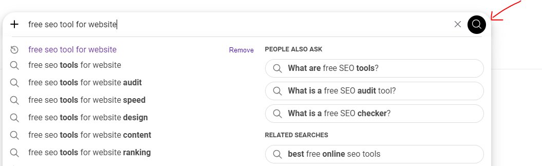
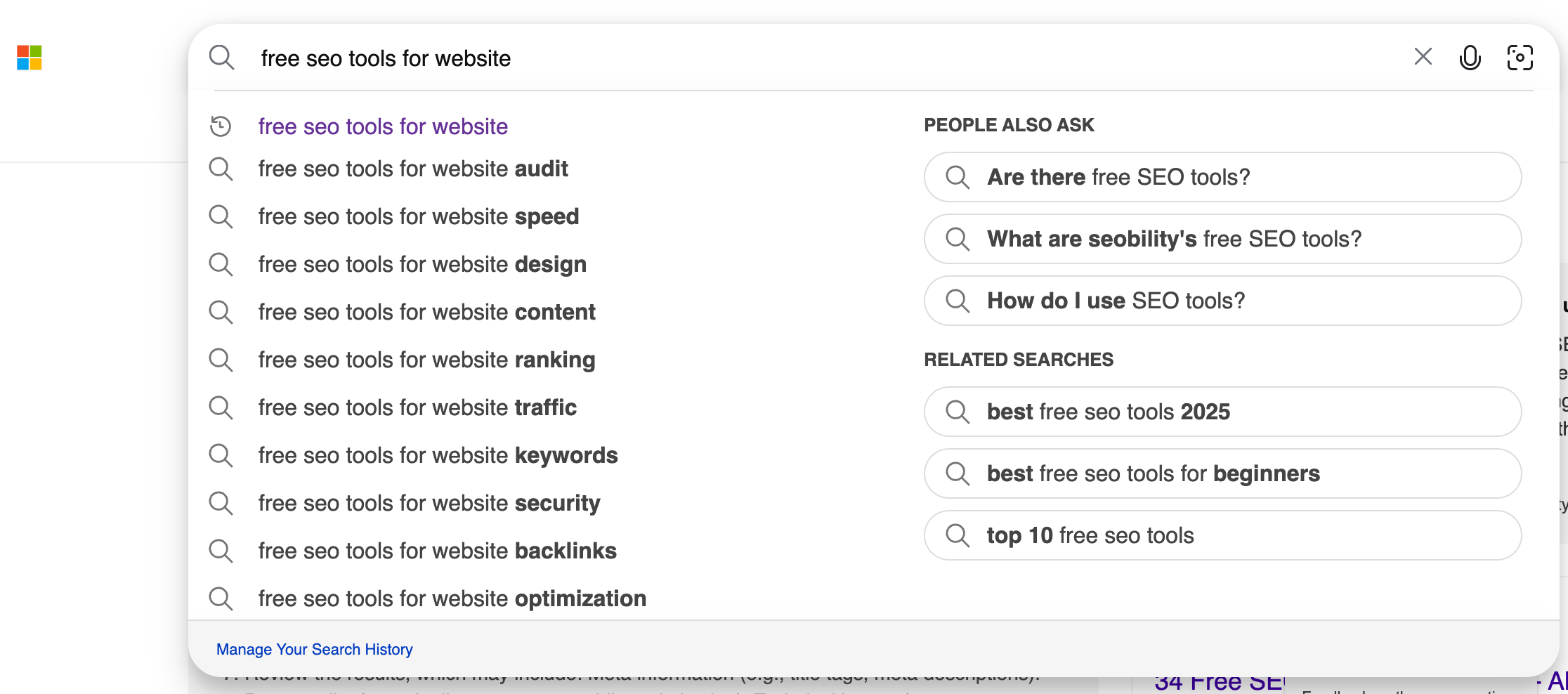
Microsoft Bing has recently initiated a user interface experiment, testing a solid black magnifying glass icon within its search bar and box, marking a departure from its traditional gray or outlined icon. This subtle yet noticeable visual alteration has been observed in a limited rollout, indicating Microsoft’s ongoing commitment to iterative design refinement and user experience optimization within its search platform. The change, first documented by keen-eyed user Khushal Bherwani and shared across social media platforms, specifically X (formerly Twitter), represents a live A/B test designed to gauge user reception and interaction with the updated aesthetic.
The new icon, fully colored in black, replaces the previously more subdued or minimalist outline often associated with search functionalities across various digital platforms. This move is not merely an aesthetic whim but is likely rooted in a strategic exploration of how minor visual cues can influence user perception, interaction, and brand identity in the highly competitive search engine market. Such tests are standard practice in the technology industry, where companies continuously gather data on user behavior to inform design decisions that can lead to enhanced usability and engagement.
The Anatomy of a Design Test: From Outline to Solid Black
The core of this development lies in the visual shift from a hollow or lightly shaded magnifying glass icon to one that is completely filled with black. Previously, Bing, like many other search engines including Google, often utilized a more understated icon—either a thin outline of a magnifying glass or one rendered in a muted gray tone. This traditional approach aimed for visual lightness and integration, allowing the search bar itself to be the primary focal point, with the icon serving as a clear, but not dominant, indicator of its function.

The introduction of a solid black icon, however, immediately draws more attention. Black, as a color, carries connotations of sophistication, power, and modernity. In user interface design, a solid, darker icon can create a stronger visual anchor, potentially making the search function feel more prominent or definitive. It might also improve contrast against various background themes and accessibility for users with certain visual impairments, although this specific benefit would require dedicated research. For instance, on a light-themed interface, a black icon offers maximum contrast, making it instantly recognizable. Conversely, on a dark mode setting, the icon might be inverted to white or a lighter color to maintain visibility, indicating a dynamic design approach.
The exact dimensions and styling of the new black icon (e.g., whether it has rounded edges, specific shading) would contribute to its overall impression. This level of detail in icon design is critical because even a few pixels can alter how a user perceives the responsiveness and modernity of an interface. Microsoft’s choice to test this particular solid black iteration suggests an exploration into bolder, perhaps more assertive, design language for its primary search input element.
The Strategic Importance of User Interface in Search
In the fiercely contested arena of search engines, where giants like Google dominate, every aspect of the user experience, from search result relevance to the visual design of the interface, plays a pivotal role in attracting and retaining users. User Interface (UI) and User Experience (UX) are not just about making things look good; they are about making them intuitive, efficient, and enjoyable. Research consistently demonstrates that a well-designed UI can significantly impact user satisfaction, reduce cognitive load, and even improve task completion rates.
For a platform like Bing, which continually strives to carve out a larger market share against its formidable competitors, such seemingly minor UI adjustments are part of a broader strategy. According to various market analytics reports, while Google maintains a dominant global search market share exceeding 90%, Bing typically hovers in the low single digits, often between 2-6% depending on the region and specific device usage (e.g., higher on desktop due to Windows integration). Even a fractional increase in user engagement or conversion attributable to UI enhancements can translate into millions of additional searches and ad impressions.
The decision to test a new icon is a micro-level manifestation of a macro-level strategy. It reflects an understanding that even subtle visual cues can contribute to the overall brand perception. A fresh, modern icon can signal innovation and attention to detail, aligning with Bing’s recent efforts to integrate advanced AI capabilities, such as its Copilot features and DALL-E image generation, directly into the search experience. These AI integrations are significant differentiators for Bing, and a refreshed UI can help communicate this forward-looking identity. For example, if the black icon is perceived as more "modern" or "sleek," it could subtly reinforce the advanced technological narrative Bing is building around its AI-powered search.
Behind the Pixels: The Psychology of Color and Iconography
The human brain processes visual information rapidly, and colors, shapes, and icons play a crucial role in forming immediate perceptions and emotional responses. The psychology of color suggests that black is often associated with power, elegance, formality, and authority. In digital design, it can evoke a sense of professionalism and a premium feel. By shifting from a lighter or outlined icon to a solid black one, Bing might be aiming to convey a stronger, more confident presence in the user’s workflow.
Iconography, the study of symbols and their interpretation, is equally important. A magnifying glass is universally recognized as the symbol for "search." However, its rendering—whether as an outline, a gradient, or a solid shape—can subtly alter its communicative impact. A solid icon, especially in a bold color like black, tends to have more visual weight and can feel more "active" or "ready" than a lighter, outlined version. This increased visual prominence might lead users to more instinctively engage with the search bar, reducing hesitation or the need for conscious thought before typing a query.
Consider the trend towards "flat design" in recent years, where interfaces prioritize simplicity and clarity. A solid black icon, while bold, can still adhere to flat design principles if rendered without complex gradients or shadows, maintaining a clean and modern aesthetic. This approach can contribute to a faster loading time for interface elements and a more consistent look across different devices and screen resolutions, which are critical performance and usability metrics for a global search engine.
Timeline of Observation and Iterative Development
The observation of this new black magnifying glass icon test is recent, noted by Khushal Bherwani on X. While the exact date of the initial rollout to a specific user segment is not publicly disclosed, such A/B tests are typically conducted over weeks or months. During this period, Microsoft’s design and engineering teams would be collecting vast amounts of data, including:
- Click-through rates (CTR): How often users click on the search bar or icon.
- Search initiation rates: How quickly users begin typing after landing on the page.
- User feedback: Direct comments or sentiment analysis from user surveys or social media mentions.
- Performance metrics: Any impact on page load times or responsiveness.
- Eye-tracking data: If available, this can show where users’ eyes are drawn on the page.
Based on this data, Microsoft will decide whether to roll out the black icon more broadly, revert to the previous design, or iterate further with another variation. This iterative process is a cornerstone of modern software development, allowing companies to continuously refine their products based on real-world user interaction rather than theoretical assumptions. The "always be testing" mantra, as noted in the original article, encapsulates this agile approach to product development. This constant experimentation ensures that even the smallest UI element is optimized for user engagement and satisfaction.
Industry Context: Bing’s Drive for Differentiation
Bing operates in an ecosystem where differentiation is key. While Google has largely focused on refining its core search algorithm and expanding into various AI-powered features like AI Overviews, Bing has made significant strides by integrating conversational AI (Copilot) and generative AI (DALL-E) directly into its search experience. These integrations position Bing as a more interactive and creative search tool.
In this context, a UI refresh, even a minor one like an icon change, can serve as a visual signal of this broader innovation. It tells users, albeit subtly, that Bing is evolving and investing in its user experience. This differentiation strategy is crucial for Bing to attract new users, particularly those interested in the cutting edge of AI-powered search. The black icon could be perceived as a more robust and modern symbol that aligns with the advanced capabilities that Bing is actively promoting.

Furthermore, UI changes are often part of a larger design language update that can span across Microsoft’s product portfolio. If this black icon test proves successful, it might influence icon designs in other Microsoft applications and services, creating a more cohesive brand identity across Windows, Edge browser, and Microsoft 365. This consistency can enhance brand recognition and make the entire Microsoft ecosystem feel more integrated and modern to users.
Anticipated Reactions and Expert Perspectives
Initial user reactions to such subtle UI changes are often mixed. Some users might not notice the change at all, while others, particularly design enthusiasts or those sensitive to visual updates, might express strong opinions. On platforms like X or Reddit, reactions could range from appreciation for a cleaner, bolder look to indifference, or even criticism if the change is perceived as unnecessary or disruptive. For example, some users might argue that the solid black is too heavy, while others might find it more contemporary.
UI/UX experts would likely analyze the change from several perspectives:
- Visibility and Contrast: Does the new icon offer better contrast and visibility across various themes (light/dark mode) and screen sizes?
- Brand Alignment: Does the solid black icon align with Bing’s current brand messaging, especially its emphasis on AI and modern technology?
- Cognitive Load: Does the change reduce cognitive load, making it easier and faster for users to identify and interact with the search function?
- Accessibility: Does the change improve accessibility for users with visual impairments?
An expert might infer that Microsoft is aiming for a more prominent call-to-action for its search bar, perhaps to subtly encourage more direct searches rather than reliance on browser address bar searches. The boldness of the black icon could be seen as an effort to make the search field more authoritative and central to the Bing experience. They might also speculate on whether this is a prelude to further visual overhauls across Bing’s interface, moving towards a bolder, more minimalist aesthetic.

Broader Implications for Bing and the Search Landscape
The outcome of this test, whether the black magnifying glass icon is widely adopted or not, carries broader implications. If adopted, it signals a potential shift in Bing’s visual brand identity towards a more modern, bold, and perhaps premium aesthetic. This could influence future design decisions across the entire Bing platform, from result pages to feature integrations. It might also subtly reinforce Bing’s positioning as an innovative alternative in the search market, especially as it continues to heavily integrate advanced AI capabilities.
For the wider search industry, even minor UI changes from a major player like Microsoft Bing are observed closely. Competitors constantly monitor each other’s design choices and user tests. A successful adoption of a solid black icon by Bing could prompt other search engines to re-evaluate their own iconography and UI elements, potentially leading to a ripple effect of subtle design adjustments across the digital landscape. This constant iteration drives innovation in user experience, ultimately benefiting the end-user with more refined and intuitive interfaces.
Furthermore, this test underscores the ongoing evolution of how users interact with digital interfaces. As technology advances and user expectations shift, even the most fundamental elements like a search icon are subject to continuous scrutiny and refinement. The era of generative AI is bringing new paradigms to search, and the visual language used to guide users through these experiences must adapt. A more robust, clear icon could be seen as an anchor in an increasingly dynamic and interactive search environment.
Conclusion: The Continuous Evolution of Digital Interfaces
Microsoft Bing’s test of a solid black magnifying glass icon in its search bar is a testament to the meticulous and iterative nature of modern software development. While seemingly a small detail, such changes are often the result of extensive research, A/B testing, and a strategic vision for user experience and brand identity. This experiment highlights the critical role of UI/UX in the competitive search engine market, where every visual element contributes to the overall perception and usability of a platform. As Bing continues its efforts to differentiate itself through advanced AI integration, these subtle design adjustments play a crucial role in shaping its evolving brand image and user engagement strategies, marking another step in the continuous evolution of digital interfaces.