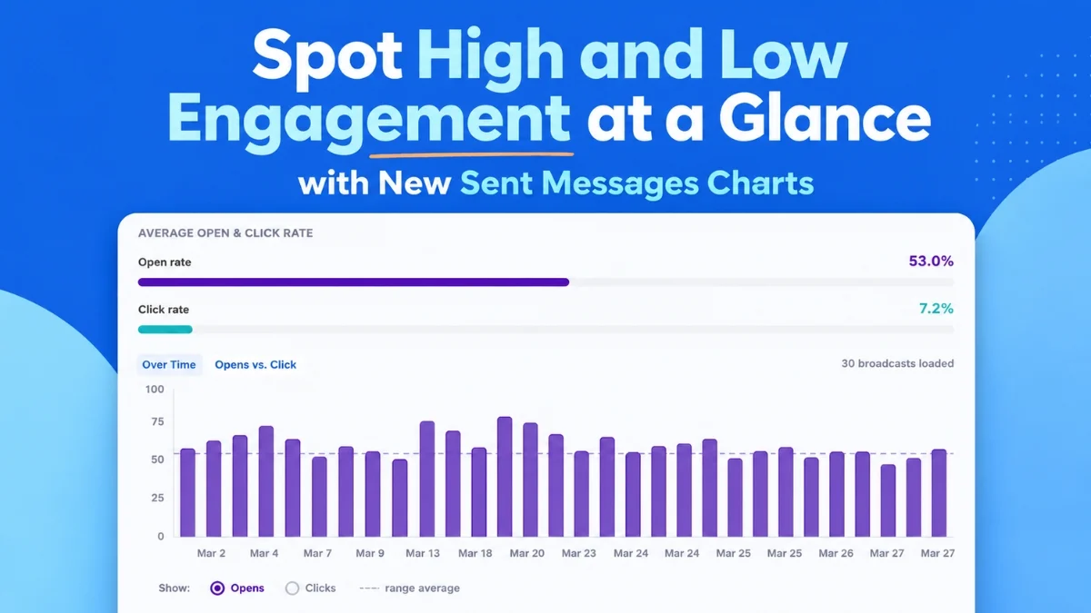
On August 6, 2026, AWeber, a venerable and leading provider of email marketing solutions, officially launched a significant enhancement to its analytics capabilities, introducing a sophisticated suite of visual reporting tools designed to empower marketers with unparalleled clarity into their email campaign performance. This update, spearheaded by product innovator Sean Tinney, transforms raw data into easily digestible charts and graphs, enabling users to swiftly identify trends, pinpoint outliers, and make data-driven decisions to optimize their email strategies. The new features integrate directly into the AWeber Dashboard, providing a comprehensive, at-a-glance overview of open rates, click rates, and email comparisons, effectively revealing which messages resonate with audiences and which fall short, thereby guiding marketers to send "more of what works."
The Evolution of Email Marketing Analytics: A Crucial Imperative
In today’s hyper-competitive digital landscape, email marketing remains an indispensable cornerstone of effective communication and customer engagement. Industry reports consistently underscore email’s superior return on investment (ROI), often cited as high as $42 for every $1 spent, making it one of the most cost-effective marketing channels available. However, merely sending emails is no longer sufficient; sustained success hinges on a profound understanding of audience behavior and a commitment to continually refining strategies based on concrete performance data. For years, marketers have grappled with the challenge of sifting through vast amounts of data, often presented in static, tabular formats, to extract meaningful insights. This laborious process required considerable time and effort to identify patterns, compare performance across campaigns, and diagnose underlying issues. The consequence of such manual analysis often led to delayed adjustments, missed opportunities for engagement, and suboptimal campaign results, hindering overall marketing effectiveness.
AWeber’s latest innovation directly addresses this critical need by shifting the paradigm from raw data presentation to intelligent, dynamic data visualization. The company, which has been a staple in the email marketing industry for over two decades, understands that its diverse user base – ranging from solo entrepreneurs and small business owners to content creators and growing enterprises – requires tools that are not only powerful but also intuitive, efficient, and immediately actionable. This release builds upon AWeber’s long-standing commitment to democratizing sophisticated marketing tools, making advanced analytics accessible without requiring users to possess specialized data science expertise. The objective is to ensure that even the busiest marketer can glean critical insights in seconds, rather than hours.
AWeber’s Strategic Vision: Empowering Marketers with Actionable Intelligence
Sean Tinney, the visionary product leader behind this significant analytics overhaul, articulated the driving philosophy and strategic intent behind the new suite during a pre-launch briefing. "Our unwavering goal has always been to simplify the complex and empower our users to achieve greater success and measurable growth," Tinney stated. "With the introduction of these new charts, we are moving beyond simply showing data; we are illuminating clear pathways to better engagement, higher conversions, and ultimately, a stronger bottom line for our customers. Marketers can now instantly see the true pulse of their campaigns, understand precisely what truly drives action, and confidently replicate those successes in future sends." This statement reflects a broader industry trend towards ‘actionable analytics,’ where the focus is less on the volume of raw metrics and more on providing insights that directly inform strategic adjustments and optimize resource allocation.
The strategic integration of these new analytical tools with AWeber’s existing functionalities, including the innovative AWeber MCP (Marketing Content Platform) app for AI tools like ChatGPT and Claude.ai, signifies a forward-looking approach to marketing technology. It positions AWeber at the forefront of combining robust, intuitive data visualization with cutting-edge artificial intelligence capabilities. This synergy allows users to not only meticulously analyze past performance but also leverage AI for intelligent content generation, predictive analytics, and strategic planning directly informed by those granular insights. This symbiotic relationship between advanced analytics and AI promises a future where email marketing becomes even more personalized, predictive, potent, and ultimately, more profitable for AWeber’s global user base.
Diving Deep into the New Analytics Suite: Unpacking Key Features
The core of AWeber’s new analytics offering comprises two primary visual charts, each meticulously designed to provide distinct yet complementary insights into email campaign performance. These charts are engineered to ensure that "patterns and outliers surface at a glance, no digging required," marking a significant advancement from previous, often tedious, data analysis methodologies.
Engagement Trends Over Time: The "Opens and Clicks Over Time" Chart
The "Opens and Clicks Over Time" chart stands out as a powerful and intuitive chronological visualization tool. It meticulously plots up to 100 of a user’s most recent broadcasts on a clear, interactive timeline. This feature allows marketers to switch effortlessly between viewing "opens" and "clicks," providing a direct, side-by-side comparison of engagement metrics across successive sends. The immediate and profound benefit of this chart lies in its ability to quickly highlight performance fluctuations, identify long-term trends, and pinpoint specific moments of exceptional or suboptimal engagement. For instance, a consistent upward trend in open rates might strongly indicate a successful refinement of subject line strategies, an improvement in audience segmentation, or a better understanding of optimal send times. Conversely, a sudden dip in engagement could immediately signal an issue with content relevance, an unexpected change in audience preferences, or even a technical delivery problem that requires prompt investigation.
A key strength of this chart is its remarkable capacity to reveal subtle yet crucial patterns that might otherwise remain obscured within dense spreadsheets. A specific type of subject line that consistently drives higher open rates becomes immediately apparent, as does a particular send day or time that reliably yields superior engagement. For example, a marketer might observe that emails featuring a personalized greeting consistently outperform generic ones, or that campaigns launched on Tuesdays at 10 AM EST invariably generate higher click rates than those sent on Friday afternoons. This type of actionable insight, readily visible on the chart, can lead to strategic adjustments in the weekly content calendar, subject line formulation, and send scheduling, potentially boosting overall campaign effectiveness without necessarily altering the core content itself.
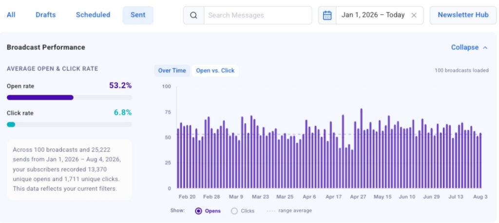
Furthermore, the interactive nature of the "Opens and Clicks Over Time" chart significantly enhances its usability and diagnostic capabilities. Users can "click-to-jump" directly from any bar on the chart to the corresponding broadcast in the detailed table below. This seamless navigation allows for rapid investigation of specific performance spikes or dips. If a particular email achieved exceptionally high click rates, a marketer can instantly access that message, thoroughly analyze its content, call-to-action (CTA), and subject line, and then systematically replicate the successful elements in future campaigns. Similarly, if an email performed unexpectedly poorly, the immediate access to its details facilitates quick post-mortem analysis to understand precisely what factors contributed to its underperformance. The chart loads automatically and populates dynamically as users scroll through their broadcast history, ensuring that even extensive campaign records are easily navigable and visually represented without performance bottlenecks.
Comparative Performance: The "Opens vs. Clicks Bubble Chart"
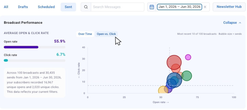
Complementing the temporal view, the "Opens vs. Clicks bubble chart" offers a dynamic, multi-dimensional comparative perspective on recent email sends. This innovative chart plots each broadcast as a distinct bubble, where the position on the X-axis represents its open rate and the Y-axis represents its click rate. A crucial differentiating factor and a stroke of intelligent design is that the size of each bubble is dynamically scaled by its corresponding send volume. This ingenious design element allows marketers to compare results across campaigns sent to vastly different audience sizes without losing crucial contextual proportionality. A campaign with an impressively high open rate sent to a small, highly engaged segment might initially appear successful, but when compared to a larger campaign, the bubble size provides a proportional understanding of its absolute reach and overall impact, preventing misinterpretations.
This bubble chart is particularly adept at surfacing "outliers fast," drawing immediate attention to campaigns that deviate significantly from the norm. Marketers can instantly identify broadcasts that earned strong open rates but generated fewer clicks – a scenario that often suggests compelling subject lines successfully captured attention, but the content within the email body was less engaging, the call-to-action was unclear, or the offer itself failed to resonate. Conversely, broadcasts with modest open rates but unexpectedly strong click rates might indicate an exceptionally compelling offer, highly valuable content, or a particularly effective call-to-action that resonated deeply with the audience that did open the email, even if the subject line didn’t initially grab a wider audience. Such nuanced insights are invaluable for refining both the "hook" (subject line strategy) and the "substance" (email content, design, and CTA effectiveness) of future communications.
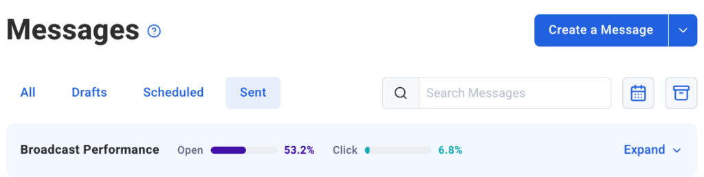
By visually representing these intricate relationships, the chart tells a compelling, immediate story about the overall effectiveness of each campaign. It clearly distinguishes between emails that successfully captured initial attention (measured by opens) and those that effectively drove deeper engagement and desired action (measured by clicks). This clear differentiation empowers marketers to quickly understand "what to repeat and what to adjust," fostering a continuous, data-informed cycle of improvement based on concrete, visual performance data. Like its timeline counterpart, the bubble chart offers a convenient collapsible view, allowing users to minimize it when they wish to focus solely on the numerical data presented in the table, and expand it again for immediate visual context as needed. This flexibility ensures that users can tailor their analytical experience precisely to their immediate needs and preferences.
Empowering Precision: Advanced Filtering Capabilities
Beyond the powerful visualizations, AWeber has significantly enhanced the data filtering capabilities, providing marketers with granular and intuitive control over the specific information they wish to analyze. This level of precision is absolutely vital for conducting targeted performance reviews, executing effective A/B tests, and extracting highly specific insights that drive actionable strategy.
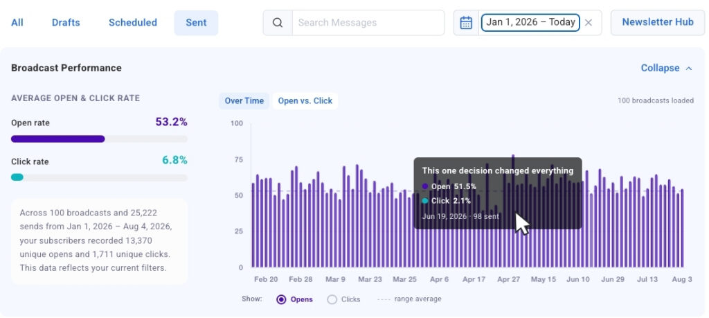
The introduction of streamlined date presets dramatically simplifies the process of historical analysis. With a single click, users can effortlessly pull data for the past 30 days, 90 days, or a full year. The charts immediately update to reflect only the sends within the selected timeframe, allowing for rapid and accurate comparisons of performance across different periods. This feature is particularly useful for seasonal businesses, those running time-bound promotions, or marketers needing to evaluate the effectiveness of their campaigns within specific operational cycles or holiday seasons.
Going a significant step further, dynamic search filtering allows for highly specific and on-the-fly inquiries. Marketers can type keywords directly into the search bar, and the chart will instantly narrow its display to only include broadcasts containing that specific word or phrase in their subject line. This is an invaluable tool for conducting granular A/B testing on subject line variations, analyzing the performance of specific product promotions, or tracking the effectiveness of different messaging themes (e.g., "new arrival," "exclusive offer," "educational content"). For example, a user could search for "discount" to quickly see how all emails featuring discounts performed collectively, or "webinar" to assess engagement with their educational content across various campaigns. This capability ensures that comparisons are made between truly comparable campaigns, leading to more accurate, reliable, and actionable insights.
A highly anticipated feature, segment name filtering, is slated for release soon. This forthcoming addition will enable users to isolate chart and table data by specific audience segments. This is a critical enhancement, as engagement metrics naturally vary significantly across different audience groups. A highly engaged loyal customer segment might consistently exhibit higher open and click rates than a newly acquired lead segment, or a segment targeted with a specific product might respond differently than a general newsletter segment. By filtering data by segment, marketers can gain a more nuanced and accurate understanding of how different parts of their audience interact with their emails, allowing for even more refined personalization, targeting strategies, and the creation of highly relevant content tailored to specific demographic or behavioral profiles. This level of segmentation in analytics is crucial for truly understanding and optimizing the effectiveness of tailored email content.
Industry Context and Supporting Data: The ROI of Intelligent Analytics
The release of AWeber’s enhanced analytics suite arrives at a pivotal moment when data-driven decision-making is no longer a luxury but an absolute necessity in competitive marketing. Recent studies by reputable organizations like the Data & Marketing Association (DMA) consistently demonstrate that companies effectively leveraging advanced analytics for their email campaigns achieve significantly higher engagement rates, superior conversion rates, and ultimately, greater revenue generation. For instance, highly personalized emails, which are often a direct outcome of deep segment-specific insights derived from detailed analytics, can generate transaction rates six times higher than non-personalized, generic emails. This underscores the immense value of understanding granular audience behavior.
The average email open rate across diverse industries typically hovers around 20-25%, with click-through rates generally ranging from 2-4%. These figures vividly highlight the constant battle for attention in increasingly crowded inboxes. Even a marginal improvement in either metric, when amplified across thousands or millions of subscribers, can translate into substantial business gains, from increased sales to enhanced brand loyalty. By making it significantly easier to identify precisely what drives these marginal improvements, AWeber is directly contributing to its users’ bottom lines and fostering sustainable growth. The true cost of ineffective email marketing isn’t just wasted time and effort; it’s lost sales opportunities, diminished brand perception, and missed chances to cultivate long-term customer lifetime value. Tools that quickly identify underperforming campaigns or reveal successful strategies directly mitigate these costs, transforming potential losses into tangible gains.
Furthermore, the growing trend towards greater transparency and accountability in marketing spend necessitates robust and clear reporting. Businesses need to consistently demonstrate the measurable ROI of their marketing efforts, and detailed, visual analytics provide the irrefutable evidence needed to justify investments, optimize budgets, and inform future strategic planning. AWeber’s new charts facilitate this by presenting complex performance data in a clear, compelling, and easily digestible manner that can be understood by stakeholders at all levels, from front-line marketing specialists to executive leadership and board members.
Implications for Marketers and AWeber: A Strategic Leap Forward
The implications of this comprehensive analytics update are far-reaching and profoundly positive for both AWeber’s expansive user base and the company itself. For individual marketers, small businesses, and growing enterprises, these intuitive tools translate directly into dramatically improved campaign performance, significantly reduced guesswork, and substantial time savings. Instead of manually sifting through disparate data points and struggling to connect the dots, users can now quickly identify winning formulas and confidently replicate them, or swiftly spot emerging issues and address them proactively before they escalate. This empowers them to maximize their email marketing ROI, nurture customer relationships more effectively through targeted communication, and ultimately drive sustainable business growth. The unparalleled ability to visualize trends over time and compare campaigns side-by-side provides a robust, empirical foundation for continuous optimization, effectively transforming email marketing from a speculative art into a more precise, data-driven science.
For AWeber, this strategic launch unequivocally reinforces its position as an innovative and customer-centric leader in the highly competitive email marketing platform space. By providing cutting-edge, yet remarkably user-friendly analytics, AWeber significantly enhances its value proposition, making it an even more attractive platform for new customers actively seeking sophisticated yet accessible tools. Simultaneously, it deepens the loyalty and bolsters the success of its extensive existing user base. In a market where core features often tend to mimic one another, superior, actionable analytics can serve as a powerful and enduring differentiator. This strategic move also firmly aligns AWeber with the broader industry shift towards more intelligent, data-driven marketing ecosystems, as evidenced by its pioneering integration with advanced AI platforms like ChatGPT and Claude.ai. This forward-thinking leap demonstrates AWeber’s unwavering commitment to continuously evolving with the dynamic needs of modern marketers and staying ahead of technological trends, ensuring its relevance and leadership for years to come.
The Future of Data-Driven Campaigns: A Continuous Journey
The release of these enhanced analytics charts is not merely a standalone product update but represents a crucial, foundational step in AWeber’s ongoing journey to empower its users with the most effective and insightful tools for email marketing success. By bringing advanced visual analytics directly into the user-friendly dashboard, AWeber has significantly lowered the barrier to entry for sophisticated performance analysis, making it accessible to a much broader audience. The ability to quickly identify what truly works, understand the underlying reasons why it works, and then systematically apply those invaluable lessons to future campaigns is the undisputed hallmark of truly effective marketing.
As the digital landscape continues its rapid evolution, the demand for more intelligent, predictive, and seamlessly integrated marketing solutions will only grow in complexity and urgency. AWeber’s steadfast commitment to continuously improving its analytics capabilities, coupled with its forward-thinking integration of artificial intelligence, strategically positions it exceptionally well to meet and exceed these future demands. The "Sent Messages charts are live now in AWeber," marking a new era of clarity, strategic insight, and empowerment for its users, enabling them to navigate the complexities of email marketing with greater confidence, precision, and ultimately, achieve superior, measurable results. This comprehensive update stands as a powerful testament to the transformative power of data visualization in converting raw numbers into actionable intelligence, thereby driving meaningful engagement and fostering sustainable growth for businesses worldwide.