The critical importance of email design for brands and marketers was a central theme at the recent Email Camp event, held on December 2, 2025. During a dedicated session, Mike Nelson of Really Good Emails presented a comprehensive overview of cutting-edge email design trends poised to drive heightened engagement in the coming year. His presentation also addressed crucial strategies for resolving common reader pain points and ensuring universal accessibility across a diverse array of devices and platforms. For those unable to attend the live presentation, this article synthesizes the key takeaways, best practices, and trends discussed, aiming to equip marketers with the knowledge to become proficient in email design.

Foundational Pillars: Essential Email Design Best Practices
Effective email design begins with adherence to fundamental principles that ensure clarity, readability, and functionality across all viewing environments. François Sahli, Digital Design Director at Sinch, provided insights applicable to both novice and experienced email marketers, emphasizing a set of core best practices.
Optimizing Visual Layout and Media
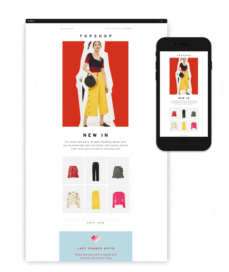
The visual framework of an email is paramount. To ensure optimal display on various devices, a standard width of 600 pixels for desktop views and 320 pixels for mobile phones is recommended. Deviating from these widely accepted dimensions can lead to horizontal scrolling, a significant deterrent to user experience that often results in immediate message abandonment.
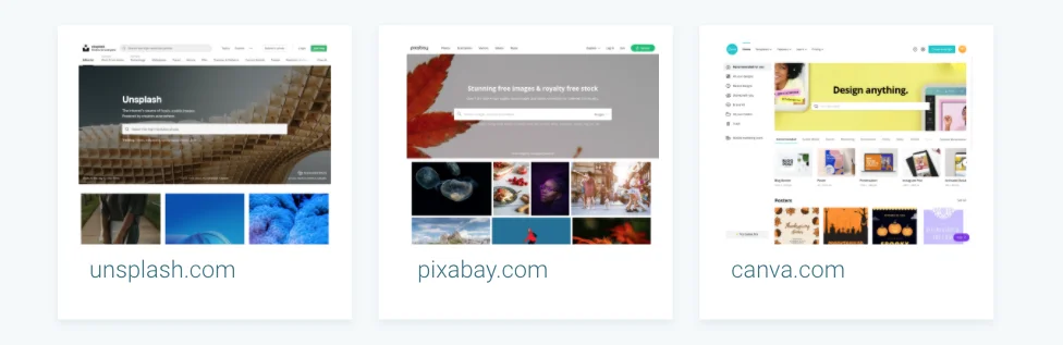
Image optimization is another critical component. Large, uncompressed images can drastically slow down email load times, particularly on mobile networks, negatively impacting engagement and even deliverability. Tools like Compress JPEG are invaluable for reducing file sizes while preserving visual quality. A commonly cited best practice for maintain deliverability and avoiding spam filters is to adhere to a text-to-image ratio of approximately 70% text to 30% images. This balance ensures content remains readable and avoids triggering spam filters that often flag image-heavy emails. Furthermore, the risk of images being blocked by email clients necessitates the use of alt-text – descriptive text displayed when an image fails to load – and the strategic inclusion of a background color to maintain text legibility even in the absence of background images. For sourcing high-quality, free imagery, platforms like Unsplash and Pixabay are excellent resources, while Canva offers user-friendly tools for creating compelling email graphics.
Strategic Call-to-Action Placement and Design
Calls-to-action (CTAs) are the lynchpin of conversion in email marketing. These buttons, designed to prompt specific user actions like registration or purchase, require careful consideration. François Sahli advises limiting the number of CTAs, especially in the ‘above the fold’ section – the content visible without scrolling – to maintain focus and avoid overwhelming the reader. Visual prominence is achieved through strategic use of color and contrast, making CTAs immediately noticeable. Crucially, clickable elements such as buttons and icons must be sized appropriately for mobile interaction, ideally between 40 to 48 pixels wide. Adequate spacing between smaller clickable elements is also essential to prevent accidental taps and enhance usability on touchscreens.
Mastering Typography for Readability and Branding
Typography plays a significant role in brand identity and readability. Emails primarily utilize two font categories: web-safe fonts and web fonts. Web-safe fonts, such as Arial, Times New Roman, Verdana, and Georgia, are universally supported by operating systems and email clients, guaranteeing consistent display. Web fonts, like Open Sans and Roboto, offer greater design flexibility but present compatibility challenges, as not all email clients render them correctly. François Sahli noted that while web fonts offer many design opportunities, specialists must be careful because, unfortunately, not all email clients support them. To mitigate this, marketers must implement fallback fonts – a list of alternative web-safe fonts that an email client can default to if the primary web font is unsupported, thus preserving the email’s intended aesthetic as closely as possible.
Ensuring Technical Compatibility Across Platforms
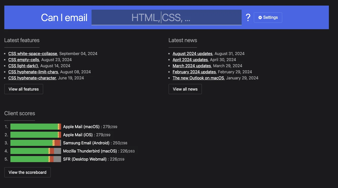
The fragmented ecosystem of email clients means that not all web features and code elements are uniformly supported. For instance, Gmail may struggle with certain web fonts, some Outlook versions might not display background images correctly, and drop shadow effects can be inconsistent across various webmail providers. This necessitates rigorous testing and an understanding of client-specific limitations. Resources like "Can I Email" provide invaluable databases detailing the partial or total support for numerous HTML and CSS features across different email clients, empowering designers to make informed decisions and anticipate potential rendering issues.
The Imperative of Responsive Design
Responsive design, a technique that automatically adjusts email layouts to suit the viewing screen, is no longer optional but a fundamental requirement. With an estimated 80% of email recipients admitting they would delete an email that fails to display correctly on a mobile device, a mobile-first approach is critical. Utilizing email editors that offer responsive design by default, such as Sinch Mailjet’s Email Editor, is essential. Advanced platforms often include preview features that allow marketers to visualize how their email will render across different devices, operating systems, and countries, eliminating guesswork and ensuring a consistent user experience.
Leveraging Templates and Components for Efficiency
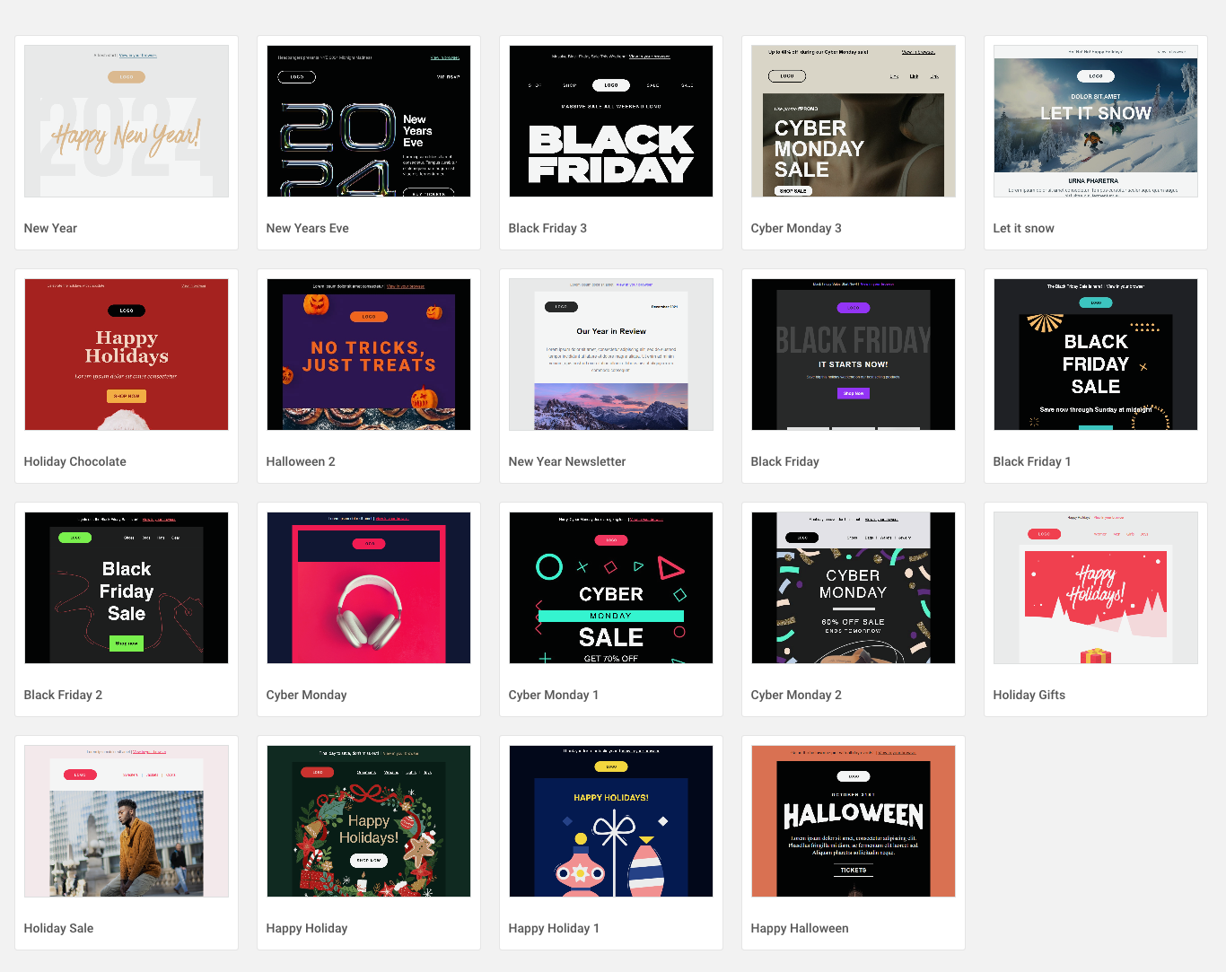
The adoption of design systems and component libraries, common in web development, offers substantial benefits for email campaigns. Creating a library of reusable email components and templates ensures brand consistency across all communications and significantly streamlines the design process. This modular approach facilitates comprehensive testing of the entire library, guaranteeing correct display for any email built from its components. Furthermore, it accelerates the creation of new emails and enables more efficient A/B testing of different layouts, allowing marketers to quickly identify optimal designs. Platforms like Really Good Emails and Email Love serve as excellent sources of inspiration for well-designed email campaigns. Sinch Mailjet’s extensive gallery of pre-designed newsletter templates, including holiday-specific options, exemplifies how such resources empower marketers.
Glimpse into 2026: Emerging Email Design Trends
Beyond the foundational best practices, the Email Camp event highlighted several innovative trends, as shared by Mike Nelson, that are shaping the future of email design as we approach 2026. These trends reflect evolving consumer behaviors and brands’ continuous efforts to differentiate themselves in a crowded digital landscape.
Brand-Centric Boldness: The "Go Big or Go Home" Approach
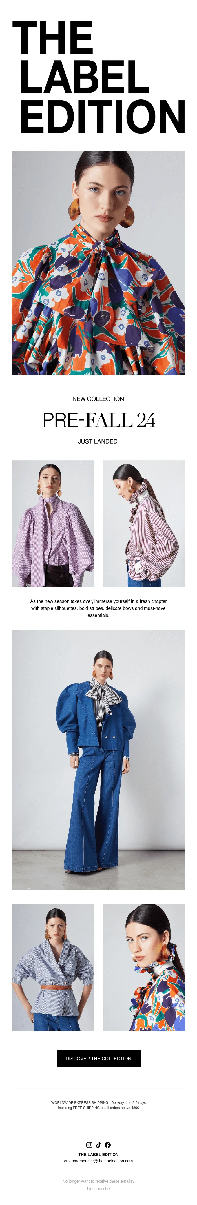
A notable trend is the move towards highly distinctive, brand-focused email designs. Instead of traditional logos or product-centric visuals, many brands are opting for large, bold texts, impactful headlines, and expansive images to instantly capture attention and emphasize their unique identity. This departure from conventional email structures is a strategic gamble, aiming to stand out amidst fierce competition. For example, brands like Happi use striking header images to immediately convey brand personality, while The Label Edition employs prominent titles that draw recipients deeper into the email’s narrative. This approach recognizes that in an oversaturated market, a unique and memorable brand impression can be more effective than a direct product pitch in the initial engagement phase.
Structured Clarity: The Rise of "Hard Tables"
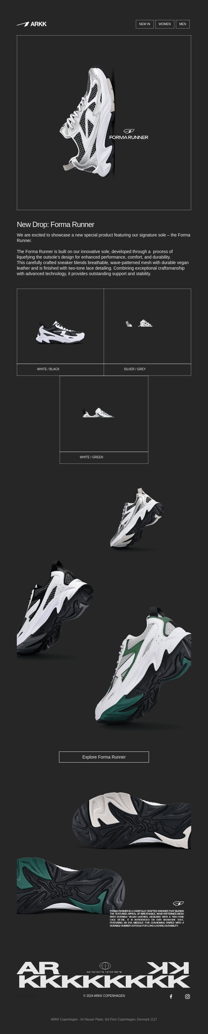
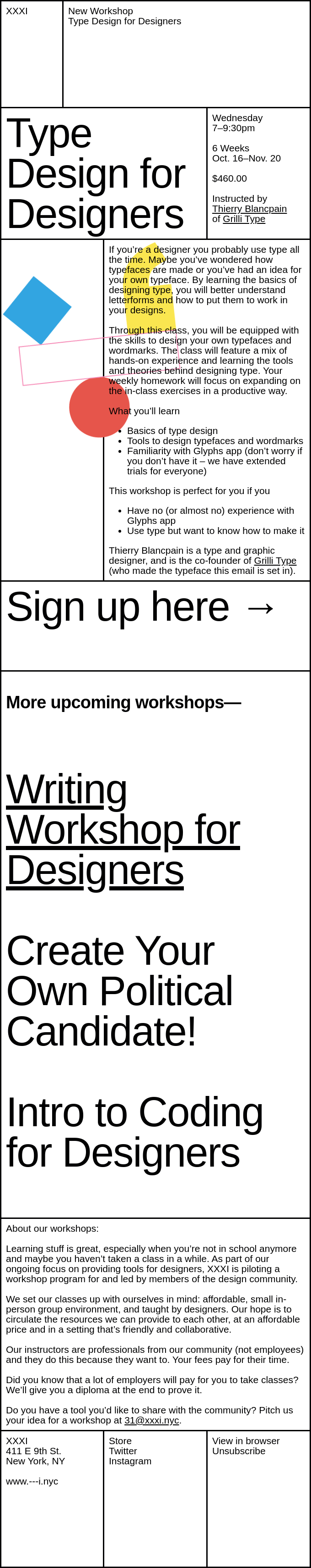
"Hard tables" refer to the practice of outlining content blocks with distinct, often black or contrasting colored lines. This trend provides a structured clarity to newsletters, segmenting content into visually organized blocks. For instance, Arkk employs white blocked lines on dark backgrounds to highlight content, while XXXI uses traditional black outlines on a white background. This visual segmentation helps readers navigate complex emails more easily, especially those with multiple sections or substantial content. It enhances readability and creates a sense of order, making the email appear more professional and digestible.
Influence Marketing in the Inbox: "Celeb Cameos"
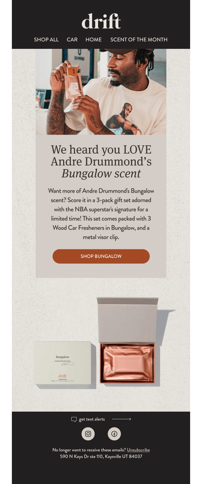
The enduring power of celebrity endorsements is experiencing a resurgence within email marketing. This trend, historically present in advertising since figures like Lily Langtree promoted Pears Soap in 1882, leverages the credibility and reach of public figures. Featuring celebrities, such as Andre Drummond in a Drift campaign, can instantly elevate a brand’s reputation and foster a sense of aspiration or relatability among specific demographics. When a celebrity is popular with the target audience and shares the email campaign on social media, it can significantly broaden reach and potentially lead to viral engagement beyond the typical subscriber base.

Visual Immersion: The "Picture Wall" Strategy
Faced with an abundance of high-quality product images, some brands are embracing the "picture wall" concept. Instead of selecting a few images, they present a collage or gallery of multiple visuals. This strategy, exemplified by Lululemon’s and Le Rose’s campaigns, allows marketers to showcase products from various angles, demonstrate diverse applications, or feature different body types interacting with clothing. This comprehensive visual presentation empowers potential customers to better envision themselves using the product, reducing guesswork and enhancing the shopping experience. It caters to visually-driven consumers and offers a richer, more detailed product exploration directly within the email.
Authenticity Over Polish: The "Raw and Unfiltered" Movement
In an era increasingly shaped by artificial intelligence, a counter-culture movement favoring authenticity is emerging in email design. Brands are intentionally incorporating unedited images and video footage into their campaigns, moving away from overly polished, artificial aesthetics. Patagonia, for example, opens newsletters with candid photos, while GiftShop’s collaboration with Parisian restaurant Dumbo features raw, unedited kitchen shots. This "no nonsense" approach aims to build trust and relatability by presenting a more genuine, unvarnished portrayal of the brand, its products, or its processes. It resonates with consumers who are increasingly wary of highly curated or AI-generated content and value transparency.
Beyond Aesthetics: Environmental and Accessibility Imperatives
The evolution of email design extends beyond visual appeal and engagement, now encompassing critical ethical and environmental considerations. As Jonathan Loriaux, CEO and founder of the email marketing agency Badsender, states, "When we talk about email and environment, there are really two points where we can have a positive influence: data storage and display."
Sustainable Email: Reducing the Digital Carbon Footprint
The environmental impact of digital communications, including emails, is gaining recognition. Efforts to reduce an email’s carbon footprint involve several practical steps:
- Optimizing Image and Video Files: Smaller, compressed files require less storage and bandwidth, reducing energy consumption during transmission and storage.
- Efficient Code: Streamlining HTML and CSS code, removing unnecessary elements, and optimizing for faster rendering can reduce processing power requirements.
- Minimalist Design: Adopting simpler layouts with fewer heavy graphics can contribute to a lighter email overall.
- Targeted Sending: Avoiding mass, untargeted emails reduces the volume of unnecessary data transmission and storage.
These collective efforts, while seemingly small individually, contribute to a more sustainable digital ecosystem and align brands with growing consumer environmental consciousness.
Inclusive Design: Ensuring Accessibility for All
Accessibility is another paramount consideration. With over 1.3 billion people globally living with some form of visual impairment, designing emails for universal access is not only an ethical imperative but also a strategic move to broaden audience reach. Moreover, the increasing adoption of voice assistants capable of reading emails necessitates designs that are comprehensible to these tools. Key accessibility practices include:
- Descriptive Alt-Text for Images: This ensures that screen readers can convey the content of images to visually impaired users.
- High Color Contrast: Sufficient contrast between text and background colors is crucial for readability, especially for those with low vision or color blindness.
- Clear and Concise Link Text: Avoid generic "click here" links; instead, use descriptive text that explains the link’s destination.
- Logical Content Structure: Utilizing semantic HTML and proper heading tags (H1, H2, H3) helps screen readers navigate the content hierarchically.
- Keyboard Navigability: Ensuring that all interactive elements can be accessed and operated using a keyboard is vital for users who cannot use a mouse.
By integrating accessibility into the design process, marketers ensure their messages are truly inclusive and reach the widest possible audience.
Empowering Marketers: The Role of Advanced Email Platforms
The complexity of balancing design best practices, emerging trends, and ethical considerations underscores the need for robust email marketing solutions. Sinch Mailjet stands out as a platform designed to empower marketers in this dynamic environment.
Mailjet’s intuitive drag-and-drop email builder simplifies the creation of visually appealing and 100% responsive email campaigns. This feature allows users to design emails that display flawlessly across any screen size with just a few clicks, directly addressing the critical need for responsive design. The platform’s Email Editor includes a comprehensive preview feature, enabling marketers to see how their emails will render in various inboxes, across multiple device manufacturers, versions, devices, and countries, thereby eliminating the uncertainties associated with cross-client compatibility.
Furthermore, Mailjet’s extensive email template gallery saves valuable time in campaign creation, allowing marketers to concentrate on optimizing email performance rather than building designs from scratch. The availability of pre-designed templates, including specialized options like holiday email templates, exemplifies the platform’s commitment to efficiency and versatility. Beyond design, Mailjet offers a suite of advanced features crucial for modern email marketing, including sophisticated email segmentation for targeted messaging, robust personalization capabilities to foster deeper connections with recipients, and comprehensive A/B testing tools to continuously refine and improve campaign effectiveness. By integrating these functionalities, Sinch Mailjet provides a holistic solution that supports both the foundational principles and the forward-looking trends of email design.
In conclusion, the landscape of email design is continuously evolving, demanding a blend of foundational best practices, awareness of emerging trends, and a commitment to environmental and accessibility standards. By embracing these principles and leveraging powerful tools, marketers can elevate their digital engagement strategies, ensuring their messages are not only seen but also effectively understood and acted upon in 2026 and beyond.