The digital gateway to an engaged audience, an email signup form stands as the singular point of entry between a website visitor and a burgeoning email list. Its efficacy can fundamentally determine the success or failure of a brand’s subscriber acquisition strategy. In an increasingly competitive online landscape, where attention spans are fleeting, the design, compelling copy, strategic placement, and functional type of a signup form are paramount to converting casual browsers into loyal subscribers. This article delves into the proven methodologies and psychological underpinnings that transform a simple data entry field into a powerful conversion engine, offering insights into what works, why it works, and how to apply these principles effectively.
I. The Strategic Spectrum of Email Signup Forms

Different objectives and user engagement patterns necessitate varied approaches to email capture. Understanding the distinct characteristics of each form type is the first step toward a high-converting strategy.
1. Inline Forms: Embedded seamlessly within the content of a webpage, inline forms offer a non-intrusive method of subscription. They can be strategically positioned at the top, bottom, within a sidebar, or contextually integrated within the body of an article. Their versatility allows them to be deployed across an entire site or on specific, highly relevant pages. The primary advantage of inline forms lies in their subtlety; they offer an opportunity to subscribe without interrupting the user’s flow, making them ideal for visitors who are already engaged with the content. For example, a "Pro tip" from AWeber highlights the utility of plugins like AWeber for WordPress, which simplifies the placement and performance tracking of these forms, ensuring they are both user-friendly and data-rich.
2. Pop-up Forms: In contrast to inline forms, pop-up forms are designed to command immediate attention by appearing ("popping up") at predefined junctures during a visitor’s interaction with a website. These can manifest as full-screen overlays that subtly blur the background, or as slide-ins from the edges of the page. While highly effective at increasing subscriber signups due to their prominence, pop-ups require careful implementation to avoid negatively impacting user experience. Advanced display settings allow for customization, ensuring they are less disruptive. Industry data consistently shows that well-timed and relevant pop-ups can significantly outperform static forms in terms of conversion rates, often by 10% or more, by virtue of their direct appeal.
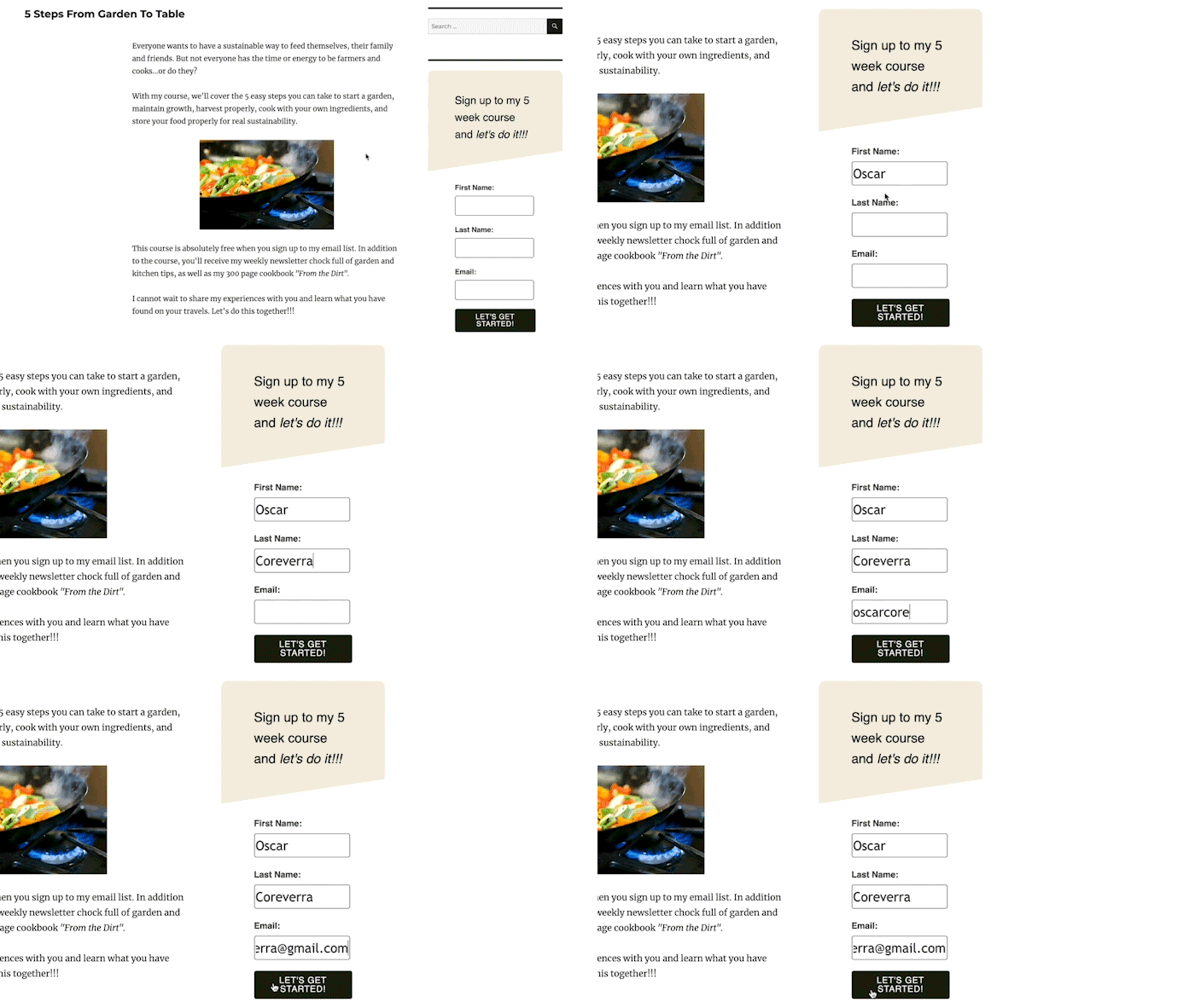
Pop-up forms come in several strategic variations:
- Time-Delayed Pop-ups: These forms appear after a visitor has spent a predetermined amount of time on a page, allowing initial content consumption before prompting a subscription. Optimal delay settings are often informed by web analytics, aligning with average time-on-page metrics. Marketers can also control frequency, ensuring the same visitor isn’t inundated with repeated prompts.
- Scroll-Delayed Pop-ups: Triggered when a visitor scrolls to a specific percentage of a page, these forms leverage demonstrated engagement. Their appearance signifies that the user has found the content sufficiently interesting to explore further, making them more receptive to an offer.
- Exit-Intent Pop-ups: Perhaps one of the most powerful forms, exit-intent pop-ups are activated when a visitor’s mouse movement suggests they are about to leave the site. This "last-chance" opportunity is highly effective for recovering potentially lost leads, often presenting an irresistible offer to encourage subscription. Studies indicate that exit-intent pop-ups can capture between 2-4% of abandoning visitors, turning potential losses into valuable leads.
- Two-Step Pop-ups: These forms appear only after a visitor actively clicks a link or button, indicating a clear intent and interest in the offer. This voluntary interaction typically leads to exceptionally high conversion rates, as the user has already qualified themselves through their action.
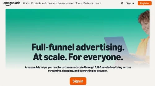
3. Landing Page Forms: Distinct from standard website pages, landing pages are meticulously crafted with a singular conversion goal: to secure subscriber signups. Devoid of distracting navigation bars, menus, or external links, landing pages present visitors with a binary choice: subscribe or leave. This focused environment is incredibly effective at minimizing distractions and maximizing conversion rates. Through compelling imagery, video, and persuasive text, landing pages are designed to unequivocally communicate the value proposition, ensuring visitors remain focused on the primary call to action. Their effectiveness is underscored by their ability to achieve conversion rates significantly higher than general website pages, often ranging from 5-15% or more for well-optimized campaigns.
II. Precision Placement: Maximizing Visibility and Relevance
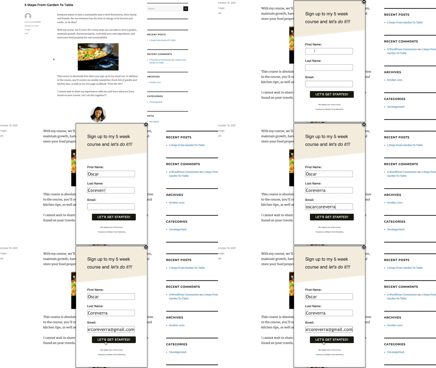
The location of an email signup form is as critical as its design and copy. Strategic placement aims to integrate the form naturally within the user journey, ensuring it appears at moments of heightened interest without being overtly intrusive.
For inline forms, ubiquitous placement in website footers or sidebars ensures a constant opportunity for subscription, regardless of the page a visitor is viewing. The incentive offered in these generalized placements should possess broad appeal, such as a site-wide discount or a general "latest updates" newsletter. For more targeted engagement, inline forms can be embedded within specific content, offering a highly contextual lead magnet directly related to the topic at hand. For instance, an article on digital photography might feature an inline form offering a free guide to editing software.
Pop-up forms are best deployed on pages with high traffic, such as the homepage, which often serves as the initial entry point for the majority of visitors. Web analytics tools, like Google Analytics, are indispensable for identifying these high-value pages. Pop-ups on such pages should promote the primary, most compelling incentive. Furthermore, pop-ups can be tailored to specific content, appearing only when relevant to the user’s current interest, thereby increasing their perceived value and reducing annoyance. The objective is to present the form precisely when a visitor is most receptive to conversion, aligning with their evolving interest in your content.
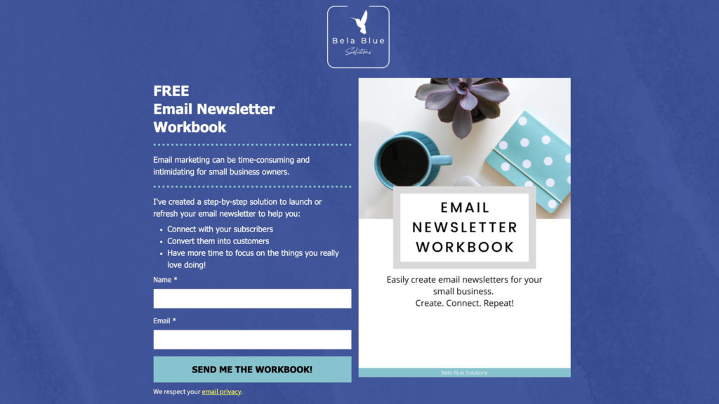
III. The Art of Persuasion: Crafting High-Converting Copy
The text accompanying a signup form is its persuasive core, responsible for articulating value and motivating action. Effective copy adheres to several key principles:
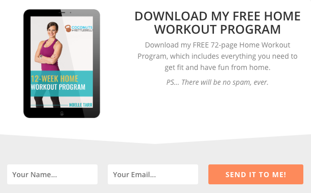
1. Use a Clear, Concise Headline: The headline is the first point of engagement. It must immediately convey the offer and its benefit to the subscriber. Ambiguity is the enemy of conversion. For example, "Get Your Free Home Workout Program" leaves no doubt about the immediate value, with a brief description elaborating on its 72-page content and fitness goals. This directness captures attention and sets expectations from the outset.
2. Clearly Communicate the Value: Beyond the headline, the form copy must expand on the tangible benefits of subscribing. This involves articulating how the offer solves a problem, answers a question, or improves the subscriber’s situation. Whether through a succinct sentence or a bulleted list, clearly outlining what subscribers will gain—such as exclusive tips, insights, or resources—reinforces the decision to sign up. Stepmom Magazine’s landing page, for instance, effectively uses bullet points to detail the types of supportive content subscribers will receive, addressing specific pain points of their target audience.
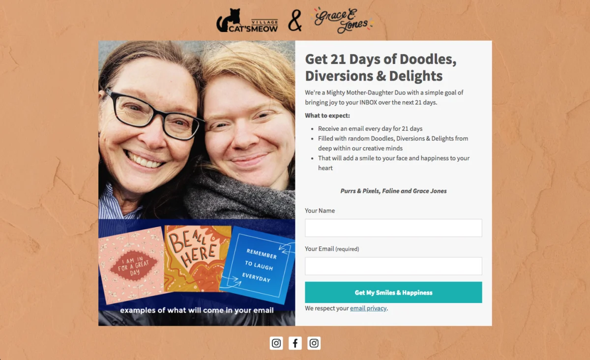
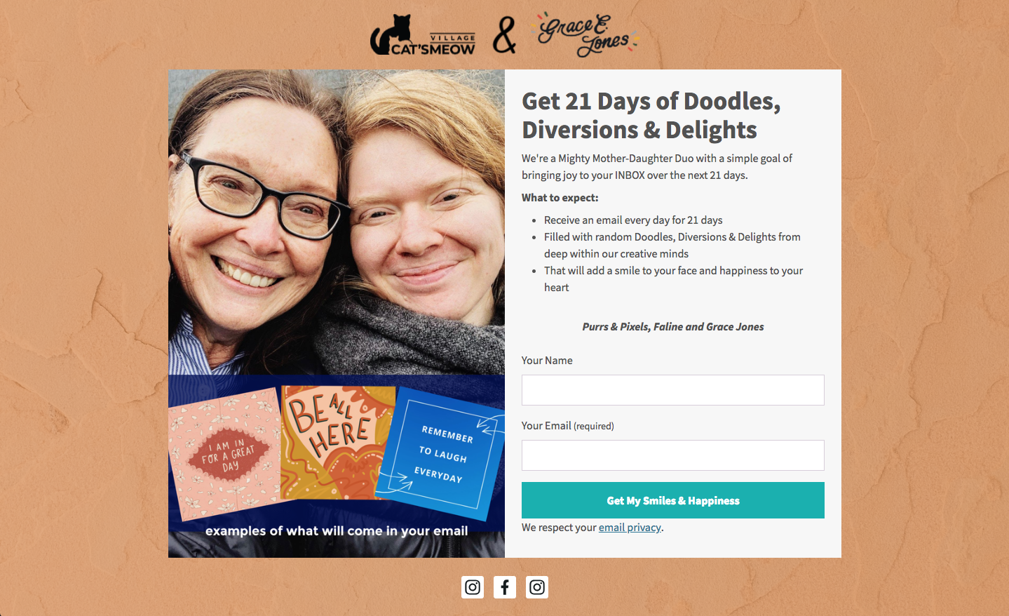
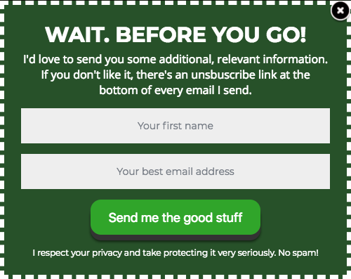
3. Set Clear Expectations: Transparency builds trust. Form copy should explicitly state what subscribers will receive, the frequency of emails, and the nature of the content. This proactive communication significantly reduces spam complaints and unsubscribes while fostering a relationship built on honesty. Adhering to principles of data privacy, such as those outlined by GDPR, is also crucial. An example from Cat’s Meow Village, promising "fun, light-hearted emails every day for 21 days," exemplifies setting precise expectations, empowering subscribers with full knowledge of their commitment.
4. Write Conversational Copy: Engaging, informal language can break through the noise of conventional marketing. Phrases like "Oh hey!" or "Hey you!" personalize the interaction, grabbing attention and creating an immediate connection. This conversational tone can make the signup process feel less transactional and more like an invitation, increasing receptivity to the value proposition. Really Good Emails successfully employs such direct, personal address to draw visitors in.

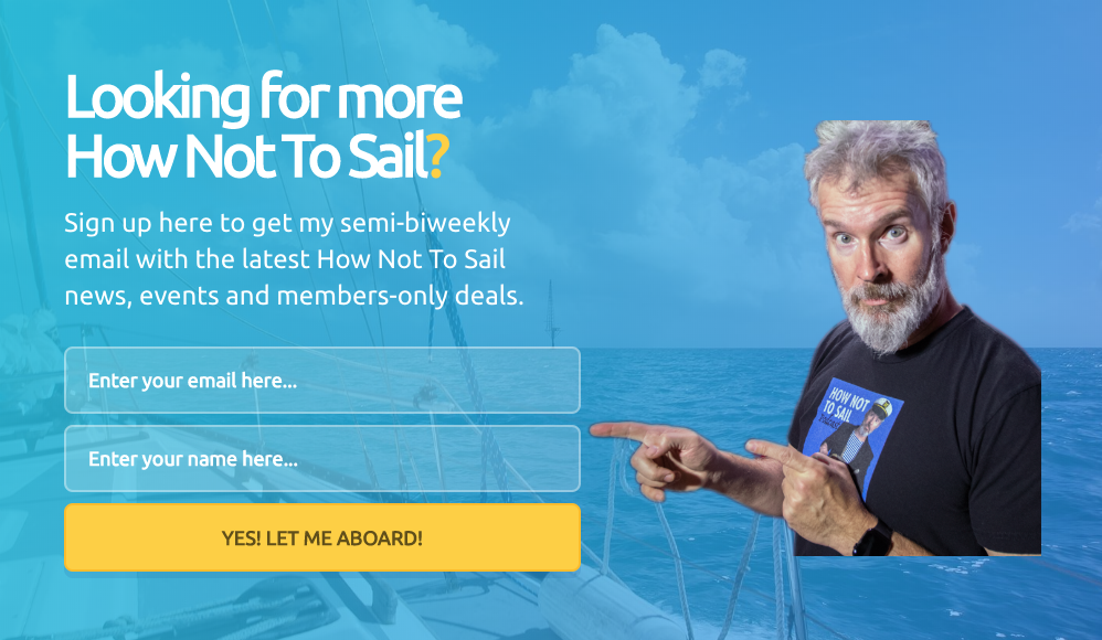
5. Be Creative, Witty, or Humorous: Infusing personality into form copy can significantly enhance brand appeal and relatability. Creativity and humor build rapport, making the brand more memorable and trustworthy. A unique approach, such as "How Not to Sail" using sailing terminology for its CTA button (e.g., "Climb Aboard!"), transforms a mundane action into an engaging experience, reinforcing brand identity and fostering a sense of community.
IV. Designing for Impact: Visual Strategies for Conversion
Visual design plays a profound role in a form’s perceived credibility and ease of use. Research suggests that 90% of first impressions are influenced by visual and color cues, underscoring the importance of thoughtful design.
1. Keep Form Fields to a Minimum: Every additional field in a signup form introduces friction, potentially deterring a subscriber. Data consistently shows that forms with fewer input fields yield higher conversion rates. For basic subscriber acquisition, requesting only a name and email address is often sufficient. If lead qualification is the goal, more information may be necessary, but this decision should be carefully weighed against potential conversion drops. Subsequent data can always be gathered through multi-step forms or post-signup surveys, optimizing the initial interaction for speed and simplicity. For example, Ann Handley’s form uses just two fields, streamlining the process for visitors and minimizing cognitive load. Industry studies have shown that reducing the number of form fields from 11 to 4 can increase conversion rates by as much as 120%.
2. Use a Clear Call to Action (CTA): The CTA button is the final prompt for conversion. Generic terms like "Sign Up" are often missed opportunities. A compelling CTA reminds visitors of the direct benefit they will receive. Phrases incorporating urgency ("Join now!") or possessive language ("Send me my free guide!") create a stronger, more personal connection, significantly boosting click-through rates. Paul Kirtley’s form, with a CTA that directly relates to the subscriber’s action, exemplifies this personalized approach. Effective CTAs are known to increase conversion rates by up to 200%.
3. Follow a Hierarchy for Font Sizes and Types: A clear typographic hierarchy guides the reader’s eye, making the form easily scannable and digestible. Headlines should be the largest, followed by subheadings, and then descriptive text. Limiting font types to one or two maintains visual coherence, with a distinct font for the headline to create emphasis. FroKnowsPhoto demonstrates effective hierarchy, using varied font styles (bold, italicized, all caps) to add visual interest while maintaining readability.
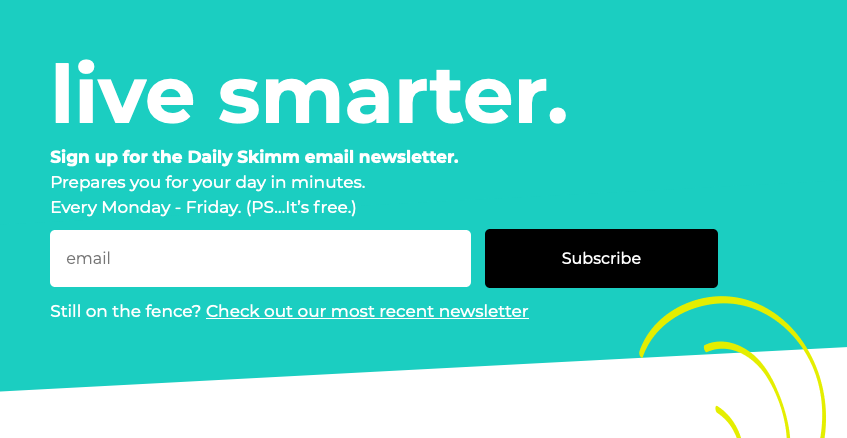
4. Stick to 1-2 Font Colors: Excessive font colors create visual clutter and can hinder readability. A minimalist approach, typically using one or two colors that align with brand guidelines, ensures clarity and professionalism. The Daily Skimm’s form, utilizing only white font color, proves that simplicity can be highly effective.
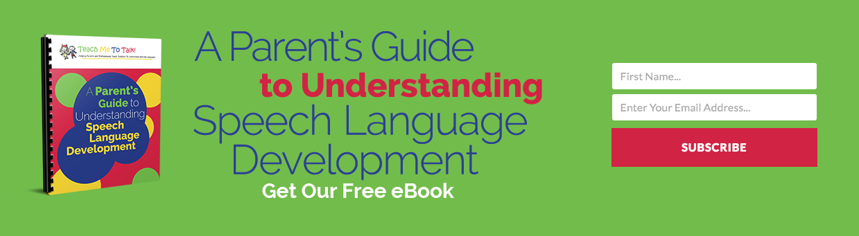
5. Create Color Contrast: High contrast between the form and the surrounding webpage, as well as between text and background within the form itself, helps it stand out and draw attention. A vibrant, well-chosen color can significantly increase a form’s visibility and completion rates. Teach Me To Talk’s form masterfully employs contrasting colors to attract the eye while clearly articulating its incentive.
6. Visually Represent Your Incentive: An image or graphic depicting the offer can be a powerful motivator. Forms incorporating visuals typically receive significantly more engagement than those without. This visual cue provides an immediate understanding of the value, reinforcing the written copy. Spoon Graphics effectively uses a fun visual graphic to represent its incentive, making the offer more tangible and appealing.
7. Let Subscribers Choose Their Preferences: Empowering subscribers to customize their email preferences (e.g., topic interests, frequency) leads to higher engagement rates and reduced churn. This personalization ensures they receive content most relevant to their needs, enhancing their overall experience and the perceived value of the subscription. The Intrepid Guide’s form, allowing topic selection, exemplifies this subscriber-centric approach.
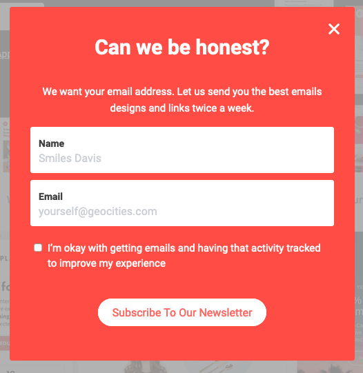
8. Try Presenting an Unfavorable Alternative: This psychological tactic, best suited for pop-up or dismissible forms, subtly nudges visitors towards subscription by highlighting the negative consequence of opting out. Boast’s form, offering a discount and presenting "No thanks, I prefer paying full price" as the alternative, makes subscribing the overwhelmingly logical choice. This strategy leverages aversion to loss, a powerful human motivator.
9. Use Social Proof: Incorporating social proof, such as the number of existing subscribers, builds trust and validates the value proposition. The principle that "if others are doing it, it must be worthwhile" instills confidence in potential subscribers. Nerd Fitness, by stating "over 300,000 people are subscribed," effectively leverages this psychological trigger, suggesting high content value. Statistics show that 88% of consumers trust online reviews and testimonials as much as personal recommendations, highlighting the power of social proof.

10. Try Using a Big CTA Button: With over half of all website visits originating from mobile devices, a large, easily tappable CTA button is a design imperative. Optimizing for mobile ensures a seamless user experience, reducing frustration and increasing conversion rates across all devices. Mark Asquith’s form features a prominent "Download Now" button, exemplifying mobile-friendly design.
11. Use Plenty of White Space: Strategic use of white space around text, images, and form fields improves readability and lends a professional, trustworthy aesthetic. This visual "breathing room" prevents the form from appearing cluttered and overwhelming, making it more inviting. 1 Chic Retreat’s form demonstrates how ample white space enhances clarity and user comfort.
V. The Emergence of AI in Form Creation
The complexities of optimizing signup forms—encompassing typography, color contrast, white space, compelling CTA copy, and field count—can be daunting. Recognizing this, platforms like AWeber have introduced AI-powered signup form builders to streamline the process. Users can describe their business in a single sentence, and the AI generates a complete form, intelligently incorporating brand colors, a relevant headline, descriptive copy, appropriate input fields, and an optimized layout. For example, a bakery seeking emails for a weekly recipe newsletter will receive a different form than a fitness coach promoting a free workout plan, tailored to their specific needs.
Every element generated by the AI is fully editable, allowing marketers to fine-tune the copy, adjust colors, add or remove fields, and customize button text. The AI serves as an intelligent drafting assistant, providing a robust starting point that users can personalize. Crucially, these AI-generated forms seamlessly integrate with existing email lists and automation workflows, ensuring new subscribers are immediately channeled into welcome sequences or targeted campaigns, significantly enhancing efficiency and reducing manual setup time. This integration represents a leap forward in marketing automation, democratizing advanced design and optimization for businesses of all sizes.
VI. Continuous Improvement: Testing and Optimization

The launch of a signup form is not the culmination of the optimization process but merely its beginning. To maintain and improve conversion rates, continuous testing and refinement are essential. A/B testing, also known as split testing, allows marketers to compare two versions of a form (A and B) to determine which performs better against key metrics.
Over time, even the most effective signup forms can experience diminishing returns as repeat visitors become accustomed to them. Periodic refreshes and updates are therefore vital to re-engage potential subscribers. Virtually any element of a signup form can be A/B tested:
- Headlines and Subheadings: Different value propositions or phrasing.
- Call to Action (CTA) Copy: Variations in urgency, personalization, or directness.
- Form Field Count: Testing the impact of fewer versus more fields.
- Color Schemes and Contrast: Evaluating how visual appeal affects engagement.
- Incentive Imagery: Comparing different visual representations of the offer.
- Placement and Pop-up Triggers: Experimenting with where and when forms appear.
- Social Proof Messaging: Testing different ways to display subscriber numbers or testimonials.
By systematically testing and iterating, marketers can continually enhance their forms’ performance, ensuring they remain effective tools for subscriber growth.
VII. Real-World Impact: A Case Study in Engagement
The power of personalization and thoughtful form design is vividly demonstrated by AWeber’s experience with their popular "What to Write in Your Emails" course. Initially, feedback from subscribers revealed conflicting preferences regarding email frequency: some desired more frequent updates, while others preferred a less intense delivery schedule.
In response, AWeber implemented a crucial change to the signup form, allowing subscribers to choose their preferred course email frequency. This seemingly minor adjustment had a profound impact. By empowering subscribers with control over their experience, AWeber observed a remarkable 47% increase in open rates and an astonishing 150% lift in click-through rates. The subsequent email automation then delivered the course content at the individual subscriber’s chosen pace, catering directly to their preferences.
This case study underscores a critical insight for small business owners, 94% of whom, according to AWeber’s research, are responsible for writing their own marketing emails. Giving subscribers control over frequency is not merely a convenience; it is one of the highest-impact changes that can be made to a signup form, directly translating into significantly higher engagement and a more satisfied audience. The detailed step-by-step explanation of this implementation offers a blueprint for others seeking to replicate similar success.
Conclusion
In the dynamic realm of digital marketing, the email signup form remains an indispensable asset, a critical juncture where visitor interest transforms into subscriber loyalty. Its optimization is a multi-faceted discipline, blending the art of persuasive copy and intuitive design with the science of strategic placement and continuous testing. From the subtle integration of inline forms to the attention-grabbing efficacy of pop-ups and the focused power of landing pages, each type serves a unique purpose in the subscriber acquisition funnel.

The modern marketer must meticulously craft compelling headlines, articulate clear value propositions, set transparent expectations, and infuse personality into their copy. Simultaneously, design elements—such as minimal fields, clear CTAs, typographic hierarchy, color contrast, and visual incentives—are paramount to creating a visually appealing and user-friendly experience. The advent of AI-powered tools further streamlines this process, offering intelligent starting points that accelerate development without sacrificing customization.
Ultimately, the journey of optimizing email signup forms is an ongoing one, demanding perpetual vigilance through A/B testing and periodic updates. As evidenced by real-world successes like AWeber’s 150% engagement lift, prioritizing subscriber preferences and user experience leads directly to tangible improvements in open rates, click-through rates, and overall list health. By embracing these principles and leveraging available technologies, businesses can transform their signup forms from mere data collectors into powerful engines of sustained audience growth and meaningful engagement.