The email signup form stands as the singular, pivotal gateway between a casual website visitor and a prospective, engaged subscriber. Its design, copy, placement, and overall user experience are not mere aesthetic choices but critical determinants that can profoundly influence a visitor’s decision to subscribe, ultimately making or breaking the success of an email marketing strategy. In an increasingly competitive digital landscape, where attention spans are fleeting and consumer privacy is paramount, mastering the art and science of email signup forms has become a strategic imperative for businesses aiming to cultivate direct relationships and drive sustained growth.
The Enduring Power of Email Marketing in a Dynamic Digital Ecosystem

In an era dominated by social media algorithms and ever-changing advertising policies, email marketing remains a cornerstone of effective digital communication, boasting an impressive return on investment (ROI). According to various industry reports, email marketing consistently delivers an average ROI of $36-$42 for every $1 spent, outperforming many other digital channels. This remarkable efficiency stems from its direct, personal nature, allowing businesses to bypass intermediaries and communicate directly with an audience that has explicitly granted permission to receive messages. The email list, therefore, is not just a database; it is a proprietary asset, a direct channel to a self-selected audience, making the initial point of entry – the signup form – incredibly vital.
The importance of well-crafted signup forms has only intensified with evolving data privacy regulations like GDPR and CCPA. These regulations emphasize the need for clear consent and transparency, making the signup process not just a conversion point but a trust-building exercise. A form that clearly communicates value and sets expectations is not only compliant but also fosters a stronger, more engaged subscriber base from the outset.
Diverse Forms for Diverse Engagements: Understanding Signup Form Types
Effective email list growth hinges on deploying the right type of signup form at the opportune moment, catering to varying user behaviors and website contexts. Each form type serves a distinct purpose, designed to capture attention without alienating the user.
1. Inline Forms:
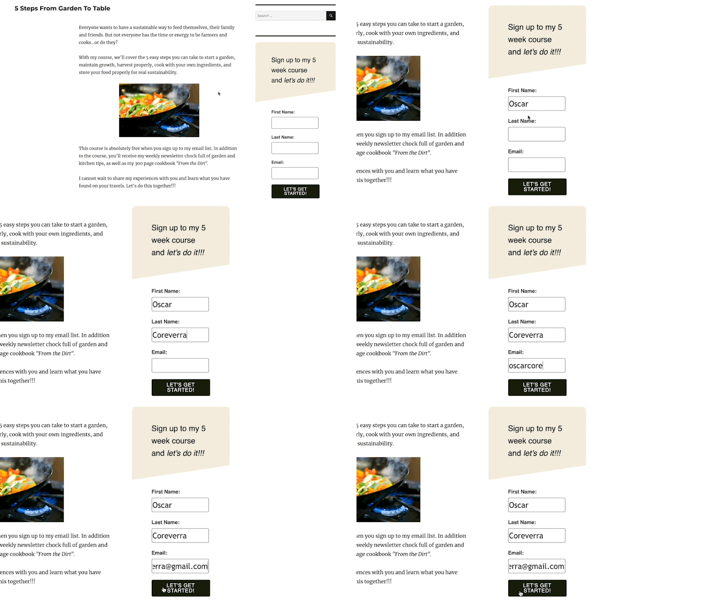
Inline signup forms are seamlessly integrated into the fabric of a webpage, appearing within the content, at the top or bottom of an article, or nestled in a sidebar. Their non-intrusive nature makes them ideal for visitors who prefer an uninterrupted browsing experience. They can be deployed site-wide or on specific, relevant pages. For instance, a blog post about healthy recipes might feature an inline form offering a free e-cookbook. The key advantage of inline forms lies in their contextual relevance; they appear when a user is already engaged with related content, increasing the likelihood of a meaningful subscription. Studies suggest that while pop-ups often have higher raw conversion rates due to their interruptive nature, inline forms can yield higher quality leads because the subscription is a more deliberate act. Businesses frequently use the AWeber for WordPress plugin, for example, to effortlessly embed and track the performance of these forms across their sites.
2. Pop-up Forms:
In contrast to their embedded counterparts, pop-up forms emerge dynamically during a visitor’s interaction with a website. These attention-grabbing elements can slide in from the side, top, or bottom, or appear centrally, sometimes blurring the background content to command focus. While highly effective at increasing subscriber signups—often achieving conversion rates between 3% and 10% compared to inline forms’ 1-2%—their potential to disrupt user experience necessitates careful configuration of display settings.
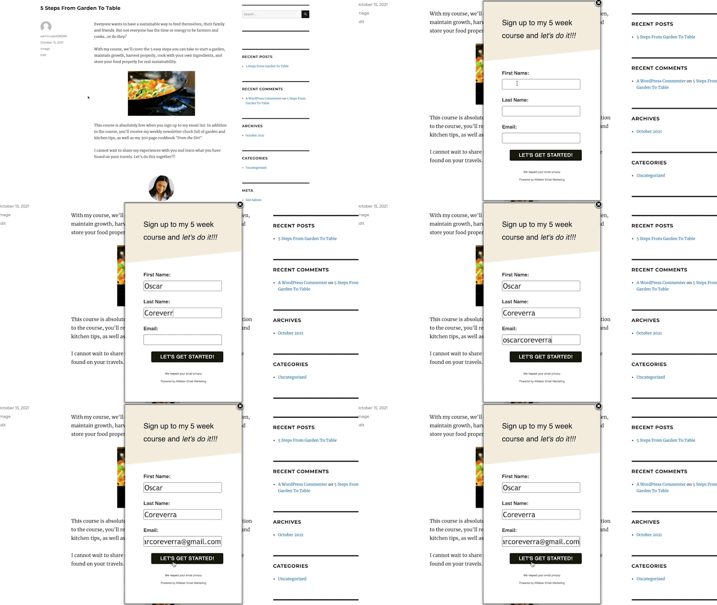
Pop-up forms come in several strategic variations:
- Time-Delayed Pop-ups: These forms appear after a predetermined duration, allowing visitors to engage with content before being prompted to subscribe. Optimal timing is often informed by web analytics, setting the delay just before the average time spent on a page. This balances visibility with user comfort.
- Scroll-Delayed Pop-ups: Triggered when a visitor scrolls to a specific point on a page, these forms capitalize on demonstrated content engagement. A user who has scrolled halfway down an article is more likely to find value in a related offer.
- Exit-Intent Pop-ups: Arguably one of the most powerful pop-up types, exit-intent forms activate when a visitor signals an intention to leave the website (e.g., by moving their mouse cursor towards the browser’s close button). These forms offer a last-ditch opportunity to convert a departing visitor, often by presenting an irresistible offer or lead magnet that might save a "lost" opportunity.
- Two-Step Pop-ups: These forms appear only after a visitor actively clicks a link or button, signifying a pre-existing interest. This voluntary interaction often leads to exceptionally high conversion rates, as the user has already committed to the first step of engagement.
3. Landing Page Forms:
Distinct from traditional website pages, a landing page is a standalone web page designed with a singular objective: to convert visitors into subscribers. Devoid of typical navigation bars, menus, or extraneous links, landing pages streamline the user’s choices to either subscribe or exit. This focused approach minimizes distractions, directing the visitor’s attention solely to the value proposition. Businesses leverage compelling visuals, videos, and persuasive text on landing pages to amplify the benefits of subscribing, often achieving conversion rates significantly higher than general website forms, sometimes exceeding 20-30% for well-optimized pages.
Strategic Placement: Maximizing Visibility and Contextual Relevance
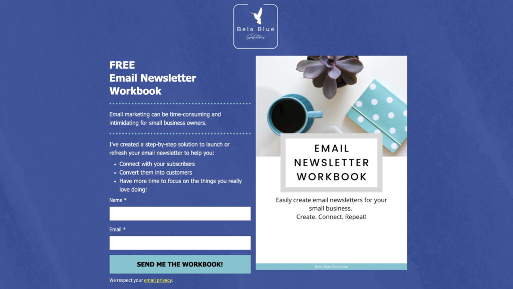
The "where" of a signup form is as crucial as the "what" and "how." Optimal placement ensures the form is noticeable without being unduly intrusive, appearing at moments when a visitor is most receptive to conversion.
-
Inline Form Placement: A foundational strategy involves placing inline forms in consistent, accessible locations such as the website footer or sidebar across all pages. This guarantees that a subscription opportunity is always present, regardless of a visitor’s navigation path. The incentive offered in these ubiquitous forms should be broadly appealing, such as a general discount or a compilation of "latest tips." For more specific content, inline forms can be embedded directly within articles or product descriptions, offering highly relevant lead magnets. For example, a travel blog might place an inline form within a destination guide, offering a downloadable itinerary for that specific location.
-
Pop-up Form Placement: The homepage, often the primary entry point for traffic, is an ideal location for an initial pop-up, promoting a primary, high-value incentive. Beyond the homepage, analytics tools like Google Analytics can identify other high-traffic pages where context-specific pop-ups can be deployed. For instance, a pop-up on a product category page could offer a "buyer’s guide" for that category.
Crafting Compelling Copy: The Art of Persuasion
Beyond visibility, the language used on a signup form is instrumental in converting interest into action. Effective copy articulates value, builds trust, and sets clear expectations.
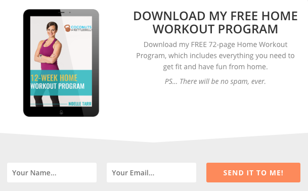
1. Clear, Concise Headlines: The headline is the form’s first impression. It must instantly convey the offer and its benefit. For example, "Unlock Your Free Home Workout Program" immediately communicates what the subscriber receives and how it helps them achieve fitness goals.

2. Articulating Value Propositions: Below the headline, the copy should elaborate on the specific benefits. This can be achieved through a brief sentence or a bulleted list highlighting how the offer solves a problem or enhances the subscriber’s life. "Stepmom Magazine," for instance, lists the diverse content subscribers will gain access to, from practical advice to community support.
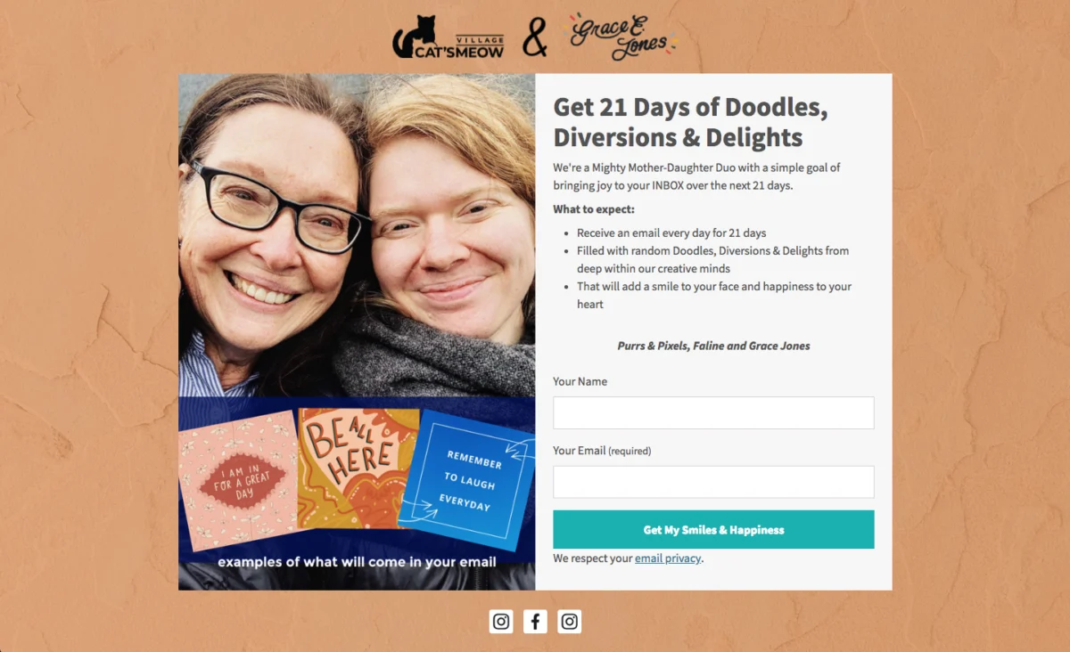
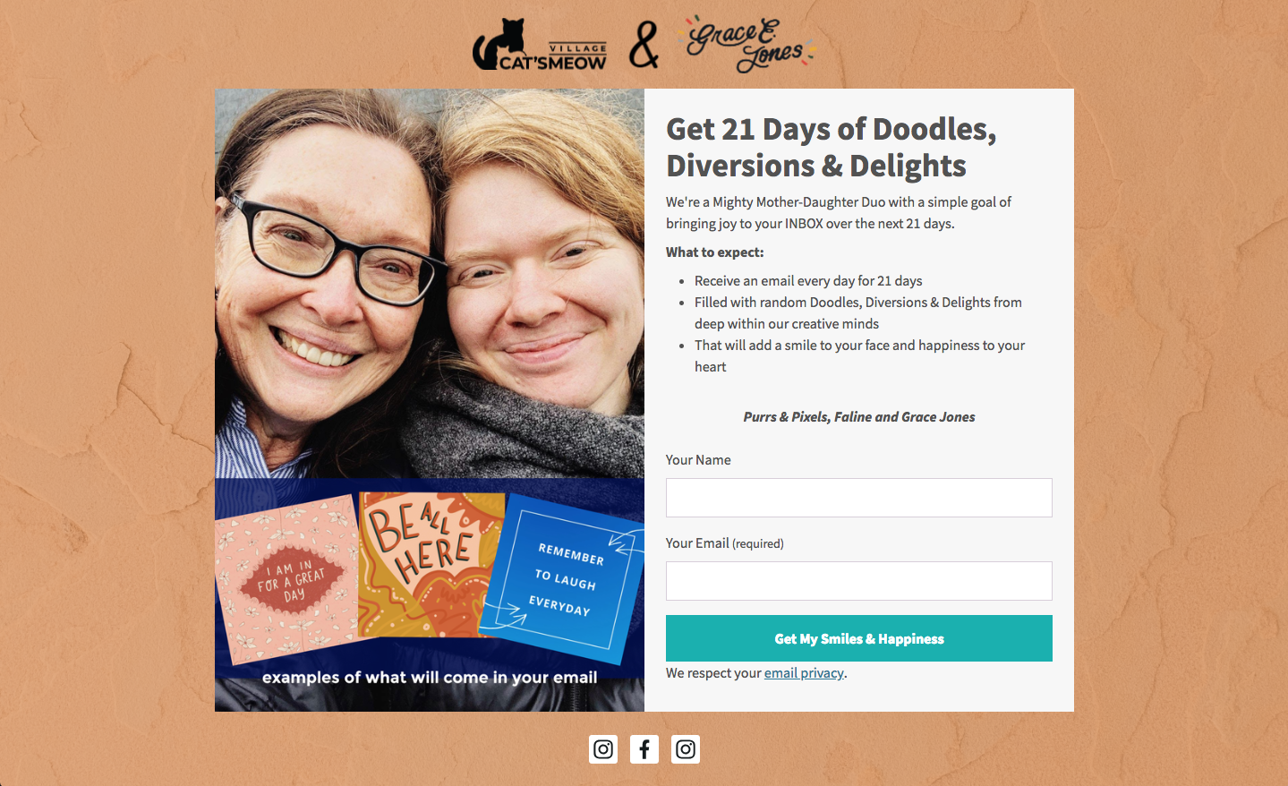
3. Setting Clear Expectations: Transparency is key to building trust and reducing churn. The form should explicitly state what subscribers will receive, the frequency of communication, and the type of content to expect. "Cat’s Meow Village" masterfully does this by informing subscribers to expect "fun, light-hearted emails every day for 21 days," eliminating guesswork and ensuring a smooth onboarding experience. This also helps maintain GDPR compliance by demonstrating clear consent for specific communication types and frequencies.
4. Conversational and Engaging Tone: Moving away from generic calls to action, conversational copy like "Oh hey!" or "Hey you!" can grab attention and foster a more personal connection, making the form feel less transactional. "Really Good Emails" utilizes this approach to create an inviting and relatable experience.
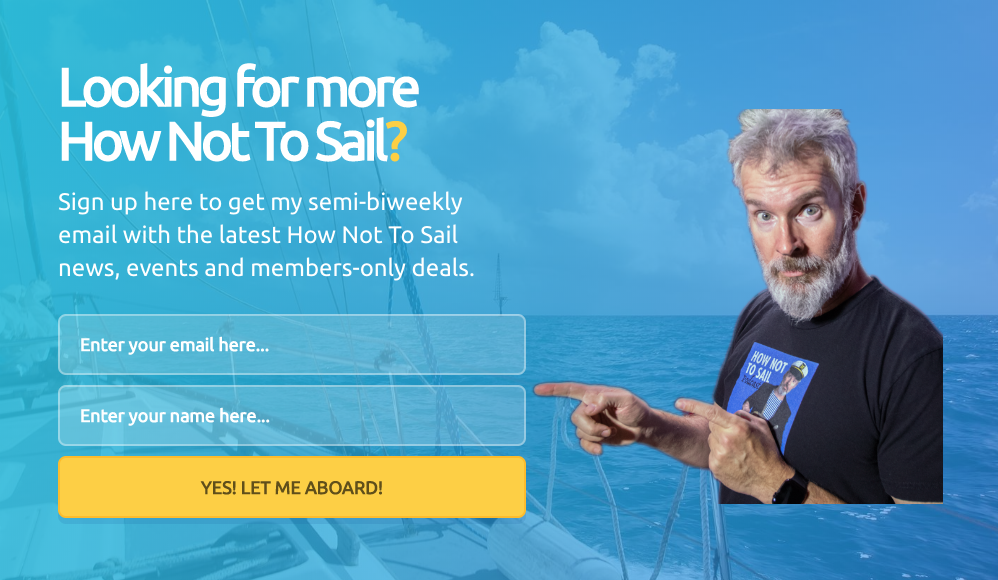
5. Creativity, Wit, and Humor: Infusing personality into form copy builds rapport and memorability. A brand’s unique voice can be a powerful differentiator. "How Not to Sail" employs sailing terminology in its call to action, transforming a mundane "Sign Up" button into an adventurous "Climb Aboard," resonating with its niche audience and enhancing brand identity.
Designing for Conversion: Visual Elements and User Experience
Visual design profoundly impacts perception and conversion rates, with studies indicating that 90% of initial impressions are based on visual and color cues.
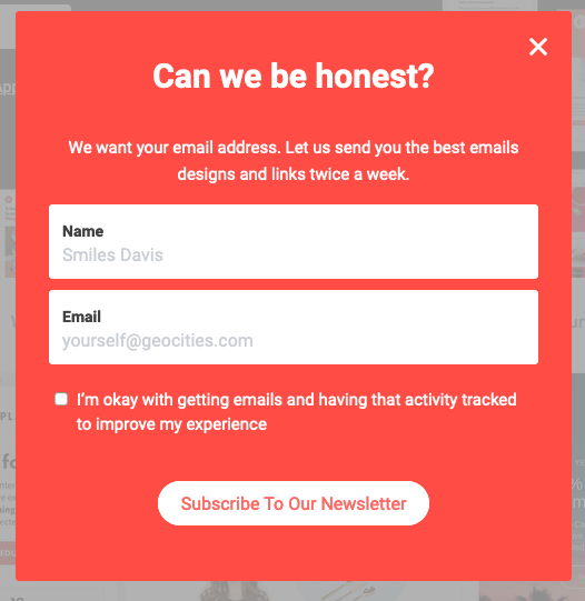
1. Minimalist Form Fields: Each additional field on a signup form introduces friction, potentially deterring completion. The best practice, particularly for initial subscriber acquisition, is to ask only for essential information, typically name and email address. If the primary goal is list growth, simplicity is paramount. More detailed demographic information can be gathered later through progressive profiling or post-signup surveys. Ann Handley’s two-field form is a prime example of this minimalist approach, prioritizing speed and ease of subscription.
2. Clear and Action-Oriented Call to Action (CTA): The CTA button should be more than a generic "Sign Up." It should reiterate the offer and incentivize immediate action. Phrases like "Send me my free guide!" or "Yes, I want in!" leverage possessive language and urgency to increase clicks. Paul Kirtley’s CTA, "Download my free templates," directly connects the action to the benefit.
3. Typographic Hierarchy: A well-structured typographic hierarchy guides the reader’s eye, with headlines as the largest text, followed by subheads and then body copy. Limiting font types to one or two and using bolding or italics for emphasis can enhance readability and visual appeal, as demonstrated by FroKnowsPhoto.
4. Strategic Use of Color: Excessive font colors can be distracting. Sticking to one or two harmonious colors ensures clarity and professionalism. The Daily Skimm’s simple white font on a contrasting background illustrates how effective minimalism can be.
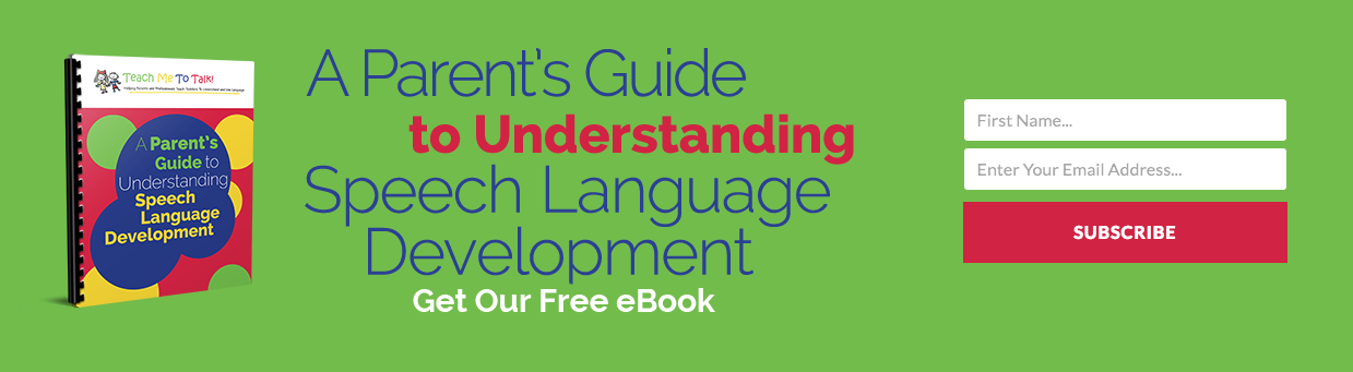
5. Color Contrast: Contrasting colors make the signup form stand out from the rest of the webpage, drawing immediate attention. A bright, brand-aligned color against a neutral background can significantly increase form completions, as exemplified by Teach Me To Talk’s vibrant design.
6. Visual Representation of Incentives: A compelling image or graphic representing the lead magnet or incentive can be a powerful motivator. Forms incorporating visuals often receive significantly more engagement than text-only versions, as visuals communicate value instantaneously. Spoon Graphics effectively uses a fun, illustrative graphic to convey its offer.

7. Subscriber Preference Options: Empowering subscribers to choose their content preferences (e.g., topics, frequency) leads to higher engagement rates and lower unsubscribe rates. This personalization ensures they receive content most relevant to them, enhancing their overall experience. The Intrepid Guide’s form allows subscribers to select their preferred travel topics, tailoring the email experience from the start.
8. Presenting an Unfavorable Alternative: Particularly effective for pop-up forms, this psychological tactic frames opting out in a way that makes subscribing the more appealing choice. Boast’s form, offering a discount, presents the alternative as "No thanks, I prefer paying full price," subtly nudging visitors towards conversion.
9. Social Proof: Incorporating social proof, such as the number of existing subscribers or testimonials, instills confidence and validates the offer. If hundreds of thousands of others have subscribed, it signals value and trustworthiness. Nerd Fitness effectively uses this by stating, "Join over 300,000 people," immediately building credibility.
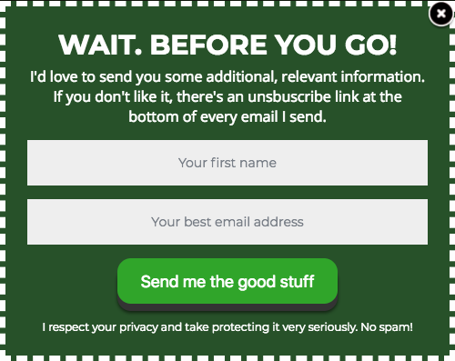
10. Large CTA Buttons and Mobile Optimization: With over half of all website traffic originating from mobile devices, forms must be mobile-responsive. Large, easily tappable CTA buttons and adequately spaced input fields are crucial for a seamless mobile experience. Mark Asquith’s form features a prominent "Download Now" button, optimized for quick interaction on any device.
11. Ample White Space: Generous white space around text, images, and form fields improves readability, reduces cognitive load, and contributes to a professional, trustworthy aesthetic. 1 Chic Retreat’s design exemplifies how thoughtful spacing enhances user experience.
Leveraging AI for Streamlined Form Creation

Recognizing the complexity of balancing design, copy, and functionality, platforms like AWeber are now offering AI-powered signup form builders. Users can describe their business in a single sentence, and the AI generates a complete form, incorporating brand colors, a compelling headline, descriptive copy, appropriate input fields, and an optimized layout. This initial draft is fully editable, allowing businesses to fine-tune every element. Critically, these AI-generated forms integrate directly with email lists and automation workflows, ensuring new subscribers are seamlessly added to welcome sequences, significantly reducing setup time and technical barriers.
Continuous Optimization: The Iterative Process of A/B Testing
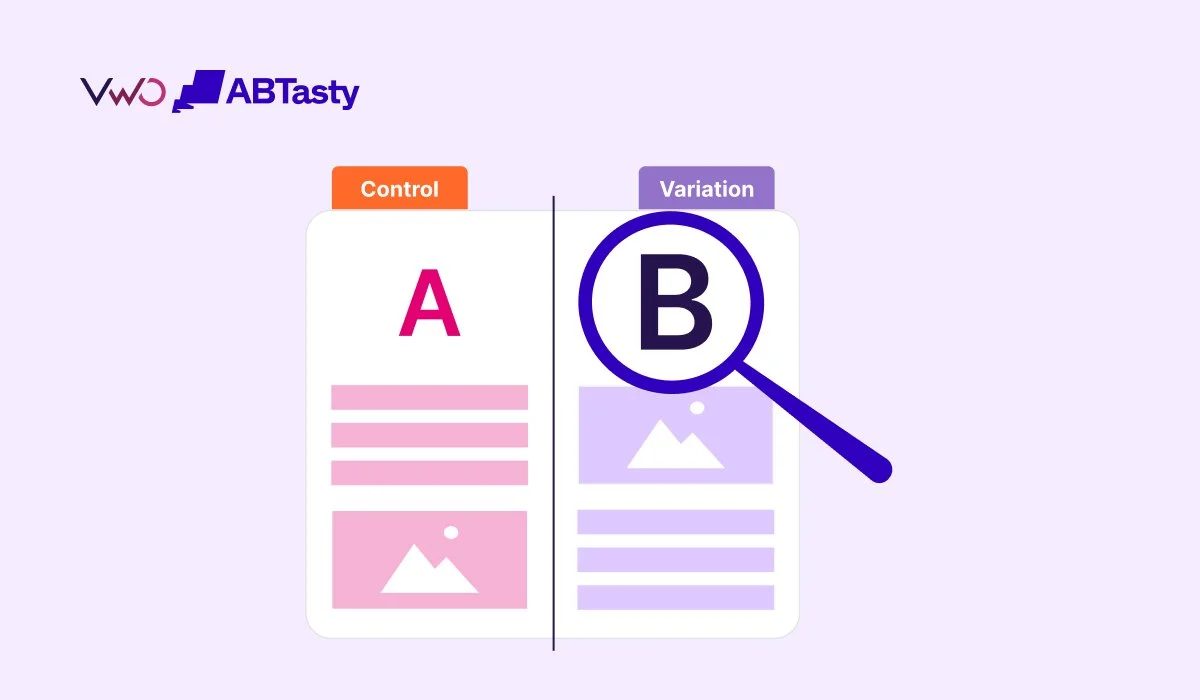
Publishing a signup form is merely the beginning of its lifecycle. Continuous improvement through A/B testing (or split testing) is essential for sustained effectiveness. By comparing two versions of a form (e.g., different headlines, CTA text, image choices, field counts, or colors), businesses can scientifically determine which elements yield higher conversion rates. Regularly refreshing form designs and copy prevents "banner blindness" and re-engages returning visitors who may have previously dismissed the offer.

Case Study: AWeber’s 150% Engagement Lift Through Subscriber Preferences
A compelling internal case study from AWeber underscores the power of thoughtful form optimization. When seeking to enhance their popular "What to Write in Your Emails" course, AWeber encountered conflicting feedback regarding email frequency. Some subscribers desired more frequent updates, while others preferred less. Their solution was innovative: empower subscribers to choose their preferred email frequency directly on the signup form, with email automation delivering the course content at the selected pace.
This seemingly simple adjustment yielded dramatic results: open rates surged by 47%, and click-through rates skyrocketed by 150%. This success highlights a crucial insight for small business owners, 94% of whom write their own marketing emails: giving subscribers control over their experience, particularly regarding frequency, is one of the highest-impact changes that can be made to a signup form. It transforms the subscription from a passive reception into an active, personalized engagement, fostering a deeper sense of ownership and satisfaction among the audience. The underlying implication is that customization and user control are not just features but fundamental drivers of engagement and loyalty in modern email marketing.
Broader Impact and Implications
The diligent optimization of email signup forms extends far beyond mere list growth. It directly impacts lead quality, customer relationship management, and ultimately, business profitability. Well-designed forms attract genuinely interested prospects, reducing the likelihood of spam complaints and unsubscribes, thereby maintaining list hygiene and sender reputation. By setting clear expectations and delivering on promises made at the signup stage, businesses build trust and credibility, laying the groundwork for long-term customer relationships. In a crowded digital marketplace, the signup form is often the first tangible interaction a potential customer has with a brand’s value proposition. Making this interaction frictionless, clear, and compelling is not just good marketing; it is a fundamental pillar of sustainable digital commerce. As the digital landscape continues to evolve, the strategic significance of an optimized email signup form will only grow, cementing its role as an indispensable tool for audience development and revenue generation.