In the dynamic landscape of consumer engagement, the psychology of color stands as one of the most potent, yet often underestimated, tools available to marketers. Color transcends language and instantly communicates, setting moods, evoking emotions, and sparking profound psychological reactions that can either powerfully support or inadvertently detract from the perceived value of an offering. Empirical evidence underscores this impact: a staggering 90 percent of a subscriber’s initial impression of an email message or a website is formed based on color and other visual cues alone. This immediate, visceral response highlights color’s critical role in shaping perceptions and influencing decisions, making it an indispensable element of any comprehensive marketing strategy.
The profound influence of color extends directly to purchasing behavior and brand recall. Surveys consistently show that 84.7% of consumers deem color important when making a product purchase. Furthermore, strategic use of color can increase brand recognition by a remarkable 80%. This substantial impact firmly positions color as a cornerstone of brand identity and a key driver of market performance. Understanding the intricate connections between color, emotion, and consumer psychology allows marketers to craft more effective campaigns across various digital touchpoints, including websites, landing pages, sign-up forms, and email communications.
The Historical and Psychological Roots of Color Perception
The power of color is not a modern discovery; its influence has been recognized across cultures and throughout history. Ancient civilizations used colors for symbolism, healing, and status. For instance, royal purple, derived from rare sea snails, denoted wealth and power in Roman times due simply to its scarcity and the arduous process of its creation. The scientific study of color perception gained momentum in the 17th century with Isaac Newton’s experiments on light, but it wasn’t until the 20th century that the systematic study of color psychology began to merge with marketing and advertising. Researchers started to categorize colors by their common psychological effects, observing how specific hues could elicit predictable emotional and behavioral responses in target audiences.
It is crucial to acknowledge that while many color associations are universal (e.g., red for danger, green for nature), cultural contexts play a significant role. For example, white signifies purity and weddings in many Western cultures but is associated with mourning in parts of Asia. Similarly, red can symbolize luck and prosperity in China, while in some African cultures, it denotes death. Therefore, effective color strategy in global marketing requires a nuanced understanding that balances universal psychological principles with specific cultural interpretations.
Decoding the Spectrum: Individual Color Meanings in Marketing
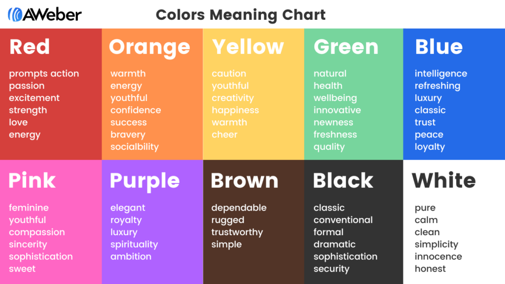
Each color possesses a unique psychological profile that marketers can leverage to communicate specific messages and evoke desired responses:
-
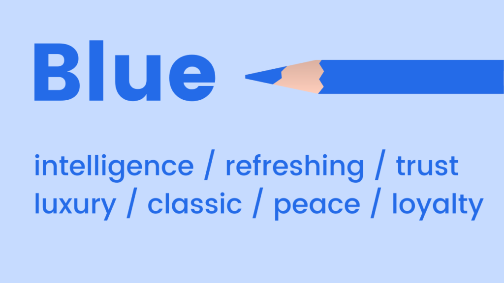
Blue: Universally associated with feelings of coolness, calm, and serenity. Blue has mood-boosting properties, signaling the body to produce calming chemicals and promoting positivity. Light blue offers a refreshing splash, while dark blue is a classic choice for brands aiming to emphasize luxury, trustworthiness, and corporate stability without the stark formality of black. It is frequently adopted by financial institutions, technology companies, and healthcare providers to convey security, professionalism, and reliability. Studies indicate that blue is often perceived as a sign of loyalty and competence.
-
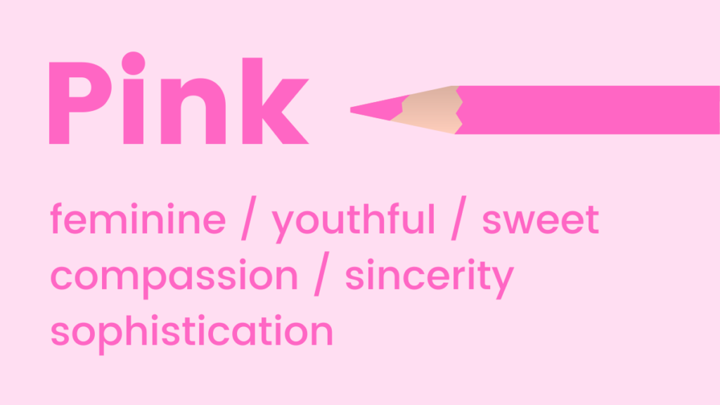
Pink: Evokes youthfulness, fun, and excitement. It is a powerful choice for emphasizing femininity, sweetness, and romance, with research even suggesting it can stimulate cravings for sugar. Various shades offer different nuances: soft pastels suggest innocence and tenderness, while vibrant fuchsias exude energy and playfulness. Pink is often utilized in industries targeting younger demographics, beauty, fashion, and confectionery, to create a welcoming and engaging atmosphere.
-
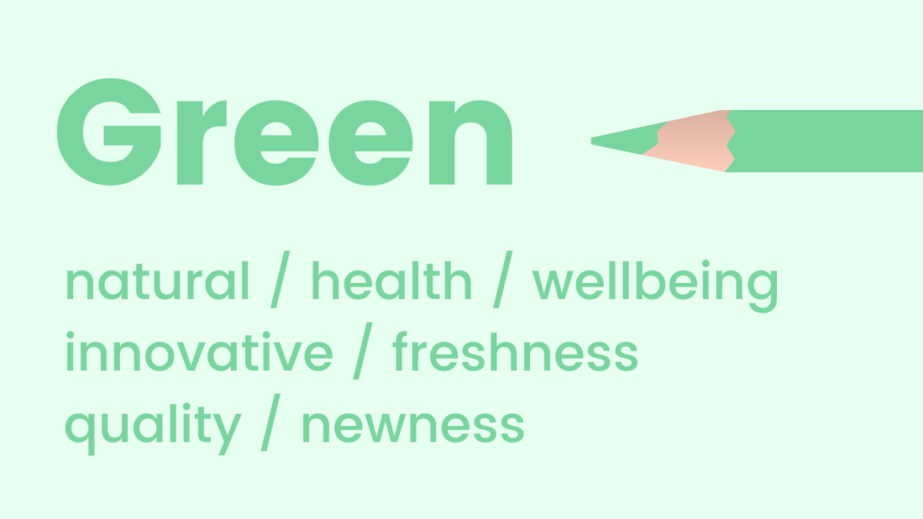
Green: Strongly reminiscent of natural elements, health, and well-being. Green is a soothing color that promotes feelings of relaxation, harmony, and balance. It is also the color to which the human eye is most sensitive, allowing for the discernment of the greatest number of shades, which can create rich, varied palettes. Its fresh connotations make it ideal for promoting new products, environmental initiatives, and organic brands. Financial sectors also use green to symbolize growth, wealth, and stability.
-
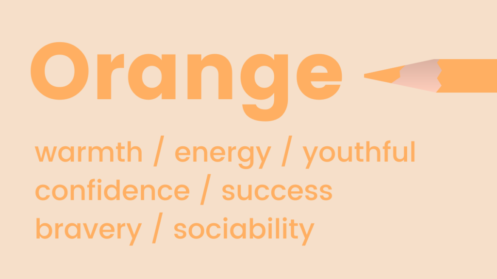
Orange: A vibrant hue representing warmth, energy, and enthusiasm. Fun and flamboyant, orange is frequently employed to symbolize positivity, optimism, and creativity. Intriguingly, it is also naturally associated with trust and safety, often used in warning signs (like traffic cones) to grab attention without inciting panic. Orange is popular among brands that wish to project an image of approachability, innovation, and affordability, often seen in children’s products, sports brands, and creative industries.
-
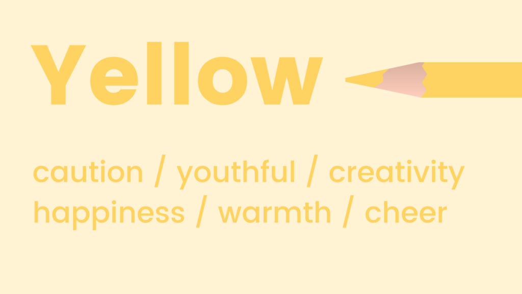
Yellow: Much like orange, shades of yellow symbolize positivity and optimism, often referred to as the happiest shade in the color spectrum. Beyond its cheerful disposition, yellow is known for activating memory, stimulating mental processes, and encouraging communication. While powerful for grabbing attention, marketers must use bright yellow judiciously as it can be visually fatiguing in large quantities. It is effective for calls to action, highlighting important information, or brands aiming for a joyful, energetic identity.
-
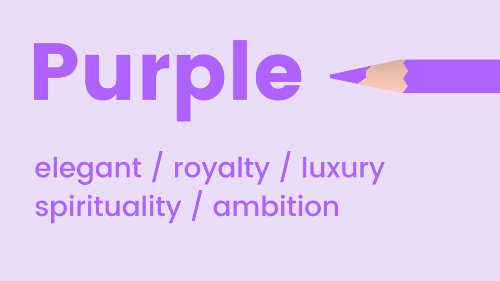
Black: A classic color choice that exudes sophistication, power, and timeless elegance. Often used to represent formality ("black tie"), black also implies weight and authority; people tend to perceive a black object as heavier than a white one of the same size. Luxury brands, high-end fashion, and professional services often adopt black to convey exclusivity, prestige, and strength. Used skillfully, it can create a powerful and modern aesthetic.
-
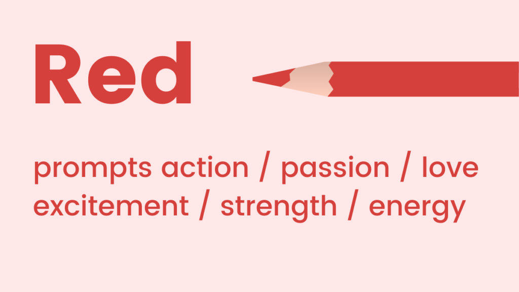
White: Conveys coolness, calm, and serenity. White is an excellent choice for brands aiming for a modern, fresh, and minimalist aesthetic. It symbolizes purity, cleanliness, simplicity, and efficiency. In design, white space is crucial for improving readability and allowing other elements to stand out. It is favored by healthcare providers, technology companies, and brands focused on clean, uncluttered designs to evoke a sense of clarity and spaciousness.
-
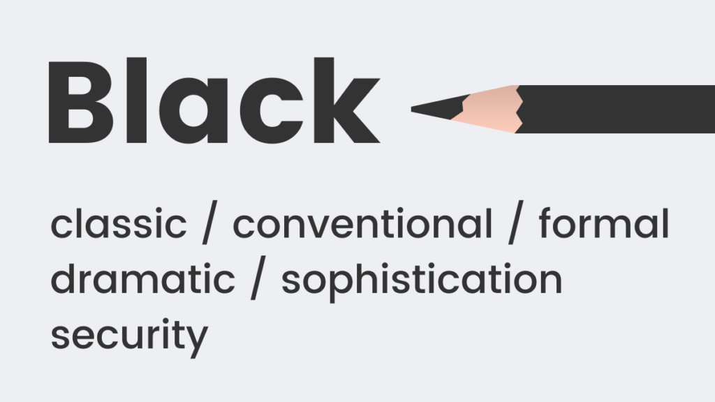
Purple: A color steeped in history, purple is associated with royalty, luxury, creativity, and wisdom. Historically, purple dyes were expensive and reserved for the elite. This legacy continues to imbue purple with an elegant and opulent feel. It’s an "in-between" shade that can uplift while maintaining a sense of calm and is also known to encourage imaginative and creative thinking. Brands in the beauty, luxury goods, and creative industries often use purple to signify premium quality, exclusivity, and innovation.
-
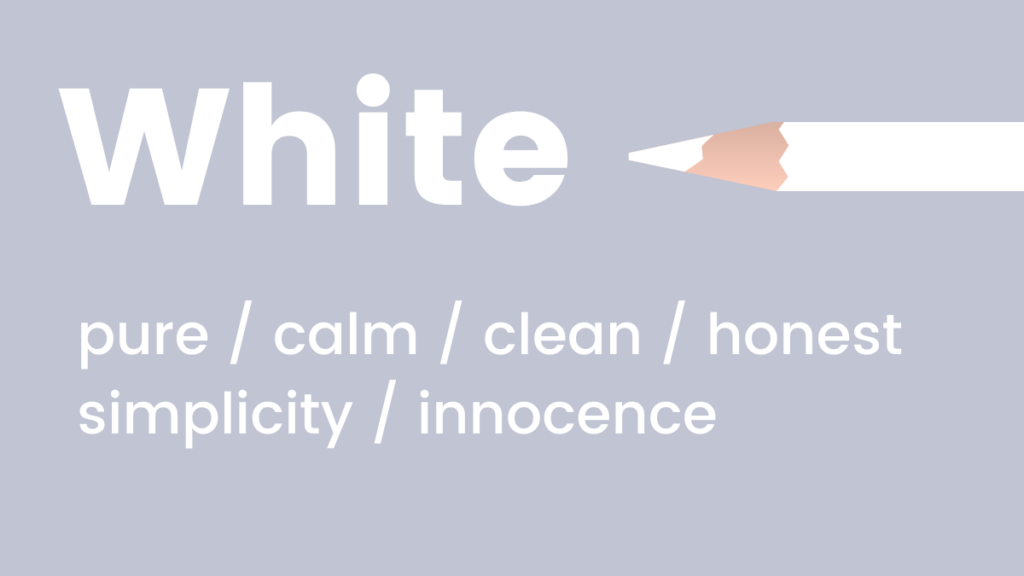
Red: Represents passion, adrenaline, and action. As a high-energy color, red can boost energy levels, increase heart rate, and stimulate urgency. It is an ideal choice for marketers who want their customers to feel the immediate importance of a message, such as during flash sales, clearance events, or for critical calls to action. However, its intensity means it should be used strategically to avoid overwhelming the audience or being perceived as aggressive.
Strategic Color Scheme Implementation Across Digital Assets
The effective application of color psychology extends beyond individual hues to the thoughtful combination of colors in design. For non-designers, choosing a harmonious color scheme can be daunting, but a basic understanding of color theory simplifies the process significantly.
Website and Landing Page Design:
Creating visually appealing and effective websites and landing pages relies heavily on coherent color schemes. Two primary color theories are particularly useful:
-
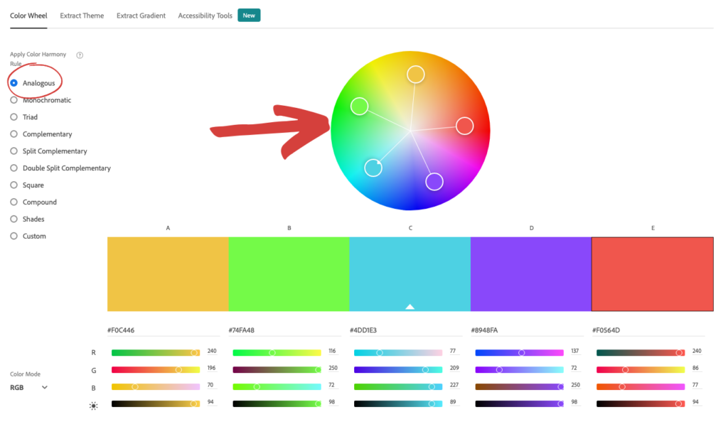
Analogous Colors: These are colors located adjacent to each other on the color wheel (e.g., blue, green, and yellow, or different shades of a single color). Analogous schemes create a sense of harmony and visual comfort due to their natural progression. Tools like Adobe Color CC allow marketers to easily identify these combinations, helping to build a cohesive and pleasing aesthetic. When implementing, one color typically dominates, another supports, and a third acts as an accent.
-
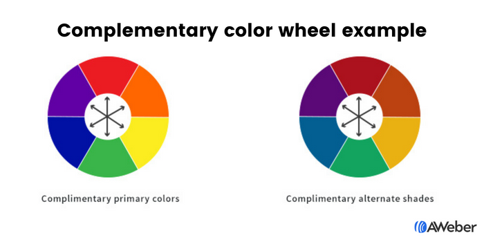
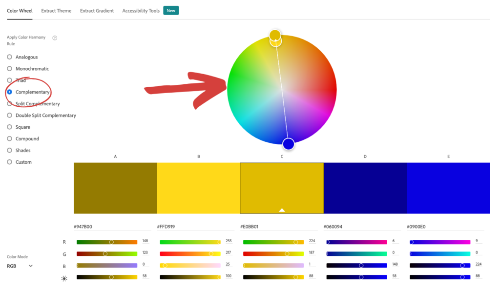
Complementary Colors: These colors are positioned directly opposite each other on the color wheel (e.g., blue and orange, green and red, purple and yellow). Complementary pairings create high contrast and visual vibrancy, making elements "pop." While visually striking, they require careful balancing to prevent overwhelming the viewer. They are excellent for drawing attention to specific elements, such as call-to-action buttons or key information. Again, Adobe Color CC provides a straightforward way to explore and select these contrasting pairs.
Beyond these, a Triadic color scheme involves three colors equally spaced around the color wheel, offering a vibrant yet balanced approach, often used for more dynamic brand identities. A popular guideline for applying color schemes is the 60-30-10 rule, where 60% of the design space is a dominant color, 30% a secondary color, and 10% an accent color, ensuring balance and visual interest.
Optimizing Sign-Up Forms with Color:
For sign-up forms, visibility and action are paramount. Color plays a significant role in attracting attention and guiding user interaction.
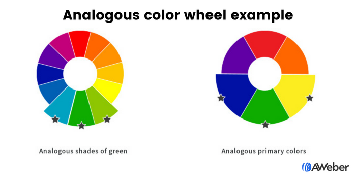
- Analogous and Complementary Schemes for Forms: Applying these theories to forms can create a visually integrated yet distinct element on a page. For instance, a form using three shades of green (analogous) can feel natural and inviting, while a purple and yellow (complementary) form can create an energetic focal point.
- Contrasting Colors for Impact: The principle of contrast is particularly powerful for forms.
- Contrast between form and site: Making the sign-up form’s background a contrasting color to the rest of the website immediately draws the eye, signaling its importance.
- Contrast within the form: Once the visitor’s attention is on the form, contrasting colors for form fields, text, and especially the call-to-action button ensure that the desired action is clear. For example, a yellow button on a black form, with white text, creates immediate visual hierarchy and prompts interaction. A compelling call to action is often achieved through a highly contrasting button color that stands out from the rest of the form and the page.
Crafting Effective Email Campaigns with Color:
The choice of colors in marketing emails should be purpose-driven, aligning with the specific goal of each message.
- Email Newsletters: Typically designed to deliver regular updates, news, or educational content. These emails benefit from ample white space with subtle splashes of brand colors. The primary goal is content consumption, so secondary colors should not distract. However, if the newsletter aims to drive clicks (e.g., to a blog post or video), a prominent, contrasting call-to-action button is essential.
- Welcome Emails: As a customer’s first significant interaction, welcome emails are ideal for reinforcing brand identity. Consistent use of brand colors helps solidify visual recognition and sets the tone for future communications.
- Sales Emails: Color choices here are highly dependent on the offer and desired emotional response. For a high-urgency flash sale, red might be used to convey immediate action. For a premium product, a sophisticated dark blue or black could emphasize luxury. For a youth-oriented promotion, vibrant pink or orange could inject fun and excitement. Brands like Warby Parker effectively use pale blues for a refreshing vibe, while Everlane opts for dark blue to project a luxurious, sophisticated image. Lyft’s pink in welcome emails fosters friendliness, and Offscreen uses green to promote new products with a relaxed, natural feel. Lego leverages yellow to appeal to its child audience, and Harry’s uses an all-black email with a white CTA button to position their product as classic and sophisticated. The Little White Company uses white to portray a calm, pure, and clean brand image, and Stuart Weitzman integrates its signature purple shoebox into abandoned cart emails to reinforce luxury and elegance.
Navigating Brand Identity with Evolving Color Palettes
A common concern for established brands is how to integrate new color psychology principles without compromising existing brand aesthetics. The key lies in flexibility and strategic evolution. Just as a person’s style evolves over time, a brand’s visual identity can adapt while retaining its core recognition. Adding a new color to a brand’s palette, or strategically adjusting the use of existing ones, can mark a "new, better era" for a business, allowing it to respond to market changes, expand its offerings, or target new demographics more effectively.
Tools like Coolors.co empower marketers to explore new color combinations that harmonize with existing brand colors. By inputting established brand hues, these platforms suggest complementary or analogous shades, enabling controlled and intentional brand evolution. Furthermore, continuous market research and A/B testing are crucial for validating color choices, ensuring they resonate with the target audience and achieve desired marketing outcomes.
The Future of Color in Marketing: AI-Powered Design
The advent of Artificial Intelligence is revolutionizing how marketers approach design and color application, democratizing sophisticated design principles and making them accessible to a wider audience. Platforms like AWeber’s AI Signup Form Builder are transforming the design process from a manual drag-and-drop exercise to an intuitive, intent-driven interaction. Marketers can simply describe their desired look, feel, or vibe—for instance, "I want a dark background with an orange button that pops"—and the AI generates a form that aligns with those specifications, even recreating designs from uploaded screenshots with integrated branding.
This AI capability moves beyond mere template selection; it allows marketers to directly input their understanding of color psychology. Knowing that orange signals trust and action, or blue builds credibility, can directly inform AI prompts, leading to highly tailored and psychologically optimized designs. The upcoming AI-powered email and landing page builders promise to extend this "describe-it-and-build-it" experience, enabling the creation of clean, white newsletters with red CTAs, or luxurious purple landing pages with gold accents, simply by articulating the desired color principles. This technological leap significantly lowers the barrier to entry for effective, psychology-driven design, allowing businesses to create highly personalized and impactful visual experiences at scale.
In conclusion, color psychology is far more than an aesthetic consideration; it is a strategic imperative in modern marketing. By understanding the inherent emotional and psychological responses elicited by different colors, and by leveraging advanced tools like AI, marketers can craft compelling visual narratives that enhance brand recognition, influence consumer behavior, and ultimately drive business success. The seamless integration of human psychological insight with cutting-edge technology ensures that the power of color remains at the forefront of effective digital communication.