The landscape of digital analytics and data communication underwent a significant transformation following the release of Google Data Studio, a tool designed to convert raw data into informative, easy-to-read, and shareable reports. Throughout 2017 and leading into 2018, the adoption of this platform by both corporate entities and independent data journalists signaled a shift toward democratized data visualization. By moving away from static spreadsheets and toward interactive, real-time dashboards, organizations have begun to bridge the gap between technical data collection and strategic decision-making. The versatility of the tool is evidenced by its application in diverse fields, ranging from high-stakes business SEO performance tracking to cultural analyses of cinematic universes and historical social trends.
The Evolution of Data Visualization in the Corporate Sector
The primary driver behind the adoption of Google Data Studio in the business world is the demand for operational efficiency. Traditionally, business intelligence (BI) reporting was a labor-intensive process, often requiring specialized analysts to manually export data, clean it in spreadsheet software, and then design static presentations. This cycle frequently resulted in a lag between data collection and actionable insight.
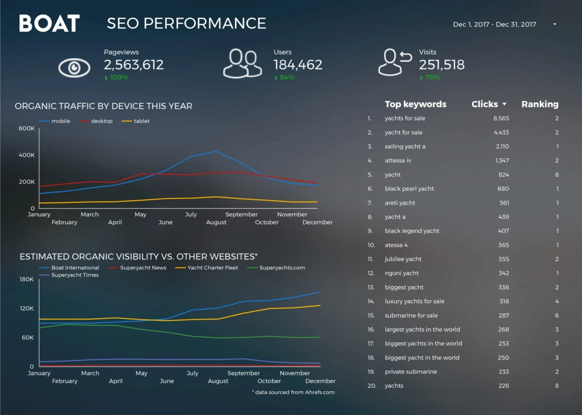
A primary example of this efficiency shift is seen in the operations of Boat International Media. Before the integration of automated visualization tools, the organization’s SEO performance reporting was a grueling manual task. Analysts spent approximately five working days each month compiling data to present to clients. By leveraging the automated connectors within Google Data Studio, the team reduced this reporting window from five days to a mere fifteen minutes. This 99% reduction in time expenditure allowed the firm to shift its focus from data entry to data strategy. The report, developed by Fanni Takacs and Drew Broomhall, emphasizes a "design-first" approach, ensuring that key performance indicators (KPIs) are not obscured by visual clutter. The ability to export these live dashboards as PDF documents further bridged the gap between traditional client expectations and modern, interactive reporting.
Technical Architecture and Integration Capabilities
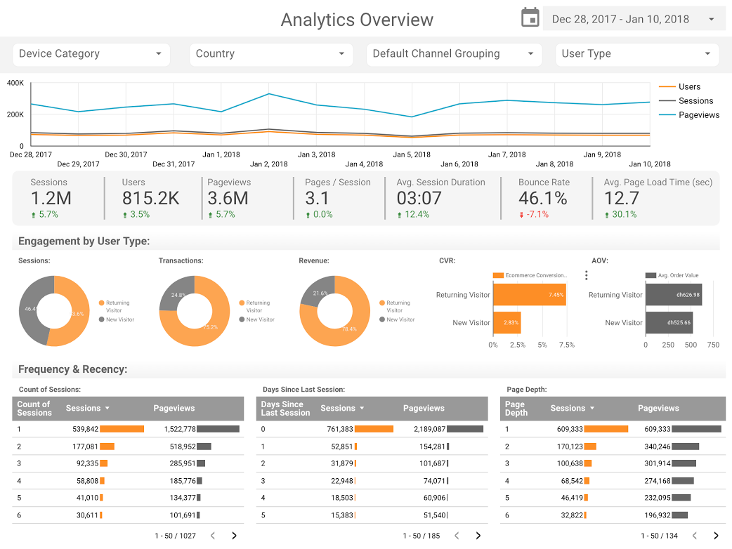
The efficacy of Google Data Studio is largely attributed to its seamless integration with the broader Google Cloud and Marketing Platform ecosystems. For many businesses, the Google Analytics (GA) connector serves as the foundational entry point. Dashboards created by firms like ClickInsight have provided the industry with templates that standardize the visualization of web activity. These templates allow businesses to monitor user behavior, traffic sources, and conversion rates in a consolidated view.

Beyond basic web metrics, the use of advanced chart types has redefined how engagement is measured. Sunil Attri of E-Nor and the team at Analytics Pros have demonstrated the utility of bullet charts for page-level engagement. Unlike standard bar charts, bullet charts allow for a comparison of current performance against both historical data and predefined benchmark targets. This provides a three-dimensional view of progress: where the metric stands today, how it compares to the previous year, and how close it is to the company’s quarterly goals. By combining these with scorecard metrics—such as average time on page and bounce rate—analysts can determine not just the volume of traffic, but the quality of user engagement.
Data Journalism and the Rise of Narrative Visualization
While business applications focus on ROI and efficiency, a parallel movement in data journalism uses Google Data Studio to tell complex stories to the general public. This "narrative visualization" approach treats data as the protagonist of the story, making abstract numbers tangible for a non-technical audience.
One prominent area of application is the analysis of the global entertainment industry. The "Marvel vs. DC Cinematic Universes" visualization serves as a case study in how public financial data can be used to track market dominance. With over $27 billion generated at the global box office by these franchises, the visualization provides a comparative analysis of commercial success and audience reception. Similarly, the "Data Behind Star Wars" report by ClickInsight utilizes multi-tabbed reporting to explore fictional universes through a factual lens, comparing starship speeds and character demographics. These projects demonstrate the tool’s ability to handle large datasets while maintaining an interface that encourages user exploration.
Large-Scale Data Processing via BigQuery
For more technical data stories, the integration between Google Data Studio and BigQuery—Google’s serverless, highly scalable data warehouse—has proven essential. This is particularly evident in the work of Google Developer Advocate Felipe Hoffa, who analyzed the state of open-source software in 2017.
By querying the massive "PushEvents" dataset published by GitHub, Hoffa was able to identify the top contributors to the open-source community. Processing this volume of data—which involves millions of rows of real-time developer activity—would be impossible in a standard spreadsheet. However, the BigQuery connector allows Data Studio to act as a front-end visualization layer for petabyte-scale data. This analysis revealed the significant role that major technology corporations play in the open-source ecosystem, providing a factual basis for discussions regarding the commercialization of shared software resources.

Historical and Social Trend Analysis
The application of data visualization extends into the realm of sociology and historical research. A comprehensive study of marriage and divorce trends in the United Kingdom over a 150-year period, conducted by Daniel Waisberg and Lizzie Silvey, showcases the longitudinal capabilities of the platform.
This visualization tracks social shifts from the mid-19th century to the present day, correlating spikes and dips in marriage rates with major historical events such as World War I, World War II, and significant legislative changes (e.g., the Divorce Reform Act 1969). By visualizing these trends, the researchers were able to answer complex questions regarding who seeks divorces and how economic stability impacts family structures. This type of analysis transforms dry archival statistics into a dynamic history lesson, making it accessible to educators, policymakers, and the public.
Broader Impact and Industry Implications
The democratization of these tools has several implications for the future of data literacy. First, it lowers the barrier to entry for high-quality data design. In the past, creating a professional-grade dashboard required knowledge of CSS, JavaScript, or expensive proprietary software. Today, the "drag-and-drop" nature of Google Data Studio allows marketers, journalists, and small business owners to produce reports that meet industry standards for design and accuracy.
Second, it fosters a culture of transparency. When data is siloed in a single analyst’s computer, it is subject to gatekeeping. Interactive dashboards, however, can be shared via a link, allowing multiple stakeholders to filter and drill down into the data themselves. This transparency leads to more collaborative decision-making and reduces the likelihood of data being misinterpreted through static, cherry-picked screenshots.
Finally, the move toward real-time data visualization reflects a broader societal shift toward "live" information. In both business and journalism, the value of data is increasingly tied to its recency. A dashboard that updates automatically as new information enters the system ensures that the narrative—whether it is an SEO strategy or a breaking news story—remains accurate and relevant.
Chronology of Google Data Studio Adoption (2016–2018)
To understand the context of these visualizations, it is necessary to look at the timeline of the platform’s development:
- March 2016: Google introduces Data Studio 360 as part of the Google Analytics 360 suite, initially aimed at enterprise-level clients.
- May 2016: A free version of Data Studio is released for individuals and small teams, allowing up to five reports per account.
- February 2017: Google removes the five-report limit on the free version, leading to a massive influx of creative projects from the data journalism community.
- Late 2017: The introduction of community connectors allows the platform to pull data from non-Google sources (e.g., Facebook Ads, Twitter, LinkedIn), making it a comprehensive hub for all digital marketing data.
- Early 2018: The platform matures with advanced features like calculated fields, data blending (joining two different data sources), and improved embedding capabilities, which allowed the visualizations mentioned in this report to be shared across the web.
Conclusion
The examples highlighted—from Boat International’s SEO efficiency to the historical mapping of UK social trends—demonstrate that Google Data Studio is more than just a reporting tool; it is a medium for communication. As data continues to grow in volume and complexity, the ability to distill that information into a visual narrative will remain a critical skill in both the boardroom and the newsroom. The success of these visualizations in 2017 and 2018 set the stage for the modern era of data-driven storytelling, where the goal is not just to show the numbers, but to explain what they mean for the future.