The landscape of business intelligence and data communication underwent a significant transformation during the 2017–2018 period, marked by the rapid adoption of accessible, cloud-based visualization tools. At the forefront of this shift was Google Data Studio, a platform that democratized the ability to transform raw data into interactive, aesthetically compelling narratives. Historically, the field of data visualization was often bifurcated between complex, high-cost enterprise software like Tableau or Power BI and static, labor-intensive spreadsheets. The emergence of Data Studio bridged this gap, offering a suite of connectors—ranging from Google Analytics and BigQuery to public datasets—that empowered both corporate analysts and data journalists to communicate insights with unprecedented speed and clarity.
The Institutional Shift Toward Automated Reporting
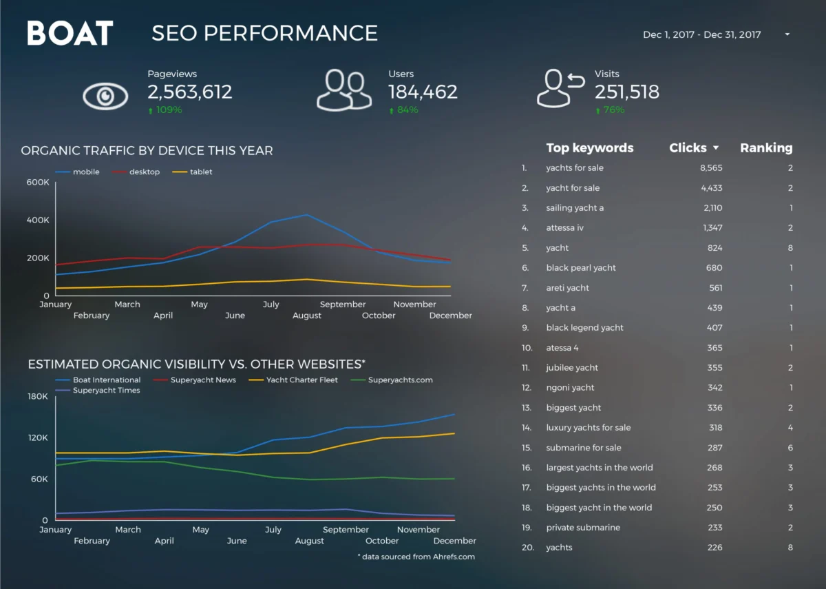
In the corporate sector, the primary value proposition of modern visualization tools has been the drastic reduction in "time to insight." For many organizations, the transition from manual data compilation to automated dashboards represented a fundamental change in operational efficiency. A primary example of this evolution is observed in the digital media industry. Boat International Media, a prominent luxury lifestyle brand, provides a compelling case study for this transition. Prior to the implementation of automated visualization, the company’s search engine optimization (SEO) performance reporting was a grueling manual process. Analysts spent an estimated five working days each month aggregating data, formatting charts, and compiling PDFs for clients.
By leveraging the native connectors within Google Data Studio, the team at Boat International, led by specialists Fanni Takacs and Drew Broomhall, successfully reduced this reporting cycle from 120 hours to a mere 15 minutes. This efficiency gain was not merely a matter of speed; it allowed the organization to focus on high-level strategic insights rather than data entry. The resulting dashboards prioritized clarity, utilizing clean design principles and a "less is more" approach to avoid the data clutter that often plagues executive reporting. This transition underscored a broader industry trend where design-led data presentation became a prerequisite for client-facing communications, ensuring that reports were as visually engaging as they were informative.

Standardizing Digital Analytics Frameworks
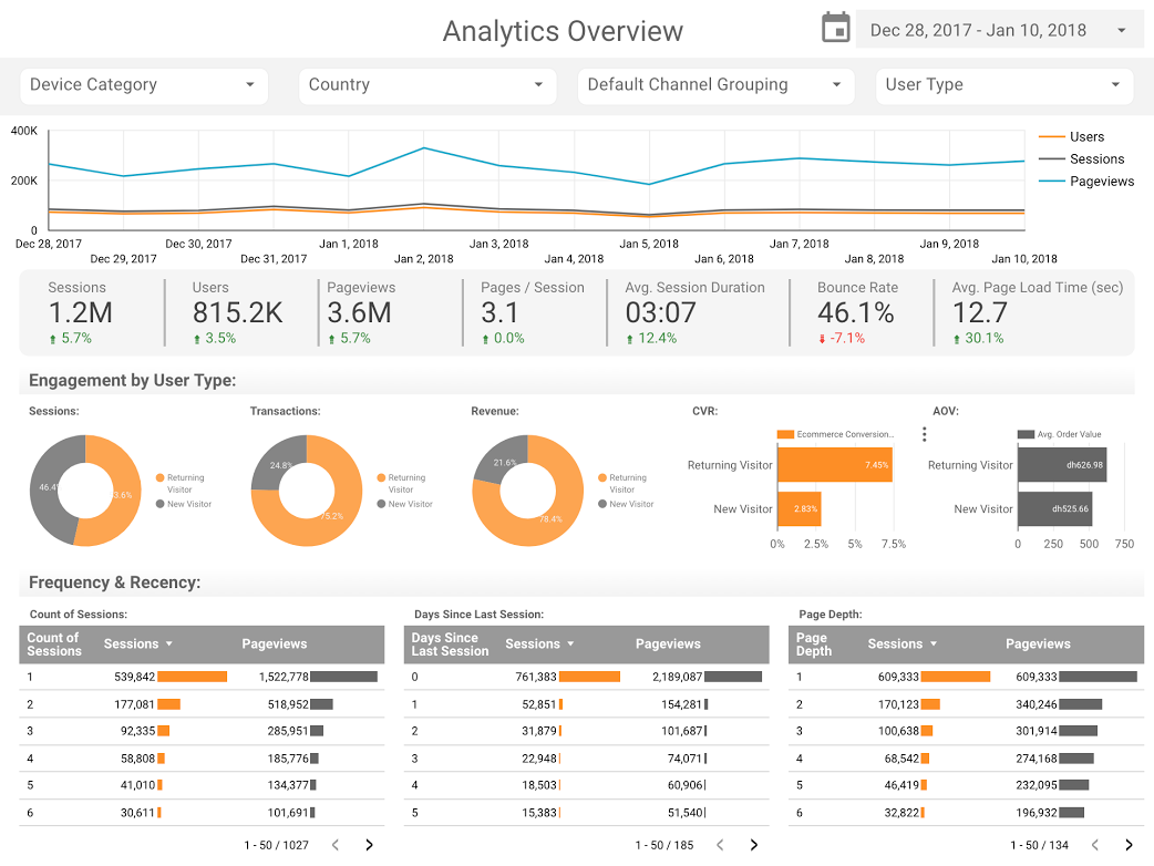
The proliferation of Google Analytics (GA) created a demand for standardized reporting templates that could be easily customized across different business models. Organizations like ClickInsight and E-Nor became instrumental in this movement, developing templates that allowed businesses to visualize web activity without building frameworks from scratch. The ClickInsight GA Web Activity Overview, for instance, provided a foundational structure for companies to track user behavior, traffic sources, and conversion rates in real-time.
Senior consultants such as Sunil Attri at E-Nor further refined these practices by utilizing interactive features such as date range comparisons and filter controls. These interactive elements allowed stakeholders to drill down into specific segments—such as mobile versus desktop traffic or regional performance—without needing technical expertise in the GA interface. The ability to create a "compact, clear, and interactive presentation" became the gold standard for digital marketing departments, facilitating faster decision-making regarding ad spend and content strategy.
Advanced Visualization Techniques: The Case for Bullet Charts
While standard bar and line charts remain staples of data visualization, the 2017–2018 period saw an increased interest in more sophisticated chart types to convey complex performance metrics. Analytics Pros, a data science and analytics consultancy, championed the use of bullet charts within Google Data Studio to solve the problem of "contextless" data. A standard scorecard might show that a page received 10,000 visits, but without context, it is impossible to determine if that figure represents success or failure.
By integrating bullet charts, analysts could visualize three layers of data simultaneously: the current performance, the previous year’s performance, and the predefined benchmark or target. This "triple-layer" approach allowed for an immediate visual assessment of whether a specific web page was meeting its KPIs. Furthermore, the integration of engagement metrics—such as average time on page and bounce rates—offered a holistic view of user intent. This methodological shift highlighted a growing maturity in the business community, where the focus moved from "vanity metrics" (simple volume) to "value metrics" (performance against goals).

Data Journalism: Bridging Public Interest and Complex Datasets
Beyond the boardroom, the utility of Google Data Studio extended into the realm of data journalism and public storytelling. This era saw a rise in "explainer" content that used data to settle long-standing debates in pop culture and social science. One of the most prominent examples was the comparative analysis of the Marvel Cinematic Universe (MCU) versus the DC Extended Universe (DCEU). With global box office revenues for superhero films exceeding $27 billion, the financial and critical stakes of these franchises became a subject of intense public scrutiny. Visualizations comparing box office returns, Rotten Tomatoes scores, and audience sentiment provided a factual basis for understanding why certain franchises achieved cultural hegemony over others.
Similarly, the "Star Wars" franchise was subjected to rigorous data analysis. ClickInsight developed reports that moved beyond film reviews to analyze the "physics" and demographics of the Star Wars universe, such as starship speeds and character details across multiple trilogies. These journalistic endeavors served a dual purpose: they entertained the public while demonstrating the technical capabilities of visualization tools to handle non-traditional datasets.
Big Data and the Open Source Ecosystem
The technical prowess of modern visualization is best demonstrated when paired with massive datasets. Felipe Hoffa, a Developer Advocate at Google, utilized the BigQuery connector to analyze the state of open-source development on GitHub. In 2017, the volume of "PushEvents" (code contributions) on GitHub was immense, representing the collective work of millions of developers worldwide. By importing this data into BigQuery and visualizing it through Data Studio, Hoffa was able to identify which corporations and individuals were the most prolific contributors to the open-source community.
This analysis provided critical insights into the "engine room" of the internet. It revealed the dominance of certain technologies and the shifting landscape of corporate involvement in open source, with companies like Google, Microsoft, and Red Hat leading the charge. This use case was significant because it demonstrated that Data Studio was not limited to small-scale marketing data; when backed by a powerful data warehouse like BigQuery, it could visualize terabytes of information, making "big data" accessible to the average reader.
Historical Analysis: A Century of Social Trends in the UK
One of the most profound applications of data visualization is the analysis of long-term social trends. A study conducted by researchers, including Lizzie Silvey, examined 150 years of marriage and divorce data in the United Kingdom. This analysis sought to answer fundamental sociological questions regarding how legal reforms, global conflicts, and economic shifts influenced domestic life.
The data revealed sharp fluctuations in marriage rates during the World Wars and significant spikes in divorce rates following the passage of the Divorce Reform Act of 1969. By mapping these trends over a century and a half, the visualization provided a historical perspective that a simple text-based report could not achieve. It allowed users to see the "rhythm" of social change, illustrating how legislation and macro-events directly correlate with personal life choices. This type of analysis serves as a vital tool for historians and sociologists, providing a visual evidence base for the study of human behavior over generations.
Implications and the Future of Data Accessibility
The examples from 2017 and 2018 illustrate a broader democratization of information. The transition of Google Data Studio from a beta product to a mainstream tool signaled the end of an era where high-end data visualization was reserved for those with massive budgets or advanced coding skills. The implications of this shift are manifold:
- Democratization of Insights: Decision-making power moved from a centralized "data priesthood" to individual department heads and journalists who could now build their own tools for inquiry.
- Transparency in Reporting: Automated, real-time dashboards reduced the ability for stakeholders to "cherry-pick" data, as the full dataset was often available for exploration via filters and drill-downs.
- Visual Literacy: As the public became more accustomed to interacting with data stories (such as the Marvel vs. DC or UK marriage studies), the general level of data literacy increased, making audiences more discerning consumers of information.
As we look back at these foundational visualizations, it is clear that the goal of data visualization has remained constant: to make the complex simple and the invisible visible. Whether it is a luxury media group saving hundreds of hours in labor or a journalist explaining the economic impact of a film franchise, the power of a well-constructed dashboard lies in its ability to tell a story that is grounded in fact yet elevated by design. The 2018 milestone was not just about a software update; it was about the maturation of a digital society that increasingly relies on data to navigate the complexities of the modern world.