rifanmuazin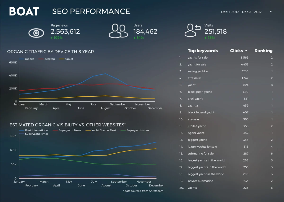
The year 2017 marked a significant turning point in the democratization of data analytics, as the adoption of Google Data Studio began to reshape how both corporate entities and independent journalists communicated complex information. Throughout the year, the platform evolved from a beta-testing phase into a robust tool capable of bridging the gap between raw data sets and actionable visual narratives. By allowing users to connect directly to diverse data sources—ranging from Google Analytics to BigQuery—the tool facilitated a shift away from static, manual reporting toward dynamic, interactive dashboards. This transition was characterized by a focus on industry best practices, including the strategic selection of chart types, high-fidelity design, and the integration of storytelling elements into traditional business reporting.
The Evolution of Google Data Studio and the 2017 Context
Launched as part of the Google Analytics 360 suite before being offered as a free version for individuals and small teams, Google Data Studio entered a market previously dominated by established players like Tableau and Microsoft Power BI. However, its integration within the Google ecosystem provided an immediate advantage for digital marketers and web analysts. By late 2017, the platform had introduced several key features, including improved data blending capabilities and a wider array of community connectors, which allowed for the visualization of non-Google data.
The timeline of this adoption shows a clear trajectory: early 2017 was defined by experimentation with basic templates, while the latter half of the year saw the emergence of sophisticated, multi-page reports that functioned as standalone data stories. This period also saw a rise in “data journalism” within the private sector, where companies began using public-facing dashboards to build brand authority and provide transparency to stakeholders.
Business Intelligence: Streamlining Corporate Reporting
One of the most profound impacts of the tool’s adoption was seen in the efficiency of agency-client relationships. A primary example is Boat International Media, which utilized the platform to overhaul its Search Engine Optimization (SEO) performance reporting. Prior to the implementation of automated dashboards, the organization’s monthly reporting process was a labor-intensive endeavor, often requiring five full business days to aggregate data, format charts, and synthesize insights. By leveraging the automated connectors in Data Studio, the team reduced this turnaround time to just fifteen minutes.

This efficiency gain allowed analysts to pivot from the “what” of the data—simply reporting numbers—to the “why,” focusing on strategic insights. The reports were designed with a dual-purpose philosophy: they functioned as interactive online dashboards for real-time monitoring while remaining formatted for high-quality PDF exports suitable for executive presentations. This emphasis on “clutter-free” design and clear key performance indicators (KPIs) became a hallmark of professional-grade visualizations during this era.
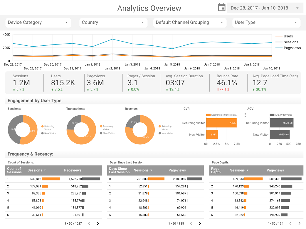
Furthermore, firms like E-Nor and ClickInsight contributed to the ecosystem by developing standardized templates for Google Analytics. These templates addressed a common pain point for businesses: the overwhelming nature of “out-of-the-box” analytics. By distilling thousands of possible metrics into a compact, interactive “Web Activity Overview,” these consultants enabled business owners to monitor user behavior, acquisition channels, and conversion rates without requiring deep technical expertise.
Advanced Analytical Techniques: The Rise of Bullet Charts
As the user base matured, the complexity of the visualizations grew. Analytics Pros, a prominent digital analytics consultancy, demonstrated the power of the “bullet chart” to provide context that standard bar charts lacked. In a business environment, a metric like “page views” is often meaningless without a benchmark. By combining bullet charts with scorecard metrics, the team was able to visualize current performance against both historical data from the previous year and specific internal targets.
This approach allowed for “Page Level Engagement” analysis that went beyond surface-level clicks. By viewing engagement duration alongside volume, businesses could identify high-traffic pages that failed to retain interest, prompting immediate UX interventions. This period saw a broader industry shift toward “contextualized data,” where every chart was expected to answer not just “how much,” but “how well” the business was performing against its strategic goals.
Journalistic Storytelling: Pop Culture and Global Trends
Beyond the boardroom, Google Data Studio emerged as a powerful medium for data journalism and public interest stories. The “Marvel vs. DC Cinematic Universes” visualization served as a prime example of using the tool to analyze market dominance in the entertainment industry. By 2017, the global box office for superhero films had exceeded $27 billion. The data story allowed users to compare the financial trajectories and audience receptions of the two rival franchises, illustrating how Marvel’s “Cinematic Universe” model had begun to consistently outperform DC’s traditional release strategy in terms of ROI and critical consistency.

Similarly, the “Data Behind Star Wars” report by ClickInsight showcased the tool’s ability to handle multi-faceted narratives. By categorizing data into tabs—covering everything from starship specifications to character demographics—the report functioned more like an interactive encyclopedia than a spreadsheet. This use case highlighted the platform’s potential for education and fan engagement, moving data visualization into the realm of popular culture.
Technical Milestones: BigQuery and Open Source Analysis
The technical capabilities of the platform were further pushed by Google’s own advocates. Felipe Hoffa, a Developer Advocate at Google, utilized the BigQuery connector to analyze the massive “PushEvents” dataset from GitHub. In 2017, the open-source community saw unprecedented growth, and Hoffa’s visualization of the top contributors provided a macro-level view of the health of the web’s infrastructure.
This specific application was significant because it demonstrated how Data Studio could handle “Big Data.” By processing millions of rows in BigQuery and visualizing the results in a front-end dashboard, the project proved that high-level data science could be made accessible to the public. The analysis revealed which companies were investing most heavily in open-source development, providing a factual basis for discussions about the future of web technology and corporate social responsibility in the tech sector.
Social Science and Longitudinal Data: 150 Years of UK Demographics
Perhaps the most ambitious use of the platform in 2017 was the analysis of 150 years of marriage and divorce trends in the United Kingdom. Created by analysts Lizzie Silvey and her colleagues, this visualization utilized historical data from the Office for National Statistics (ONS). The project sought to answer complex sociological questions: How did the World Wars affect marriage rates? What was the immediate impact of the Divorce Reform Act of 1969?
The visualization allowed users to see the sharp spikes in marriages following the end of global conflicts and the subsequent rise in divorce rates as legal barriers were removed and social stigmas shifted. This use of Data Studio for longitudinal study demonstrated its value as a tool for researchers and historians, offering a way to make a century and a half of government records digestible for the modern digital reader. It moved the conversation from anecdotal “trends” to statistically verifiable historical shifts.
Industry Implications and the Future of Data Democratization
The proliferation of these visualizations in 2017 and early 2018 signaled a broader change in the professional landscape. Data was no longer the exclusive province of data scientists or IT departments. The ease of use and the free-to-access model of Google Data Studio forced a “visual literacy” across various sectors. Marketing managers, journalists, and small business owners were now expected to present their findings through professional, interactive mediums rather than static tables.
Official responses from the industry were largely positive. Analysts noted that the “low barrier to entry” encouraged more frequent data check-ins, which in turn led to more data-driven decision-making. However, experts also cautioned that the ease of creating charts increased the risk of “misleading visualizations.” This led to a secondary movement within the community to educate users on data ethics—ensuring that scales were not manipulated and that correlations were not presented as causations.
Conclusion: A New Standard for Communication
As the industry moved into 2018, the examples set by Boat International Media, Analytics Pros, and independent data journalists established a new standard for what a “report” should be. The transition from manual, time-consuming documentation to automated, insightful storytelling became the benchmark for success.
The legacy of the 2017 data visualization boom is the realization that data is most powerful when it is accessible. Whether it is a business optimizing its SEO strategy, a fan comparing superhero movie budgets, or a historian tracking a century of social change, the ability to transform raw numbers into a visual narrative has become an essential skill in the modern information economy. The “happy visualizing” sentiment that closed the year was more than a greeting; it was a recognition of a newly empowered class of data communicators.