The digital marketplace has undergone a radical transformation over the last decade, shifting from a simple catalog-style interface to a sophisticated, data-driven ecosystem. At the heart of this evolution is the e-commerce category page, a critical junction in the consumer journey that often determines whether a visitor proceeds to a purchase or exits the site entirely. Industry experts and user experience (UX) researchers now view these pages not merely as organizational folders, but as strategic tools designed to reduce cognitive load and facilitate seamless navigation. The optimization of these pages requires a multifaceted approach that balances aesthetic design with psychological triggers and technical precision.
The Foundational Role of Purpose in Category Design
Before any structural changes are implemented on an e-commerce platform, stakeholders must define the specific objective of each category page. In the modern retail environment, category pages generally fall into three functional categories: browsing-focused, decision-focused, or transaction-focused. Each of these roles necessitates a distinct architectural philosophy.
Browsing-focused pages are designed for top-of-funnel visitors who are in the exploratory phase of their journey. These users are typically asking, “What options are available here, and which path should I take next?” When brands introduce high-commitment conversion actions, such as “Add to Cart” buttons, on these specific pages, they risk creating “decision conflict.” Psychological studies in consumer behavior suggest that when an interface demands a higher level of commitment than the user is prepared to offer, the result is often a “freeze” response. Instead of progressing, the user may experience friction, leading to increased bounce rates. On these pages, the priority must remain on clarity of navigation and the visual hierarchy of subcategories rather than immediate sales.
Conversely, decision-focused and buy-focused pages cater to users further down the funnel. These visitors often arrive via specific long-tail search queries or targeted advertising. For this demographic, an “Add to Cart” or “Quick View” option is not a distraction but a convenience. The challenge for e-commerce managers lies in identifying the exact moment a user transitions from a browser to a buyer and tailoring the interface to meet that specific intent.
Strategic Implementation Timeline: A Chronology of Optimization
The process of refining a category page is rarely a singular event; rather, it is a chronological progression of audits and iterative testing. Most successful digital retailers follow a standardized timeline when overhauling their category structures:
- Phase I: The Data Audit (Weeks 1–2): Analysts examine existing metrics, focusing on exit rates and click-through rates (CTR) from category to product pages. If a category page shows an exit rate significantly higher than the site average, it serves as a red flag for design friction.
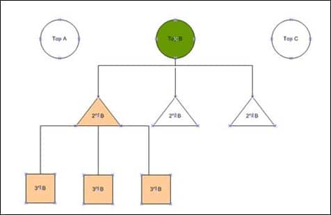
- Phase II: Taxonomy Definition (Weeks 3–4): Information architects determine the depth of the product hierarchy. The industry standard suggests that products should be grouped into top-level categories and then broken down at least one level further. However, experts warn against exceeding three levels of sub-categories, as excessive “nesting” can lead to user disorientation.
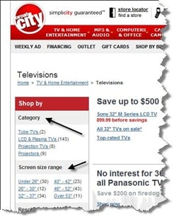
- Phase III: Feature Integration (Weeks 5–6): Designers identify the specific attributes that drive purchasing decisions in a given niche—such as resolution for televisions or media format for books—and integrate these as primary filters.
- Phase IV: Deployment and A/B Testing (Ongoing): Once the new design is live, the focus shifts to empirical validation. This involves heatmapping and session recording to observe how users interact with new filtering systems or “need-based” navigation blocks.
Analyzing Analytics: The Indicators of Success and Failure
Evaluating the performance of a category page requires a deep dive into analytics beyond simple traffic numbers. High exit rates on category pages are often symptomatic of a “dead end” in the user journey. In a healthy e-commerce ecosystem, the category page acts as a bridge; its success is measured by its ability to funnel traffic to product detail pages (PDPs).
Data from major UX research firms, such as the Baymard Institute, indicates that nearly 42% of e-commerce sites lack sufficient sub-category options on their main category pages, forcing users to scroll through hundreds of irrelevant items. This lack of granularity is a primary driver of site abandonment. By examining the “Search Within Category” data, retailers can identify what their customers are looking for but failing to find through the existing navigation, providing a roadmap for future sub-category development.
Technical Minimums and Hierarchical Logic
The structural integrity of a category page depends on a logical hierarchy. For expansive inventories, such as electronics or home goods, a single “Electronics” category is insufficient. The “Three-Level Rule” is frequently cited as a best practice: a primary category (e.g., Electronics), a secondary sub-category (e.g., Audio), and a tertiary sub-category (e.g., Headphones).
Beyond the hierarchy, the visual representation of “child” categories is vital. When a user hovers over or clicks a primary category, the interface should highlight popular or relevant sub-sections. This guided navigation reduces the number of clicks required to reach a specific product, a metric directly correlated with higher conversion rates.
Feature-Based vs. Need-Based Navigation
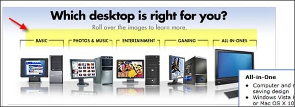
Modern consumers do not always shop by brand or technical specification; often, they shop by “need” or “use case.” This has led to the rise of need-based filtration systems. For instance, a desktop computer category might be segmented into “Gaming,” “Home Office,” “Photo & Video Editing,” or “Basic Browsing.”
This approach aligns with the “Jobs to be Done” framework in product marketing, which posits that customers “hire” a product to perform a specific task. By categorizing products according to these tasks, retailers can simplify the decision-making process for non-expert users.
However, for technical products, feature-based filtering remains paramount. In sectors like consumer electronics, specifications such as screen size, resolution, and battery life are the primary drivers of value. A robust category page must therefore offer a hybrid approach: intuitive need-based entry points for casual browsers and granular, attribute-based filters for informed shoppers.
The Role of Buying Guides and Assisted Selling
For complex product categories—such as insurance, high-end photography equipment, or medical supplies—the category page must often take on an educational role. The inclusion of “Buying Guides” or interactive “Wizards” can significantly enhance the user experience. These tools act as digital sales assistants, asking the user a series of questions to narrow down the selection to the most appropriate sub-category or product.
Industry feedback suggests that while these tools are highly praised by marketing teams for their innovative feel, their actual utility must be tracked rigorously. If heatmaps show that users are bypassing a “Need-Based Filter” or a “Buying Guide,” it may indicate that the tool is either poorly positioned or that the target audience already possesses a high level of product knowledge and finds the tool redundant.
Expert Consensus and Broader Implications
Digital marketing consultants emphasize that “nothing is set in stone” in the realm of web design. The consensus among top-tier e-commerce strategists is that the category page is a living document. The shift toward mobile-first indexing by search engines like Google has further complicated category page design. On mobile devices, the vast filtering options available on desktops must be condensed into “filter drawers” or “accordions” that do not clutter the limited screen real estate.
The broader implication for the retail industry is a shift toward hyper-personalization. Future iterations of category pages are expected to utilize machine learning to rearrange sub-categories and filters in real-time based on the individual user’s past behavior and search intent. If a user has previously searched for “organic” products, the category page for “Groceries” might automatically elevate organic sub-sections to the top of the visual hierarchy.
In conclusion, the optimization of e-commerce category pages is a sophisticated balancing act. It requires an understanding of human psychology, a commitment to data-driven decision-making, and a willingness to iterate based on user feedback. By defining the page’s purpose, maintaining a clean hierarchy, and providing both feature-based and need-based navigation, brands can transform their category pages from simple directories into powerful engines for growth and customer satisfaction. The ultimate goal is to remove the “interruption” of the interface, allowing the visitor to move effortlessly from curiosity to a completed transaction.