 rifanmuazin
Email marketing, far from being a static discipline, continues to evolve as a critical channel for brand communication and engagement. On December 2, 2025, industry experts convened at the annual Email Camp event, where discussions centered on transforming email design from a perceived complexity into an accessible art form. The overarching message underscored that effective email design is attainable for any marketer through a firm grasp of fundamental best practices and a keen awareness of emerging trends. This comprehensive overview, drawing insights from Email Camp speakers like Mike Nelson of Really Good Emails and Sinch’s Digital Design Director François Sahli, aims to equip marketers with the knowledge to craft high-performing, accessible, and future-ready email campaigns as we approach 2026.
Email Camp: A Hub for Innovation and Strategy
Email Camp, a premier industry gathering, serves as a vital platform for email marketers, designers, and strategists to explore the latest advancements and challenges in the field. This year’s event, hosted by Sinch Mailjet, featured an intensive session dedicated entirely to email design, led by Mike Nelson, a respected voice from Really Good Emails. Nelson’s presentation, titled "Cutting-edge email designs," delved into innovative trends poised to drive heightened engagement, while also addressing critical issues such as problem-solving for diverse readers and ensuring universal accessibility across myriad devices and platforms. For those unable to attend the live presentation, the core principles, essential resources, and groundbreaking trends discussed offer an invaluable guide to mastering the craft of email design.

Foundational Principles: Best Practices from Sinch’s Digital Design Director
Even as new trends emerge, the bedrock of successful email design remains rooted in established best practices. François Sahli, Digital Design Director at Sinch, provided a definitive set of guidelines applicable to both novice and experienced email marketers. His advice emphasizes technical precision and user-centric design, ensuring emails not only look good but also perform optimally.
Responsive Formatting: Adapting to Every Screen
A cornerstone of modern email design is responsive formatting, which dictates how an email renders across various devices. Sahli emphasized adherence to industry-standard widths: 600 pixels for desktop displays and 320 pixels for mobile phones. Deviating from these dimensions can lead to frustrating user experiences, such as horizontal scrolling, which significantly degrades readability and engagement. Data consistently shows that over 80% of email opens occur on mobile devices, making mobile optimization not just a recommendation but a necessity. A 2023 study by Litmus indicated that emails not optimized for mobile often see a 20-30% drop in engagement rates.
Beyond dimensions, image optimization is paramount. Large, uncompressed images can drastically increase email load times, leading to recipient abandonment and negatively impacting deliverability. Tools such as Compress JPEG are invaluable for reducing image file sizes while preserving visual quality. Furthermore, oversized HTML files can trigger spam filters and slow down rendering. A recent guide by Mailgun on "Optimal Email File Sizes" reinforces that lean code and optimized assets are crucial for maintaining healthy deliverability rates and ensuring emails reach the inbox rather than the spam folder.
Strategic Image Use: Balancing Visual Appeal with Deliverability
Images are powerful tools for conveying brand identity and message, but their use in emails requires careful consideration, particularly concerning deliverability. Internet Service Providers (ISPs) scrutinize the text-to-image ratio as a factor in spam filtering. The recommended balance is approximately 70% text to 30% images. An excessive reliance on images can flag an email as potentially spammy, leading to messages being blocked or filtered out before they even reach the recipient’s inbox.
A critical design consideration is the potential for images to be blocked by email clients. To mitigate this, Sahli advises two key strategies:
- Alt-text (Alternative Text): Providing descriptive alt-text ensures that if an image fails to load, a textual description is displayed instead, maintaining context and accessibility.
- Background Colors: When using background images, applying a fallback background color ensures that text remains legible even if the image does not render, preserving the email’s core message.
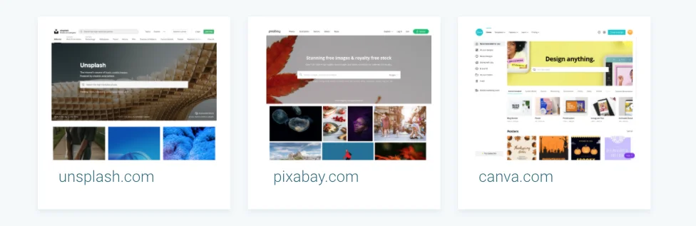
For sourcing high-quality, free imagery, platforms like Unsplash and Pixabay offer extensive libraries. For those requiring assistance with basic graphic design, Canva provides user-friendly tools to create visually appealing email elements without needing advanced design software.
Optimizing Calls-to-Action (CTAs): Driving Conversion
The Call-to-Action (CTA) is the focal point of any marketing email, designed to prompt a specific user action. To maximize conversion rates – whether it’s a purchase, a registration, or a download – CTAs must be strategically designed and placed. Sahli recommends limiting the number of CTAs, especially "above the fold" (the content visible without scrolling), to avoid overwhelming the user and diluting the message.
Visual prominence is also key. Utilizing contrasting colors and distinct button designs ensures CTAs stand out from the surrounding content. Furthermore, mobile responsiveness extends to clickable elements. CTAs and other interactive icons should be at least 40 to 48 pixels wide to facilitate easy tapping on touchscreens. Adequate spacing between clickable elements is equally important to prevent accidental clicks, enhancing the overall user experience on mobile devices. Studies consistently show that well-designed and strategically placed CTAs can increase click-through rates by up to 200%.
Mastering Typography: Readability and Brand Consistency
Typography plays a significant role in readability and brand identity. Email design distinguishes between two primary font categories:
- Web Safe Fonts: These are standard fonts like Arial, Times New Roman, Verdana, and Georgia, which are universally supported by most operating systems and email clients. Their widespread compatibility ensures consistent rendering.
- Web Fonts: These include popular choices like Open Sans and Roboto, offering greater design flexibility and brand differentiation. However, web fonts are not universally supported by all email clients.
As François Sahli aptly stated, "While web fonts offer many design opportunities, specialists must be careful because, unfortunately, not all email clients support them." To circumvent compatibility issues, designers must implement fallback fonts. This involves specifying a list of alternative web-safe fonts that an email client can use if it cannot render the preferred web font, thus preserving the intended aesthetic as closely as possible. This approach ensures brand consistency and readability across diverse viewing environments.
Code Compatibility and Cross-Client Support
The fragmented nature of email clients poses a significant challenge for designers. Features commonly supported on the web, such as advanced CSS or JavaScript elements, may not render correctly in all email applications. For instance, while Gmail might struggle with certain web fonts, older versions of Outlook may misinterpret background images, and many webmail providers have limited support for effects like drop shadows.
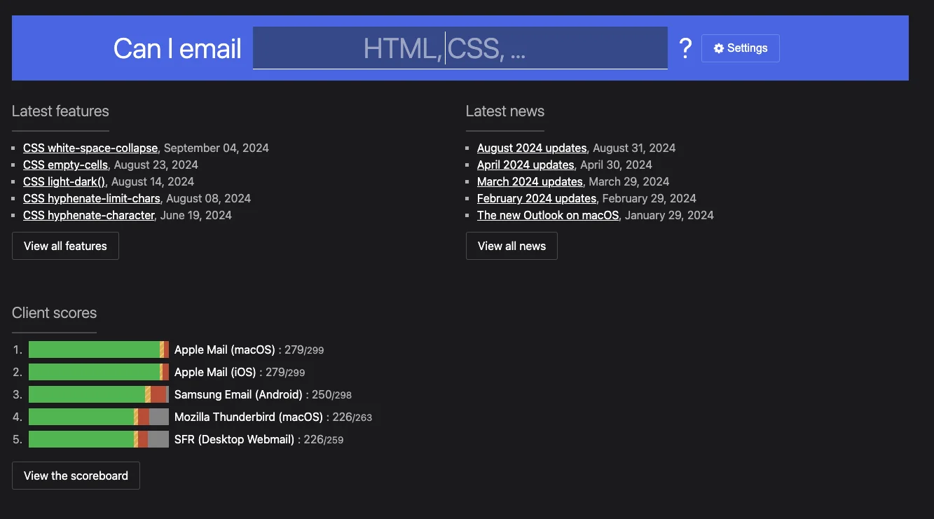
To navigate this complexity, designers must verify the compatibility of their code elements with various email systems. Resources like "Can I Email" are invaluable, providing a comprehensive database of HTML and CSS feature support across a wide range of email clients. This tool enables designers to make informed decisions, ensuring their creative choices translate into a consistent and functional experience for all recipients.
Embracing Responsive Design: A Non-Negotiable Standard
Responsive design is not merely a best practice; it is an absolute requirement in the current digital landscape. This technique automatically adjusts an email’s layout and content to fit the screen size of any device, from desktops to smartphones. The data is unequivocal: a Mailjet guide on "Responsive Emails" highlights that 80% of email recipients would delete an email that fails to display correctly on their mobile device. This statistic underscores the direct correlation between responsive design and user retention.
Email editors, such as Sinch Mailjet’s Email Editor, are designed with responsive principles embedded by default. Advanced features, like Mailjet’s preview function, allow marketers to test how their emails will appear across different inboxes, devices, and even geographical regions, eliminating guesswork and ensuring a flawless presentation every time.
Leveraging Templates and Components: Efficiency and Consistency
Drawing inspiration from web page design, creating a robust library of email components and templates offers significant advantages in efficiency, consistency, and testing. Once a component library is established, it streamlines the creation of new email campaigns, ensuring adherence to brand guidelines and accelerating the design process.
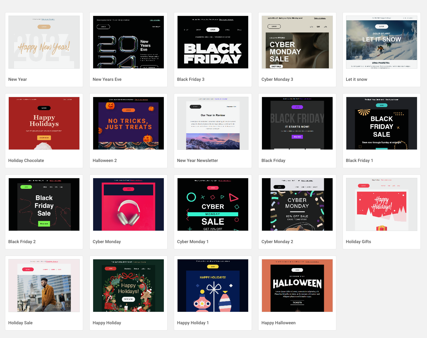
A key benefit of component libraries is the ability to conduct comprehensive testing. By verifying the integrity of the entire library, marketers can be confident that any email assembled from these components will display correctly. Moreover, libraries facilitate rapid A/B testing of different layouts and content arrangements, providing actionable insights to optimize existing campaigns and improve performance metrics. For inspiration, platforms like Really Good Emails and Email Love showcase a vast collection of well-designed emails, serving as an endless source of creative ideas for marketers. Sinch Mailjet itself offers an extensive gallery of pre-designed newsletter templates, including seasonal options, to jumpstart campaigns.
Emerging Horizons: Email Design Trends for 2026
Looking ahead to 2026, Mike Nelson’s session at Email Camp illuminated several cutting-edge trends that reflect evolving consumer preferences and the competitive digital landscape. These trends often push conventional boundaries, aiming to capture attention and foster deeper connections.
Bold Brand Statements: "Go Big or Go Home"
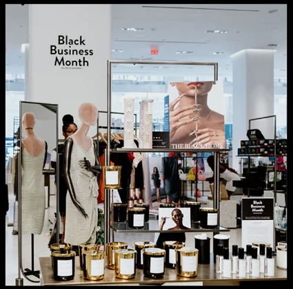
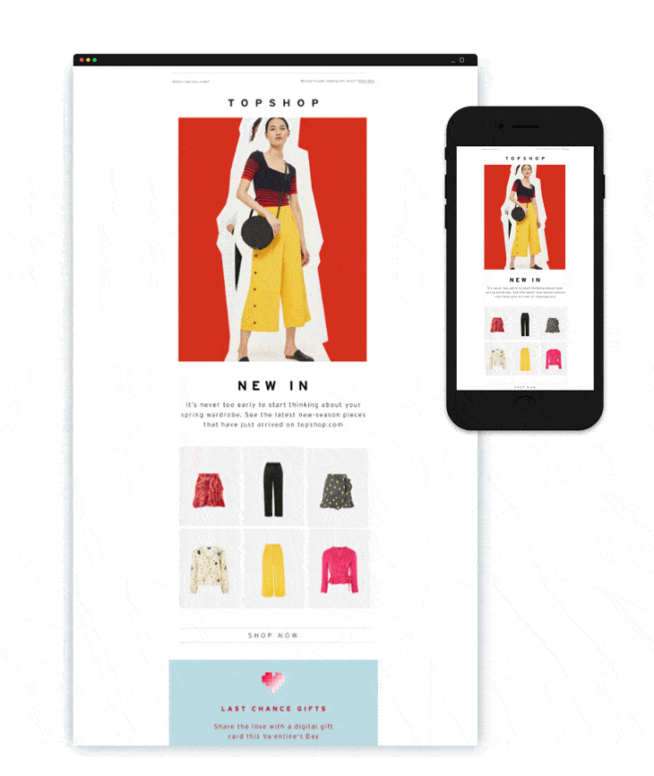
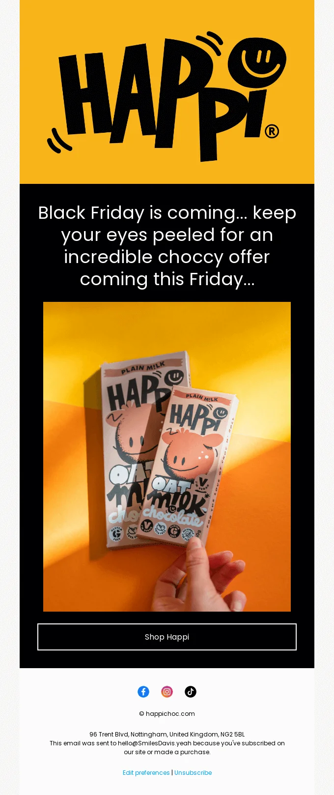
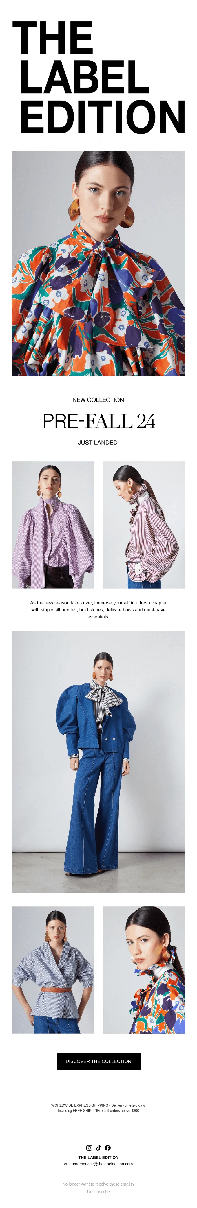
In an increasingly saturated market, brands are aggressively seeking ways to differentiate themselves. The "Go Big or Go Home" trend sees brands shifting focus from individual products or specific messages to the overarching brand identity itself. This is often achieved through the prominent use of oversized, bold texts, striking headlines, and impactful images, sometimes even foregoing the traditional logo in favor of a more unconventional, attention-grabbing visual identity. Examples from brands like Happi, which uses a dominant header image to command attention, or The Label Edition, whose large titles immediately draw recipients in, illustrate this powerful approach. The underlying rationale is to break through the noise, intrigue the audience with a unique aesthetic, and cultivate strong brand recall.
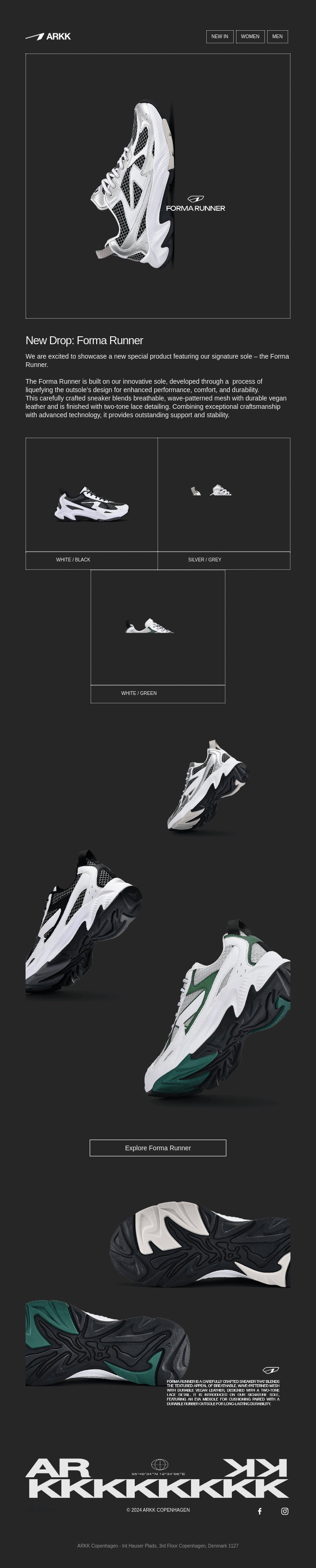
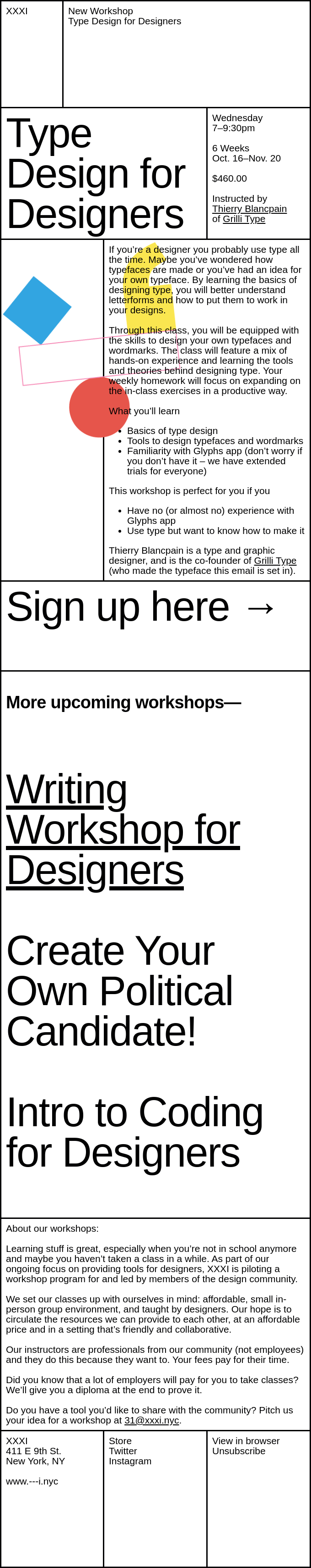
Structured Clarity with "Hard Tables"
A trend offering both aesthetic appeal and enhanced readability is the use of "hard tables," which involves outlining content blocks with distinct lines. While traditionally black, these outlines can be adapted for dark mode emails, using white or light colors to maintain visual separation. This design choice, exemplified by brands like Arkk using white lines on dark backgrounds or XXXI employing classic black outlines on white, brings structured clarity to newsletters. By segmenting content visually, hard tables help readers navigate complex information, making newsletters with multiple sections or extensive content appear more organized and digestible, thereby improving the user experience.
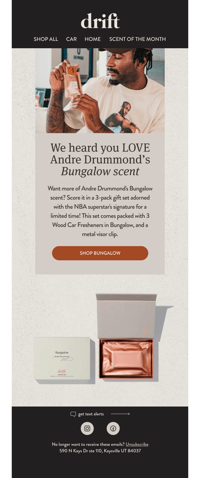
The Enduring Appeal of "Celeb Cameos"
The power of celebrity endorsement, a marketing staple since the 19th century, is experiencing a resurgence in email design. Integrating celebrities into newsletter campaigns lends immediate credibility and can significantly elevate a brand’s reputation. As seen with Drift employing NBA star Andre Drummond as the face of their campaign, a celebrity’s association can resonate strongly with target audiences. If the chosen celebrity aligns well with the brand’s demographic and shares the campaign on their social media, it has the potential to go viral, extending reach far beyond the typical subscriber base and generating substantial buzz.
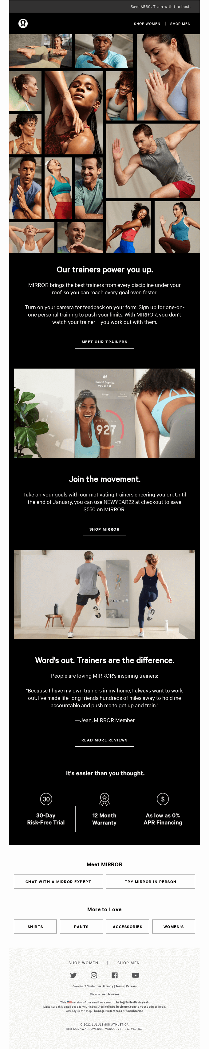
Visual Storytelling through "Picture Walls"
For brands with an abundance of high-quality visual assets, the "picture wall" trend offers an effective solution to the dilemma of choosing a select few images. This approach involves showcasing a multitude of images in a grid-like or collage format. Brands like Lululemon and Le Rose demonstrate how picture walls can effectively present products from various angles, highlighting different features, colors, or even showing items worn by diverse body types. This comprehensive visual presentation helps potential customers better envision themselves using the product, addressing common purchasing barriers and enriching the visual narrative within the email.
Authenticity with "Raw and Unfiltered" Content
In an era increasingly dominated by polished, AI-generated, and hyper-curated content, the "raw and unfiltered" trend offers a refreshing counter-narrative. This approach embraces unedited images and video footage, injecting a sense of authenticity and relatability into email campaigns. Inspired by advertising campaigns that champion "no-nonsense" messaging, brands like Patagonia, opening with an unedited photo of a dog in a camper van, or GiftShop, showcasing raw kitchen footage, are leaning into this trend. It resonates with audiences weary of artificiality, fostering trust and a genuine connection by presenting a more honest and less manufactured brand image. This trend is particularly salient given the rise of AI email marketing, where a human touch can provide significant differentiation.
Ethical Imperatives: Environment and Accessibility
Beyond aesthetics and engagement, future-proof email design must integrate ethical considerations: environmental sustainability and universal accessibility. These two pillars are rapidly gaining prominence in brand strategies and consumer expectations.
Email Ecology: Reducing Carbon Footprint
The digital world has a tangible environmental impact, and emails contribute to this "carbon footprint." Jonathan Loriaux, CEO and founder of Badsender, emphasized that "When we talk about email and environment, there are really two points where we can have a positive influence: data storage and display." While individual emails have a small carbon footprint (estimated at 0.3g CO2 for a standard email, rising to 50g for an email with large attachments), the sheer volume of emails sent globally means the collective impact is substantial.
Simple yet impactful strategies for reducing email’s environmental footprint include:
- Optimizing Image and File Sizes: As discussed, smaller files consume less data during transmission and storage.
- Minimizing Code Bloat: Clean, efficient HTML and CSS reduce the data payload.
- Limiting Animation and Video: While engaging, these elements significantly increase file sizes.
- Practicing List Hygiene: Regularly cleaning email lists to remove inactive subscribers reduces unnecessary sends and associated data storage.
- Designing for Dark Mode: Dark mode consumes less power on OLED screens, which are increasingly common in mobile devices.
- Consolidating Emails: Sending fewer, but more valuable, emails rather than frequent, lightweight ones can reduce overall impact.
Accessibility: Designing for All Users
Accessibility in email design is a critical, often overlooked, aspect that ensures content is usable by everyone, including individuals with disabilities. With over 1.3 billion people globally living with some form of visual impairment, designing for accessibility is not just good practice but an ethical and increasingly legal imperative. As voice assistants and screen readers become more prevalent, accessibility also enhances compatibility with these technologies.
Key accessibility practices include:
- Descriptive Alt-Text for Images: Essential for screen readers to convey image content to visually impaired users.
- Sufficient Color Contrast: Ensuring adequate contrast between text and background colors improves readability for users with low vision or color blindness. Tools are available to check contrast ratios against WCAG (Web Content Accessibility Guidelines) standards.
- Legible Font Sizes and Line Spacing: Using a minimum font size (e.g., 14px-16px for body text) and generous line spacing enhances readability.
- Logical Heading Structure: Proper use of H1, H2, H3 tags helps screen readers navigate content hierarchically.
- Clear and Concise Language: Simple, direct language benefits all readers, especially those with cognitive disabilities or for whom English is not their first language.
- Keyboard Navigation: Ensuring all interactive elements are reachable and usable via keyboard.
- ARIA Attributes: Implementing Accessible Rich Internet Applications (ARIA) attributes in HTML to provide additional context for assistive technologies.
Practical Implementation: How Sinch Mailjet Empowers Designers
Sinch Mailjet’s email marketing solution stands as a powerful tool for implementing both foundational best practices and emerging design trends. Its intuitive drag-and-drop email builder enables marketers to craft 100% responsive email campaigns with ease, guaranteeing perfect display across any screen. This visual editor simplifies the creation of complex layouts, negating the need for extensive coding knowledge.
Mailjet’s extensive email template gallery serves as a significant time-saver, allowing marketers to focus on content and optimization rather than starting from scratch. These templates are pre-optimized for responsiveness and can be customized to align with specific brand aesthetics. Beyond design, Mailjet offers a suite of advanced features crucial for modern email marketing, including robust email segmentation capabilities for targeting specific audience groups, personalization tokens for creating highly relevant content, and comprehensive A/B testing functionalities to continuously refine and improve campaign performance. By providing these tools, Sinch Mailjet enables marketers to not only design beautiful emails but also to execute sophisticated, data-driven strategies that resonate with their audience and achieve measurable business objectives.
Conclusion

The landscape of email design is dynamic, constantly shaped by technological advancements, evolving consumer behaviors, and a growing emphasis on ethical considerations. As we look towards 2026, the insights shared at Email Camp, particularly from François Sahli and Mike Nelson, underscore a dual imperative for email marketers: mastering the timeless best practices that ensure deliverability, readability, and accessibility, while simultaneously embracing the innovative trends that capture attention and foster deeper engagement. From responsive formatting and strategic image use to the bold statements of "Go Big or Go Home" and the authentic appeal of "Raw and Unfiltered" content, the future of email design is about balancing technical excellence with creative ingenuity. Ultimately, successful email marketing in the coming years will be characterized by a holistic approach that prioritizes user experience, brand integrity, and responsible digital citizenship.