
 rifanmuazin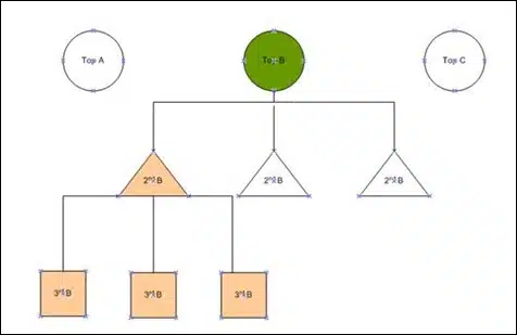
The global e-commerce landscape, currently valued at over $5.8 trillion, has reached a critical inflection point where the difference between a conversion and an abandoned session often rests on the structural integrity of the category page. No longer viewed as mere navigational waypoints, category pages—frequently referred to in the industry as Product Listing Pages (PLPs)—have evolved into sophisticated psychological tools designed to balance user intent with inventory accessibility. Industry data suggests that while homepages serve as the “front door” of a digital storefront, category pages act as the “aisles” where the majority of purchase decisions are either nurtured or terminated.
Recent analysis of consumer behavior indicates that the strategic optimization of these pages involves a multi-faceted approach, prioritizing the definition of a page’s purpose, the application of granular analytics, and the implementation of hierarchical sub-categorization. As digital retailers face increasing competition and rising customer acquisition costs, the efficiency of the category page has become a primary focus for conversion rate optimization (CRO) specialists worldwide.
The Strategic Definition of Category Purpose
The foundational step in modern e-commerce architecture is the clear definition of a category page’s primary function. Retail analysts categorize these pages into three distinct roles: browsing, deciding, and buying. Each role necessitates a unique design philosophy to prevent “decision conflict,” a psychological state where a user is presented with too many choices or a call-to-action (CTA) that does not align with their current stage in the buyer’s journey.
In a browsing-focused environment, the visitor is typically in an exploratory phase, seeking to understand the breadth of options available. When retailers prematurely introduce high-commitment actions, such as “Add to Cart” buttons, on these pages, they risk creating friction. Psychological studies in consumer behavior suggest that when an interface demands a higher-commitment decision than a user is prepared to make, the result is often a “backtrack” or a complete abandonment of the site. On these pages, the priority shifts toward navigation, visual storytelling, and providing clear pathways to more specific sub-sections.
Conversely, for “buying-focused” category pages, the user intent is often pre-determined. For replenishment items or highly standardized goods, the inclusion of an “Add to Cart” button directly on the category page can streamline the path to purchase, reducing the number of clicks required to reach the checkout. The challenge for modern retailers lies in identifying the intersection between the actions a brand desires (immediate conversion) and the actions a visitor expects (detailed research).
Chronology of Category Page Evolution
The development of the e-commerce category page has followed a distinct timeline, reflecting broader trends in web technology and consumer expectations.
- The Early Era (1995–2005): Category pages were largely static lists of text links. Navigational structures were shallow, and the primary goal was simply to index inventory for search engines.
- The Visual Revolution (2006–2012): The introduction of high-speed internet allowed for image-heavy grids. This era saw the birth of “Quick View” features and the first iterations of faceted navigation (filters).
- The Data-Driven Era (2013–2019): Retailers began utilizing heatmaps and session recordings to understand user drop-off points. The “mobile-first” transition forced category pages to become more streamlined, prioritizing vertical scrolling over complex horizontal menus.
- The Personalization and AI Era (2020–Present): Modern category pages now utilize machine learning to reorder products based on individual user history, local weather patterns, or real-time inventory levels. The focus has shifted from “showing everything” to “showing the right thing.”
Utilizing Analytics to Diagnose Design Failures
A critical component of category page optimization is the rigorous evaluation of analytics data. Journalistic investigation into e-commerce performance metrics reveals that exit rates on category pages serve as the “canary in the coal mine” for user experience. While it is standard for category pages to have exit rates similar to the site average, a significant spike in this metric usually indicates a misalignment between user expectation and page content.
Industry benchmarks suggest that if a category page experiences an exit rate 20% higher than the site average, the design is likely failing to facilitate the transition to the Product Detail Page (PDP). CRO experts utilize tools such as Google Analytics 4 (GA4) to track “Product List Views” and “Product List Clicks” to calculate the Click-Through Rate (CTR) of specific items. A low CTR across an entire category suggests that the grouping is either too broad, the filters are ineffective, or the imagery is not compelling enough to warrant further investigation.
Hierarchical Structuring and the Three-Level Rule
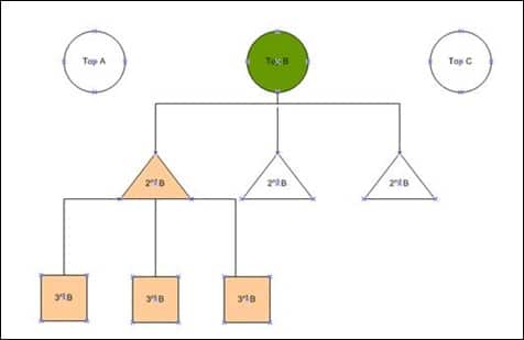
The architectural “minimum” for a successful e-commerce site involves the logical grouping of products into a hierarchy that mirrors the consumer’s mental model. Retailers often make the mistake of maintaining overly broad top-level categories, such as “Electronics,” which can overwhelm the visitor.
The prevailing industry standard is the “Three-Level Rule,” which suggests that a category hierarchy should rarely exceed three levels of sub-categories. For instance:
- Level 1 (Top Level): Electronics
- Level 2 (Sub-category): Televisions
- Level 3 (Granular): OLED 4K Televisions
As a visitor navigates through these levels, the page should dynamically highlight “child” categories to provide a clear roadmap. This hierarchical approach not only aids user navigation but also significantly improves Search Engine Optimization (SEO) by creating a “silo” structure that helps search engine crawlers understand the relationship between different products.
Feature-Based and Need-Based Filtering Systems
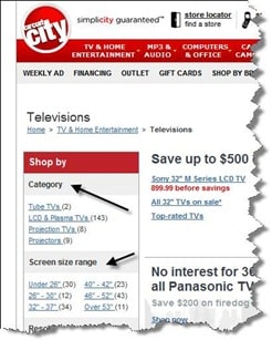
To further enhance the utility of category pages, leading retailers have moved beyond simple price and brand filters. They now implement “Feature-Based” and “Need-Based” categorization.
Feature-based filtering allows consumers to sort products by technical specifications. For example, in the consumer electronics sector, retailers like Best Buy or the former Circuit City pioneered the use of resolution, screen size, and refresh rates as primary filters. This recognizes that for certain products, technical specifications are the primary driver of the purchase decision.
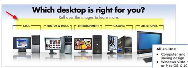
Need-based filtering, however, addresses the “why” behind the purchase. A consumer shopping for a desktop computer may not know the difference between a Core i5 and a Core i7 processor, but they know they need a machine for “Gaming,” “Photo Editing,” or “Basic Home Office.” By breaking down category pages into these intent-based segments, retailers can act as digital consultants, guiding the user toward the appropriate sub-category without requiring them to possess deep technical knowledge.
The Role of Buying Guides and Decision Support
For complex product categories—such as medical equipment, high-end photography gear, or insurance products—the category page must serve as an educational resource. Modern digital retail strategy often involves the integration of buying guides or “wizards” directly into the category interface. These tools help the user determine which sub-category is appropriate for their specific situation, effectively reducing “choice paralysis.”
Case studies from major retailers indicate that the presence of a “Help Me Choose” tool on a category page can increase the conversion rate of the subsequent product pages by as much as 15%. This is because the visitor arrives at the product page with a higher level of confidence that the item meets their specific needs.
Continuous Testing and Iterative Refinement
The final pillar of category page excellence is the commitment to A/B testing and iterative refinement. In the fast-paced world of digital commerce, no design is considered “final.” Industry experts emphasize that while best practices provide a starting point, actual user behavior—recorded via heatmaps and click-tracking—should dictate the final layout.
A notable example in the industry involved a major retailer who implemented a “need-based” filtration system at the top of their category pages. Despite the design team’s confidence in the feature, analytics revealed that less than 2% of visitors were interacting with it. By removing the feature and replacing it with a more traditional faceted sidebar, the retailer saw an immediate 8% lift in navigation to product pages. This underscores the necessity of letting data, rather than internal preference, drive design decisions.
Broader Impact and Market Implications
The optimization of category pages has implications that extend far beyond individual site performance. In an era where Amazon and other marketplaces dominate the “buying” phase, independent retailers must excel in the “browsing” and “deciding” phases to maintain market share. A well-designed category page builds brand authority and trust, positioning the retailer as an expert in their niche.
Furthermore, as privacy regulations like GDPR and CCPA limit the effectiveness of third-party tracking, the “first-party” data gathered from how users interact with category filters and sub-sections becomes invaluable. This data allows retailers to understand shifting market trends in real-time, enabling more agile inventory management and marketing strategies.
In conclusion, the e-commerce category page is a complex engine of commerce that requires a delicate balance of psychology, data science, and intuitive design. By defining clear purposes, adhering to logical hierarchies, and relentlessly testing user interactions, retailers can transform these often-overlooked pages into powerful drivers of growth and customer loyalty. The future of digital retail will belong to those who can most effectively bridge the gap between a vast inventory and a specific user need.








