The landscape of digital journalism and data analysis has undergone a significant transformation with the introduction of native report embedding within Google Data Studio. This technological advancement addresses a long-standing challenge for content creators: the transition from static, non-responsive screenshots to dynamic, interactive environments that allow readers to engage directly with raw data. By enabling users to embed live reports into any online environment, Google has provided a streamlined mechanism for analysts to share insights with a level of transparency and interactivity previously reserved for high-budget newsrooms with custom-coded visualizations.
For years, the dissemination of data-driven narratives was hampered by the "click-through" barrier. Analysts would often present static images of their findings, forcing interested readers to navigate away from the primary article to an external hosting platform to interact with the data. This friction frequently resulted in lower engagement rates and a fragmented user experience. The integration of iFrame-based embedding directly into content management systems (CMS) represents a shift toward a more cohesive consumption of information, where the data and the narrative exist in a unified space.
The Marvel vs. DC Case Study: A Benchmark for Performance Analysis
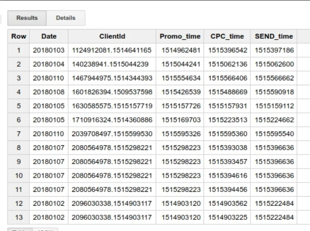
To illustrate the efficacy of these new embedding tools, industry analysts have revisited the long-standing box office and critical performance rivalry between the Marvel Cinematic Universe (MCU) and the DC Extended Universe (DCEU). This specific data set serves as an ideal use case for interactive visualization due to the high volume of variables involved, including domestic and international box office receipts, critical scores from aggregators like Rotten Tomatoes and Metacritic, and production budgets.
In the 2017 update of this ongoing study, five significant films were added to the data set: Guardians of the Galaxy Vol. 2, Wonder Woman, Spider-Man: Homecoming, Logan, and Thor: Ragnarok. The inclusion of these titles provided a fresh opportunity to test the capabilities of Data Studio’s embedding features. The data indicated a continuing trend of Marvel’s dominance in terms of consistent box office returns and critical reception, though the success of Wonder Woman marked a pivotal moment for DC, demonstrating that the gap in audience sentiment was narrowing in specific demographics.
By utilizing embedded reports, researchers were able to move beyond simple conclusions. Instead of reading a summary stating that "Marvel is winning," readers could use filters within the embedded report to compare Phase 1 of the MCU against the early stages of the DCEU, or isolate films by director, release date, or ROI (Return on Investment). This level of granularity, provided within the flow of the article, enhances the credibility of the reporting and allows the audience to reach their own evidence-based conclusions.
Technical Implementation: Enabling Live Data Integration
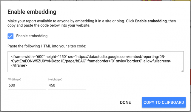
The process of embedding these reports involves a series of technical steps designed to ensure both security and accessibility. Within the Google Data Studio interface, the "Enable Embedding" feature generates a snippet of HTML code (an iFrame) that can be inserted into the source code of a webpage. However, the functionality is contingent upon the report’s sharing settings.
For a report to be visible to a general audience, it must be set to "Public" or "Anyone with the link can view." If the report is intended for internal corporate use, the permissions can be restricted to specific domains or email groups. This flexibility allows the tool to be used for both public-facing journalism and private business intelligence dashboards. Once enabled, the embedded report remains "live," meaning any updates made to the underlying data source—whether it be a Google Sheet, BigQuery, or Google Analytics—are reflected in real-time on the website where the report is embedded.
Optimization for Cross-Platform Accessibility and Responsiveness
One of the primary hurdles in data visualization is the diversity of hardware used to access the internet. With mobile traffic consistently accounting for more than half of global web usage, visualizations must be responsive. Google Data Studio addresses this through specific display modes, most notably the "Fit to Width" setting.
When embedding a report, the width of the iFrame must be synchronized with the content area of the host website. For example, if a website’s layout is capped at a 640px width, the iFrame should be configured to match this dimension. The "Fit to Width" feature ensures that as the browser window shrinks—such as when viewing on a smartphone—the visualization scales proportionally.
Despite these automated features, experts recommend a "mobile-first" approach to data design. While a comprehensive dashboard might look impressive on a 27-inch desktop monitor, it can become illegible on a 5-inch mobile screen. Therefore, the strategy of "breaking down" visualizations into digestible segments has become a best practice in the industry. Instead of embedding one massive, multi-page report, analysts often create several smaller, focused reports—one for a single bar chart, another for a geographic map—and intersperse them throughout the text of an article. This "scrollytelling" approach keeps the reader engaged and prevents information overload.
Chronology of Google Data Studio’s Evolution
The introduction of embedding is part of a broader timeline of Google’s expansion into the business intelligence (BI) space:
- May 2016: Google Data Studio is launched as part of the Google Analytics 360 Suite, initially offered as a limited free version and a more robust enterprise version.
- Early 2017: Google removes the five-report limit for the free version, significantly increasing the tool’s adoption among independent analysts and small businesses.
- September 2017: Native embedding functionality is officially released, allowing reports to be integrated into websites, blogs, and apps via iFrames.
- 2018-2020: Continuous updates add advanced features like calculated fields, data blending from multiple sources, and enhanced community visualizations.
- 2022: Google rebrands Data Studio as Looker Studio, integrating it more deeply with the Looker ecosystem and Google Cloud’s data analytics suite.
Strategic Implications for Data Journalism and Corporate Reporting
The ability to embed interactive reports has profound implications for several sectors. In the realm of data journalism, it fosters a higher standard of transparency. Readers no longer have to take a journalist’s word for it; they can hover over data points to see exact figures, filter by year or category, and explore the dataset themselves. This transparency is crucial in an era where data literacy is increasing and audiences are more skeptical of summarized information.
In the corporate world, this feature streamlines the reporting process. Marketing agencies can embed live performance dashboards directly into client portals, eliminating the need to send static PDF reports every month. This ensures that stakeholders always have access to the most current data, fostering a culture of data-driven decision-making.
Furthermore, the "democratization of data" is a key outcome of this technological shift. Tools like Data Studio (now Looker Studio) have lowered the barrier to entry. Previously, creating an interactive, web-based visualization required knowledge of D3.js, HTML, and CSS. Now, a professional-grade interactive report can be built using a drag-and-drop interface and embedded with a simple copy-paste action.
Analyzing the Broader Impact on Audience Engagement
Preliminary data suggests that articles containing interactive elements have a higher "time on page" metric compared to those with static images. Interactive content invites participation, which transforms the reader from a passive consumer into an active participant. In the case of the Marvel vs. DC analysis, the ability for a user to toggle between "Box Office" and "Rotten Tomatoes Score" creates a personalized experience that a static article cannot replicate.
The integration of data visualization into the narrative also aids in information retention. Cognitive load theory suggests that when text and relevant visuals are integrated effectively, the brain can process the information more efficiently. By placing the chart directly next to the analysis, the reader does not have to expend mental energy switching between different contexts.
Future Outlook: The Convergence of AI and Visualization
Looking ahead, the integration of artificial intelligence into tools like Looker Studio is expected to further enhance the embedding experience. Future iterations may include "Natural Language Query" features within the embedded iFrame, allowing readers to type questions like "Which DC movie had the highest ROI?" and have the chart update automatically.
As the volume of global data continues to grow exponentially, the tools used to interpret and share that data must become more sophisticated yet more accessible. The move by Google to allow seamless report embedding was a foundational step in this journey, bridging the gap between complex data analysis and mainstream digital storytelling. The Marvel vs. DC project remains a quintessential example of how these tools can turn dry statistics into a compelling, interactive narrative that resonates with a broad audience.