The landscape of data visualization underwent a significant shift following the introduction of Google Data Studio, a tool designed to bridge the gap between complex data processing and accessible visual reporting. As organizations moved away from static, manual reporting, the demand for interactive dashboards grew, allowing stakeholders to derive actionable insights from disparate data sources in real-time. This transition was marked by a series of high-profile implementations across both the corporate sector and the field of data journalism, demonstrating the platform’s versatility in handling everything from search engine optimization (SEO) metrics to decades of sociological statistics. By integrating seamlessly with the Google Cloud ecosystem, particularly BigQuery and Google Analytics, the platform enabled a new era of “data democratization,” where technical and non-technical users alike could interpret complex datasets.
The Chronology of Google’s Visualization Ecosystem
The development of Google Data Studio, now known as Looker Studio, followed a strategic trajectory aimed at consolidating Google’s disparate data offerings. Initially launched in beta in mid-2016, the tool was positioned as a part of the Google Analytics 360 Suite. By 2017 and 2018, the period during which many of the most influential early visualizations emerged, the platform had expanded its connector library, allowing for direct pipelines from MySQL, PostgreSQL, and YouTube Analytics.
This period was critical for the tool’s adoption. Before the rise of such cloud-based visualization platforms, businesses often relied on monthly PDF reports that were manually compiled by analysts. This process was not only prone to human error but was also inherently reactive, providing data that was often weeks old by the time it reached decision-makers. The shift to Data Studio represented a move toward “live” data, where dashboards refreshed automatically, providing a continuous pulse on business health and market trends.
Operational Efficiency and the Boat International Case Study
One of the most cited examples of business transformation during this era involved Boat International Media. The organization faced a common industry challenge: the labor-intensive nature of client reporting. Historically, the SEO and digital marketing teams at Boat International required approximately five days of manual labor every month to compile, format, and verify performance data for their clients.

By migrating their reporting structure to Google Data Studio, analysts Fanni Takacs and Drew Broomhall reported a reduction in reporting time from five days to just fifteen minutes. This efficiency gain was achieved by creating a standardized, yet flexible, report template that focused on clear key performance indicators (KPIs) while eliminating the “clutter” typically found in raw data exports. The transition allowed the team to shift their focus from the mechanical act of data entry to the strategic act of data analysis. The resulting reports were designed with a dual-purpose aesthetic, functioning as interactive online dashboards for daily monitoring and as professional-grade PDFs for formal monthly reviews.
Technical Architecture and the Role of Connectors
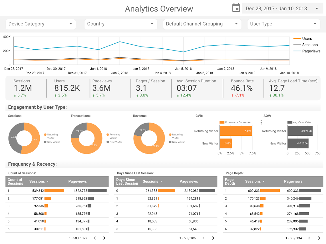
The power of these visualizations is fundamentally tied to the “connectors” that feed them. In the business context, firms like E-Nor and ClickInsight pioneered the use of Google Analytics (GA) connectors to create comprehensive web activity overviews. These templates served as blueprints for the industry, showing how to aggregate session data, bounce rates, and conversion metrics into a single-page view.
Further technical sophistication was demonstrated by the team at Analytics Pros, who utilized bullet charts to enhance page-level engagement reporting. Unlike standard bar charts, bullet charts allow for a nuanced comparison against multiple benchmarks. For instance, a dashboard could simultaneously display current page performance, the previous year’s performance, and the established target for the current quarter. This “three-dimensional” view of progress provided a level of context that static spreadsheets could not replicate, allowing managers to see not just the volume of traffic, but the quality and duration of engagement relative to historical norms.
Large-Scale Data Processing: GitHub and the BigQuery Integration
Beyond traditional business metrics, the platform’s integration with BigQuery opened doors for massive-scale data analysis, particularly in the realm of open-source software. Felipe Hoffa, a Developer Advocate at Google, utilized this integration to analyze the global state of open-source contributions in 2017.
By pulling “PushEvents” published by GitHub—a dataset comprising millions of rows of activity—Hoffa was able to visualize which companies and individuals were the primary drivers of open-source development. This required the use of the BigQuery connector, which allows Data Studio to query massive datasets without the latency issues typically associated with browser-based visualization tools. The resulting data story revealed the dominance of specific tech giants in the open-source space and provided a roadmap for understanding how collaborative coding evolved over a calendar year. This application highlighted the platform’s ability to move beyond simple internal business data into the realm of global “Big Data” analysis.

Data Journalism: Narrative Techniques in Pop Culture and Science
The rise of Google Data Studio also provided a new toolkit for data journalists and hobbyist analysts to tell stories about culture and technology. Two notable examples from this era include deep dives into the “Marvel vs. DC” cinematic rivalry and the technical lore of the “Star Wars” universe.
In the Marvel vs. DC analysis, researchers compiled box office data totaling over $27 billion in worldwide revenue. The visualization did more than just list numbers; it used a comparative framework to show the “war for hearts and minds,” tracking the success of various film phases and character arcs. Similarly, ClickInsight’s report on Star Wars data allowed fans and analysts to compare fictional starship speeds and character demographics through an interactive interface. These examples demonstrated that data visualization was not merely a tool for accountants, but a medium for cultural commentary, capable of engaging audiences through interactive tabs and visual storytelling.
Sociological Analysis: 150 Years of UK Marital Trends
Perhaps the most rigorous application of the tool in a journalistic context was the analysis of UK marriage and divorce trends spanning a century and a half. Conducted by analysts including Lizzie Silvey, this study sought to answer complex sociological questions: How do major geopolitical events, such as World Wars, correlate with marriage spikes? What was the immediate impact of the Divorce Reform Act of 1969 on the legal dissolution of marriages?
The visualization utilized historical data from the Office for National Statistics (ONS) to create a timeline of social change. By overlaying legal milestones and historical events onto a trend line of marriage and divorce rates, the analysts provided a clear visual representation of how law and society interact. This type of analysis is particularly effective in a dashboard format, as it allows users to hover over specific years to see the exact figures and the corresponding historical context, making the data feel “alive” rather than buried in a static academic paper.
Official Responses and Industry Implications
The reception of these visualization techniques within the tech industry was overwhelmingly positive. Google’s own development teams frequently highlighted these community-created dashboards as “best-in-class” examples of how to use their product. The consensus among data professionals was that the primary value of Data Studio lay in its ability to facilitate “data transparency.”
When data is siloed in complex databases, it is only accessible to those with SQL or programming knowledge. By moving this data into an interactive, visual format, organizations reported that more departments—from marketing to HR—were able to use data in their daily decision-making. This shift led to a broader movement in the late 2010s toward “self-service analytics,” where the role of the data scientist shifted from “report generator” to “data architect,” focused on building the pipelines that allow others to explore data safely and accurately.
Broader Impact and the Future of Interactive Reporting
The long-term impact of these early Google Data Studio visualizations cannot be overstated. They set a standard for what modern reporting should look like: clean, interactive, and automated. The principles established in these early dashboards—such as the use of bullet charts for benchmarking, the integration of BigQuery for scale, and the focus on narrative storytelling—continue to inform how Looker Studio is used today.
As we look back at the 2017–2018 period, it is clear that the “powerful visualizations” mentioned by early adopters were the vanguard of a broader revolution in business intelligence. The ability to turn raw data into a compelling story is no longer a luxury for major corporations; it is a fundamental requirement for any organization operating in the digital age. Whether tracking the performance of an SEO campaign or analyzing 150 years of social history, the tools of data visualization have fundamentally changed how we perceive and interact with the world around us.
The transition from manual, static reporting to automated, interactive dashboards has not only saved thousands of hours of labor but has also deepened our collective understanding of the complex datasets that define modern life. As the platform continues to evolve, the core mission remains the same: to make data accessible, understandable, and, ultimately, actionable for everyone.