The landscape of data visualization underwent a significant transformation throughout 2017 and into early 2018, as organizations and independent analysts moved away from static reporting toward interactive, cloud-based dashboards. At the center of this shift was Google Data Studio, a tool that transitioned from a niche beta product to a cornerstone of the modern business intelligence (BI) suite. By bridging the gap between complex data processing and accessible design, the platform allowed users to synthesize vast datasets into coherent narratives. This evolution was marked by a dual-track development: the optimization of internal business reporting and the rise of sophisticated data journalism.
The Strategic Shift in Business Reporting
In the corporate sector, the primary challenge has historically been the "reporting lag"—the time required to extract data from various sources, format it in spreadsheets, and present it to stakeholders. During the 2017–2018 period, several organizations demonstrated how Google Data Studio could effectively eliminate this bottleneck.
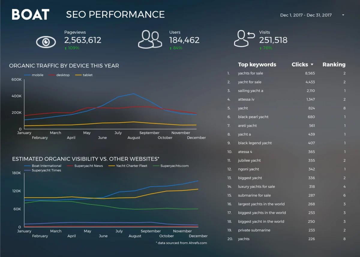
One of the most prominent case studies involved Boat International Media, a leading luxury yachting lifestyle brand. Prior to adopting automated visualization tools, the company’s SEO performance reporting was a labor-intensive process. Analysts Fanni Takacs and Drew Broomhall reported that the monthly client reporting cycle, which previously consumed five full working days, was reduced to just fifteen minutes through the implementation of Data Studio. This efficiency gain was not merely a matter of speed; it allowed for a higher standard of design and clarity. By focusing on key performance indicators (KPIs) and removing "data noise," the team produced reports that functioned both as interactive online dashboards and as high-fidelity PDFs suitable for executive-level presentations.
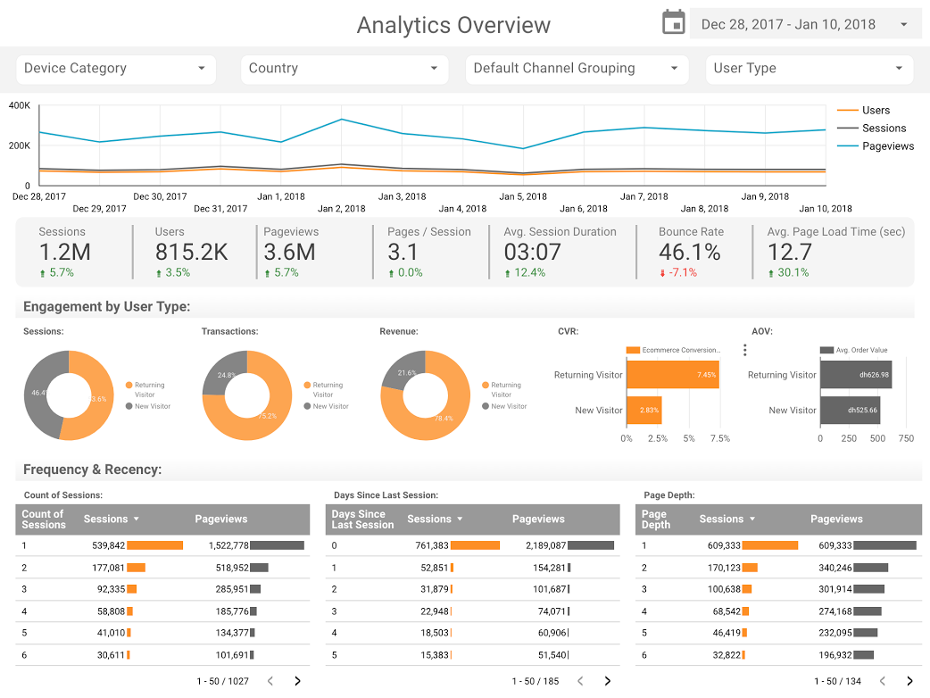
Similarly, firms like E-Nor and Analytics Pros (now part of Adswerve) pushed the boundaries of what was possible within the Google Analytics ecosystem. Sunil Attri, a senior consultant at E-Nor, developed comprehensive analytics overview reports that utilized the tool’s native data connectors. These connectors allowed for real-time synchronization with Google Analytics, AdWords, and BigQuery, ensuring that decision-makers were looking at live data rather than historical snapshots.

A critical technical advancement during this era was the adoption of bullet charts for page-level engagement. The team at Analytics Pros utilized these charts to provide a nuanced view of performance. Unlike standard bar charts, bullet charts allow for a comparison against multiple benchmarks—such as the previous year’s performance and current quarterly targets—within a single, compact visual space. This enabled digital marketers to identify not just which pages were receiving traffic, but which ones were meeting specific engagement thresholds, such as time-on-page and scroll depth.
The Rise of Data Journalism and Public Storytelling
Beyond the boardroom, Google Data Studio emerged as a powerful medium for data journalism, allowing creators to tell complex stories using publicly available datasets. This democratization of data meant that intricate topics, from cinematic trends to sociological shifts, could be explored by anyone with an internet connection.
One notable area of public interest was the "box office war" between major film franchises. Visualizations comparing the Marvel Cinematic Universe (MCU) and the DC Extended Universe (DCEU) became a staple of data storytelling. By 2018, the MCU had already become a global phenomenon, with its films collectively grossing over $13 billion worldwide. Analysts used Data Studio to track these financial trajectories, comparing critical reception on platforms like Rotten Tomatoes against commercial success. These reports highlighted a clear trend: while both universes commanded massive audiences, the MCU maintained a more consistent correlation between high critical scores and long-term box office "legs."
The "Star Wars" franchise also received the data treatment, with teams like ClickInsight building reports that cataloged everything from starship speeds to character demographics. These journalistic endeavors served a dual purpose: they entertained the public while demonstrating the technical capabilities of the software to handle diverse, non-traditional datasets.
Chronology of Google Data Studio’s Development
To understand the impact of these visualizations, it is necessary to look at the timeline of the tool’s availability:

- Mid-2016: Google introduces Data Studio as a "beta" part of the Google Analytics 360 Suite, initially limiting the free version to five reports per user.
- Early 2017: In a move to capture the mid-market and individual analyst sectors, Google removes the five-report limit, making the tool essentially free for anyone with a Google account.
- Late 2017: The introduction of the Community Connectors program allows third-party developers to build bridges to non-Google data sources, such as Facebook Ads, LinkedIn, and Salesforce.
- Early 2018: The tool gains significant traction in the data journalism community as embedding features are improved, allowing reports to be integrated directly into news articles and blog posts.
Technical Infrastructure: The Role of BigQuery
A significant factor in the sophistication of 2018-era visualizations was the integration with BigQuery, Google’s enterprise data warehouse. This was best exemplified by the work of Felipe Hoffa, a Developer Advocate at Google. Hoffa utilized the BigQuery connector to analyze the "PushEvents" published by GitHub throughout 2017.
GitHub, the world’s largest host of source code, generates billions of data points annually. By importing this data into BigQuery and visualizing it in Data Studio, Hoffa was able to identify which companies and individuals were the most prolific contributors to open-source software. This analysis revealed the growing influence of corporate giants like Microsoft and Google in the open-source community, a finding that had significant implications for the tech industry’s understanding of collaborative development.
Sociological Analysis through Data
The power of visualization was also applied to long-term sociological trends. A landmark report by analysts including Lizzie Silvey examined 150 years of marriage and divorce data in the United Kingdom. This project moved beyond simple line graphs to explore the "why" behind the numbers.
By layering historical events—such as the World Wars and major legislative changes like the Divorce Reform Act of 1969—over the data, the visualization provided a narrative of social change. The data showed that marriage rates peaked following the conclusion of both World Wars, while divorce rates spiked significantly after legal barriers were lowered. This type of analysis demonstrated that data visualization is not just about numbers; it is about providing context to the human experience.
Broader Impact and Industry Implications
The widespread adoption of tools like Google Data Studio has had several lasting impacts on the industry:
1. The Democratization of Insights:
Previously, creating high-quality dashboards required expensive licenses for software like Tableau or Qlik. The availability of a free, powerful alternative allowed small businesses and independent journalists to compete on an equal footing with large corporations.
2. The Move Toward Transparency:
Public-facing dashboards have become a tool for transparency. Governments and non-profits now use these platforms to share spending data and project progress with the public in a format that is easy to digest.
3. The Integration of Design and Analysis:
The emphasis on "good design" mentioned in the original reporting highlights a shift in the role of the data analyst. Modern analysts are expected to be part-statistician and part-graphic designer, ensuring that insights are not just accurate but also persuasive and easy to understand.
4. Automation of the Data Pipeline:
The success of Boat International Media serves as a blueprint for the modern agency. By automating the data pipeline from collection to visualization, professionals can shift their focus from "compiling" data to "interpreting" it. This adds more value to the client and reduces the risk of human error inherent in manual data entry.
Conclusion
The visualizations produced in 2017 and 2018 were more than just aesthetic achievements; they represented a fundamental change in how information is consumed. From tracking the box office dominance of superheroes to analyzing a century of social trends in the UK, these reports proved that data, when visualized correctly, can tell stories that are both commercially vital and culturally significant. As the technology continues to evolve into what is now known as Looker Studio, the principles established during this period—clarity, interactivity, and storytelling—remain the gold standard for the industry. The era of the static spreadsheet has effectively ended, replaced by a dynamic, interconnected world of data.