In the rapidly evolving landscape of global digital commerce, the e-commerce category page has emerged as a critical pivot point in the consumer purchasing journey. Often referred to as the “digital aisle,” these pages serve as the primary organizational framework for online storefronts, bridging the gap between a user’s initial landing and the final product selection. Industry data suggests that a significant portion of site abandonment occurs at the category level, often due to cognitive overload, poor navigation, or technical latency. As global e-commerce sales are projected to exceed $8 trillion by 2027, the optimization of these intermediary pages has become a top priority for retailers seeking to lower bounce rates and maximize “Revenue per Visitor” (RPV).
The difference between a high-performing category page and a failing one often hinges on the balance between aesthetic appeal and functional utility. A cluttered page with ineffective filters and slow load times frequently leads to “choice paralysis,” a psychological state where a consumer, overwhelmed by options, opts to leave the site entirely. Conversely, a well-structured page featuring intuitive sorting, high-resolution imagery, and clear breadcrumb trails facilitates a seamless transition to the checkout phase. This report examines the multi-faceted approach required to design, optimize, and maintain e-commerce category pages that drive conversion and brand loyalty.
The Evolution of E-commerce Navigation: A Chronology of User Interface Trends
The architecture of the online shopping experience has undergone a significant transformation over the past two decades. In the early 2000s, e-commerce sites functioned largely as static digital catalogs, offering basic list-style views with minimal filtering capabilities. By 2010, the rise of “faceted search” allowed users to narrow down products by attributes such as size and color, marking a shift toward personalized browsing.
Between 2015 and 2020, the industry saw the integration of mobile-first design as smartphone usage surged. Today, the modern category page is a dynamic environment characterized by AI-driven recommendations, “quick view” overlays, and infinite scrolling or paginated layouts optimized for touchscreens. This evolution reflects a broader trend in retail: the movement away from simple transaction-based interfaces toward immersive, high-utility environments that mirror the efficiency of a physical flagship store.
Establishing Strategic Objectives and Audience Segmentation
Effective category page design begins with a rigorous definition of objectives. Retailers must move beyond the generic goal of “increasing sales” to establish specific, measurable KPIs. According to conversion rate optimization (CRO) experts, the most vital metrics include the Click-Through Rate (CTR) to product pages, the Category Bounce Rate, and the Add-to-Cart rate directly from the category view.
Identifying the target audience is the first step in this process. Professional retailers utilize customer personas to determine whether their shoppers are “mission-driven”—knowing exactly what they want—or “browsers” who require more visual cues and promotional nudges. To gather this data, companies frequently employ a combination of customer surveys, analysis of internal site search queries, and reviews of competitor layouts. By understanding the specific needs of the demographic, such as a preference for price-sensitivity versus brand-loyalty, retailers can tailor their category headers and filter priorities accordingly.
Structural Optimization and Visual Hierarchy
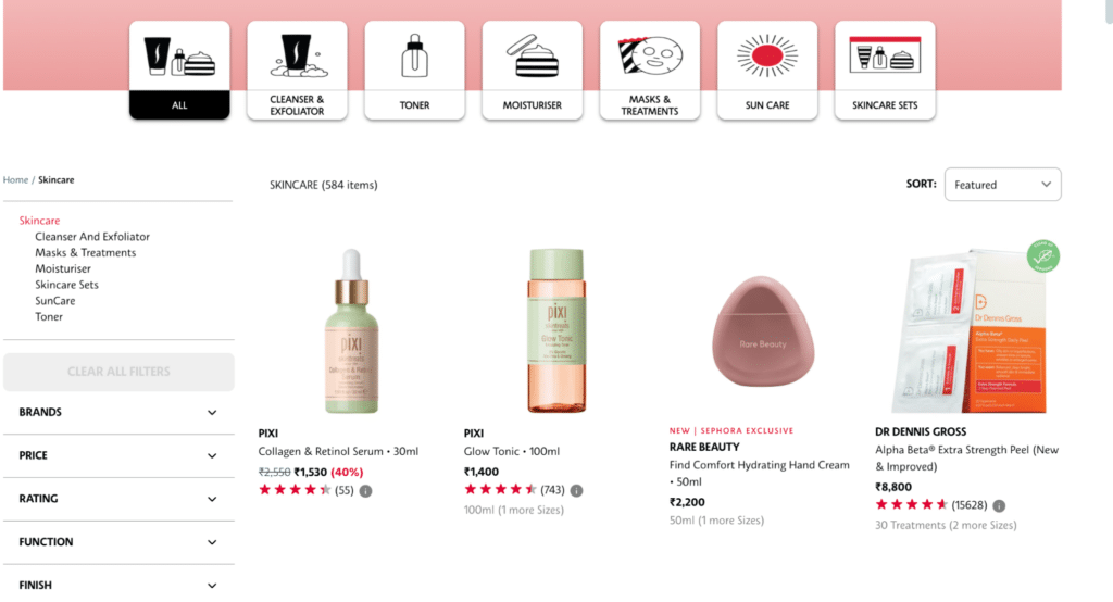
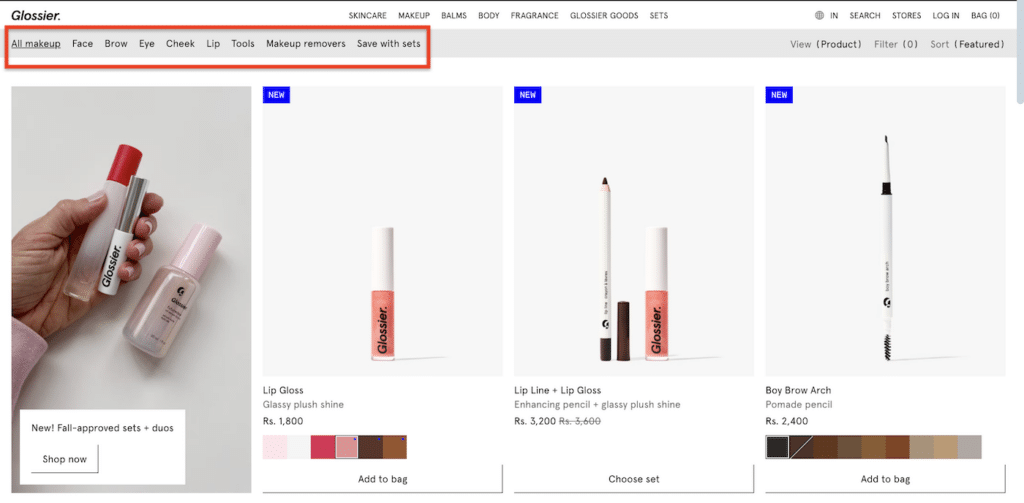
A well-structured layout is the cornerstone of a successful category page. The visual hierarchy must guide the user’s eye toward the products while providing the tools necessary to refine the search. Industry leaders like Sephora and Glossier have set benchmarks for how clarity in design translates to user satisfaction.
Header and Category Titles
The category title serves both a functional and an SEO purpose. It must be clear and descriptive, such as “Women’s Running Shoes” rather than vague marketing jargon. Clear titles improve the user’s sense of place within the site’s taxonomy and help search engine crawlers index the page for relevant high-volume keywords.
Advanced Filtering and Sorting
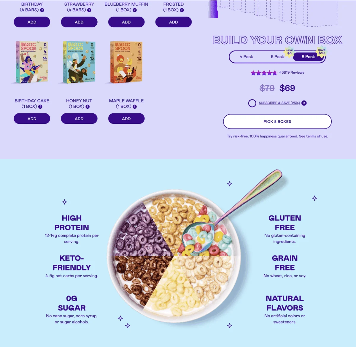
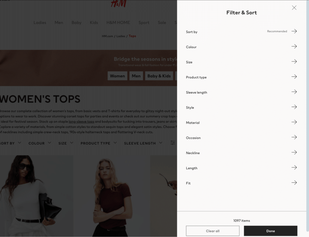
For retailers with extensive inventories, robust filtering is non-negotiable. H&M, for example, provides filters that go beyond size and price, including material type, neckline, and occasion. This level of granularity reduces the “noise” for the consumer. Sorting options—such as “Newest Arrivals,” “Price: Low to High,” and “Customer Ratings”—allow users to organize the data according to their personal shopping logic.
Product Listings and Imagery
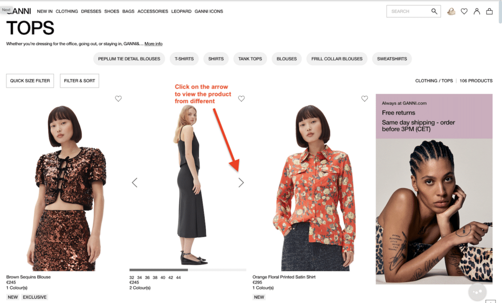
High-quality, consistent imagery is essential. Brands like Ganni utilize multi-angle shots and zoom-on-hover features that allow customers to inspect fabric textures without leaving the category page. This reduces the number of clicks required to make a decision, streamlining the path to purchase. Furthermore, concise product descriptions that highlight key benefits, such as “Sustainable Material” or “Water-Resistant,” provide immediate value.
The Mobile Commerce Mandate
The urgency for mobile optimization cannot be overstated. Current market analysis indicates that by 2025, approximately 79% of all e-commerce sales will be conducted via mobile devices. This shift requires a departure from traditional desktop layouts. Mobile-friendly category pages must feature “thumb-friendly” navigation, with large buttons and easy-to-tap filters.
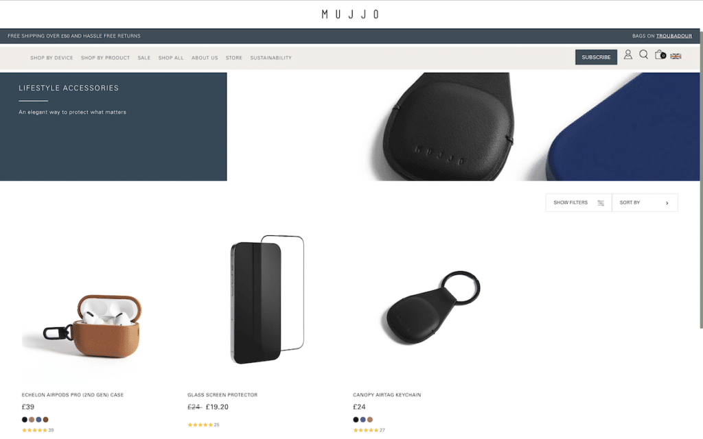
Mujjo, a premium tech accessory brand, exemplifies this minimalist approach. Their mobile interface utilizes ample white space and simplified product grids to prevent the screen from feeling cramped. For mobile users, page load speed is a critical factor; a delay of even one second can result in a 7% reduction in conversions. Consequently, technical optimizations such as lazy loading for images and the use of Content Delivery Networks (CDNs) are vital for maintaining mobile performance.
Enhancing User Experience Through Intuitive Navigation
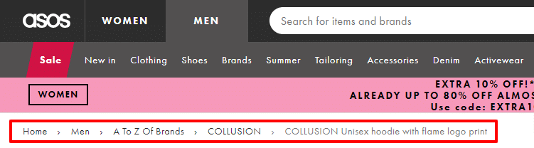
User experience (UX) is the invisible hand that guides a shopper through a digital store. Beyond the product grid, the surrounding navigation elements play a vital role in retention. Breadcrumb trails, for instance, provide a “map” for the user, allowing them to jump back to a broader category (e.g., Home > Men’s Apparel > Jackets) without using the browser’s back button.
Additionally, the implementation of “trust signals” on category pages can significantly impact conversion. Displaying star ratings and the number of reviews directly under the product name provides social proof. For long-scrolling pages, a “Back to Top” button is a simple yet effective tool to improve usability. Analysts suggest that these small UI enhancements collectively contribute to a more professional and reliable brand image.
Content Strategy: SEO and Promotional Psychology
Category pages are often the highest-ranking pages on an e-commerce site for broad search terms. Therefore, integrating SEO best practices is essential for organic growth. This involves researching targeted keywords—such as “keto-friendly cereal” for a brand like Magic Spoon—and incorporating them into H1 tags, meta descriptions, and on-page copy.

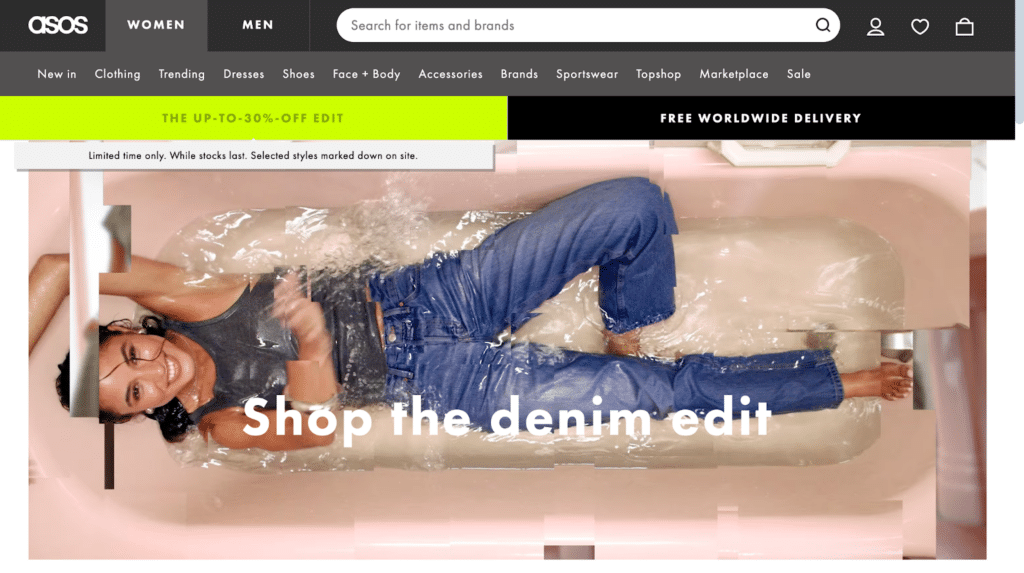
The use of category descriptions at the top or bottom of the page provides an opportunity to build internal links and satisfy search engine algorithms. However, this content must remain user-centric. In addition to SEO, promotional content can act as a powerful nudge. ASOS strategically places “limited time offer” banners and “free delivery” notices at the top of category pages to create a sense of urgency. This psychological trigger encourages shoppers to act quickly, increasing the likelihood of a conversion during that specific session.
Data-Driven Iteration: The Role of Analytics
The launch of a category page is not the final step but rather the beginning of an ongoing optimization cycle. Modern retailers use sophisticated tools like FigPii or Hotjar to monitor user behavior through heatmaps and session replays. These tools reveal where users are clicking, how far they are scrolling, and where they encounter friction.
A/B testing is a fundamental component of this analysis. By testing two versions of a category page—one with a sidebar filter and one with a horizontal top-bar filter, for example—retailers can make data-backed decisions that improve the bottom line. Monitoring metrics such as “Exit Rate” on specific category pages can help identify inventory issues or technical bugs that may be driving customers away.
Broader Industry Implications and Future Outlook
The optimization of e-commerce category pages has broader implications for the retail industry, particularly concerning Customer Acquisition Cost (CAC). As digital advertising costs continue to rise, retailers cannot afford to waste the traffic they drive to their sites. A high-converting category page ensures that the investment made in marketing translates into tangible revenue.
Furthermore, the rise of Artificial Intelligence is expected to revolutionize category pages through “hyper-personalization.” Future iterations may see category grids that automatically reorder themselves based on an individual user’s past browsing history and purchase behavior.
In conclusion, the e-commerce category page is a sophisticated engine of digital retail. By defining clear objectives, prioritizing mobile-first design, and utilizing data analytics for continuous improvement, retailers can create a browsing experience that is both efficient for the consumer and highly profitable for the business. As the digital marketplace becomes increasingly crowded, the ability to provide a clear, navigable, and engaging “digital aisle” will remain a primary differentiator for successful brands.