The psychology of color stands as one of the most potent, yet often underestimated, tools available to modern marketers. Its profound influence extends far beyond mere aesthetics, deeply impacting consumer perception, mood, and ultimately, purchasing decisions. Color instantaneously sets a mood, evokes specific emotions, and triggers subconscious psychological reactions, capable of either enhancing or diminishing the perceived value of an offering. Research consistently underscores this critical role; a staggering 90 percent of a subscriber’s initial impression of an email message or a website is formed based on color and other visual cues alone. This fundamental principle highlights why a nuanced understanding and strategic application of color psychology are indispensable for any effective marketing strategy.
The Science Behind the Shades: How Color Influences Perception
The human response to color is not arbitrary; it is rooted in a complex interplay of biology, culture, and individual experience. From an evolutionary standpoint, certain colors have innate associations – red with danger or ripe fruit, green with lush vegetation and safety. These primal connections are further shaped by cultural contexts, where colors can carry symbolic weight varying significantly across different societies. For marketers, recognizing these underlying mechanisms is crucial. Studies have shown that color can cause an 80% increase in a consumer’s recognition of a brand, making it an incredibly important component of brand identity. Furthermore, a significant 84.7% of consumers surveyed consider color important when making a product purchase, emphasizing its direct link to commercial success. This connection between color use and customer perception of a brand is well-documented, urging businesses to meticulously craft their color palettes to align with desired brand attributes.
A Historical Glimpse: Color’s Evolving Role in Commerce
While modern marketing has systematized the study of color psychology, the use of color to influence human behavior in commerce is far from new. Ancient civilizations utilized pigments in art and architecture to evoke spiritual or emotional responses. Early marketplaces relied on vibrant displays to attract attention, though often without a formalized understanding of psychological impact. The industrial revolution brought mass production and, with it, the first widespread attempts to standardize branding through color. By the early 20th century, advertisers began to experiment more consciously with color to differentiate products and appeal to specific demographics. However, it is in the digital age, with the advent of sophisticated analytics and A/B testing, that color psychology has truly matured into a data-driven science, allowing marketers to precisely measure and optimize its impact across various digital touchpoints.
Decoding the Spectrum: Individual Color Meanings and Marketing Applications
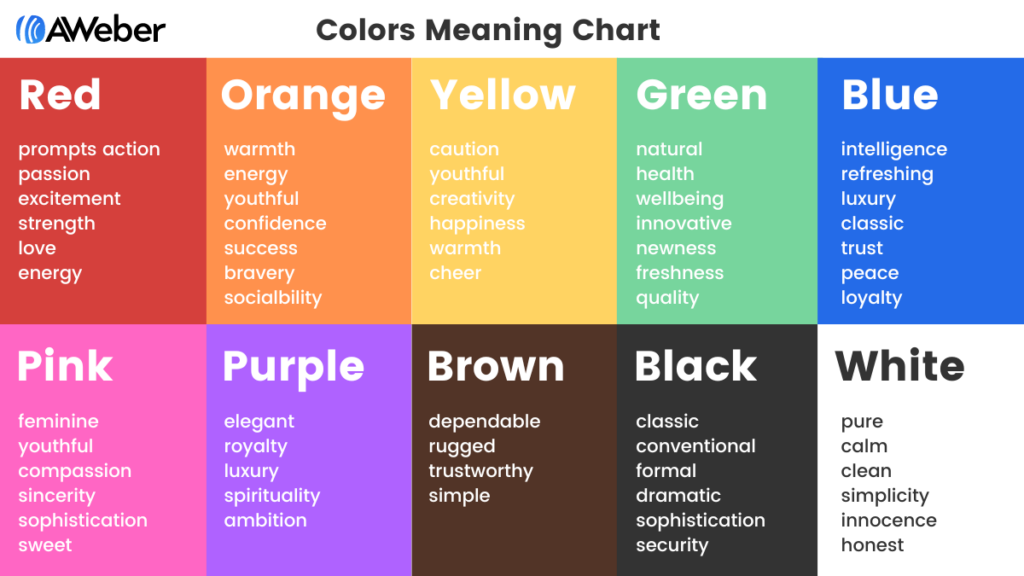
Each color in the spectrum carries its own unique psychological baggage, influencing perceptions in distinct ways. Leveraging these associations requires a deep understanding of their inherent meanings and how they can be applied to specific marketing objectives.
-
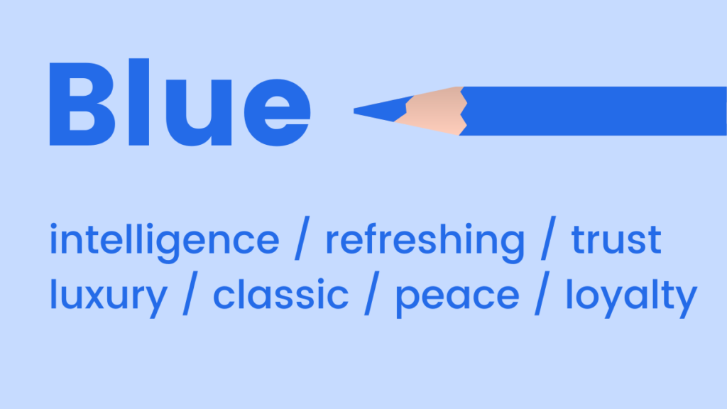
Blue: Often associated with feelings of coolness, calmness, and serenity, blue’s mood-boosting properties signal the body to produce calming chemicals, promoting positivity. Light blue can offer a refreshing touch, ideal for brands emphasizing clarity, innovation, or a gentle approach. Dark blue, conversely, is a classic choice for brands aiming to convey luxury, trust, professionalism, and stability without the starkness of black. Major financial institutions, tech companies, and healthcare providers frequently utilize blue to instill confidence and reliability. Its prevalence in corporate branding underscores its universal appeal in projecting dependability.
- Marketing Applications: Ideal for corporate websites, trust-building content, technology products, health and wellness, financial services, or any brand seeking to project professionalism and security.
-
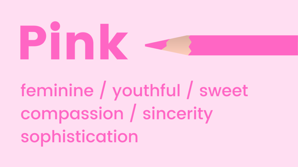
Pink: Youthful, fun, and exciting, pink is a versatile color that can emphasize femininity, sweetness, and playfulness. Interestingly, studies suggest that certain pink tones can even stimulate a craving for sugar, making it a powerful choice for confectionery or dessert brands. Its softer shades can convey tenderness and compassion, while brighter hues project vibrancy and energy.
- Marketing Applications: Excellent for beauty products, children’s brands, feminine hygiene, confectionery, or campaigns targeting a younger demographic seeking a cheerful and approachable feel.
-
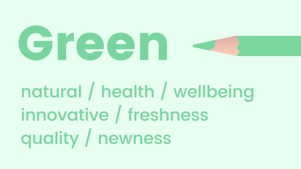
Green: Strongly reminiscent of natural elements, health, and well-being, green is a soothing choice that promotes feelings of relaxation, harmony, and balance. It is also the color to which the human eye is most sensitive, allowing for the discernment of numerous shades. Due to its fresh and organic feel, green is superb for promoting new products or features, signifying growth and innovation. It is also deeply associated with environmentalism and sustainability.
- Marketing Applications: Perfect for eco-friendly products, organic food, health supplements, financial growth services, outdoor brands, or launches of new features that promise improvement or freshness.
-
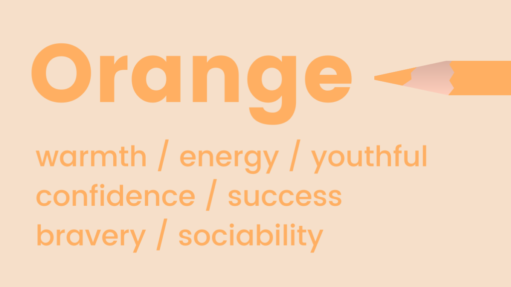
Orange: Representing warmth, energy, and enthusiasm, orange is a flamboyant and fun color often used to convey positivity and optimism. It combines the energy of red with the happiness of yellow. Beyond its vibrant appeal, orange is often associated with trust and safety, particularly in its more muted or earthy tones. Its stimulating nature makes it excellent for calls to action.
- Marketing Applications: Effective for creative services, entertainment, youth-oriented brands, food and beverage, or to draw attention to call-to-action buttons. A "Pro Tip" for marketers is to gradually introduce orange through images if the color feels too bold for a primary brand palette, easing consumers into its energetic embrace.
-
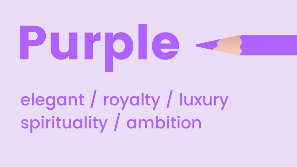
Yellow: Like orange, shades of yellow symbolize positivity and optimism, often hailed as the happiest color in the spectrum. Psychologically, yellow is known for activating memory, stimulating mental processes, and encouraging communication. Its high visibility makes it an effective color for capturing attention. However, overuse or certain drab shades can sometimes evoke caution or cheapness, so careful application is key.
- Marketing Applications: Great for leisure and travel brands, children’s products, educational content, or to highlight key information and calls to attention. Its cheerful disposition can instantly lift spirits.
-
Black: A classic and timeless choice, black often represents formality, sophistication, and power. The concept of "black tie" events immediately brings to mind elegance and exclusivity. Intriguingly, black also implies weight; people tend to perceive a black box as heavier than an identical white one. In branding, black conveys luxury, authority, and professionalism, making it a staple for high-end goods.
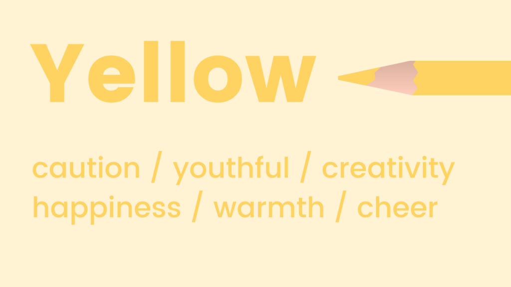
- Marketing Applications: Ideal for luxury brands, high-tech products, formalwear, photography, or any brand aiming to project exclusivity, strength, and timelessness. It also provides strong contrast for other colors.
-
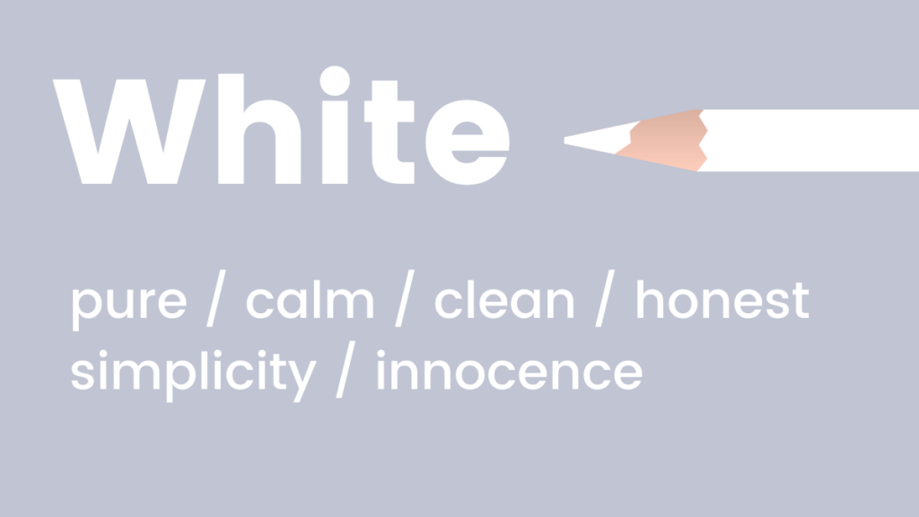
White: Exuding coolness, calmness, and serenity, white is an excellent choice for brands seeking to convey modernity, freshness, purity, and simplicity. It often represents new beginnings and cleanliness. White space in design is crucial for readability and creating a sense of openness, allowing other elements to breathe and stand out.
- Marketing Applications: Suitable for minimalist brands, healthcare, bridal, technology, or products that emphasize cleanliness, purity, and simplicity. It provides an excellent canvas for highlighting other colors.
-
Purple: Luxe and elegant, purple is an in-between shade that combines the stability of blue with the energy of red. Historically associated with royalty and nobility, it still carries connotations of sophistication, mystery, and creativity. Purple is also known to encourage creativity and problem-solving, making it appealing for innovative brands.
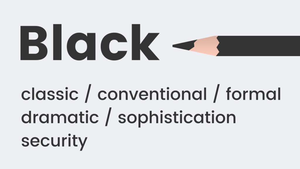
- Marketing Applications: Excellent for luxury goods, creative industries, beauty products, spiritual services, or brands seeking to convey uniqueness, wisdom, and imagination.
-
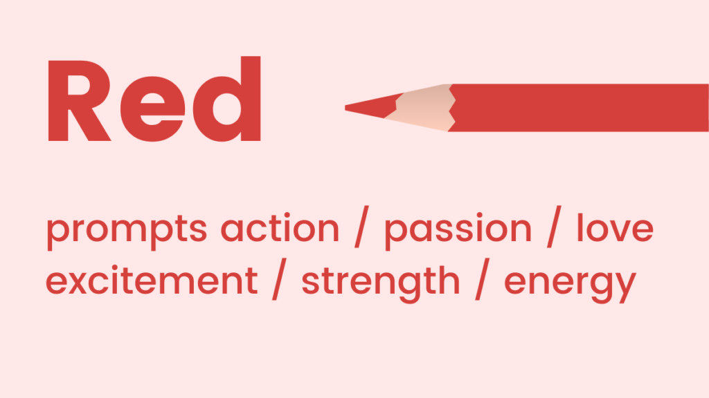
Red: Representing passion, adrenaline, and action, red is a high-energy color that can boost energy levels and quicken the heart rate. It is highly visible and commands attention, making it effective for signaling urgency or importance. While it can evoke strong positive emotions like love and excitement, it can also signal danger or aggression, requiring careful deployment.
- Marketing Applications: Powerful for sales promotions, urgency-driven calls to action, food brands (as it can stimulate appetite), automotive, or any campaign where drawing immediate attention and inspiring action are paramount.
Strategic Color Schemes for Digital Platforms
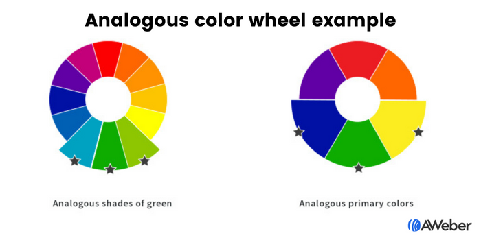
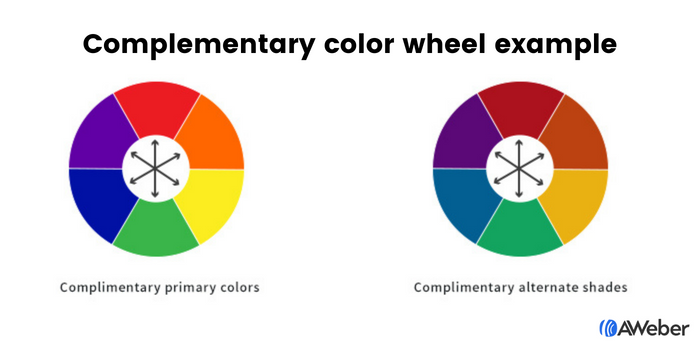
Beyond individual color meanings, the combination of colors forms a scheme that dictates the overall aesthetic and emotional resonance of a digital presence. For websites, landing pages, and sign-up forms, two primary color theories prove particularly effective: analogous and complementary.
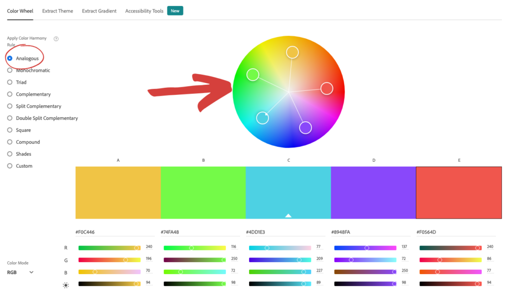
Analogous Colors: These are colors located adjacent to each other on the color wheel. For instance, blue, green, and yellow, or different shades within a single color family. This scheme creates a harmonious and visually pleasing design that is easy on the eyes. It simplifies the color selection process, as one can identify two harmonious colors simply by looking at their neighbors on the wheel. Tools like Adobe Color CC allow designers and marketers to easily find analogous color combinations, ensuring a cohesive look. This approach is ideal for creating a calm, unified, and aesthetically balanced user experience.
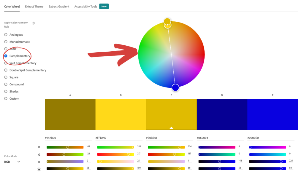
Complementary Colors: Found on opposite sides of the color wheel (e.g., blue and orange, green and red, purple and yellow), complementary colors offer high contrast and visual dynamism. These pairings are inherently eye-catching and can make elements "pop," especially when moving beyond primary colors. They are visually appealing and create a strong focal point, ideal for drawing attention to specific elements. Again, tools like Adobe Color CC are invaluable for generating these impactful combinations. This scheme is excellent for creating vibrancy and directing user focus.
Optimizing Sign-Up Forms: The Power of Contrast
For sign-up forms, visibility and clarity are paramount. Color plays a pivotal role in ensuring these forms are noticed and completed. The principle of contrast is particularly powerful here.
- Contrast Between the Form and the Site: Making the sign-up form’s background a contrasting color to the main website background naturally draws the eye to the form. This visual separation signals importance and prompts engagement.
- Contrast Within the Form: Once the user’s attention is on the form, the form fields and, most crucially, the call-to-action (CTA) button must be highly noticeable. Using contrasting shades for these elements—such as a vibrant button color against a more subdued form background—creates a clear visual hierarchy. For example, a black form with yellow fields and a white CTA button effectively guides the eye through the necessary steps. Complementary colors can be used to make the button and form backgrounds both complement and contrast, creating an undeniable invitation to "click here."
Email Marketing Nuances: Tailoring Color to Objective
The strategic use of color extends significantly to email marketing, where each email type has distinct objectives.
- Email Newsletters: These typically deliver regular updates, news, or educational content. A minimalist approach with ample white space and subtle brand color splashes is often best. The primary goal is content consumption, so excessive colors that distract from the text should be avoided. However, if the newsletter includes links to blog articles or videos, a strategically placed, contrasting call-to-action button is essential to guide readers to the next step.
- Welcome Emails: As one of the first interactions with a brand, welcome emails are crucial for reinforcing visual identity. Utilizing core brand colors here helps establish immediate recognition and familiarity, setting the tone for future communications.
- Sales Emails: The color choices in sales emails depend heavily on the specific offer and desired emotional response. Applying the individual color psychology principles discussed earlier—e.g., red for urgency, green for freshness, purple for luxury—can significantly influence the effectiveness of the sales message.
Examining how successful brands deploy color in their emails offers practical insights:
- Blue: Warby Parker uses pale blue for a refreshing vibe, while Everlane opts for dark blue to convey luxury and sophistication.
- Pink: Lyft employs pink in welcome emails to project friendliness and an approachable brand personality.
- Green: Offscreen effectively uses a green palette to promote products, creating a feeling of relaxation and natural appeal.
- Yellow: Lego consistently uses yellow in its branding and emails, recognizing its appeal to children and its association with happiness and playfulness.
- Black: Harry’s uses an all-black email to position its product as classic and sophisticated, with a white CTA button ensuring visibility. A simpler alternative is the classic black-on-white combination for universal appeal.
- White: The Little White Company’s campaigns predominantly use white to portray a calm, pure, and clean brand image.
- Purple: Stuart Weitzman cleverly incorporates its signature purple shoebox in abandoned cart emails, reinforcing its luxe and elegant brand identity.
Brand Identity and Adaptability: Evolving with Color
The challenge for established brands lies in integrating these color psychology principles while maintaining a consistent brand aesthetic. However, brand identity is not static; it evolves. Sometimes, breaking free from a rigid brand standards document to embrace a color that better serves a specific marketing goal is necessary. Just as a person’s style changes over time while their core identity remains, a brand’s visual language can adapt. Tools like Coolors allow brands to input existing brand colors and then suggest harmonious or contrasting colors that complement the established palette, facilitating this evolution without abandoning core identity. This flexibility enables businesses to adapt to new marketing trends, target diverse audiences, or highlight new product lines effectively.
The Future of Color in Marketing: AI-Powered Design
The landscape of marketing design is rapidly changing, with artificial intelligence poised to revolutionize how marketers harness the power of color. AI-powered design tools are emerging, democratizing sophisticated color application for non-designers. AWeber’s AI Signup Form Builder, for instance, allows users to describe their desired form—its look, feel, and vibe—and the AI constructs it. Marketers can upload screenshots of preferred designs or articulate specific color intents, such as "a dark background with an orange button that pops." The AI understands the psychological intent behind color choices, allowing for highly customized, audience-specific designs without manual drag-and-drop.
Looking ahead, the same AI-powered "describe-it-and-build-it" experience is expected to extend to email and landing page builders. Marketers will soon be able to dictate a "clean, white newsletter layout with a red CTA" or a "purple, luxury-feel landing page with gold accents," and the AI will execute the design. This advancement transforms the principles of color psychology from theoretical knowledge into direct input for automated design, empowering marketers to apply these insights with unprecedented ease and precision. By leveraging AI, businesses can ensure their visual communication is not only aesthetically pleasing but also strategically aligned with the psychological drivers of consumer behavior, making every marketing touchpoint more effective.