
The newsletter signup form stands as the singular, pivotal gateway between a casual website visitor and a burgeoning email list, serving as the initial point of data collection that integrates a prospective subscriber into an email platform for ongoing communication. While many small businesses tend to deploy a basic form and subsequently overlook its strategic importance, this approach frequently leads to missed opportunities. Common deficiencies include excessive data requests, insufficient articulation of value propositions, and static, inconspicuous placement, collectively presenting three distinct junctures where a potential subscriber may disengage before receiving their inaugural email. Addressing these fundamental flaws is critical for maximizing list growth and fostering robust subscriber engagement.
Streamlining Data Collection: The Essential Fields for Conversion
The foundation of an effective newsletter signup form begins with minimalism: an email address field and a clear "subscribe" button. This baseline is established for a compelling reason: each additional field introduced into a form directly correlates with increased friction, which invariably diminishes conversion rates. For the vast majority of small business newsletters, the email address alone provides all the necessary information to deliver value effectively to the subscriber.
-
The Strategic Inclusion of a First Name Field: The decision to incorporate a first name field should be contingent upon a concrete plan for personalization within the newsletter content. Addressing a subscriber by their name, such as "Hey Sean," rather than a generic "Hey there," has been statistically shown to potentially enhance open rates. However, this benefit materializes only if the email content consistently utilizes the collected name through merge tags. If there is no explicit strategy to leverage the subscriber’s name in subsequent email communications, omitting this field is advisable. Removing even one field can significantly reduce the cognitive load and perceived barrier to entry, thereby mitigating reasons for visitor abandonment. Studies by various email marketing platforms frequently indicate a 5-10% increase in conversion rates for forms that reduce fields from three to two.
-
Fields to Rigorously Exclude from Newsletter Forms: Certain data fields, including phone number, company name, job title, and physical address, are largely inappropriate for a standard newsletter signup. These fields are typically reserved for lead capture forms associated with gated content, sales inquiries, or more intensive business-to-business (B2B) engagements. Their presence on a newsletter form sends an unintended signal, suggesting that the sender is seeking significant personal or professional information from the subscriber before any value has been reciprocated. Collecting data that will not be actively utilized in the immediate context of newsletter delivery is not only inefficient but can also erode trust and deter sign-ups, as visitors may perceive it as an unwarranted intrusion or a prelude to aggressive sales tactics.
Optimizing Form Visibility: Strategic Placement for Maximum Impact
The placement of a newsletter signup form is paramount to its visibility and, consequently, its conversion potential. Even the most impeccably designed form will fail to grow a subscriber list if it remains unseen. Effective placement ensures that the form intercepts visitors at opportune moments during their interaction with the website.

-
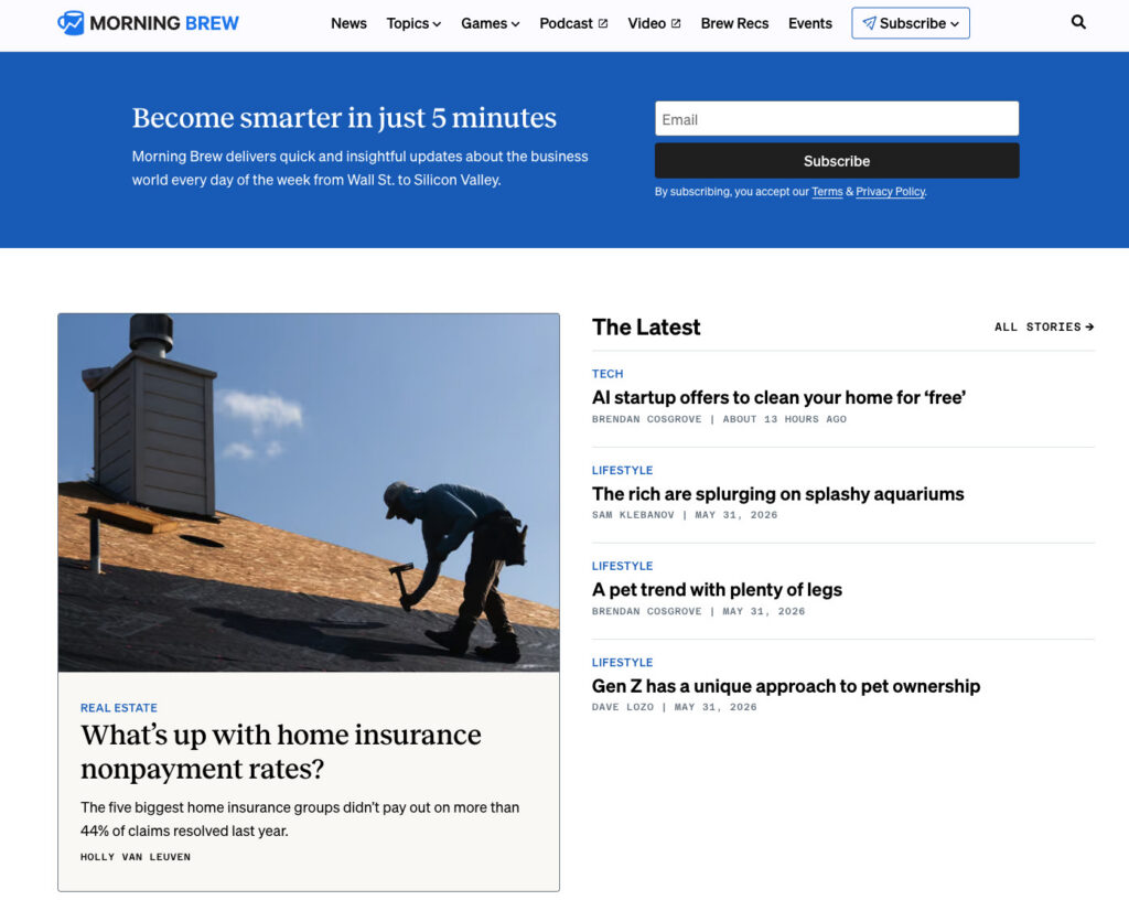
Above the Fold on the Homepage: A Prime Location: The suitability of an above-the-fold homepage placement largely depends on the primary nature of the business. For entities where the newsletter is the core product, such as prominent media newsletters like Morning Brew or The Hustle, this placement is indispensable. Visitors to these sites often arrive with the express intent of subscribing, making the form the central element of the page. Conversely, for businesses where the newsletter serves as a supportive adjunct to a primary product or service, a homepage form remains effective but must be strategically positioned to complement, rather than overshadow, the site’s primary calls to action. It should integrate seamlessly with the main message, offering an immediate value proposition without competing unduly with other crucial business objectives. Data consistently shows that elements placed above the fold receive significantly more engagement.
-
Sidebar Placement: Persistent Visibility for Engaged Readers: A sidebar signup form offers sustained visibility as visitors navigate and scroll through content. This placement is particularly effective when the newsletter’s subject matter aligns closely with the content being consumed. It presents a continuous option to subscribe without interrupting the reading flow, catering to readers who may develop an interest as they delve deeper into related topics. On desktop interfaces, sidebar forms maintain their presence alongside the main content. However, it is crucial to note that on mobile devices, many website themes reconfigure sidebars to appear below the main content. Therefore, for mobile optimization, sidebar placement should ideally be complemented by at least one other form location.
-
Dedicated Signup Page: A Comprehensive Value Proposition: A standalone page exclusively dedicated to the newsletter offers ample space to articulate the comprehensive value proposition of subscribing without the distraction of competing calls to action. This dedicated space allows for more persuasive copy, testimonials, and a detailed outline of what subscribers can expect. Such pages are ideal for linking from external sources like social media bios, podcast show notes, guest post author bylines, and any other platform where the newsletter is promoted. As business strategist Alexandra Franzen, known for building an audience solely through email, described her newsletter as "an art project," advocating for content so compelling that "every reader goes and tells ten friends about it." A dedicated signup page should embody this philosophy, focusing on selling the unique experience and intrinsic value of the subscription rather than merely the act of subscribing.
-
Header or Top Navigation Bar: Ubiquitous Accessibility: A persistent form embedded within the website’s header or top navigation bar ensures the signup option is consistently visible across every page of the site. This approach is exceptionally effective for content-rich websites where visitors tend to browse multiple pages within a single session. For optimal user experience, the form in this location should be compact, typically comprising just an email field and a concise button. Its ubiquitous presence serves as a constant, subtle reminder to subscribe, capturing interest from users who might be exploring various sections of the site.
-
Footer Placement: The End-of-Journey Opportunity: The website footer is traditionally where visitors look for supplementary information after they have consumed the main content of a page. Placing a newsletter signup form here acts as a crucial safety net, capturing individuals who have scrolled through an entire page and are sufficiently engaged to seek further interaction. It caters to those who may not have been ready to subscribe upon their initial arrival but have since found value in the site’s offerings.
-
Exit-Intent Popup: The Last-Chance Conversion: An exit-intent popup is a dynamic form that activates when a visitor’s cursor indicates an intention to leave the browser window (e.g., moving towards the close or back button). This serves as a final opportunity to present the newsletter offer before the visitor departs. The effectiveness of exit-intent popups hinges on careful implementation: they should be displayed only once per session to avoid annoyance, feature a prominent and easily accessible close button, and offer a specific, compelling benefit. For instance, "Get weekly email tips for your small business" significantly outperforms a generic "Subscribe to our newsletter" by clearly defining the value proposition and setting expectations. Data indicates that well-designed exit-intent popups can convert 2-7% of leaving visitors.
Crafting Compelling Copy: Driving Conversions Through Clear Value
The conversion efficacy of a newsletter signup form is fundamentally driven by three core elements: the clarity of the promised benefit, the transparency of the sending frequency, and the minimal effort required from the subscriber.
-
Leading with Benefit, Not Action: A common pitfall in form design is defaulting to generic calls to action such as "Subscribe to our newsletter." While this instructs the reader on what to do, it crucially fails to provide a compelling reason to do it. The word "subscribe" denotes a mechanical action, offering no insight into the value proposition. In contrast, a benefit-driven headline actively answers the visitor’s implicit question: "What’s in it for me?" For example, "Get one email per week with strategies to grow your small business" immediately addresses three key inquiries: what will I receive, how often, and is it relevant to my needs? This clarity enables visitors to make an informed decision within seconds, as the value proposition is explicitly articulated. The difference between "Subscribe to our newsletter" and "Get our Tuesday email: one tactic to grow your list this week" is profound; the latter removes all guesswork by specifying the day, the promise, and the topic.
-
Setting Frequency Expectations Upfront: This is one of the most frequently overlooked yet critical components of an effective newsletter signup form. Explicitly informing subscribers at the point of sign-up whether emails are sent weekly, twice a month, or on a specific day, significantly reduces post-subscription unsubscribes. When new subscribers receive an email without prior knowledge of the sending frequency, their initial instinct might be to unsubscribe due to perceived intrusion or unexpected volume. Transparent frequency expectations counteract this reaction, as subscribers who opted in with full awareness of the schedule are far less likely to feel surprised when an email arrives. This transparency also establishes a foundational contract of trust between the sender and the reader, creating a mutual understanding from the very first interaction. Research suggests that setting clear expectations can reduce early unsubscribes by up to 20%.
-
Utilizing a Specific Call-to-Action Button: The call-to-action (CTA) button represents the final textual element a visitor reads before committing to subscribe. Generic text like "Submit" conveys no information, while "Subscribe" offers only minimal clarity. The most potent button text mirrors and reinforces the benefit articulated in the form’s headline. If the headline promises "Weekly email marketing strategies for small businesses," the button could effectively read "Get weekly strategies" or "Send me the tips." This transforms the button from a mere mechanical instruction into a confirmation of the value being offered. Social proof can also be integrated effectively; a button stating "Join 1,200 readers" leverages the psychological principle that others have already found value in the subscription, encouraging new sign-ups. It is imperative to avoid ambiguous button text such as "Learn more" or "Get started," as these phrases fail to clearly communicate the immediate outcome of clicking, thereby introducing uncertainty.
The Evolution of Form Creation: Leveraging AI for Customization
For many years, the conventional wisdom suggested selecting a pre-designed newsletter signup form template, customizing it with brand colors and logos, and then publishing. However, this approach inherently carries a significant limitation: templates are generic, built to suit a broad, undefined audience, and often fail to capture the unique essence of a specific business or newsletter. This typically results in a backward design process, where the business adapts its offering to fit a pre-existing layout, rather than developing a form that genuinely reflects its unique value proposition.
A generic template cannot intuitively understand the specific nuances of a newsletter—such as its weekly publication schedule, its target audience (e.g., freelance designers, small business owners in the food industry), its brand voice, or its precise color palette. The business is left to fill in blanks that were conceived by an external party unfamiliar with its specific identity and objectives.
This challenge has spurred innovation, leading to solutions like the AI Signup Form Builder offered by AWeber. This advanced tool represents a paradigm shift, moving beyond static templates to dynamic, intelligent form generation. Users describe the core essence of their newsletter, and the AI system autonomously generates a complete form meticulously matched to their brand. By analyzing the website’s content and understanding its voice, the AI produces a form that seamlessly integrates with the site’s aesthetic and messaging, eliminating the need to start from a generic template. A demonstration by AWeber’s Chief Product Officer, Chris Vasquez, showcased this capability, transforming Keenya Kelly’s standard newsletter signup form into a custom-tailored, brand-aligned asset. These AI-generated forms can be embedded on any webpage, deployed as standalone landing pages, or configured as popups. They connect directly to the subscriber list, ensuring that new sign-ups are instantly ready to receive the next newsletter.
Measuring and Optimizing Performance: Data-Driven Growth

The creation of an optimized newsletter signup form is merely the first step; continuous tracking and analysis of its performance are essential to ascertain the effectiveness of placement, copy, and field choices.
-
Conversion Rate by Placement: Identifying High-Impact Zones: Monitoring sign-ups generated by each distinct form placement allows businesses to identify which locations are most effective in driving subscriptions. For example, a form embedded within a high-performing blog post might yield a 3% conversion rate, whereas a footer form might convert at 0.5%. This granular data provides invaluable insights, directing where to allocate more strategic attention and resources. Tools like AWeber’s AI Signup Form Builder often integrate this tracking capability, providing clear dashboards for performance analysis. A/B testing different headlines, CTAs, and field configurations across various placements can further refine conversion rates, typically yielding incremental improvements of 1-3%.
-
Unsubscribe Rate in the First 30 Days: A Critical Indicator: A significant unsubscribe rate within the first month of subscription often signals a mismatch between the expectations set by the signup form and the reality of the email content or frequency. A thorough review of the form copy in comparison to the actual newsletter content and sending schedule is imperative. Discrepancies between what was promised and what is delivered are the most common catalysts for early subscriber churn. Addressing these misalignments is crucial for building a high-quality, engaged subscriber base and preventing resource wastage on acquiring subscribers who quickly disengage. High initial unsubscribe rates can erode sender reputation and impact future email deliverability.
Concluding Insights: The Strategic Imperative of Form Optimization
A newsletter signup form is far more than a simple data collection tool; it is a critical marketing asset that dictates the initial quality and long-term engagement potential of an email list. By adhering to best practices—minimizing fields, crafting benefit-driven copy, setting clear frequency expectations, utilizing specific calls to action, and strategically placing forms—businesses can significantly enhance their subscriber acquisition efforts. The advent of AI-powered form builders further streamlines this process, allowing for highly customized and effective forms without extensive manual design. Continuous measurement of conversion rates and early unsubscribe rates provides the feedback loop necessary for ongoing optimization, ensuring that the newsletter remains a potent channel for customer engagement and business growth. Ultimately, a well-optimized signup form is foundational to building a sustainable and valuable relationship with one’s audience.