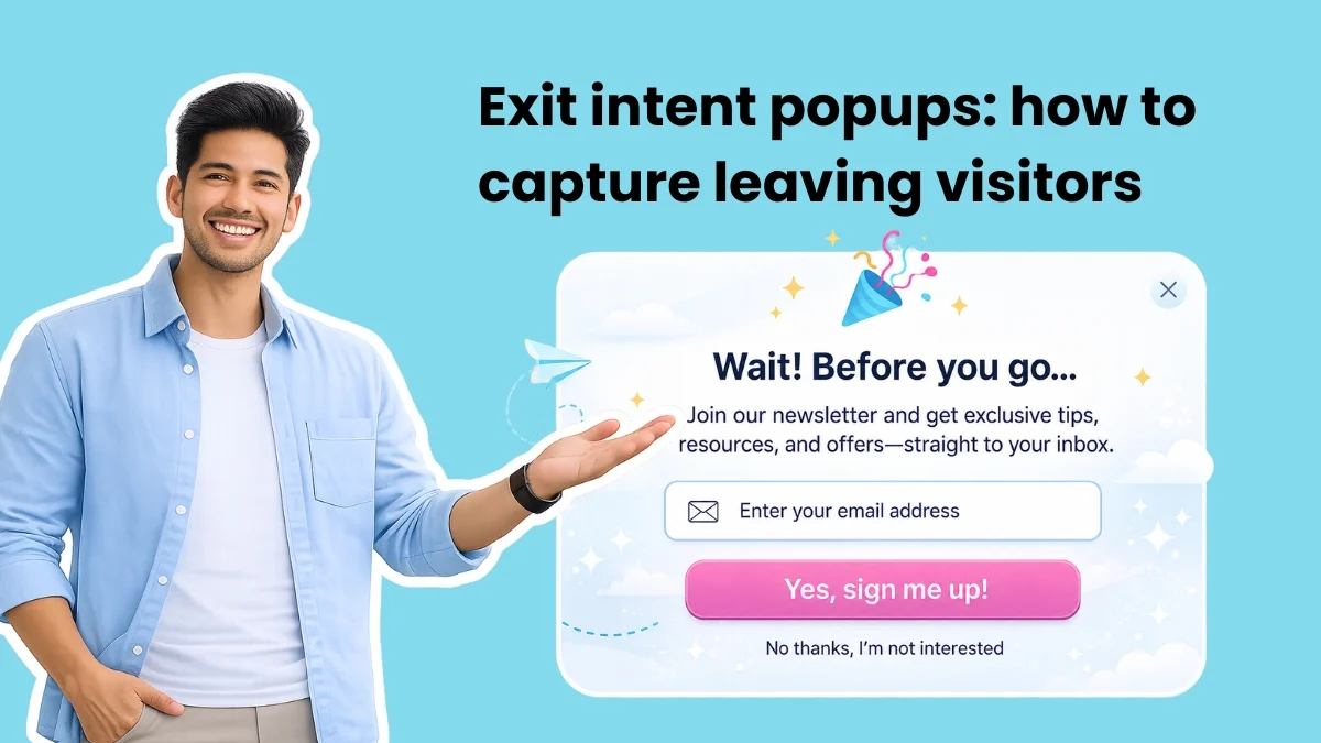
An exit-intent popup represents a sophisticated digital marketing tool, appearing as a signup form when a visitor signals their intention to leave a website, typically by moving their cursor toward the browser’s close button or address bar on desktop, or by exhibiting specific navigational behaviors on mobile devices. This precisely timed intervention offers a critical, final opportunity to engage a user who is moments away from abandoning the site, transforming a potential lost lead into a valuable conversion point. Its efficacy lies in its non-intrusive nature during active browsing, deploying only once the visitor has consumed content, formed an opinion, and made a decision to depart. At this exact juncture, a strategically relevant offer can reframe the exit as a decision-making moment, rather than an interruption.
The Evolving Landscape of Digital Engagement and Abandonment
In the highly competitive digital realm, website abandonment poses a significant challenge for businesses across all sectors. Industry reports consistently indicate high bounce rates and substantial cart abandonment figures. For instance, data from Statista suggests that the average cart abandonment rate globally hovers around 70-80%, representing billions of dollars in lost revenue annually. Similarly, bounce rates, which measure the percentage of visitors who navigate away from a site after viewing only one page, can range from 20% to 90% depending on the industry and site type. Each visitor acquired represents an investment in marketing and advertising, making the retention of even a small percentage of departing users economically impactful.
The concept of popups in web design has evolved considerably since its inception. Early iterations were often perceived as disruptive, appearing without warning and hindering the user experience. However, advancements in web technology and user experience design have led to the development of more intelligent, behavior-triggered popups. Exit-intent technology emerged as a direct response to the need for a less intrusive yet highly effective method of capturing user attention. By waiting for a clear signal of departure, these popups circumvent the primary criticism leveled against their predecessors: interruption. They instead offer a polite, last-ditch effort to provide value or address unfulfilled needs, aligning with a more customer-centric approach to online marketing. This shift has allowed exit-intent popups to gain widespread acceptance as a legitimate and powerful conversion optimization tool.
Understanding the Mechanics of Exit-Intent Detection
The sophisticated timing and deployment of exit-intent popups are underpinned by distinct technological mechanisms tailored for different device types.
On desktop browsers, the detection relies primarily on JavaScript tracking of the visitor’s mouse movements. A small script embedded on the webpage continuously monitors the cursor’s velocity and trajectory. When the cursor accelerates rapidly and moves towards the top edge of the browser window – specifically targeting areas like the browser’s tab bar, URL bar, or close button – the script interprets this pattern as an imminent intent to leave. Upon identifying this signal, the popup is "fired" or displayed just before the user can fully exit the page. This proactive interception allows the website to present a final offer, question, or piece of information.
Mobile environments, lacking a traditional cursor, necessitate an entirely different approach. Exit-intent triggers on smartphones and tablets respond to specific behavioral cues that signify an intent to depart. These signals can include:
- Pressing the device’s back button: A common action for users attempting to navigate away from a page or return to previous content.
- Switching tabs or applications: Indicates a user’s diversion of attention from the current website.
- Fast-scrolling back to the top of a page: While not always an exit signal, rapid vertical movement can sometimes indicate a user searching for navigation or preparing to close the tab.
- Device orientation changes or app switching events: More advanced implementations might leverage these system-level signals.
The development of these mobile-specific triggers has been crucial in adapting exit-intent technology for an increasingly mobile-first internet, ensuring that the strategy remains effective across all user touchpoints.
Strategic Implementation: Crafting High-Impact Offers
The effectiveness of an exit-intent popup hinges not just on its timing, but crucially on the relevance and perceived value of its offer. A generic, one-size-fits-all popup is less likely to convert than a highly targeted message. Digital marketers have identified several high-performing patterns for exit-intent offers, each tailored to specific contexts and user intents:
-
The Content Upgrade:
- Best for: Blog posts, resource pages, educational content.
- Context: A visitor has just finished reading a valuable piece of content. Their interest in the topic is high.
- Strategic Angle: Offer an expanded, downloadable version of the content, a related checklist, template, ebook, or exclusive research. This leverages the user’s existing engagement with the content.
- Style Idea: A small, compelling preview thumbnail of the PDF or resource on one side, paired with a clear headline emphasizing the benefit and a single email field on the other. This visual cue reinforces the value proposition.
-
The Discount Offer:
- Best for: E-commerce sites, service businesses with introductory pricing, product pages.
- Context: A user has browsed products or pricing, potentially adding items to a cart, but is now hesitating or comparing options.
- Strategic Angle: Provide an immediate incentive, such as a percentage off the first purchase, free shipping, or a limited-time bundle offer. This addresses price sensitivity or decision paralysis.
- Style Idea: Utilize a bold background color from the brand palette. A large, prominent percentage number (e.g., "15% OFF") serves as the focal point, with minimal supporting copy. A single email field leads to a high-contrast call-to-action button, making the conversion path unambiguous.
-
The Quiz or Assessment:
- Best for: Consultants, coaches, SaaS companies with multiple plans, businesses offering personalized solutions.
- Context: Users are likely seeking solutions to specific problems or trying to determine the best fit for their needs.
- Strategic Angle: Engage users with an interactive quiz that promises personalized results, recommendations, or insights. This offers value beyond a simple discount and can gather valuable lead qualification data.
- Style Idea: Incorporate progress dots at the top to indicate advancement, displaying only one question at a time to reduce cognitive load. Soft gradients or illustrated backgrounds can make the experience feel approachable and less corporate, encouraging participation.
-
The Newsletter/Community Sign-up:
- Best for: News outlets, community-driven platforms, content creators, thought leaders.
- Context: The visitor has engaged with general site content and might be interested in ongoing updates or being part of a larger conversation.
- Strategic Angle: Highlight the benefits of joining a community or subscribing to a newsletter, emphasizing exclusivity, valuable insights, or connection. Social proof, like the number of existing subscribers, can be highly effective.
- Style Idea: Minimalist design, where the subscriber count or a key benefit number is the hero element, large and bold. One or two concise lines of supporting copy explain the value, followed by a single email field.
-
The Free Tool/Resource:
- Best for: SaaS companies, financial services, marketing tools, B2B businesses.
- Context: Users are often researching solutions, comparing tools, or looking for practical applications.
- Strategic Angle: Offer immediate access to a free calculator, trial, template, or diagnostic tool that solves a specific problem for the user. This showcases product value without requiring a purchase.
- Style Idea: A dark background can make a screenshot or animation of the tool in action pop. The headline should focus on the tangible output or benefit (e.g., "See your email ROI in 30 seconds," "Calculate Your Savings Now").
-
The "Before You Go" Reminder:
- Best for: Cart abandonment pages, pricing pages, booking platforms.
- Context: The user has indicated a clear intent (e.g., adding items to a cart, configuring a service) but is now leaving before completing the transaction.
- Strategic Angle: A gentle reminder about items in their cart, an expiring offer, or key benefits of completing their action. The goal here is often to facilitate a return to the cart or complete the purchase, not necessarily to capture an email.
- Style Idea: A compact card format works well, perhaps featuring a product image or a screenshot of the page the user is leaving. Short, direct reminder copy (e.g., "Don’t forget your items!", "Special offer expires soon!") on the right, with a clear call-to-action button in a contrasting color. An email field is typically not needed if the primary goal is re-engagement with the current session.
These diverse patterns demonstrate the versatility of exit-intent technology, moving beyond simple newsletter sign-ups to address a wide array of conversion goals.
Advanced Creation Methods: Traditional vs. AI-Powered Builders
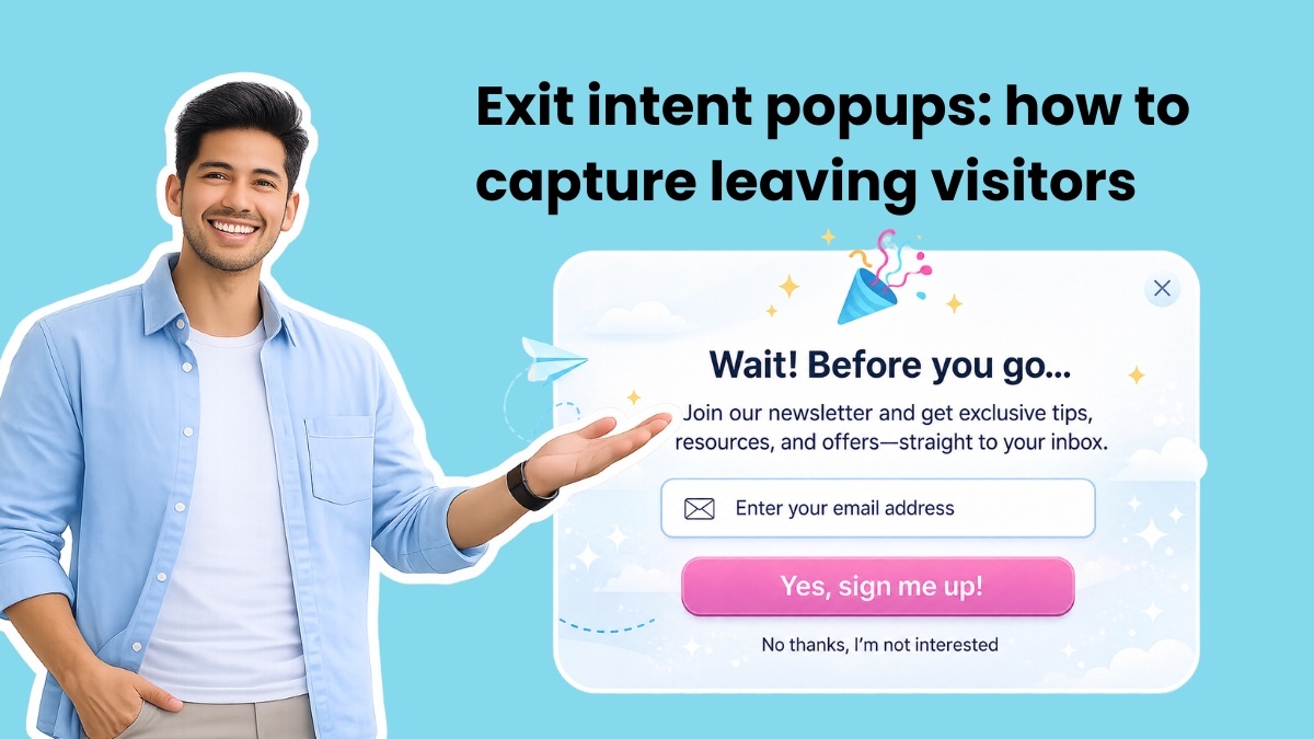
The process of creating exit-intent popups has become increasingly streamlined, with two primary approaches dominating the market:
Traditionally, most drag-and-drop form builders, whether standalone popup tools or plugins for platforms like WordPress or Shopify, adhere to a two-step process. First, users design the visual aspects of the form using a visual editor. This involves selecting a layout, adding headlines, fields, setting colors, and connecting it to an email marketing platform. Subsequently, in a separate targeting or display settings interface, users configure the trigger by selecting "exit intent." Additional parameters such as page targeting (where the popup appears), frequency (once per visit, once per week), and mobile display options are also set here. While functional, this method often requires multiple rounds of setup and can lead to design decisions being made before the trigger logic is fully considered, potentially resulting in a less integrated user experience.
A more recent advancement comes in the form of AI-powered builders, exemplified by platforms like AWeber’s AI Signup Form Builder. This approach simplifies the entire process by allowing users to create exit-intent popups from a single text prompt. For instance, a user might simply instruct, "create a popup offering my free email marketing checklist, triggered on exit intent." The AI then generates a fully designed form, complete with relevant copy, brand-consistent colors, and the exit trigger already configured. Once generated, the implementation on the website requires only a single JavaScript snippet to be installed. Any subsequent modifications made within the AI builder automatically update across the site, eliminating the need for further code interaction. This method drastically reduces setup time, ensures design and trigger logic are inherently aligned, and centralizes management.
Optimizing for Success: Key Best Practices
Maximizing the conversion rates of exit-intent popups requires adherence to several best practices focused on user experience and strategic targeting:
-
Ask for One Field Only: The primary goal of an exit-intent popup is to capture an initial lead. Every additional field (name, phone number, company) introduces friction and increases the likelihood of the visitor closing the popup without completing it. Data from various A/B tests consistently shows that reducing form fields significantly boosts conversion rates. The email address is typically sufficient for initiating a relationship; more detailed information can be collected later through a progressive profiling strategy within a welcome email sequence.
-
Page-Specific Offers: Blanket, sitewide popups are less effective than tailored messages. A visitor leaving a pricing page has a distinct intent compared to someone exiting a blog post. The pricing page visitor might respond well to a free trial offer or a limited-time discount, whereas the blog reader is more likely to engage with a content upgrade related to the article they just read. Segmenting offers based on the specific page content or user journey significantly improves relevance and, consequently, conversion rates.
-
Control the Frequency: Over-exposing visitors to the same popup can lead to annoyance and a negative brand perception. If a user closes a popup on Monday and encounters the identical one on Tuesday, it signals a lack of responsiveness. A common recommendation is to display a popup no more than once per week for most websites. For high-traffic sites with low repeat visitors, once per session might be acceptable. Implementing cookie-based frequency capping ensures a smoother user experience.
-
Make Closing Easy: User trust is paramount. Popups should feel like a helpful suggestion, not a trap. A clearly visible "X" button and an explicit "No thanks" link empower the user to dismiss the popup without frustration. Employing dark patterns, such as tiny or hidden close buttons, or using "shame-based" decline copy (e.g., "No, I don’t want to grow my business") can create resentment and damage brand reputation, ultimately undermining long-term engagement.
-
Design for Mobile Responsiveness: With mobile traffic often surpassing desktop, optimizing for smaller screens is non-negotiable. Full-screen takeovers on mobile devices are often penalized by search engines like Google for obstructing content, negatively impacting SEO. Instead, mobile-optimized designs like bottom banners or half-screen overlays are recommended. These formats convert better and adhere to Google’s guidelines against intrusive interstitials. Additionally, ensuring close buttons are large enough to tap comfortably, without accidentally triggering the signup button, is crucial for mobile usability.
-
Test the Offer, Not Just the Design: While design plays a role, the core offer is the primary driver of conversion. A/B testing different offers is critical for uncovering what truly resonates with your audience. For instance, testing "10% off" against "free shipping" for an e-commerce store, or a PDF checklist versus a video course for a content site, can yield surprising results. Similarly, experimenting with different value propositions like "Join 10,000 subscribers" versus "Get weekly tips" helps refine messaging for newsletter sign-ups. Continuous testing and iteration based on data are essential for ongoing optimization.
Integrating Exit-Intent Popups into Your Digital Ecosystem
For businesses leveraging WordPress, the integration of exit-intent functionality is straightforward, offering both plugin-based and platform-specific solutions. Popular WordPress popup plugins like OptinMonster, Sumo, and Thrive Leads come with built-in exit-intent detection. Users typically install the plugin, design their popup within the plugin’s interface, and then simply select "exit intent" as the trigger mechanism.
However, for users already invested in comprehensive email marketing platforms, a more integrated approach can offer significant advantages. For example, AWeber’s AI-powered signup forms are designed to function seamlessly on any WordPress site. By installing AWeber’s Universal JavaScript snippet into the site’s header (often facilitated by plugins like WPCode), the exit-intent trigger, display frequency, and page targeting can all be managed directly from the AWeber platform. This eliminates the need for a separate popup plugin, consolidating form design, subscriber data, tags, and automation sequences within a single ecosystem. The core advantage here is the removal of data silos and the simplification of workflows, ensuring that new subscribers are immediately connected to their intended email lists and automated sequences without complex integrations or syncing between disparate tools.
When deciding on a tool, businesses face a choice between standalone popup solutions and integrated functionalities within email marketing platforms. Standalone popup tools, such as OptinMonster, Sumo, and Wisepops, often excel in offering highly specialized targeting rules, advanced A/B testing capabilities, and a wide array of design customizations. They are ideal for organizations whose primary focus is sophisticated popup deployment and optimization.
Conversely, if an email marketing platform is already in use, it is prudent to first explore its built-in form creation capabilities. Integrating popups directly within an email platform ensures that subscriber data, tags, and automation sequences are inherently connected from the moment someone signs up. This unification streamlines workflows, reduces potential integration headaches, and provides a holistic view of the customer journey. Platforms like AWeber, with its AI Signup Form Builder, exemplify this integrated approach, building exit-intent popups from a simple text prompt, managing display frequency and page targeting, and directly linking new subscribers to email lists and automated campaigns.
The Broader Implications and Future Outlook
The strategic deployment of exit-intent popups carries significant implications for overall website performance, lead generation, and customer relationship management. By effectively converting a portion of abandoning visitors, businesses can significantly improve their return on investment from traffic acquisition efforts. This translates to a stronger lead pipeline, increased sales opportunities, and a more robust email list for ongoing marketing initiatives.
Looking forward, the evolution of exit-intent technology is likely to be intertwined with advancements in artificial intelligence and machine learning. Future iterations may involve even more sophisticated predictive analytics, where AI algorithms analyze user behavior in real-time to offer hyper-personalized popups based on inferred intent, demographic data, and past interactions. This could lead to dynamic offers that adapt instantaneously to individual user preferences, further blurring the lines between proactive marketing and seamless user experience.
However, as these technologies become more powerful, ethical considerations around data privacy and user consent will remain paramount. Compliance with regulations like GDPR and CCPA will continue to shape how data is collected and utilized for personalization. The ongoing challenge for marketers will be to strike a delicate balance: leveraging innovative tools like exit-intent popups to drive conversions while upholding user trust and delivering genuine value without resorting to manipulative tactics. Ultimately, the future of conversion optimization will belong to strategies that prioritize both effectiveness and a positive, respectful user experience.