The landscape of B2B Software-as-a-Service (SaaS) marketing is undergoing a fundamental shift as buyers move away from traditional sales-led cycles toward self-directed, research-heavy evaluation processes. In this new environment, the traditional “competitor takedown” page—characterized by biased feature tables and cherry-picked weaknesses—is no longer an effective conversion tool. Modern B2B buyers are more informed, more skeptical, and less patient with marketing collateral that fails to provide objective value. According to recent industry insights from landing page expert Tas Bober and data from the Harvard Business Review, the most successful comparison pages today are those that prioritize integrity over persuasion, helping the right buyers make confident decisions rather than forcing a specific outcome.
The Evolution of the B2B Buyer Journey
Historically, SaaS comparison pages were designed as defensive SEO plays. Marketing teams would create “Us vs. Them” pages to capture search traffic from competitors, filling them with rigged comparison tables where their own product received a row of green checkmarks while the competitor was saddled with red Xs. However, the rise of “Dark Social”—private communities, Slack groups, and peer-to-peer networks—means that by the time a buyer reaches a comparison page, they often already have a baseline understanding of the market.
Research from Gartner indicates that B2B buyers spend only about 17% of their total purchase journey meeting with potential suppliers. The remaining time is spent on independent online research and internal consensus-building. When these buyers encounter a heavily biased comparison page, it creates a “trust deficit” that can disqualify a vendor early in the consideration set. Consequently, the role of the comparison page has shifted from a sales pitch to a navigational guide.
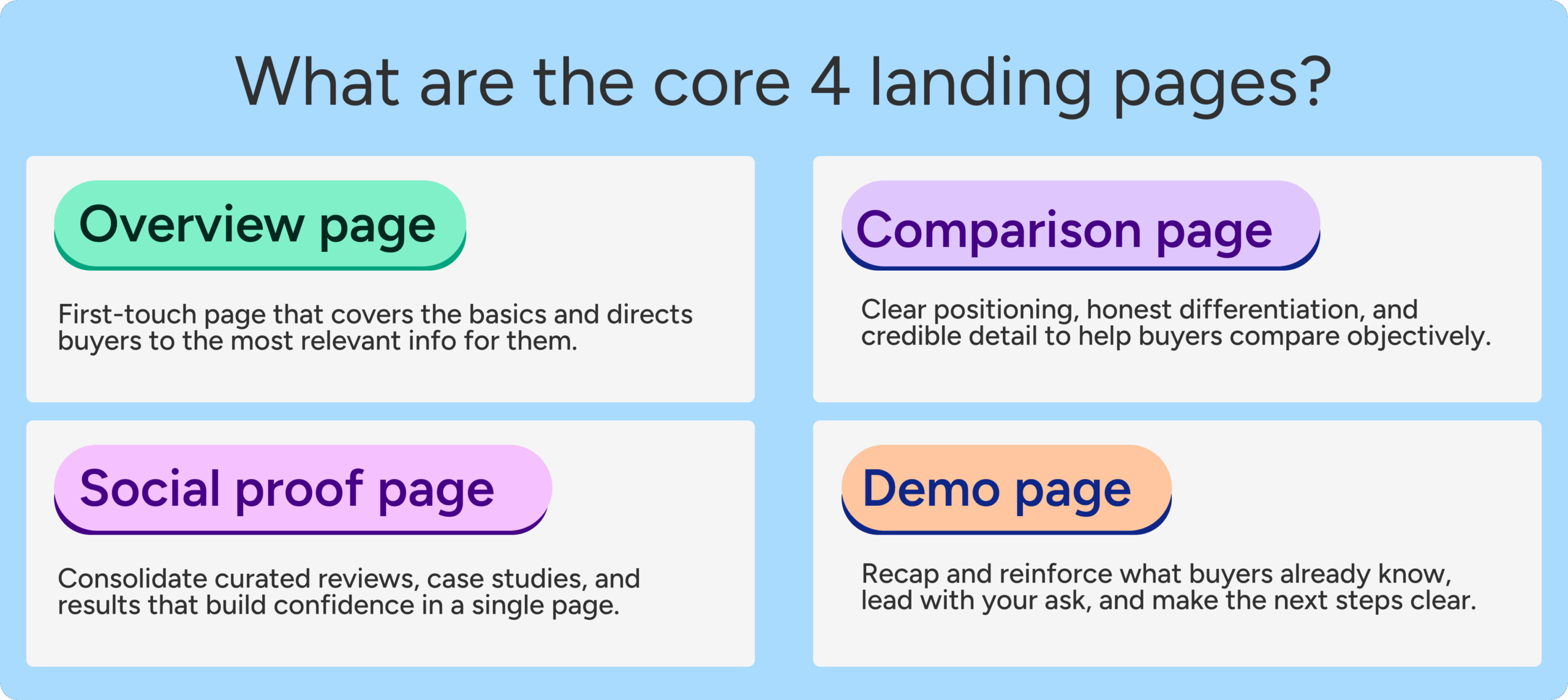
The Strategic Importance of Comparison Overview Pages
Tas Bober, a leading authority on B2B landing pages, argues that the most critical asset for a paid media team is the comparison overview page. While many brands focus exclusively on one-to-one matchups (e.g., Brand A vs. Brand B), the overview page addresses a much larger segment of the market: those who are aware of a problem but are unsure of the category of solution they need.

In a market where budgets are tightening, the primary competitor for many SaaS companies is not another software provider, but “status quo” or inaction. Harvard Business Review reports that between 40% and 60% of B2B deals are lost to customer indecision or the choice to stick with manual workarounds. A robust comparison overview page helps mitigate this by outlining various ways to solve a problem—including manual processes, custom-built internal tools, and legacy software—thereby positioning the vendor as a transparent advisor rather than just another salesperson.
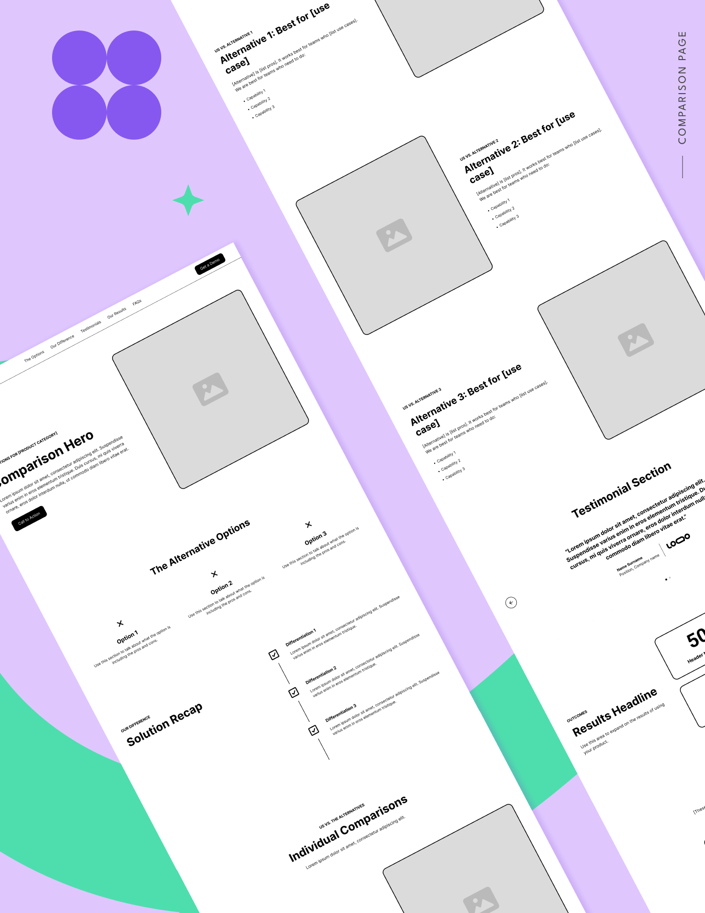
Anatomy of a High-Trust Comparison Page
To build a comparison page that resonates with modern buyers, marketers must move beyond the feature table. Bober’s framework for a high-converting, high-trust page includes several non-negotiable elements designed to align with search intent and provide genuine utility.
1. Navigation as an SEO and Quality Model Signal
Contrary to the old landing page “best practice” of removing all navigation to prevent exit, modern pages should include anchor links. This is driven partly by Google’s ad quality prediction models, which reward pages that align closely with search intent and allow users to find specific information quickly. If a buyer is looking specifically for “pricing comparison,” providing an anchor link to that section prevents them from bouncing back to the search results, which improves the page’s performance in both paid and organic rankings.
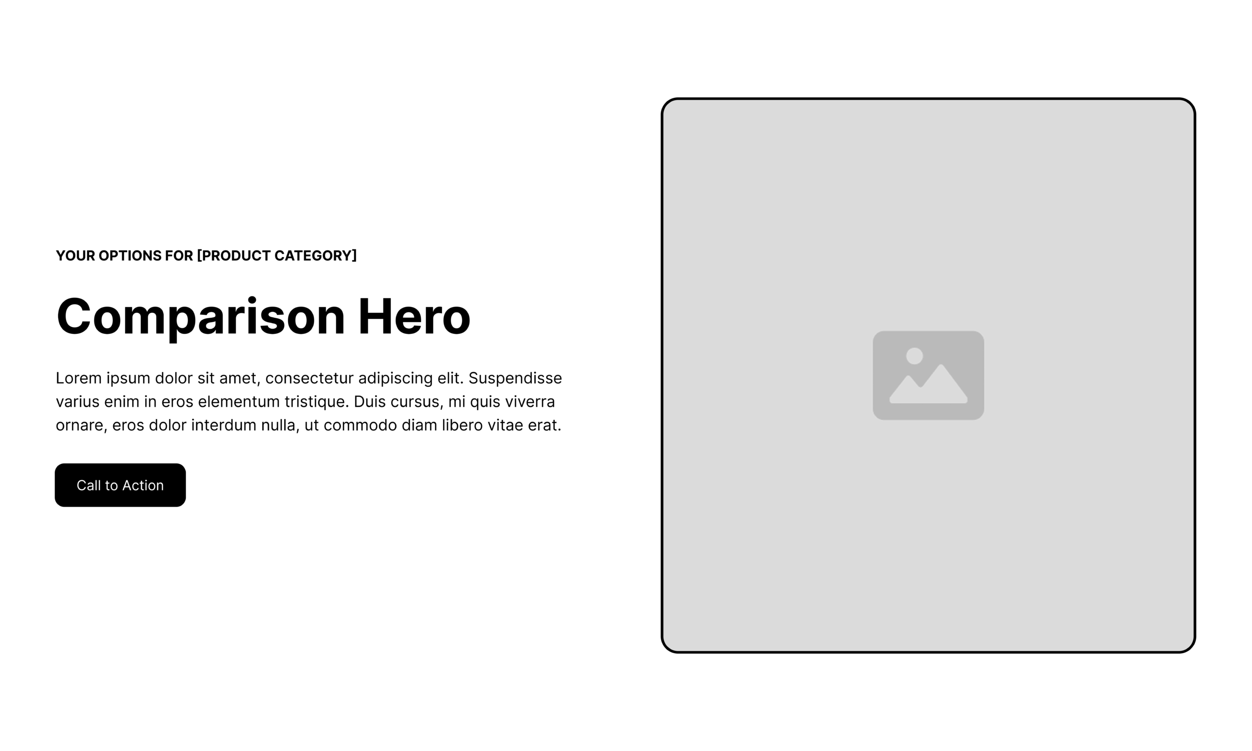
2. The Keyword-Targeted Hero Section
The hero section must immediately validate the user’s search query. By using an “eyebrow” (a small line of text above the main headline) that explicitly mentions the category or the specific competitors being compared, brands can reduce friction. The headline should focus on “fit” rather than “superiority.” For example, instead of “The World’s Best CRM,” a high-trust headline might be “Which CRM is the right fit for your mid-market sales team?”
3. Objective Solution Differentiation
A critical mistake in SaaS marketing is the refusal to acknowledge product limitations. High-trust pages include a “pros and cons” or “best for” section that realistically assesses where a product excels and where it might fall short. This self-qualification process ensures that the leads generated are a good fit for the product, ultimately reducing churn and increasing long-term customer satisfaction.
4. Migration-Focused Testimonials and Social Proof
Generic testimonials (“This tool is great!”) carry little weight on comparison pages. Instead, marketers should use “switcher” testimonials—quotes from customers who specifically migrated from the competitor being discussed. These testimonials should highlight the specific pain points of the previous solution and the measurable results achieved after the switch.
Four Industry Examples of Integrity-Driven Comparisons
Several leading B2B SaaS companies have successfully implemented these high-trust strategies, providing a roadmap for others to follow.
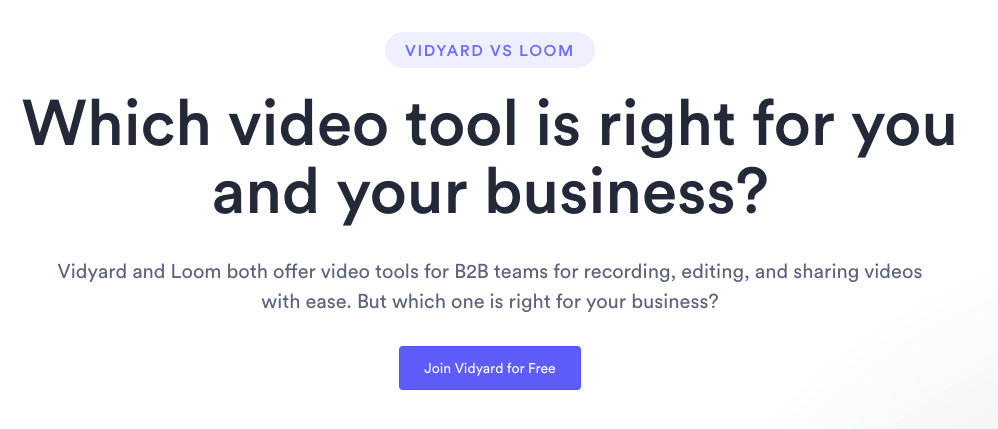
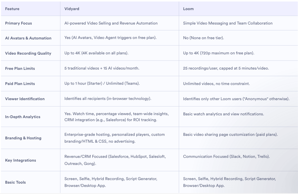
Vidyard vs. Loom: The Transparency Play
Vidyard’s comparison with Loom is notable for its hero section, which frames the page as a tool to help the buyer choose the right platform for their specific business needs. Their feature table avoids the “all or nothing” checkmark trap by describing how each platform approaches core features. This allows the buyer to see that while both tools may offer video recording, Vidyard prioritizes sales integrations while Loom focuses on internal team communication.
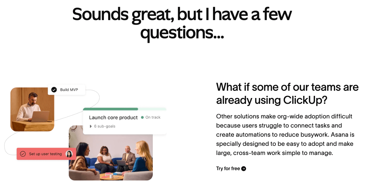
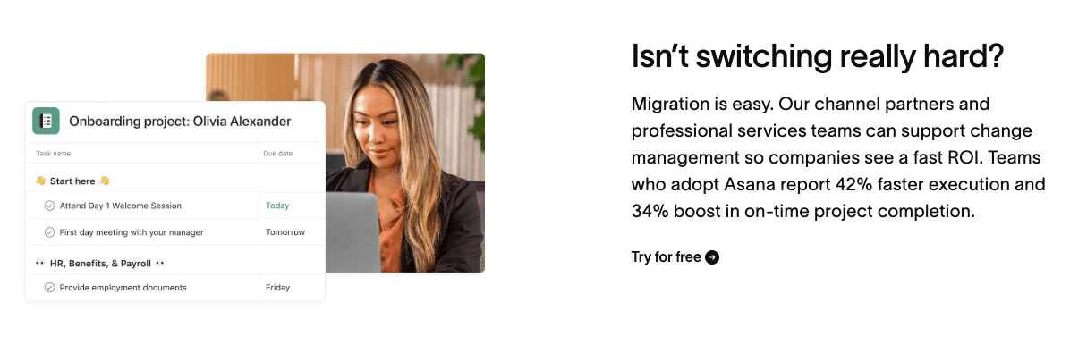
Asana vs. ClickUp: Addressing Migration Friction
Asana’s comparison strategy shines in its FAQ section. Recognizing that the biggest hurdle to switching project management tools is the data migration process, Asana uses its comparison content to directly address how teams can move their data without downtime. This reduces the perceived “risk” of the switch, which is often a greater barrier than the software’s price or features.
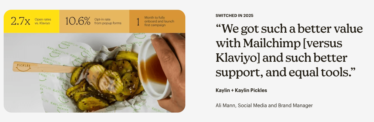
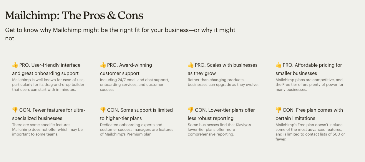
Mailchimp vs. Klaviyo: Honest Trade-offs
Mailchimp provides a rare example of a “pros and cons” section that includes its own gaps. By acknowledging that Klaviyo might offer more comprehensive reporting for certain e-commerce niches on lower-tier plans, Mailchimp earns the trust of the reader. When they then highlight their own strengths—such as ease of use for generalist marketers—the claim feels earned and credible.
Zendesk vs. Freshdesk: Independent Research
Zendesk elevates its credibility by citing independent research firms to compare its product with Freshdesk. By bringing in third-party data and customer interviews conducted by an external agency, Zendesk removes the “marketing bias” that buyers expect, making the resulting claims about ROI and efficiency far more persuasive.
Technical Implications: SEO, LLMs, and AI Search
The shift toward helpful, objective comparison content is not just a psychological necessity; it is a technical one. Search engines and Large Language Models (LLMs) like ChatGPT and Perplexity are increasingly prioritizing “helpful content” over keyword-stuffed marketing pages.
As AI-driven search becomes a primary research tool for B2B buyers, these models “read” and summarize web content to answer user prompts like “Compare Zendesk and Freshdesk for a 50-person support team.” If a brand’s comparison page is too biased or lacks specific, objective data, the AI is likely to ignore it in favor of third-party review sites or more balanced competitor content. Therefore, writing for “integrity” is now a prerequisite for visibility in the AI-driven search era.
Chronology of a Comparison Page Build
For marketing teams looking to overhaul their comparison strategy, a logical timeline is essential:
- Month 1: Data Gathering. Review sales call recordings (via tools like Gong or Chorus) to identify the top 3-5 competitors mentioned in lost deals. Identify the “status quo” workarounds buyers are using.
- Month 2: Content Architecture. Use the Tas Bober “Core Four” template to build a Comparison Overview page. Focus on the category first to capture high-intent research traffic.
- Month 3: Specific Matchups. Develop 1:1 pages for the top two competitors. Reach out to the customer success team to secure “switcher” testimonials.
- Month 4: Optimization. Implement anchor navigation and FAQ schemas. Monitor “Time on Page” and “Return to Search” metrics to ensure the content is meeting buyer needs.
Conclusion: The Long-Term Impact of Trust-Based Marketing
Building SaaS comparison pages that buyers trust requires a departure from the “win at all costs” mentality of early-stage growth marketing. In a mature SaaS market, differentiation is found not just in feature sets, but in the quality of the buying experience.
By providing objective, guided evaluation tools, SaaS brands can shorten the sales cycle, improve lead quality, and build a foundation of credibility that lasts long after the initial click. As B2B buying continues to evolve, the brands that win will be those that treat their comparison pages as a service to the buyer, rather than a trap for the prospect. In the end, the most persuasive thing a marketer can do is tell the truth.