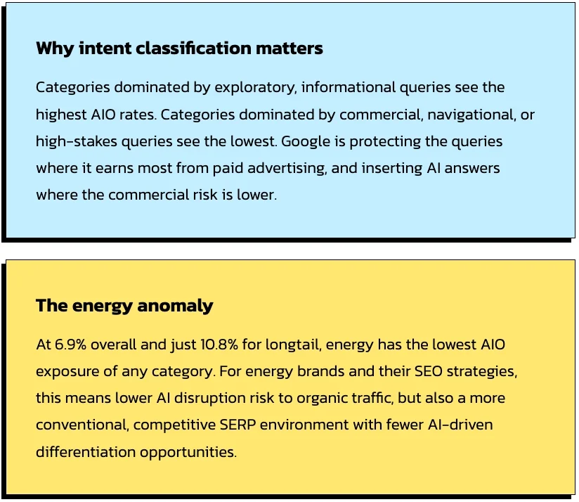
The landscape of digital journalism and data analysis has undergone a significant transformation with the introduction of advanced embedding features within Google Data Studio, a move that empowers content creators to integrate interactive reports directly into online environments. This technological advancement addresses a long-standing challenge for data journalists and market analysts: the transition from static, non-responsive screenshots to dynamic, real-time data environments that allow readers to engage with complex information sets. By facilitating a more immersive user experience, the tool bridges the gap between raw data collection and effective narrative delivery, a development exemplified by recent comparative studies of the ongoing commercial and critical competition between the Marvel Cinematic Universe (MCU) and the DC Extended Universe (DCEU).
The Evolution of the Cinematic Rivalry: A Contextual Overview
The competition between Marvel and DC, two titans of the comic book industry, has shifted from the printed page to the global box office over the past two decades. While Marvel Studios established a cohesive, multi-phase strategy beginning with "Iron Man" in 2008, DC Entertainment and Warner Bros. sought to accelerate their own shared universe following the conclusion of Christopher Nolan’s "Dark Knight" trilogy. The divergence in these strategies—Marvel’s slow-burn character development versus DC’s initial attempts at rapid ensemble building—has provided a rich dataset for analysts.
In the year following initial comparative visualizations of these franchises, the landscape has shifted with the release of five major motion pictures. These additions have not only altered the financial standings of the respective studios but have also provided new insights into critical reception and audience sentiment. The inclusion of these new data points is essential for a contemporary understanding of the "superhero fatigue" narrative and the varying degrees of success achieved by different directorial approaches.
Technical Implementation: The Shift Toward Embedded Interactivity
The primary hurdle in previous data-driven stories was the reliance on external links. Readers were frequently forced to leave the primary article to view interactive charts, a friction point that often resulted in lower engagement rates and fragmented understanding. Google Data Studio’s embedding feature mitigates this by allowing the integration of an HTML iframe directly into a website’s Content Management System (CMS).
The process of enabling this feature involves a streamlined administrative workflow within the Data Studio interface. Once a report is finalized, the "Enable Embedding" option generates a snippet of code. However, the efficacy of this tool is contingent upon proper permission settings. For public-facing journalism, reports must be configured for public visibility; conversely, internal corporate reports can be restricted to specific organizational domains, ensuring that data security is maintained while still benefiting from the improved visual layout.
Optimizing Visualizations for Multi-Platform Consumption
In the current digital ecosystem, where mobile traffic often accounts for more than half of total web engagement, the responsiveness of data visualizations is a critical concern. Journalistic best practices dictate that websites must be responsive, and the embedded data reports must follow suit. When configuring an iframe for a standard content area—typically around 640 pixels wide for many editorial platforms—analysts must select a "Fit to Width" display mode.
This setting ensures that as the screen size of the device decreases, the visualization scales proportionally. However, technical experts note that excessive scaling can render complex charts unreadable on smartphone screens. To counter this, the strategy of "modular data storytelling" has emerged. Rather than embedding a single, comprehensive report containing dozens of charts, analysts are encouraged to break down the data into digestible segments. By creating separate reports or distinct pages within a report for specific insights—such as a single bar chart comparing box office returns—creators can intersperse text and data, leading to a more coherent and persuasive narrative.
Comparative Analysis: Marvel vs. DC Performance Metrics
When examining the updated data encompassing the five most recent cinematic releases, several trends become apparent. Marvel has historically maintained a higher "floor" for its critical reception, with the Disney-owned studio rarely dipping below the 60% threshold on aggregate review platforms. This consistency has fostered a reliable brand identity that translates into high "opening weekend" predictability.
In contrast, the DC Extended Universe has experienced more significant volatility. While certain entries have achieved massive commercial success, others have struggled to align critical praise with financial performance. The data indicates that the DCEU often sees a sharper "second-week drop" in box office revenue compared to Marvel films, suggesting that initial fan enthusiasm may not always be sustained by broader word-of-mouth recommendations.

Supporting data points for this analysis include:
- Global Box Office Totals: A comparison of the cumulative earnings per film, adjusted for inflation.
- Critical vs. Audience Disparity: An analysis of the gap between professional critics and general audience scores, which often reveals the "polarization" of certain film franchises.
- Production Efficiency: A ratio of production budget to global gross, highlighting the return on investment (ROI) for each studio.
The Role of Data in Modern Newsrooms
The integration of tools like Google Data Studio into the journalistic workflow represents a broader trend toward the democratization of data. No longer the exclusive domain of specialized data scientists, the ability to manipulate and present large datasets is becoming a core competency for digital editors. This shift has significant implications for how news is consumed.
Interactive charts allow readers to act as their own analysts. By hovering over data points, filtering results by year or genre, and toggling between different metrics, the audience moves from passive consumption to active exploration. This engagement not only builds trust—as the raw data is often made transparent and accessible—but also increases the "time on page," a key metric for digital publishers.
Industry experts suggest that the next phase of this evolution will involve real-time data streaming into these embedded reports. For example, a report on the Marvel vs. DC rivalry could theoretically update its box office figures automatically as new weekend data is released, ensuring that the article remains evergreen and relevant long after its initial publication date.
Broader Impact and Industry Implications
The move by Google to enhance Data Studio’s sharing capabilities is widely seen as a response to the growing demand for low-code or no-code business intelligence tools. By competing with established players like Tableau and Power BI, Google is positioning itself as the accessible alternative for small-to-mid-sized newsrooms and independent analysts.
The implications for the "Marvel vs. DC" debate are equally notable. As the two franchises continue to expand into streaming services and new media formats, the volume of data will only increase. The ability to visualize the "multiverse" of content—spanning television ratings, merchandise sales, and theatrical returns—will require the very tools that are being refined today.
Furthermore, this development highlights the importance of visual literacy in the 21st century. As data becomes the backbone of storytelling, the responsibility of the journalist shifts toward ensuring that these visualizations are not only accurate but also ethical. The choice of scale, the color coding of "winning" vs. "losing" factions, and the selection of which data points to include or exclude are all editorial decisions that carry significant weight.
Conclusion: The Future of Data-Driven Narratives
The updated visualization of the Marvel and DC cinematic universes serves as more than just a treat for comic book enthusiasts; it is a proof-of-concept for the future of digital communication. By utilizing Google Data Studio’s embedding capabilities, creators can now present a unified experience that respects the reader’s intelligence and time.
As the digital landscape continues to favor interactive and personalized content, the ability to embed live, responsive data will become a standard requirement for high-quality reporting. Whether the subject is the financial health of global film franchises or the complex socio-economic trends of the modern world, the goal remains the same: to tell stories that are not only read but felt and understood through the power of data. The "war" on the big screen may continue for decades, but the tools we use to track its progress have officially entered a new era of sophistication.