In the high-stakes environment of digital advertising, every click on a paid advertisement represents a financial investment. However, the ultimate fate of that investment—whether it matures into revenue or dissipates as a sunk cost—is decided in the seconds immediately following the click. Industry data suggests that while marketing teams allocate substantial portions of their budgets to sophisticated targeting and high-end creative assets, a significant percentage of this traffic is directed toward generic product pages that were never engineered for conversion. This disconnect between a compelling advertisement and a distraction-heavy destination is widely recognized by industry analysts as the "leaky bucket" of digital marketing.
The solution to this systemic inefficiency lies in the strategic deployment of product landing pages. Unlike standard website pages, these specialized destinations are designed to bridge the gap between initial interest and final action. This report examines the fundamental principles of product landing page architecture, the critical differences between landing pages and standard product detail pages, and the technological advancements, such as those provided by platforms like Instapage, that allow enterprise teams to scale these assets without the bottleneck of developer dependencies.
The Strategic Imperative of the 1:1 Conversion Ratio
A product landing page is a standalone web entity created for a specific marketing campaign with the intent of driving a single conversion action. This differs fundamentally from a traditional product page found within a website’s navigation. The defining characteristic of an effective landing page is its 1:1 conversion ratio: one page, one goal, and one call to action (CTA).

In the current digital landscape, consumer attention is a finite resource. Research from various marketing analytics firms indicates that the average conversion rate across industries hovers around 2.35%, yet the top 10% of landing pages achieve rates of 11.45% or higher. The difference often stems from the elimination of choice. By removing site navigation, footers, and links to unrelated categories, marketers can guide visitors through a curated narrative that leads exclusively to the desired conversion point.

Comparative Analysis: Product Landing Pages vs. Standard Product Pages
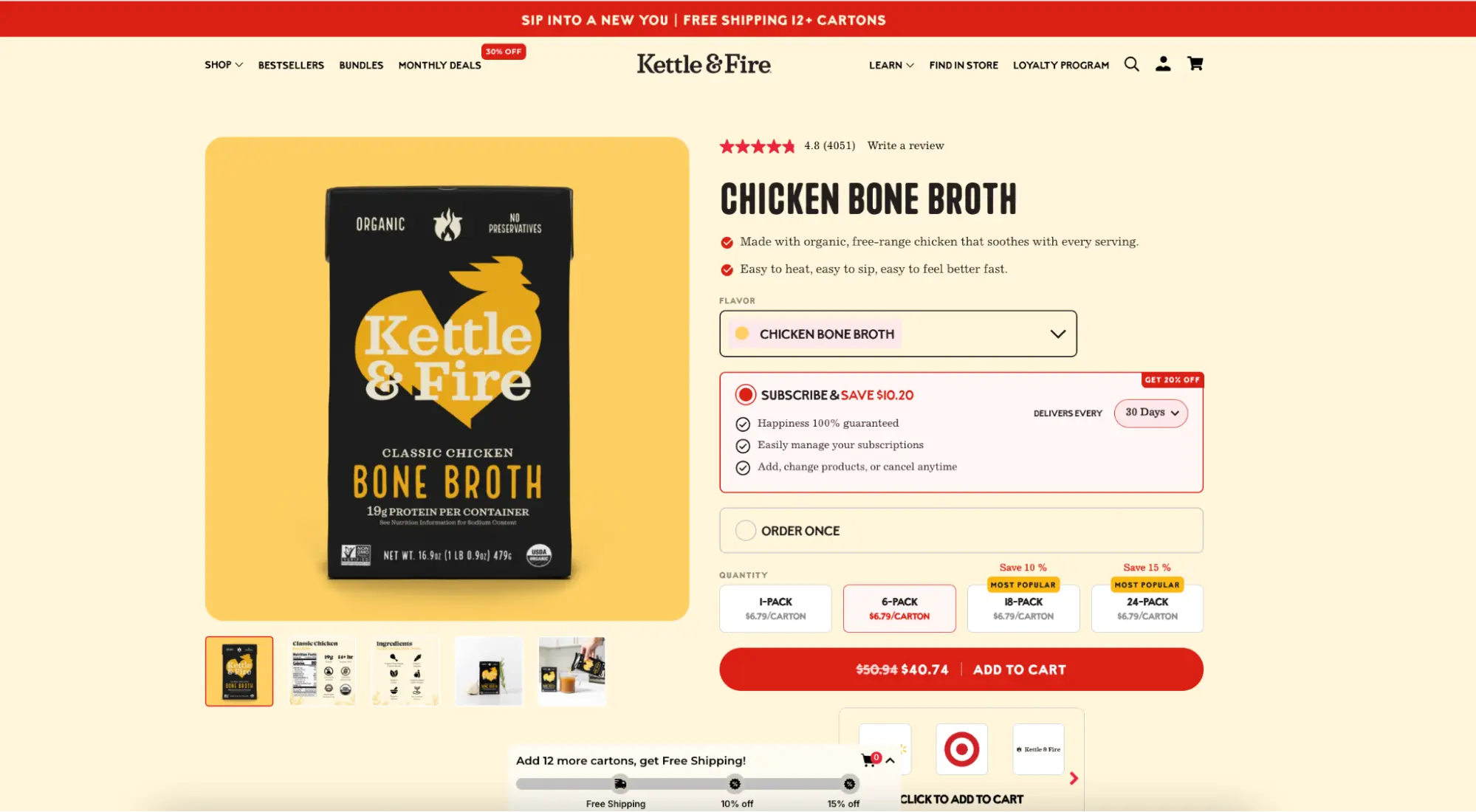
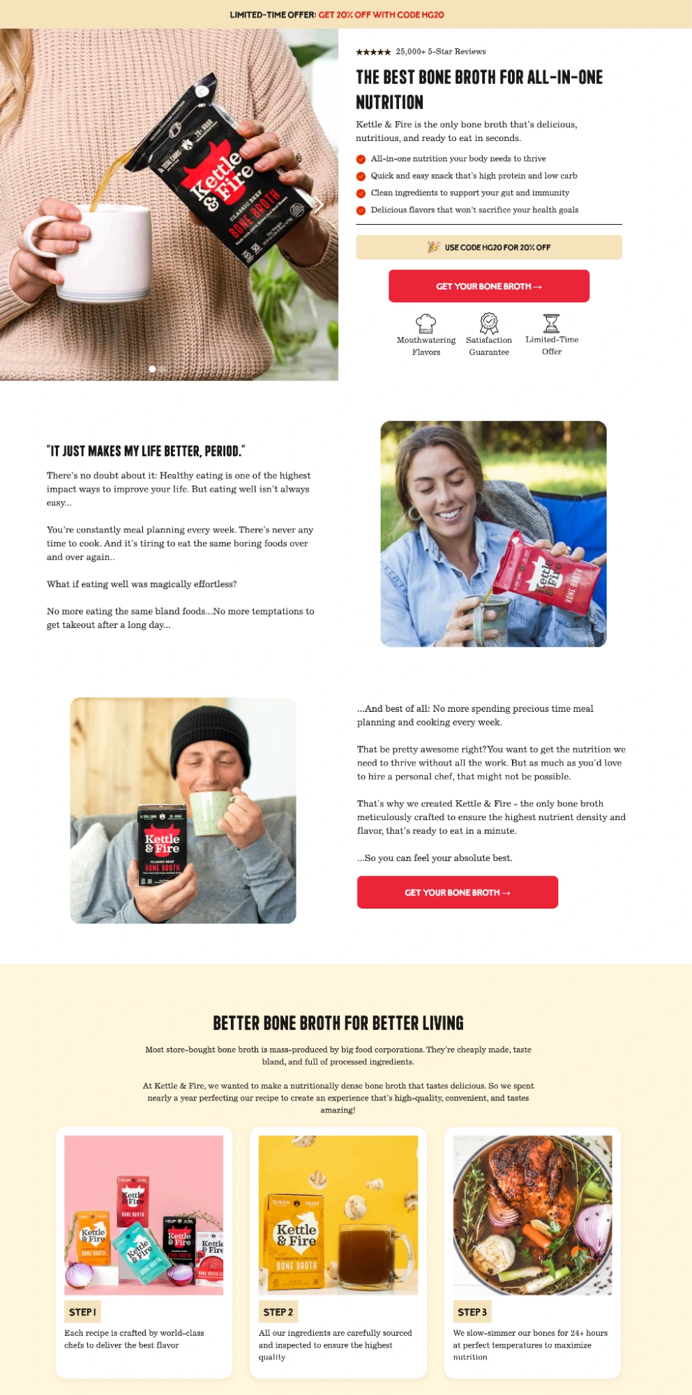
To understand the operational impact of these pages, one must look at the contrast in user experience. A prominent case study involves the bone broth brand Kettle & Fire, which utilizes both standard product detail pages (PDPs) and dedicated campaign landing pages simultaneously.
The standard Kettle & Fire product page is an aesthetic and informative asset. However, it includes a full navigation bar, a dropdown menu linking to a dozen product variants, a section suggesting additional bundles, a complex footer, and social media icons. While excellent for organic browsing, an individual arriving via a Facebook ad is presented with over 30 different ways to exit the page without making a purchase.
In contrast, the brand’s dedicated landing page exists on a separate subdomain. It is devoid of navigation and external links. Every interactive element either scrolls the user to a more detailed section of the same page or directs them to the checkout. By utilizing urgency triggers—such as limited-time discount codes—and high-authority endorsements from health figures, the page minimizes "friction." The only options for the visitor are to convert or to leave, a binary choice that historically yields higher ROI for paid traffic.
The Science of Conversion: Core Design Principles
Design aesthetics, while important for brand perception, are secondary to conversion mechanics. Leading researchers, including the Nielsen Norman Group, have identified several "non-negotiable" principles that dictate the success of a product landing page.
Above-the-Fold Value Proposition
Eye-tracking studies consistently demonstrate that content visible without scrolling—the "above-the-fold" area—receives the vast majority of user attention. An effective page must deliver a complete value proposition, a primary benefit, and a clear CTA within this initial view. While informed buyers may scroll for more details, the page must be capable of converting a ready-to-buy visitor instantly.
The Role of Message Match
One of the most frequent causes of "bounce" (immediate exit) is a lack of message match. If an advertisement promises "Sustainably Sourced Leather Wallets" but the landing page headline reads "Browse Our Full Collection," the cognitive dissonance causes the visitor to lose trust. Furthermore, Google and other ad platforms measure message match as a component of "Quality Score." A high match leads to lower costs-per-click and better ad placement.
Technical Performance and Core Web Vitals
In an era of mobile-first browsing, page speed is no longer a technical luxury but a financial necessity. Google’s performance data suggests that for every second of delay in mobile load times, conversion rates can drop by as much as 20%. The industry has shifted toward prioritizing "Core Web Vitals"—specifically Largest Contentful Paint (LCP) and Cumulative Layout Shift (CLS). Platforms like Instapage have addressed this through proprietary infrastructure like the Thor Render Engine®, which optimizes page delivery at the server level to ensure near-instantaneous loading.
Essential Components of High-Performing Pages
To maximize the effectiveness of a landing page, several key elements must be integrated into a cohesive visual hierarchy.

- Problem-Focused Headlines: Rather than describing what a product is, the most successful headlines describe what the product does for the user. For instance, the electric flosser brand Flaus uses the headline "Flossing Made Simple," immediately identifying a common pain point and offering a solution.
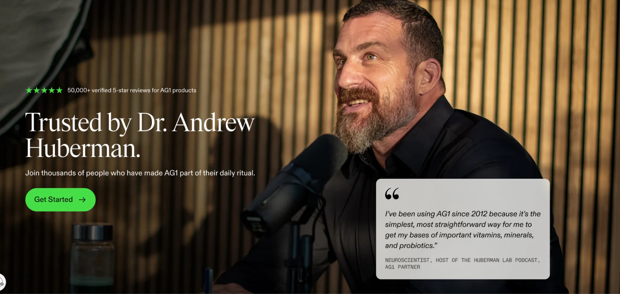
- Social Proof and Trust Indicators: Skepticism is the default state of the online shopper. Positioning testimonials, star ratings, and industry awards near the CTA button helps resolve doubt at the moment of decision.
- Minimal Form Friction: Research from the Baymard Institute shows that nearly 18% of users abandon checkouts due to overly complex forms. High-converting landing pages ask only for the minimum information required to facilitate the transaction.
- Visual Tangibility: For physical goods, lifestyle photography showing the product in use is essential. For software (SaaS), interactive UI screenshots allow the user to visualize the experience before committing to a trial.
Categorizing Landing Page Strategies by Campaign Goal
Not all product landing pages are created equal. The architecture of the page must align with the specific intent of the marketing campaign.
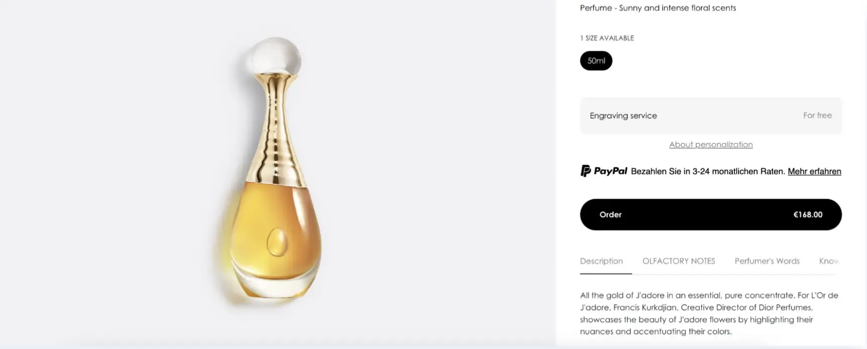
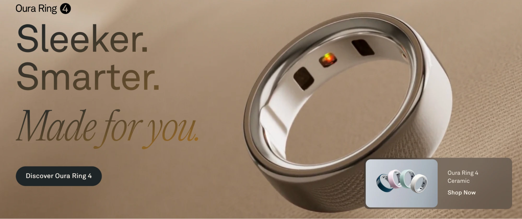
- Single-Product Pages: These are highly focused and built around a specific SKU. They are ideal for targeted ads where the user is looking for a specific item, such as an Oura Ring or a specific Dior fragrance.
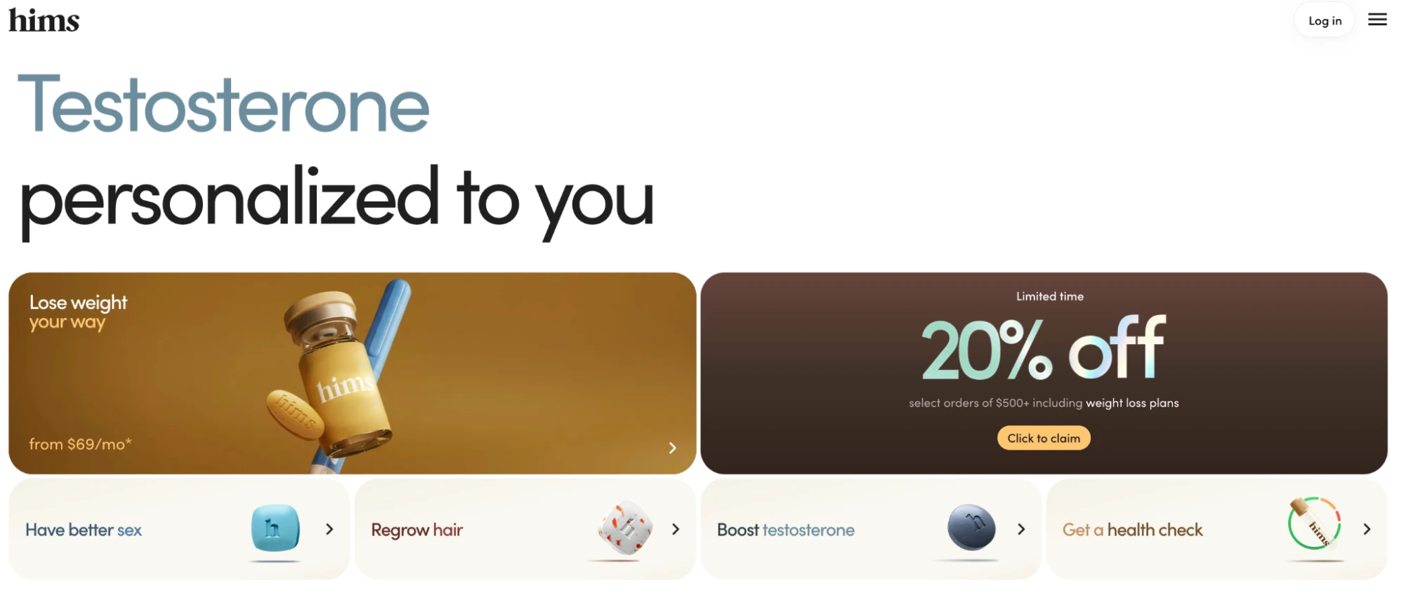
- Multi-Product Pages: These serve as a "hub" for a product family. They are effective when an ad targets a broader category (e.g., "Men’s Skincare") and the visitor needs a structured way to self-select the right product for their needs. Brands like Hims and Adidas utilize this to guide users toward specific sub-categories while maintaining a distraction-free environment.
- Launch and Waitlist Pages: Used for new releases, these pages emphasize scarcity and urgency. The goal is often lead generation rather than immediate sales, capturing email addresses for a future product drop.
The Operational Shift: Building Without Developer Bottlenecks
Historically, creating high-quality landing pages required a dedicated team of designers and front-end developers, a process that could take weeks. In the modern fast-paced market, this latency is unacceptable.
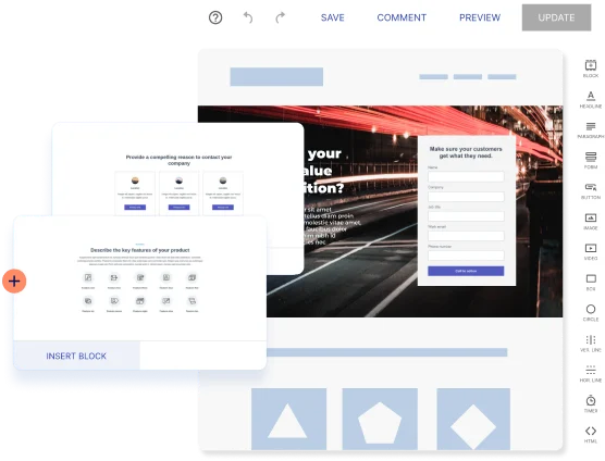
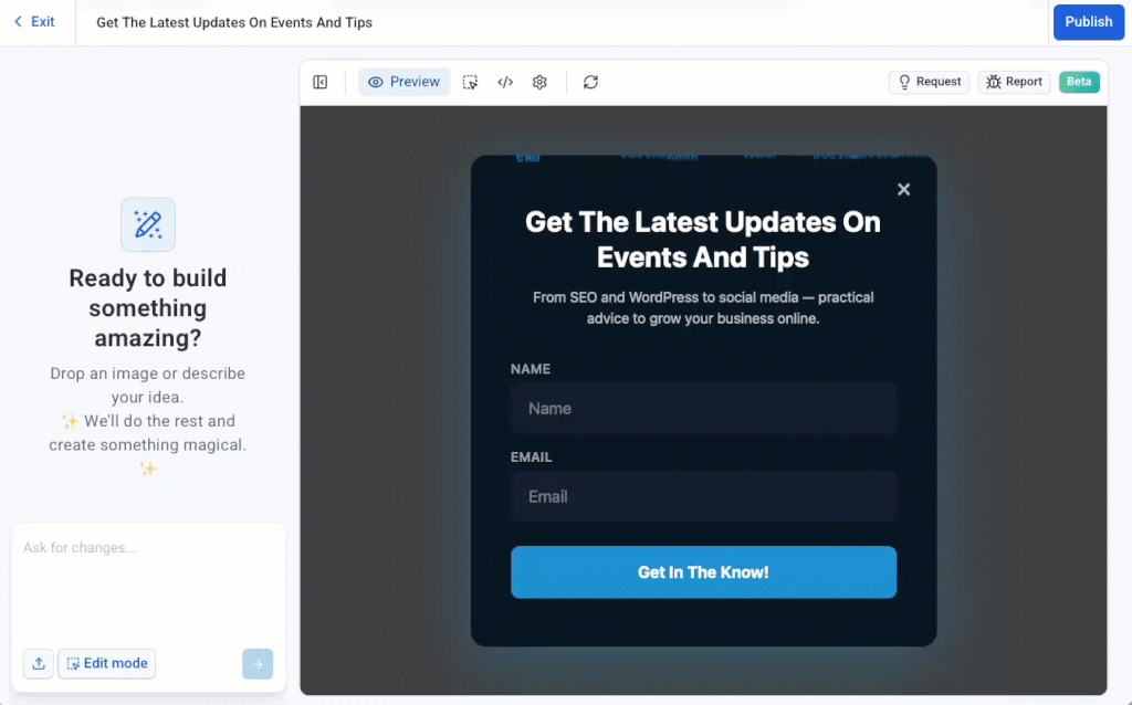
The emergence of no-code platforms has democratized the creation of these assets. Modern workflows involve selecting conversion-tested templates, using drag-and-drop builders for pixel-perfect adjustments, and leveraging AI to generate copy variations. This shift allows marketing teams to deploy and test dozens of variations simultaneously.

The process typically follows a six-step cycle:

- Goal Definition: Aligning the page type with the conversion objective.
- Template Selection: Utilizing industry-specific layouts that have already proven effective.
- Structural Building: Arranging elements to guide the user’s eye toward the CTA.
- AI-Assisted Content: Generating headlines and body copy that resonate with specific audience segments.
- Collaborative Review: Using cloud-based tools to gather stakeholder feedback in real-time.
- Continuous Optimization: Utilizing A/B testing and heatmaps to refine the page based on actual user behavior.
Measurement and the Future of Performance Marketing
The final stage of the landing page lifecycle is rigorous measurement. A page’s success is quantified through a framework of Key Performance Indicators (KPIs). While conversion rate remains the primary metric, sophisticated teams also track "Cost per Conversion" and "Return on Ad Spend" (ROAS).
Behavioral data, provided by heatmaps, offers insights that standard analytics cannot. For instance, if a heatmap shows that visitors are clicking on an unlinked image rather than the CTA, marketers can adjust the layout to remove the distraction.

As digital privacy regulations—such as the deprecation of third-party cookies and Apple’s ATT framework—make top-of-funnel targeting less precise, the importance of the "destination" increases. The landing page is becoming the primary lever for profitability in digital advertising. By focusing on the post-click experience, brands can ensure that their media spend is not merely generating traffic, but building a sustainable pipeline of revenue. The transition from generic product pages to optimized, high-performance landing pages represents the next frontier in competitive digital commerce.