Email remains a cornerstone of personal and professional communication, with projections indicating a staggering 4.89 billion users worldwide by 2027. Yet, despite its pervasive reach and an average engagement time of nearly nine seconds per message, a critical aspect often remains overlooked: email accessibility. Neglecting this fundamental principle risks alienating a substantial portion of the subscriber base, particularly individuals living with visual, physical, cognitive, and neurological disabilities. Prioritizing email accessibility is not merely an ethical consideration but a strategic imperative, ensuring universal access, legal compliance, and tangible business growth.
Defining Digital Inclusivity: What is Email Accessibility?
At its core, email accessibility extends the foundational pillars of user experience and design, ensuring that every individual can effortlessly read, comprehend, and interact with your digital messages. This encompasses people with diverse abilities and those who rely on assistive technologies. Much like developers meticulously craft fallbacks for varied email clients with differing support capabilities, accessibility in email design involves implementing workarounds and thoughtful design choices to guarantee a positive and consistent experience for all recipients. This proactive approach broadens audience reach, fosters trust, and cultivates lasting loyalty among subscribers. It acknowledges that digital content should be designed for everyone, regardless of their physical or cognitive capabilities.

The Global Benchmark: Understanding WCAG Guidelines
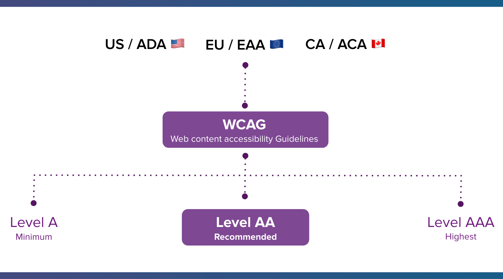
The primary standard governing digital accessibility, including email, is the Web Content Accessibility Guidelines (WCAG). Developed by the World Wide Web Consortium (W3C) under its Web Accessibility Initiative (WAI), WCAG represents an internationally recognized framework that outlines how to make websites, applications, and other digital properties accessible to people with disabilities. These guidelines are regularly updated to integrate new accessibility considerations and technological advancements, reflecting an evolving understanding of inclusive design.
Critically, adherence to WCAG standards signifies a business’s commitment to meeting benchmarks that are increasingly supported by U.S. and international accessibility laws. While WCAG itself is not a legal statute, it serves as the universally recognized and authoritative guide for creating accessible digital experiences, often referenced in legal interpretations and enforcement actions.
The POUR Principles Explained
WCAG standards are meticulously structured around four main principles, collectively known by the acronym POUR:
- Perceivable: Information and user interface components must be presentable to users in ways they can perceive. This means content cannot be invisible to all their senses. For email, this translates to providing text alternatives for non-text content (like images via ALT text), ensuring sufficient color contrast, and making content adaptable for different presentations (e.g., screen readers, large print).
- Operable: User interface components and navigation must be operable. Users must be able to interact with the content. This includes ensuring all functionality is available via keyboard, providing enough time for users to read and use content, and avoiding content that causes seizures (e.g., flashing GIFs).
- Understandable: Information and the operation of the user interface must be understandable. Users must be able to comprehend the content and how to operate the interface. This involves making text readable and understandable, making web pages appear and operate in predictable ways, and helping users avoid and correct mistakes. For emails, clear language, logical structure, and consistent navigation are key.
- Robust: Content must be robust enough that it can be interpreted reliably by a wide variety of user agents, including assistive technologies. This means ensuring compatibility with current and future user agents, by adhering to well-established web standards like HTML.
Navigating Conformance Levels
WCAG specifies three levels of conformance, indicating increasing degrees of accessibility:
- Level A (Minimum): This level addresses the most basic accessibility barriers. Failing to meet Level A makes it impossible for some groups to access the content.
- Level AA (Recommended): This is the most commonly adopted target for digital accessibility. It addresses the most common and significant barriers for users with disabilities and is often the legally mandated standard in many jurisdictions (e.g., ADA, EAA).
- Level AAA (Highest): This level offers the highest degree of accessibility, but achieving it for all content may not be feasible for all organizations, particularly for certain types of content or design.
For most businesses and public entities, achieving WCAG 2.1 or 2.2 Level AA conformance is the recommended benchmark to ensure broad accessibility and mitigate legal risks.
Beyond Compliance: Why Email Accessibility Drives Success
Despite email’s undeniable influence, accessibility is frequently an afterthought. Yet, the reasons for prioritizing it extend far beyond mere compliance, encompassing vast demographic reach, evolving legal mandates, and significant business advantages.

Reaching a Vast, Underserved Audience
Disabilities affect a substantial segment of the global population. According to the World Health Organization (WHO), over 1.3 billion people, or one in six worldwide, experience a significant disability. In the United States, one in four adults, and a similar proportion in the European Union, live with a disability. This demographic represents one of the largest, yet often overlooked, audiences in digital design.
As Lauren Castady, a Design Leader, Accessibility Advocate & Creative Consultant at LC Creative, aptly notes, "Too often accessibility is framed as designing for someone, if that’s an edge case or a small segment. But the truth is it’s one of the largest audiences we design for." Ignoring accessible design means missing out on a colossal audience and potential customer base.
Beyond diagnosed disabilities, accessibility also benefits individuals facing temporary impairments (e.g., a broken arm, eye strain, bright sunlight making screens hard to read) or situational limitations (e.g., using a mobile device in a noisy environment, limited internet access, or older technology). Universal design principles, inherent in accessibility, create better experiences for everyone, not just those with permanent disabilities.
The Legal Mandate: A Global Overview
Governments worldwide have progressively established comprehensive accessibility laws, reflecting a growing commitment to digital inclusion:
- United States: The Americans with Disabilities Act (ADA) prohibits discrimination against individuals with disabilities in all areas of public life. While originally enacted before the internet’s widespread adoption, courts and the Department of Justice have consistently interpreted ADA Title III to apply to websites and other digital assets, including emails. Non-compliance can lead to costly lawsuits and reputational damage.
- European Union: The European Accessibility Act (EAA), fully applicable by June 28, 2025, sets common accessibility requirements for a wide range of products and services, explicitly including electronic communication services. Businesses operating within the EU or targeting EU citizens must ensure their digital communications, including emails, meet these standards.
- Canada: The Accessible Canada Act (ACA), passed in 2019, aims to achieve a Canada without barriers by 2040. It mandates accessibility standards for organizations under federal jurisdiction, which can extend to digital content like email campaigns.
- United Kingdom: The Equality Act 2010 requires service providers to make reasonable adjustments for disabled people, which includes digital services.
- Australia: The Disability Discrimination Act 1992 prohibits discrimination on the basis of disability, including in the provision of goods and services online.
Failing to meet these evolving legal standards not only risks significant legal repercussions, including fines and litigation, but also actively excludes individuals who depend on accessible digital experiences to participate fully in society and commerce.
Tangible Business Benefits and ROI
While legal compliance is a powerful driver, email accessibility is far from a mere burden; it’s a powerful catalyst for business success. Accessible design expands market reach, attracting a broader audience who might otherwise struggle to engage with inaccessible content. This increased reach directly translates into enhanced engagement metrics. When emails are easier to read, navigate, and understand for everyone, subscribers are more likely to interact with the content, click on links, and ultimately convert. Boosting engagement, in turn, positively impacts email deliverability, ensuring more messages land in the inbox rather than spam folders.
Moreover, the financial incentive is substantial. The Return on Disability (ROD) Group estimates that people with disabilities, representing 28.7% of adults in the U.S., control over $1 trillion in annual disposable income. Ignoring this demographic means leaving significant revenue on the table. Companies that champion accessibility cultivate a stronger brand image, fostering trust and loyalty among a highly engaged and appreciative consumer segment. With today’s sophisticated tools and technology, there is no longer an excuse for inaccessible email campaigns. Prioritizing accessibility is not just the ethical choice; it is a smart, forward-thinking business strategy that improves the experience for every single subscriber, including those with temporary impairments.
Embracing Diversity: Tailoring Emails for All Abilities
Designing for email accessibility requires a nuanced understanding of how various disabilities impact interaction with digital content. It’s about creating a truly inclusive experience. As Lauren Castady reiterates, "If you design email long enough, you learn pretty quick that you’re not designing for edge cases, you’re designing for real life because a hundred percent of people experience situational or temporary impairments."
Visual Impairments: Seeing Your Message Clearly
For individuals with visual impairments, email accessibility is paramount.
- Blindness: Screen readers (like NVDA, JAWS, VoiceOver) vocalize email content, making clear structural hierarchy (headings), descriptive ALT text for images, and semantic HTML essential.
- Low Vision: Users may rely on screen magnifiers, requiring larger font sizes, high color contrast, and layouts that don’t break when zoomed in.
- Color Blindness: Affecting approximately 8% of men and 0.5% of women of Northern European descent, color blindness means specific colors may be indistinguishable. Information conveyed solely by color (e.g., "red indicates an error") becomes inaccessible.
Physical Disabilities: Effortless Interaction
People with physical or motor disabilities may have limited dexterity, making traditional mouse navigation challenging.
- Limited Mobility: They might use keyboards, head pointers, eye-tracking devices, or voice control software. This necessitates that all interactive elements (buttons, links) are easily navigable via keyboard (e.g., using the
tabkey), are sufficiently large to be tappable/clickable, and have clear focus indicators.
Cognitive and Neurological Differences: Clarity and Simplicity
Individuals with cognitive or neurological disabilities, such as dyslexia, ADHD, or certain learning disabilities, benefit greatly from clear, uncluttered, and predictable email designs.
- Cognitive Overload: Complex layouts, excessive jargon, or rapidly flashing content can be disorienting or trigger adverse reactions (e.g., photosensitive seizures). Text readers or dictation software can assist, but the underlying content must be structured for comprehension.
- Dyslexia: Benefits from clear, sans-serif fonts, adequate line spacing, and left-aligned text.
Assistive technologies bridge the gap between users and digital content. Screen readers and magnifiers aid those with visual impairments, while head pointers or eye tracking support individuals with physical disabilities. Text readers or dictation software can help people with cognitive or learning challenges. Designing with these tools and diverse user needs in mind ensures that every subscriber can engage with your message effectively.
Architecting Accessible Emails: Best Practices for Marketers
Implementing email accessibility is a multi-faceted endeavor, encompassing visual design, typography, semantic structure, and content writing. By adopting these best practices, marketers can ensure their emails are truly inclusive.
Visual Elements: Color, Contrast, and Motion
Visual design plays a crucial role in accessibility, particularly for users with visual impairments or cognitive differences.
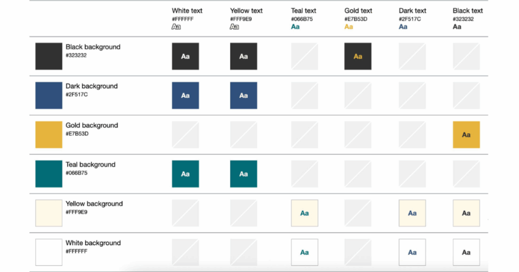
- Use Color Intelligently: Color should never be the sole method of conveying important information. For subscribers with color blindness, distinctions made only by color may be invisible. Instead, use a combination of color, text labels, icons, or patterns. For example, instead of a red circle to indicate an error, use a red circle with an "X" icon and the word "Error."
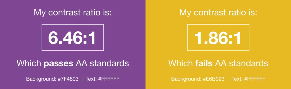
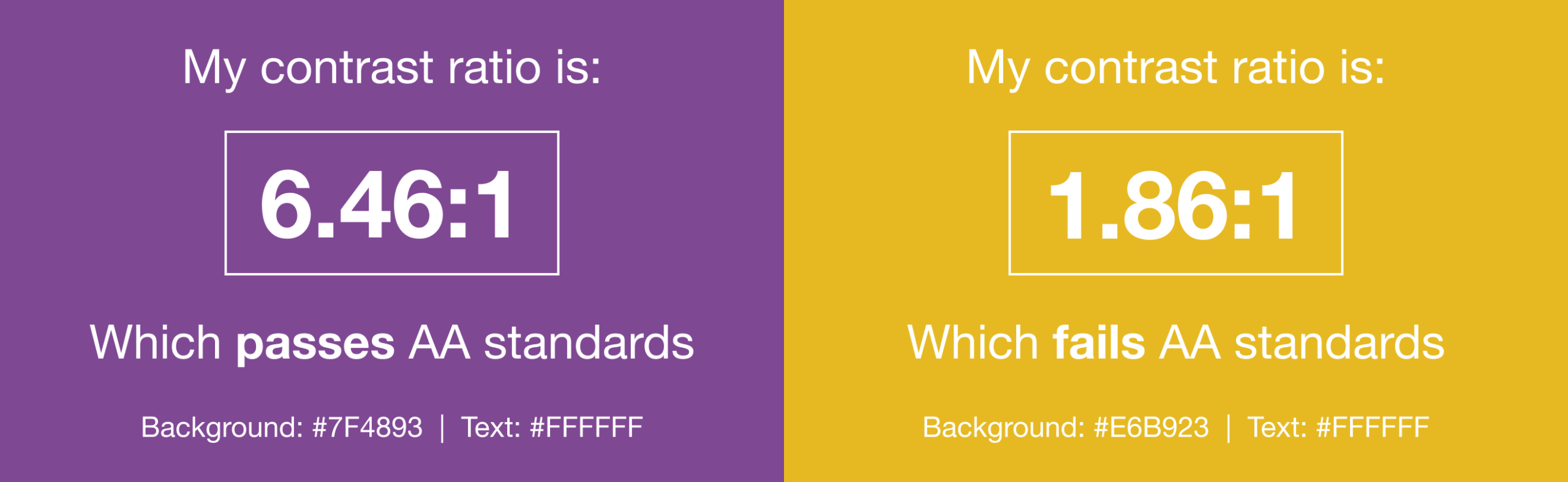
- Color Contrast: High color contrast between text and background is vital. WCAG 2.1 Level AA recommends a contrast ratio of at least 4.5:1 for normal text and 3:1 for large text (18pt or 14pt bold). Tools like WebAim’s Color Contrast Checker are invaluable for verifying these ratios. Creating a "color matrix" that defines which brand colors work together effectively, as suggested by Lauren Castady, removes subjective decision-making and streamlines team efforts.
- Avoid Harmful Content: Content that flashes at certain rates or in specific patterns can trigger photosensitive seizures in some individuals. Avoid flashing content entirely. For animated GIFs, ensure they stop after three cycles (within five seconds) or provide a mechanism for users to pause or stop the animation. Always offer a static image fallback for GIFs to cater to those who prefer or require it.
Typography and Readability: Crafting Clear Text
The way text is presented significantly impacts readability for all users, especially those with low vision or cognitive disabilities.
- Larger Font Sizes: A minimum font size of 14 pixels for body text on desktop screens is recommended. For mobile devices, use media queries to increase this to at least 16 pixels to prevent users from having to zoom, which can break layouts.
@media screen and (max-width: 600px) p.mobile font-size: 16px;Furthermore, consider using
remsinstead ofpixelsfor font sizes.Remsscale dynamically based on the user’s browser settings, accommodating those who have increased their default font size for personal accessibility needs. As Lauren Castady emphasizes, "The single biggest thing we can do to improve accessibility over and over for as long as I’ve worked in email is to use live HTML text wherever possible. Live text supports screen readers. It scales when someone zooms in, it adapts to dark mode and it allows us to maintain minimum readable body size of 14-16 pixels." Live text is vastly superior to image-based text for accessibility. - Give Copy Space: Adequate line height (leading) and spacing between paragraphs enhance readability. A line height of 1.5 times the font size is generally recommended. Ample white space around text blocks and paragraphs allows content to breathe, aiding comprehension and reducing cognitive load. Additionally, ensure text is not flush against the edges of the email by adding padding to table cells or paragraph tags.
- Avoid Justified Copy: While common in print, justified text (where letter and word spacing are adjusted to align with both left and right margins) creates inconsistent gaps between words, making it harder to read. Left-aligned text has been consistently proven to be more legible for all users.
- Choose the Right Typeface: Select typefaces that are evenly spaced, not overly condensed, and easy to read. Sans-serif fonts like Arial, Helvetica, or Verdana are generally preferred for digital content due to their clear letterforms. Always include appropriate fallback fonts for email clients that do not support web fonts.
Structural Integrity: Semantic HTML and Navigation
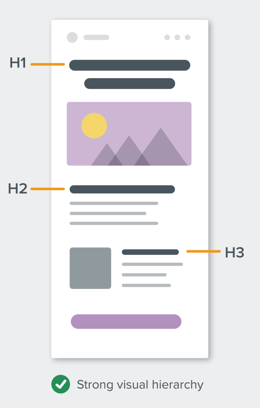
A well-structured email, built with semantic HTML, greatly improves navigability for screen reader users and overall comprehension.
- Use Semantic Elements: Employ HTML heading tags (
<h1>to<h6>) to create a clear visual and logical hierarchy. The<h1>tag should be used for the main title,<h2>for major sections, and so on. Screen readers allow users to navigate an email by headings, offering a quick overview of the content.<h1 style="mso-line-height-rule:exactly; margin:0; font-size:24px; line-height:28px;">This is a title in an email</h1> <p style="margin:0; font-size:14px; line-height:18px;">And this is the paragraph</p>For semantic elements, use
margininstead ofpaddingfor spacing, aspaddingis not universally supported on these elements. Themso-line-height-rule:exactly;property in<h1>tags helps maintain consistent line height in Microsoft Outlook clients.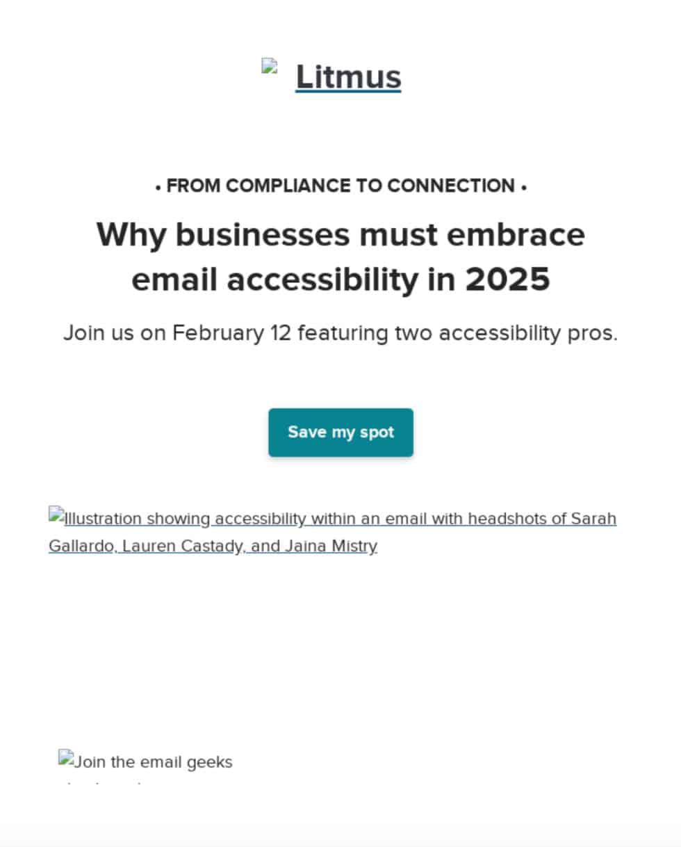
role="presentation"on Tables: Email design often relies on<table>elements for layout, despite their original purpose for data. To inform screen readers that a table is purely for presentational layout and not for tabular data, applyrole="presentation"to the<table>element. This prevents screen readers from announcing each cell individually, allowing users to get straight to the meaningful content.<table role="presentation" aria-hidden="true" cellpadding="0" cellspacing="0" border="0"> <tr> <td>Content here</td> </tr> </table>The
aria-hidden="true"attribute can further hide purely visual elements from screen readers. Similarly,role="presentation"can be used on images with empty ALT attributes to prevent screen readers from announcing irrelevant image names.
Actionable Content: Links and Call-to-Actions
Interactive elements require careful consideration to ensure they are usable by all.
- Make Links Clickable/Tappable: Buttons and links should be large enough (at least 44×44 pixels) to be easily activated by thumbs and fingers on mobile devices, or by users who may have difficulty with precise mouse control. "Bulletproof buttons" (HTML-based buttons that render consistently across clients) are ideal.
- Banish "Click Here" Link Copy: Avoid vague link text like "click here" or "learn more." Screen reader users often tab through links, relying on the link text alone for context. Descriptive link text (e.g., "Download the full report," "See our new shoe collection") provides clarity out of context, benefiting both assistive technology users and those who quickly scan emails. It also makes your content more device-independent, as "click here" is irrelevant for touchscreens or voice commands.
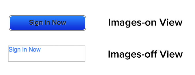
Image Descriptions: The Power of ALT Text
The ALT attribute, which displays ALT text when images are blocked or for screen readers, is an email best practice dating back to the early days of HTML emails. Effective ALT text ensures that subscribers can understand the image’s purpose even if they cannot see it.
- Correct Usage of ALT Attribute: The context of the image dictates the
ALT text.- Functional Images: If an image is also a link, the
ALT textshould describe the link’s destination (e.g.,<img src="button.png" alt="Shop our summer collection">). - Informative Images: For images conveying essential information, the
ALT textshould describe the content of the image (e.g.,<img src="chart.png" alt="Sales growth chart showing 15% increase in Q3">). - Decorative Images: For purely decorative images that add no informational value, use a null
ALT attribute(alt=""). This tells screen readers to skip them.
- Functional Images: If an image is also a link, the
- Testing: View your email with all images turned off to simulate the experience of a subscriber with images blocked or using a screen reader. This helps identify where
ALT textis missing or inadequate. WebAim’s resources on the ALT attribute offer comprehensive guidance.
Accessibility in Practice: Real-World Examples
Several innovators in the email marketing community have demonstrated how accessibility can be seamlessly integrated into engaging campaigns.
- Eyal Bitton’s Accessible Email: Eyal Bitton crafted an email that allowed subscribers to increase text size by up to 200% via their browser without breaking the design. His email also featured an animated GIF that ceased after three cycles (within five seconds), preventing potential issues for individuals prone to photosensitive seizures. Crucially, Bitton used contextual copy for links, ensuring meaning even out of context, and included hidden text at the email’s end to signal important information for blind subscribers.
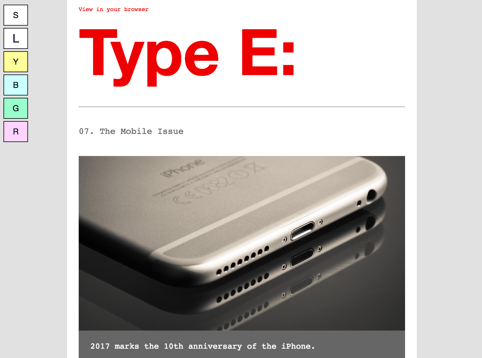
- Paul Airy’s Type E Newsletter: Paul Airy’s "Type E" newsletter exemplifies progressive enhancement for accessibility. It offers an interactive option, driven by an opt-in preference, allowing subscribers to choose between standard or large text sizes. Furthermore, Airy incorporated an innovative feature where subscribers could opt to display the email with tinted backgrounds, a beneficial adjustment for those with certain visual processing disabilities.
These examples underscore that even small, thoughtful adjustments can significantly enhance email accessibility, broadening audience reach and improving the experience for everyone.
Building an Accessible Future: Tools and Team Empowerment
Achieving email accessibility is a journey that benefits from both robust tools and a culture of inclusivity within an organization. Making emails accessible is undeniably the right choice, but demonstrating its business value is key to securing team buy-in. With email boasting an impressive ROI of 36:1, and the disability market representing over $1 trillion in annual disposable income in the U.S. alone, ignoring accessibility is a significant missed opportunity.
Leveraging Technology for Compliance and Creativity
Integrating accessibility into the email workflow can be streamlined with the right technological support:
- Automatic Accessibility Checks: Platforms like Litmus offer built-in accessibility checkers that scan emails for over 40 common accessibility issues, providing detailed reports and actionable guidance. This allows designers and developers to identify and fix problems in real-time within their email builder.
- Visual Impairment Filters: Tools that simulate various color vision deficiencies (e.g., deuteranopia, protanopia, tritanopia, achromatopsia) enable marketers to see how their emails appear to subscribers with different types of color blindness, ensuring crucial information isn’t lost.
- Screen Reader Previews: Integrations with screen readers like NVDA (NonVisual Desktop Access) provide an auditory preview of how an email will be interpreted. This feature, supporting over 80 languages, also highlights the importance of the
langattribute in HTML to ensure accurate pronunciation and transcription by screen readers.
Cultivating a Culture of Accessibility
Beyond tools, fostering an organizational culture that champions accessibility is paramount for long-term adherence and innovation:
- Standardized Templates: Develop accessible email templates that embed best practices from the outset, such as live text, strong color contrast, and semantic structure. This provides a consistent foundation for all campaigns.
- Regular Training: Implement continuous learning and training programs for all teams involved in email creation—designers, developers, copywriters, and marketers—to keep them updated on evolving accessibility standards and best practices.
- Integrated Workflow: Embed accessibility checks into every stage of the campaign planning and quality assurance process. This ensures that accessibility is not an afterthought but an integral part of email production.
- Cross-Functional Collaboration: Encourage collaboration between design, development, content, and legal teams to collectively address accessibility challenges and ensure compliance.
By proactively integrating accessibility into campaign planning and operations, businesses not only fulfill legal and ethical obligations but also forge stronger, more inclusive, and lasting relationships with their entire audience. This commitment transforms email from a mere communication tool into a powerful medium for universal connection.